Tagged: magazine

take care: visual identity development

I started off by looking at creating a clean, contemporary and fresh design for the zine, and designed a minimalist cover combining photography and type. I looked to Trekstock’s existing branding for guidance, especially on their Wellbeing page. However, after considering this piece of work and the aims and audience for the campaign, I wanted to create something younger and more exciting that would draw people in as an exciting publication. I realised I didn’t have to adhere to Trekstock’s exact branding (Yellow Bird Project as an example of one of their projects that has a different look and feel to Trekstock’s own identity) so could be a little freer in the design process. After experimenting a little with some initial page spreads too, I decided to make the zine entirely illustrative with no photography, which I think is more engaging and unique, and also will push me to try new things using ilustration, typography, Indesign and Illustrator.

launch party still life: food display

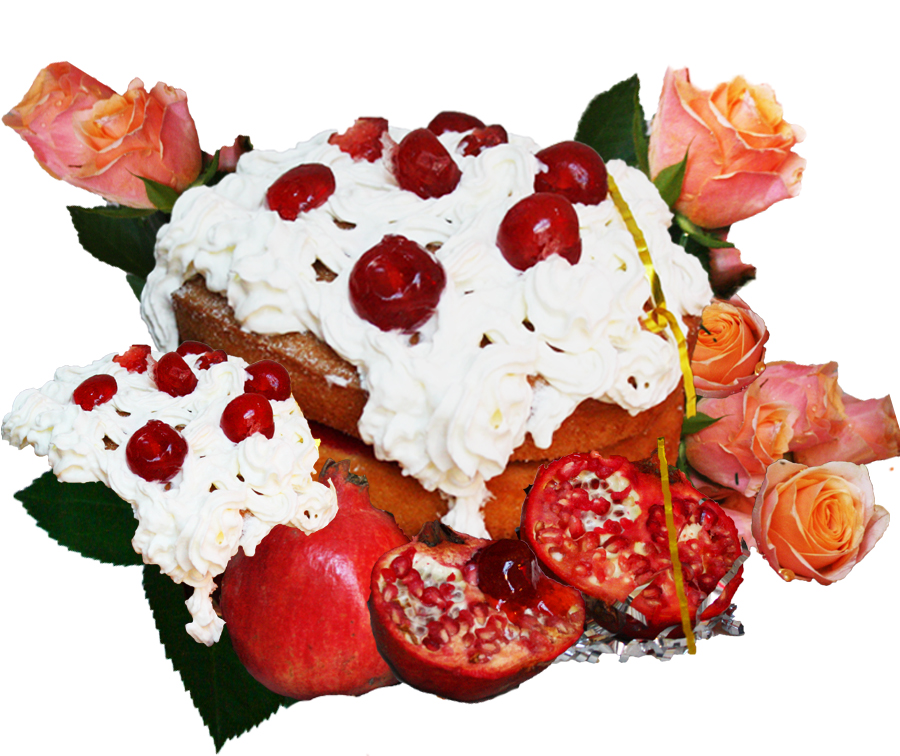
Me and Immi wanted to create a more solid vision of the launch party, and as we’ve used our mutual interest in still life a lot in this brief, we continued that by creating and shooting examples of creative food and drink displays that may appear at the event. We wanted the products to still have the kitsch, garish look of our previous work, but also look appealing and form a stunning display – the point would be that the food is there to look at and be appreciated and engaged with playfully as a sort of installation, but also still needed to look like something people would want to eat.

We took classic childish party foods and snacks, and arranged them into playful displays and combinations to match the over-the-top, colourful identity of the magazine itself. The cocktails we designed would be available on the night, also resembling the colour scheme and themes of Nookie magazine.

Continue reading

magazine content breakdown

  • 3-5 full page adverts
  • portraits of team, editor’s letter, contents page
  • main editorial: male and female model in date settings (cinema, bowling alley, diner) 6 double pages
  • secondary article: rise of males wearing make-up/Youtube make-up tutorial trend
  • editorial: males wearing subtle make-up (provoking thought and question their gender)
  • editorial: female getting ready for a date (references: Petra Collins, Nan Goldin, Juergen Teller. female pampering and grooming routines) around 4 double pages
  • main feature article: embarrassing Tinder stories from the public. illustrations alongside
  • interview with couple that met on Tinder + imagery
  • advertorial: Monki (shot in Edward Street building. yellow. simplistic styling and bright, fun, colourful setting) 4 double pages ? + illustration over top ?
  • still life shoot: food, sexualising food (references: Ladybeard promotion, Jala Wahid sculptures, Rebecca Storm)
  • band or artist interview OR spotify playlist

NOOKIE media pack

https://issuu.com/hollyeliza/docs/media_pack_nookie_final_2

In our finished media pack, I wanted to capture the fun and lighthearted mood we want our publication to create, and so the art direction and overall layout and design has this feel. The media pack illustrates our thoughts and plans for fashion direction, the flat plan of the issue, promotional strategies and advertising.

editorial/layout inspiration

ladybeard-the-sex-issue

One of my main inspirations when thinking about layout and design in relation to our concept was Ladybeard magazine, an independent artsy publication, with each issue having a clear, unique theme. Their first issue was titled The Sex Issue, and featured interesting, quirky photography, graphic design and illustrations. This publication, as ours aims to, discusses and depicts taboo or secretive subjects e.g. masturbation, in an artistic way with a clear contemporary aesthetic.

magazine concept: sex/relationships and internet dating

After mindmapping the current zeitgeist/scene amongst people around our age, we decided a theme stood out to all of us and this was social media, connectivity and mainly, internet dating. We chose our magazine to have a theme of modern relationships and perhaps more broadly, matters of youth culture, with our first issue being heavily themed around Tinder and internet dating.

We wanted our publication to tackle the topics not often explicitly talked about in young adults’ publications, with our magazine providing a platform to create a commentary on these new ways of living and connecting. The magazine will challenge norms and what is ‘acceptable’, giving a satirical, fun and light-hearted approach while also being a publication that readers can identify with.

final zine!!

IMG_8162When I came to print my zine and put all the pages together, including my laser-cut cover and pink end pages, I used a 5 hole pamphlet stitch to bind it together as one publication. 

I also packaged them in A5 cellophane bags to help protect the laser-cut design and glitter paper, and also give them a clean, polished look.
IMG_8165