Tagged: food

“room service”: fashion editorial

(pre-editing)


I didn’t want FILLER to lose its roots in fashion and trend investigation, however fashion editorials are not a strong point of mine. I have always preferred candid, simplistic photography, and so I decided to use this to create a (sort of) style editorial for the zine, using people’s comfort foods as a prop, and actually quite a main focus, in the photos. My further knowledge and research into youth trends highlighted a trend in nightwear and lingerie, notably silky, pastel fabrics and loungewear – which coincidentally link to this rising trend in self care, looking after and loving yourself.

I wanted to create a candid, intimate photo shoot, which looked at the clandestine act of comfort eating in bed, perhaps in glamorous lingerie or nightwear. The photos focused on the act of eating more than the fashion itself, combining feminine pastel colours with grotesque, messy foods such as cheeseburgers and fries (which I styled with ornate glass and silverware to parody how inexpensive and unglamorous they are often perceived to be).


development of concept: food & fashion

Ader Error

In my tutorial with Vanessa today we went through my progress so far in terms of collecting submissions for FILLER, as well as my own content that I have begun to think about. We discussed how I have an interest in food photography and the discourse around food and diet trends, and how this translates well into fashion communication as the relationship between fashion and food is rather tenuous. This led me to consider how FILLER could focus exclusively on food and fashion, as it is a theme that appears in a lot of my research, inspiration and ideas, and also makes the zine personal to my interests (which is after all what a zine is all about). I also stated how people seem to be excited to engage with content surrounding food, as I received a lot of responses in my comfort food survey. I have therefore decided to work with this naturally emerging theme of food and tailor my call for submissions to focus more on food-related pieces, which has led me to feel a lot more excited about the development of the project, as a truly unique publication based around my personal interests but catering for the individual, forward-thinking reader that is still interested in trends, art and fashion.


comfort food shoot

I conducted a survey online asking people (through social media platforms) to submit their ‘ultimate comfort food’ – some submitted simply a word or two, others a short description, and some a lengthy anecdote describing the nostalgia or pleasure created by consuming their favourite food. This formed the basis of a still life shoot depicting people’s comfort food. After researching and being aware of the ‘wellness’ and ‘clean-eating’ trend that is especially visible on social media, I find it intriguing how the foods people actually enjoy eating, that make them feel better when they are sick, sad, tired or just relaxing, are actually not the most aesthetically pleasing. I wanted to, visually, comment on how we are constantly Instagramming superfood-packed bowls of porridge, açai bowls, smoothies or fruit platters, because they are so typically ‘pretty’ and send out a message of health, purity and attractiveness to our followers, but really the foods we get real pleasure from are (to name a few submissions) toast, garlic bread, macaroni cheese, pizza, donuts and shortbread biscuits.

I wanted to select a few of these submissions and depict them against backdrops resembling bedcovers, to relate to the theme of comfort food and the intimate, clandestine act of bingeing on your favourite snacks in bed. I used silky, luxurious looking fabrics which when juxtaposed with the typically ‘unattractive’ food created a playful aesthetic, presenting cheap, everyday supermarket products as something glamorous.


W E E K 3 ethnobotany: natural plant dyes

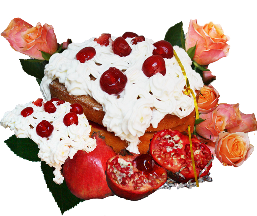
I conducted a still life shoot based on the concept of ethnobotany and natural dyes in textiles. I wanted to focus on vibrant colours and bold shapes to give the images a contemporary look and make them differ from already existing images around this subject (which often focus on neutral tones, minimal styling and low contrast photography). I purposely picked plants that are known to give strong/vibrant colour results, such as pomegranate, beetroot and turmeric, so I could create bright and fun images with them. I intend for the these photos to feature alongside samples of fabric that I have actually dyed with the plants to demonstrate how natural dyeing is possible and effective…to hopefully inspire a change in the way we think about the designs and colours of our clothing – maybe we should be dyeing garments naturally ourselves? Maybe we should simply source more ethical brands that do this already? Could this inspire a larger interest in up cycling and DIY fashion, that has so far only been picked up by outsider groups that do not “associate” themselves with mainstream trends?

Continue reading

launch party still life: food display

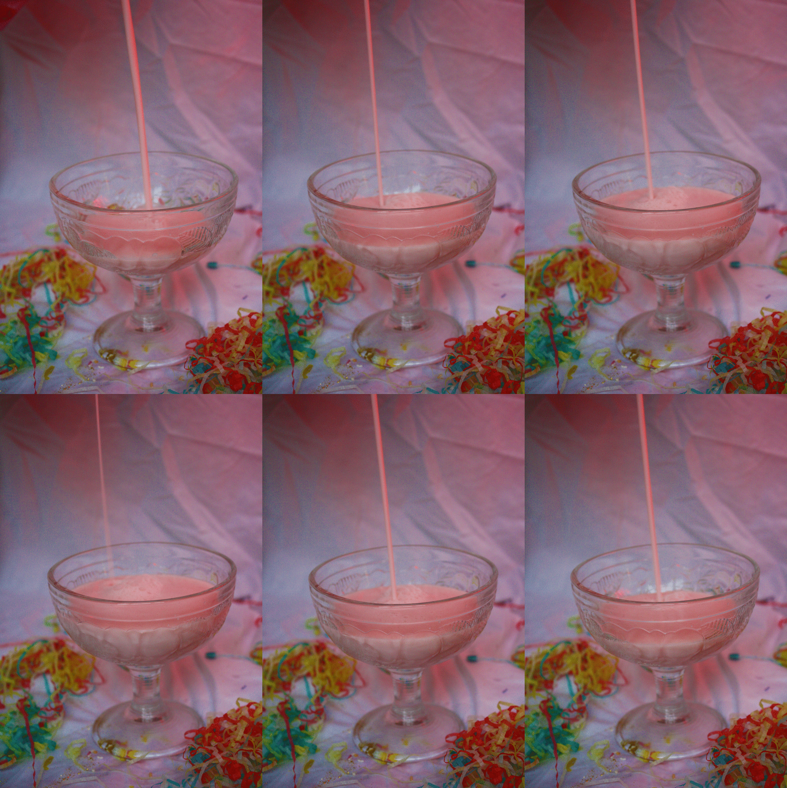
Me and Immi wanted to create a more solid vision of the launch party, and as we’ve used our mutual interest in still life a lot in this brief, we continued that by creating and shooting examples of creative food and drink displays that may appear at the event. We wanted the products to still have the kitsch, garish look of our previous work, but also look appealing and form a stunning display – the point would be that the food is there to look at and be appreciated and engaged with playfully as a sort of installation, but also still needed to look like something people would want to eat.

We took classic childish party foods and snacks, and arranged them into playful displays and combinations to match the over-the-top, colourful identity of the magazine itself. The cocktails we designed would be available on the night, also resembling the colour scheme and themes of Nookie magazine.

Continue reading

more still life: cake / sexts

img_1868 img_1883

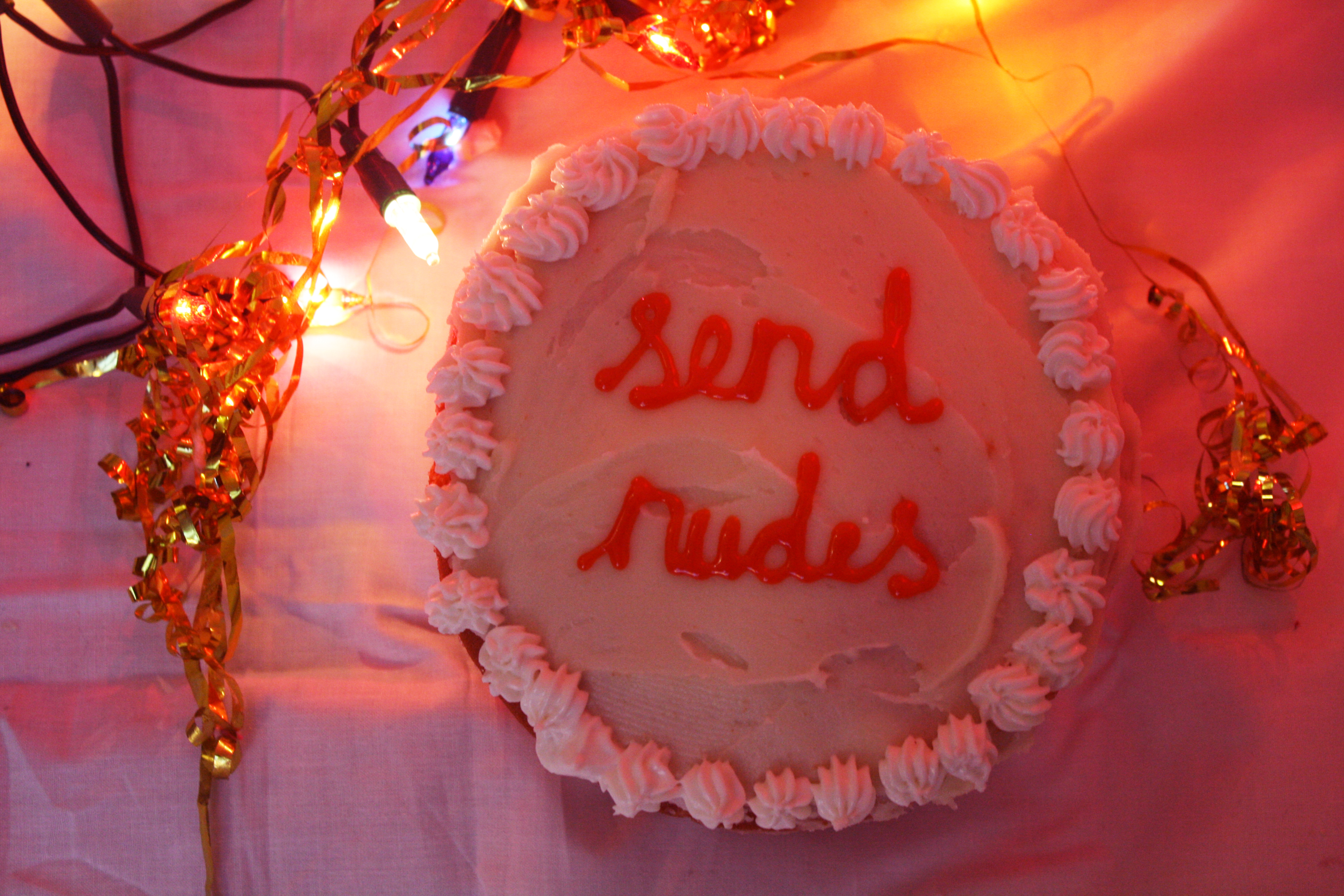
These are the remaining images from our second still life shoot when there was no longer daylight to shoot in, but I actually like the soft pink light which we achieved with a lava lamp. We still wanted to use cake as it links slightly to our previous shoot and also the involvement of food at our launch party, as well as the fact that cakes are usually given as a gift or gesture towards somebody.

We took this use of cakes as a gift and decorated them with somewhat explicit or provocative messages which are often sent as ‘sexts’ in our contemporary dating culture. These demanding and less-than-romantic statements are things most people our age have been sent, or have sent themselves, and so by juxtaposing them with extravagantly decorated cakes conveys a lighthearted commentary on the lukewarm sentiment of these online relationships.

The images aim to provoke the viewer into wondering how they would feel if these ‘sext messages’ were, rather than being sent through cyberspace at 2am, presented to them by their love interest on a cake as a romantic gesture.

Continue reading

CAKE: promotional images

img_1817img_1820

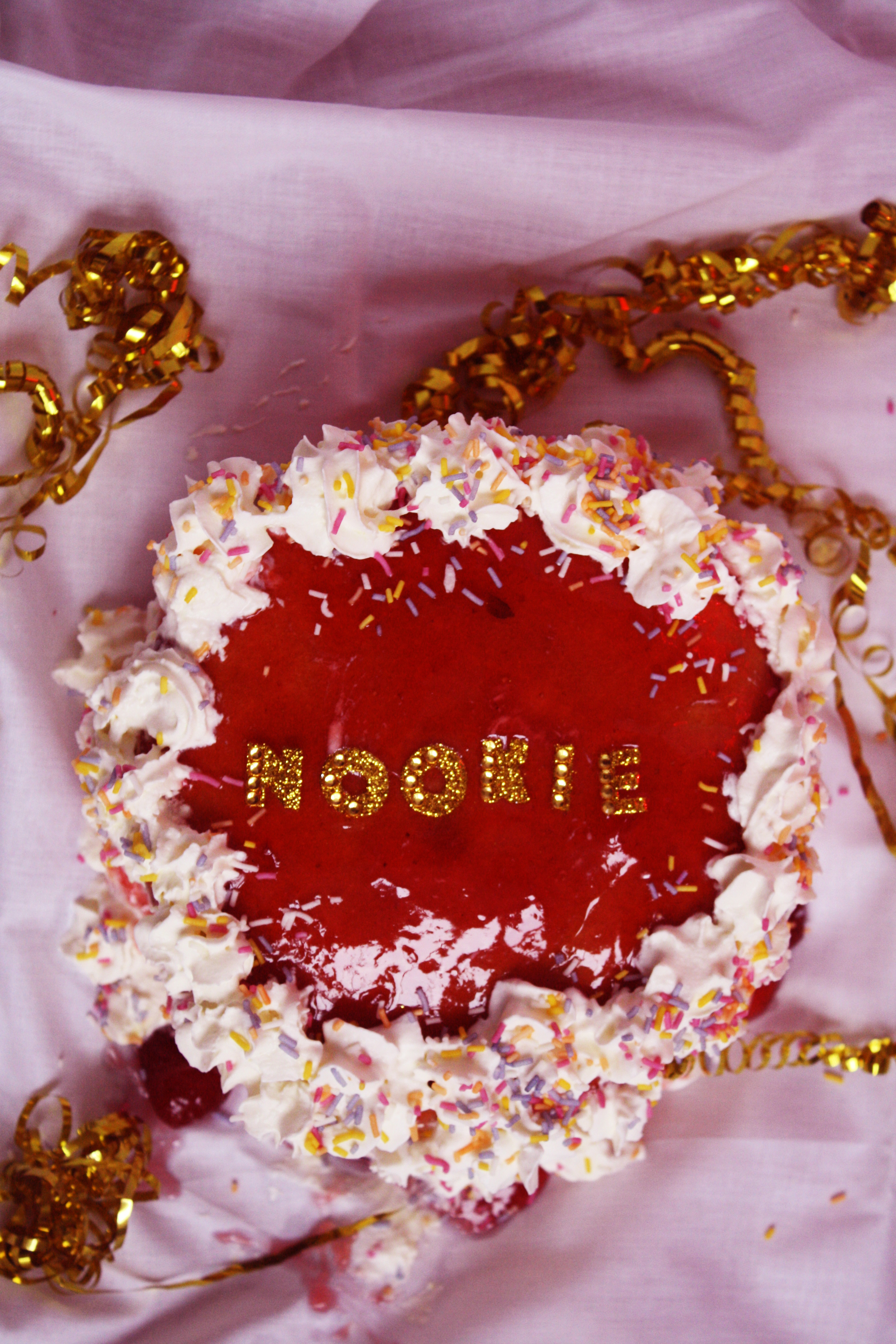
We experimented again with cake to create more images that could be used in our magazine – however we thought the images looked best taken with daylight and because it got dark so early, all of the images would not work as a cohesive editorial, so we decided these could be used separately as promotional images (posters, stickers?).

Continue reading

sexualisation of food: final images

img_1405-edited img_1416-edited

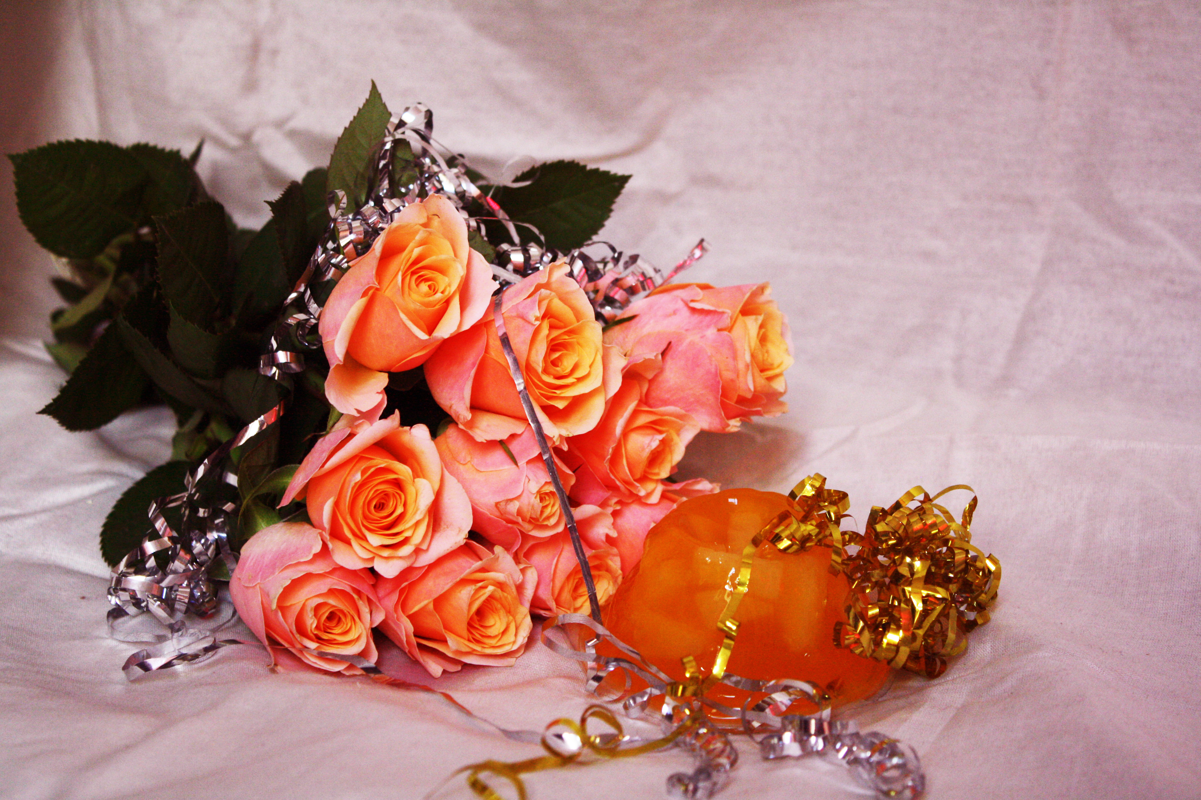
This editorial that I shot with Immi stemmed from our love of still life, and by taking inspiration from artists we love such as Rebecca Storm and Prue Stent, as well as looking at Bompas & Parr’s creative use of food to create sensual moods and environments, we based this editorial around the sexualisation of food in contemporary art and culture and how particular foods and their shapes, colours and textures can be provocative or resemble sexual imagery – for example our selection of very sweet and sugary foods to convey romance, aphrodisiac properties and even using food in sex. e.g. drenching objects in honey and capturing it dripping down and pooling around the objects, using squirty cream and documenting it slowly deflating and running off jelly, the placement of fruit and berries which have often been used to depict fertility or female genitalia.

We wanted our images to be quite kitsch and created bizarre set-ups of edible and non-edible objects. Our images began quite clean and minimal but we found that when we added more and more to the arrangements the images really came alive and had the appearance that we wanted, and fit our concept more.

Continue reading