final poster submission

I combined my photography with digital illustration and type to give my work a fun, creative yet strong message, that we should embrace our differences. This one final image was selected to be entered into Diversity Now 2017.
I combined my photography with digital illustration and type to give my work a fun, creative yet strong message, that we should embrace our differences. This one final image was selected to be entered into Diversity Now 2017.


I wanted to shoot images of females with varying appearances, whether that be simply facially, in body shape, race/ethnicity or style. I chose several subjects that all had very different and unique appearances and shot a series of portraits. I let the models direct themselves and have fun with the shoot as I wanted these photos to show diversity in appearance, style and personality, rather than be a strictly directed and staged fashion shoot. I also kept make-up very minimal and did not use post-production enhancements except to correct lighting/colour as I shot in natural light to give a softer, more feminine feel to the images.
Inspired by the phrase ‘oranges are not the only fruit’ I made this my own by basing my photos around the phrase ‘roses are not the only flower’, which has references to femininity as well as roses referencing an ‘English rose’ appearance that is typically attractive in the Western world. For this reason I included other ethnicities, complexions and facial features to show the diversity in appearance and how female beauty is not limited to one type of look.

I came across this phrase which is a title of a novel, but the words inspired me for my project to think about diversity and how we are not all the same, and the industry shouldn’t be limited to a particular size/shape/age/look of person to promote fashion.

After initial visual research into other artists’ work and possible directions, I decided to focus my response to the Diversity Now brief towards women and the variations in bodies, style and appearance. I want to specifically challenge the attitude the fashion industry has towards flaws, imperfections, different body types and body choices, e.g. the (lack of) acceptance of body hair, tattoos, piercings and even skin/body differences that cannot be helped.


In our collage workshop I started thinking about themes within “Diversity” that I could explore. I found myself selecting images around body standards, sexuality and gender as those are often areas I enjoy discussing and challenging. This first collage was very minimal but I think it worked best this way as it had a strong enough visual message with just the two images, creating a theme of masculinity and sexuality, and the idealized body.

In this piece of collage I focused more on the female body, slicing the body to resemble the pig image next to it. I wanted to create a thoughtful message around women’s body shapes; our lack of confidence with our bodies and our desire to constantly change ourselves. However the pig illustration also touches on how women’s bodies are seen as meat or something desirable, to be consumed. I experimented with stitching into the collage which I had not thought of before but I really feel it has the ability to add to what you are trying to say with an image.

This expanded on the discussion of the sexualisation of women’s bodies. Although very simple again in composition, I think I was able to create a strong message, aided by the addition of type and sewing.
This brief taught me a lot, both about my individual creative skills and my skills in teamwork and communication. I have always been someone who takes charge and uses my initiative in group projects to solve problems if things aren’t going to plan. I focused on the layout, design and overall visual identity for our magazine, and was able to use my existing interests and skills in design to create the appearance of Nookie as a brand, as well as putting together elements such as the media pack, typography and imaging themes and the final magazine layout. I looked at areas of art and design which interested and inspired me and kept referring back to them during the project, including other publications such as Ladybeard and Polyester Zine, illustrators such as Laura Callaghan, and other creatives like Bompas & Parr and Ryder Ripps. I think this constant referencing and research allowed my work to have clear themes, and ensure design was cohesive throughout.

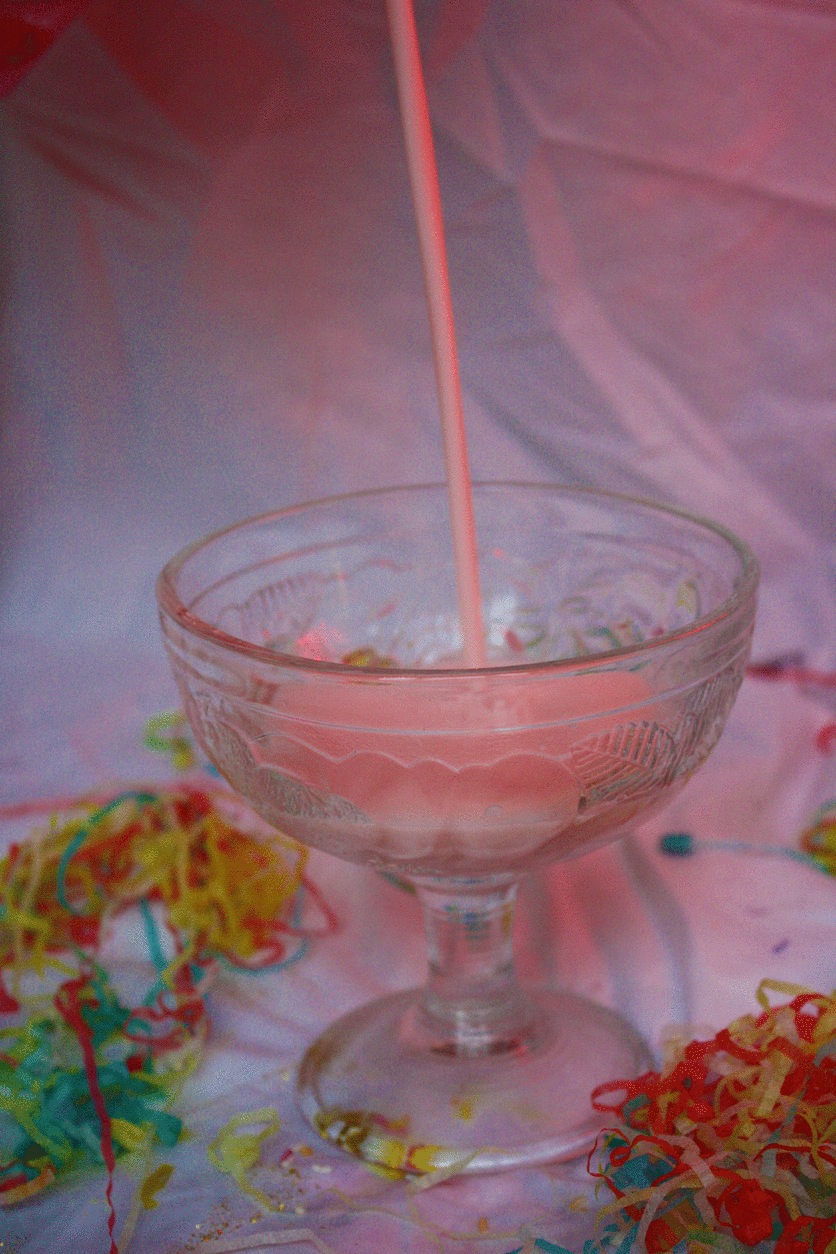
Me and Immi wanted to create a more solid vision of the launch party, and as we’ve used our mutual interest in still life a lot in this brief, we continued that by creating and shooting examples of creative food and drink displays that may appear at the event. We wanted the products to still have the kitsch, garish look of our previous work, but also look appealing and form a stunning display – the point would be that the food is there to look at and be appreciated and engaged with playfully as a sort of installation, but also still needed to look like something people would want to eat.
We took classic childish party foods and snacks, and arranged them into playful displays and combinations to match the over-the-top, colourful identity of the magazine itself. The cocktails we designed would be available on the night, also resembling the colour scheme and themes of Nookie magazine.