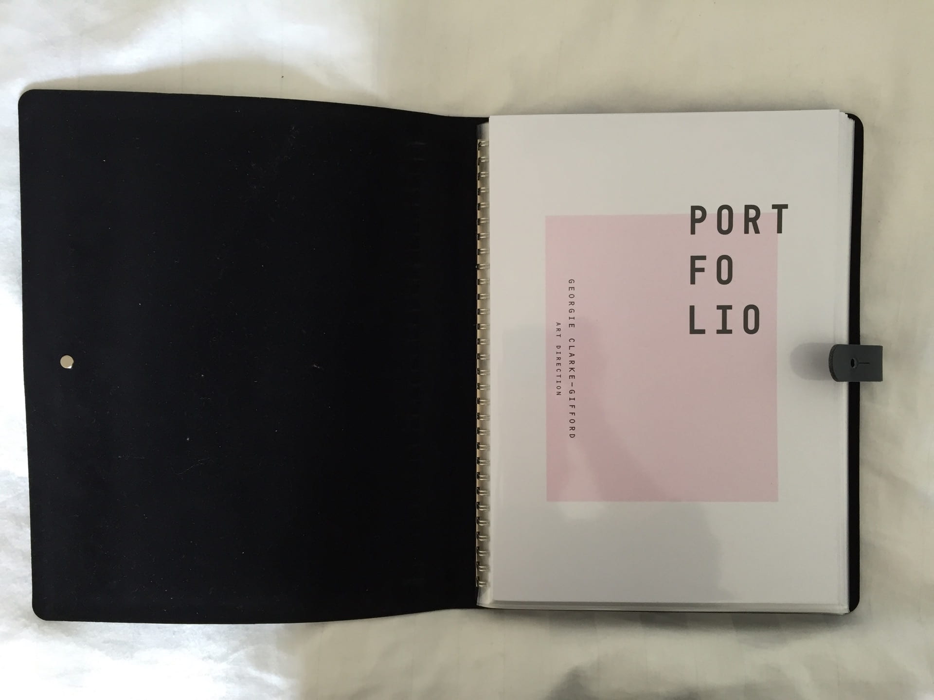
For my final physical portfolio I decided to use a leather spiral book sleeve portfolio to display my work. As mentioned in a previous post, I did consider doing a box portfolio, however, after much thought, I felt that a sleeve portfolio would be more suitable, particularly as I am displaying layout/ art direction skills and therefore having it displayed visually as a double page spread is quite important. I liked the idea of being able to move the images around and change the order with a box portfolio, however, as it is going to be showcased at Graduate Fashion Week, I felt something which is more secure and tidy would be more suitable for the viewer. Nevertheless, I may consider using a box portfolio in the future for interviews and smaller audiences. Additionally, I also considered having an embossed front cover with my name, however due to costings and my personal budget, this was not possible.
Overall, I am pleased with my printed portfolio. I think it displays my skills and interests within art direction, photography, layout/ magazine work well. I was worried to begin with that I would not have enough varied content, however creating a magazine which focused on fashion, food, culture, lifestyle meant I had a little variation within my work in terms of topic despite the majority of it being photographic.
When I began to create my layout for my portfolio and choose the imagery/ work, I didn’t feel happy with including my work from previous years at uni as I felt it wasn’t as strong as my latest work. Furthermore, I also felt it wouldn’t necessarily look right amongst my new work as my style has changed slightly.
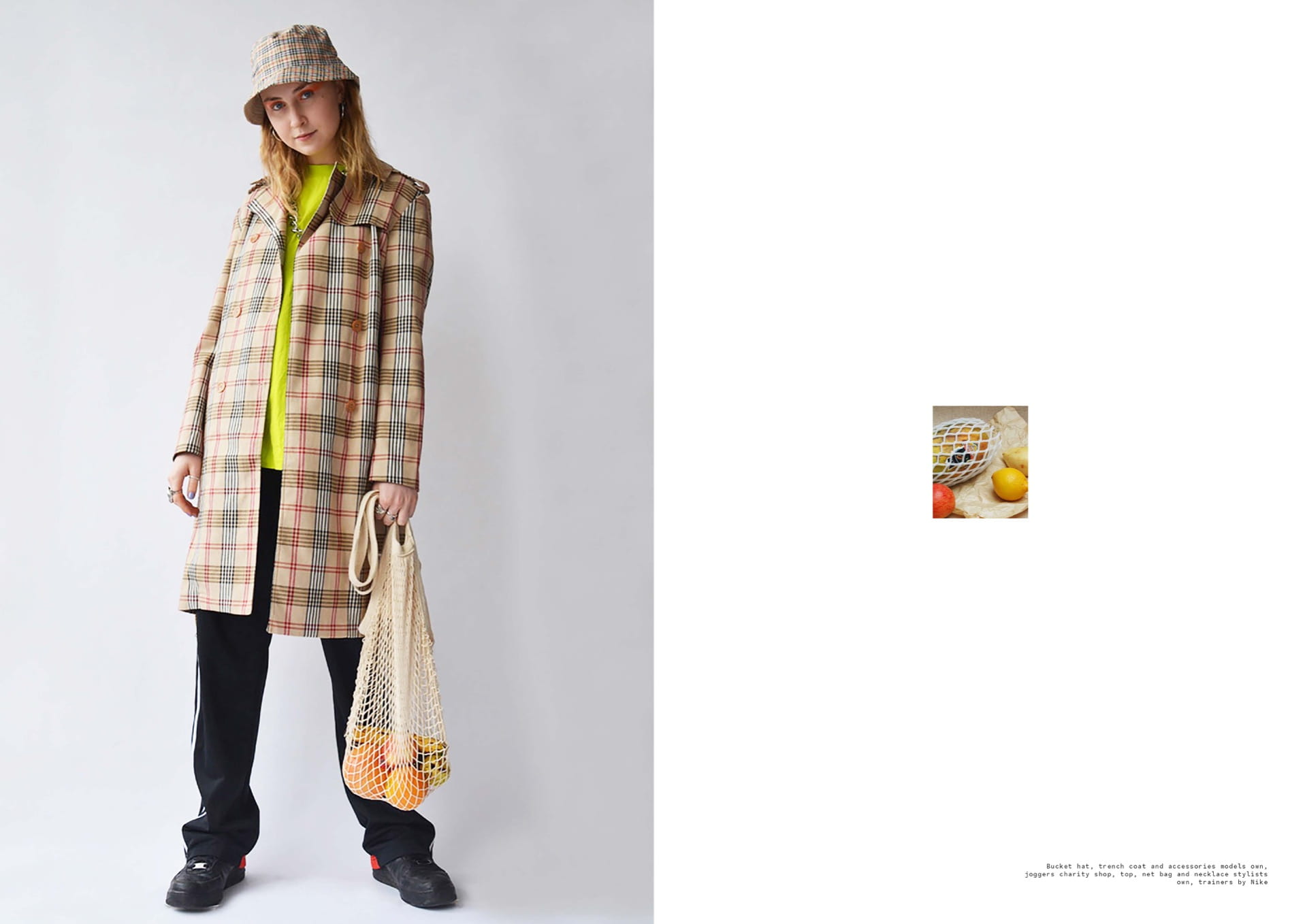
I decided to choose features from my final major project (oaf magazine) for my physical portfolio content. I have chosen 4 features from this publication, including Lazy Arms, Organ Organic, B & Bazz The Gluttony Series and Simon’s Yard. I didn’t want my portfolio to be too extensive, so I chose what I believe is some of the strongest imagery, whilst remembering to display a variety.
I chose these 4 features because I felt it would display a range of visual imagery and skills. In other words, there is food and fashion related imagery alongside my art direction, magazine/ layout skills, which I feel creates a balance. In terms of design, I decided to give display each features title with a small paragraph providing some context into the visuals so that the viewer can fully understand my projects as there is subtle hidden metaphors and meanings behind them. In terms of layout, have maintained a clean and minimalistic aesthetic with a strong consideration for white space to ensure that it mirrors my visual style in order to remain consistent and reflect a strong brand identity to the viewer, which is key when displaying your work to industry professionals and creatives.
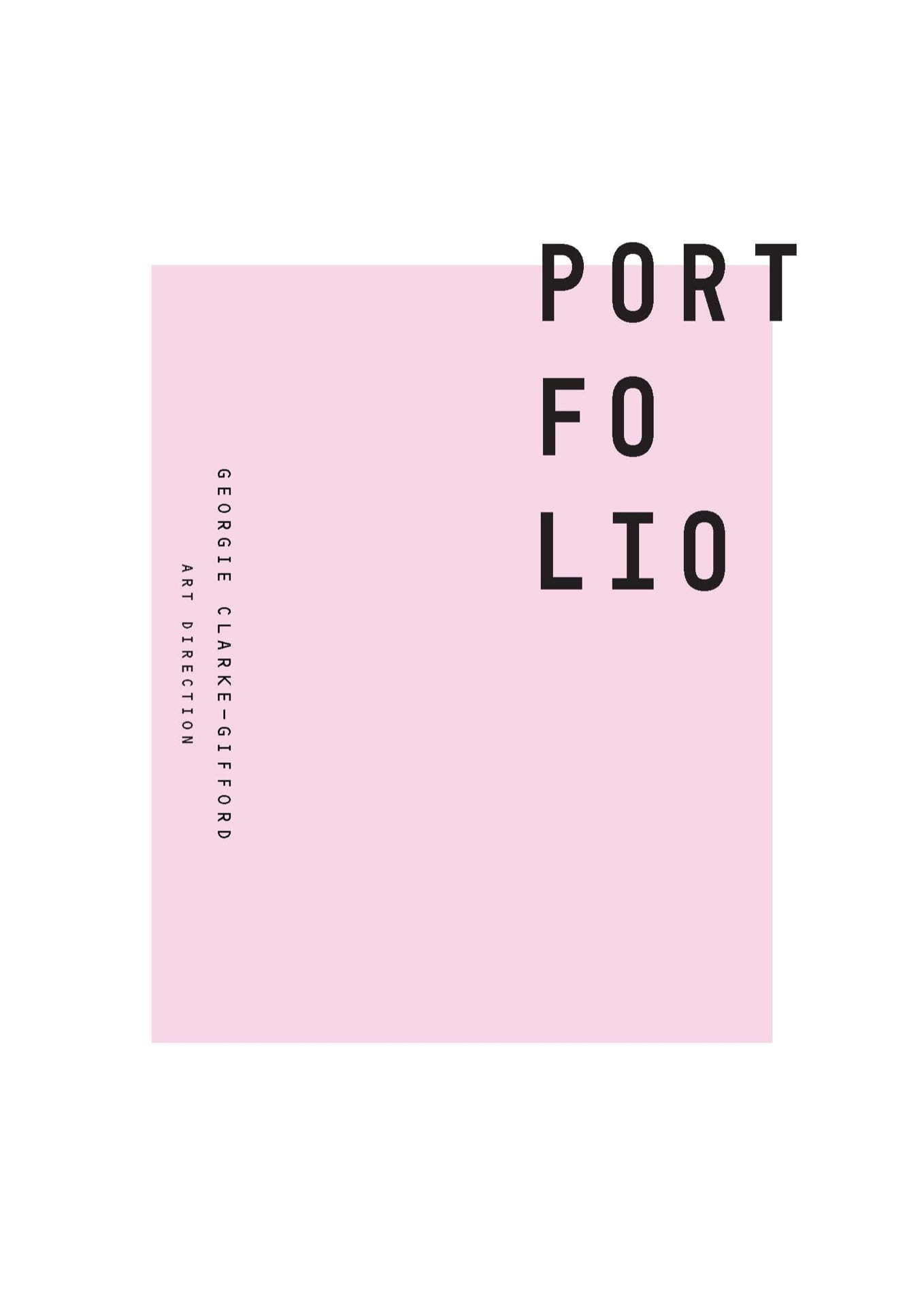
Below is a few selected spreads from the portfolio as well as an image of the physical portfolio itself alongside a link to the full pdf version.


