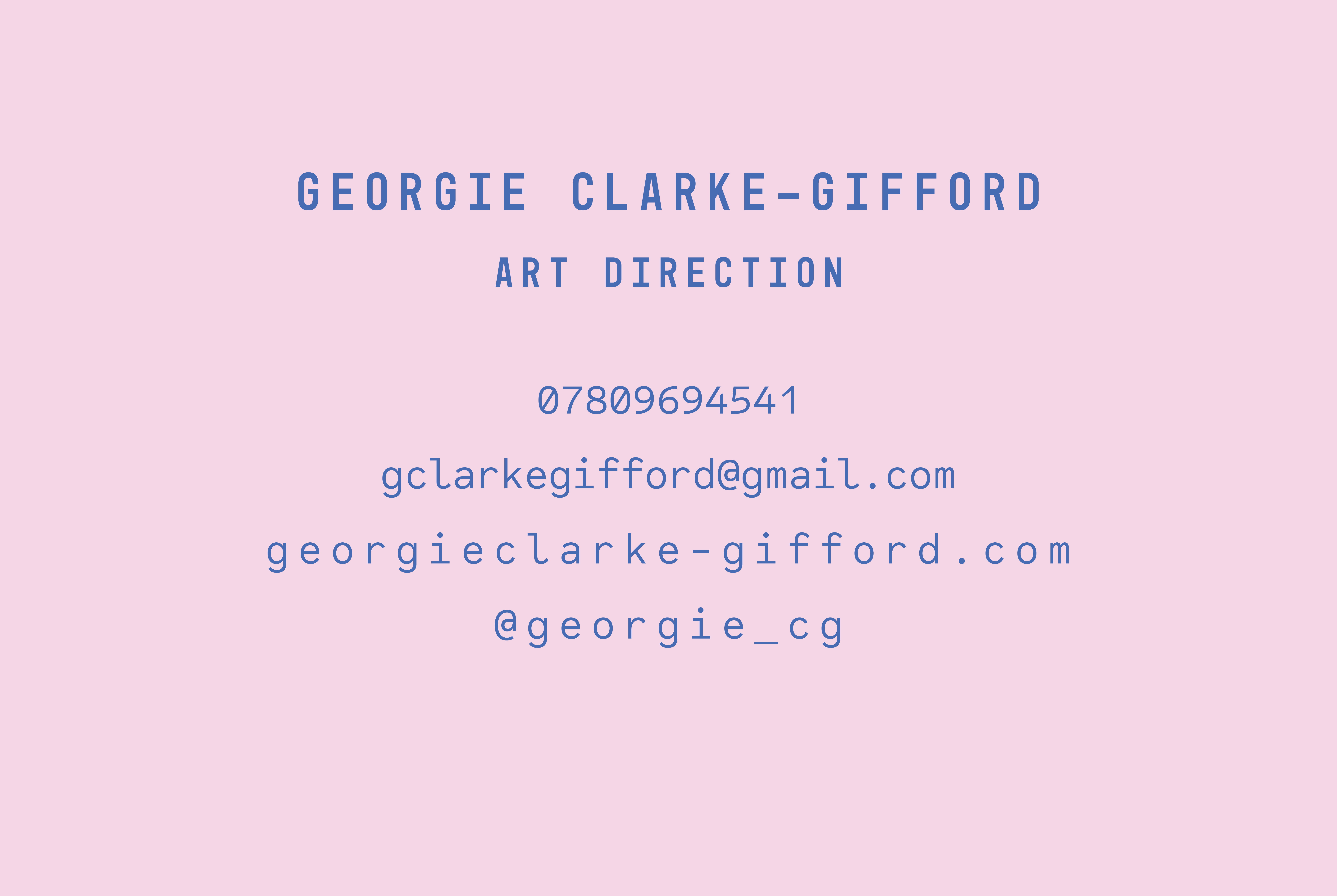
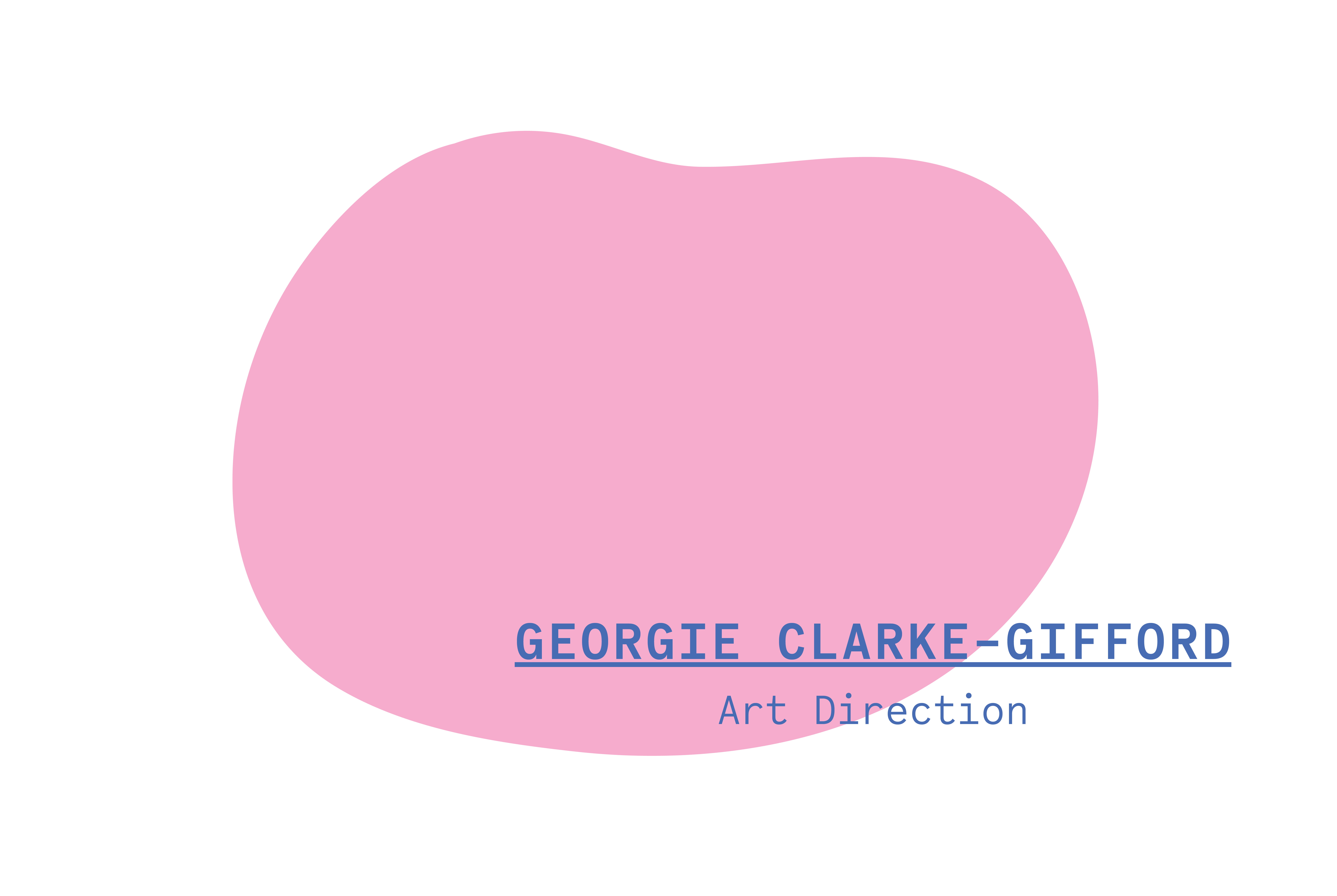
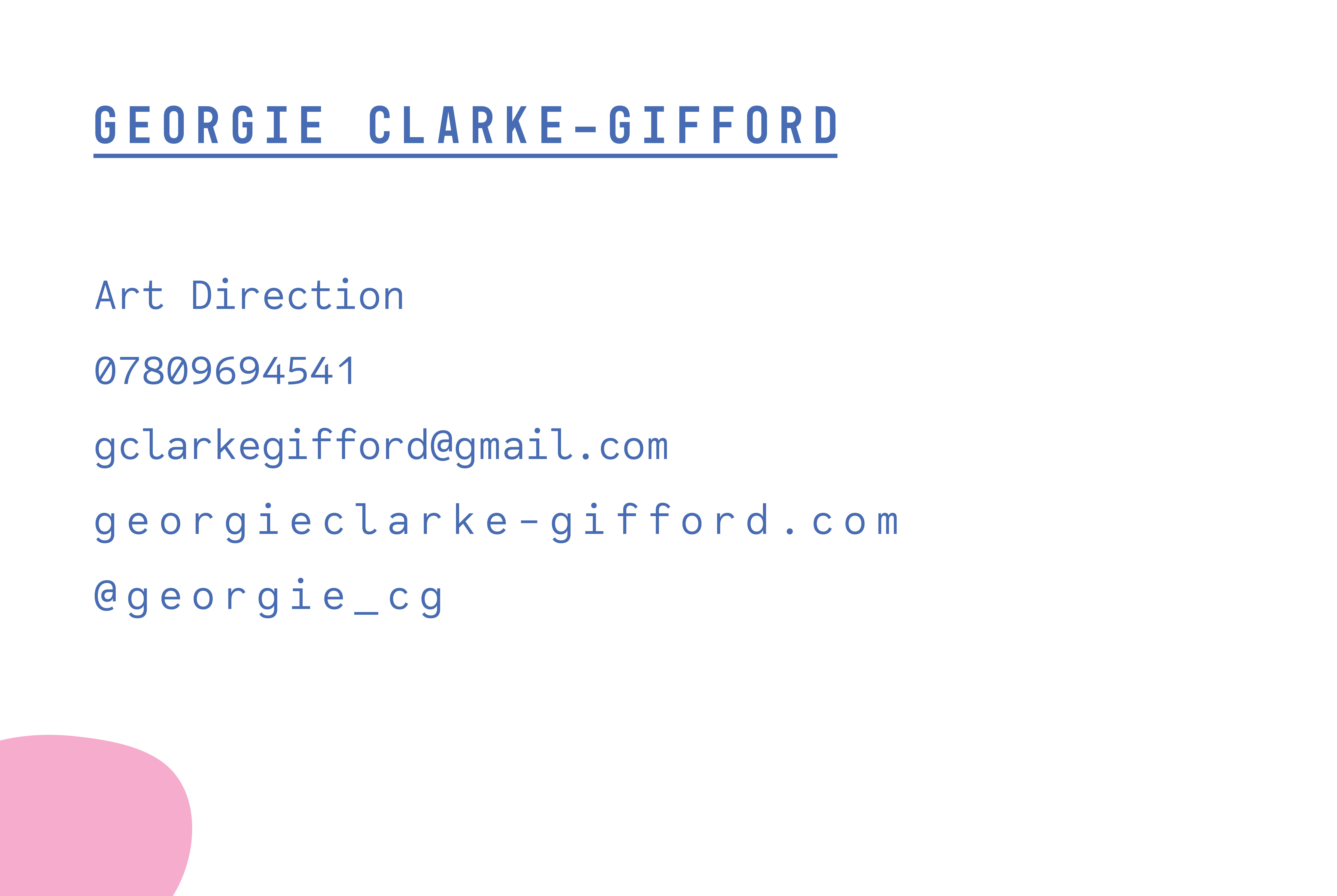
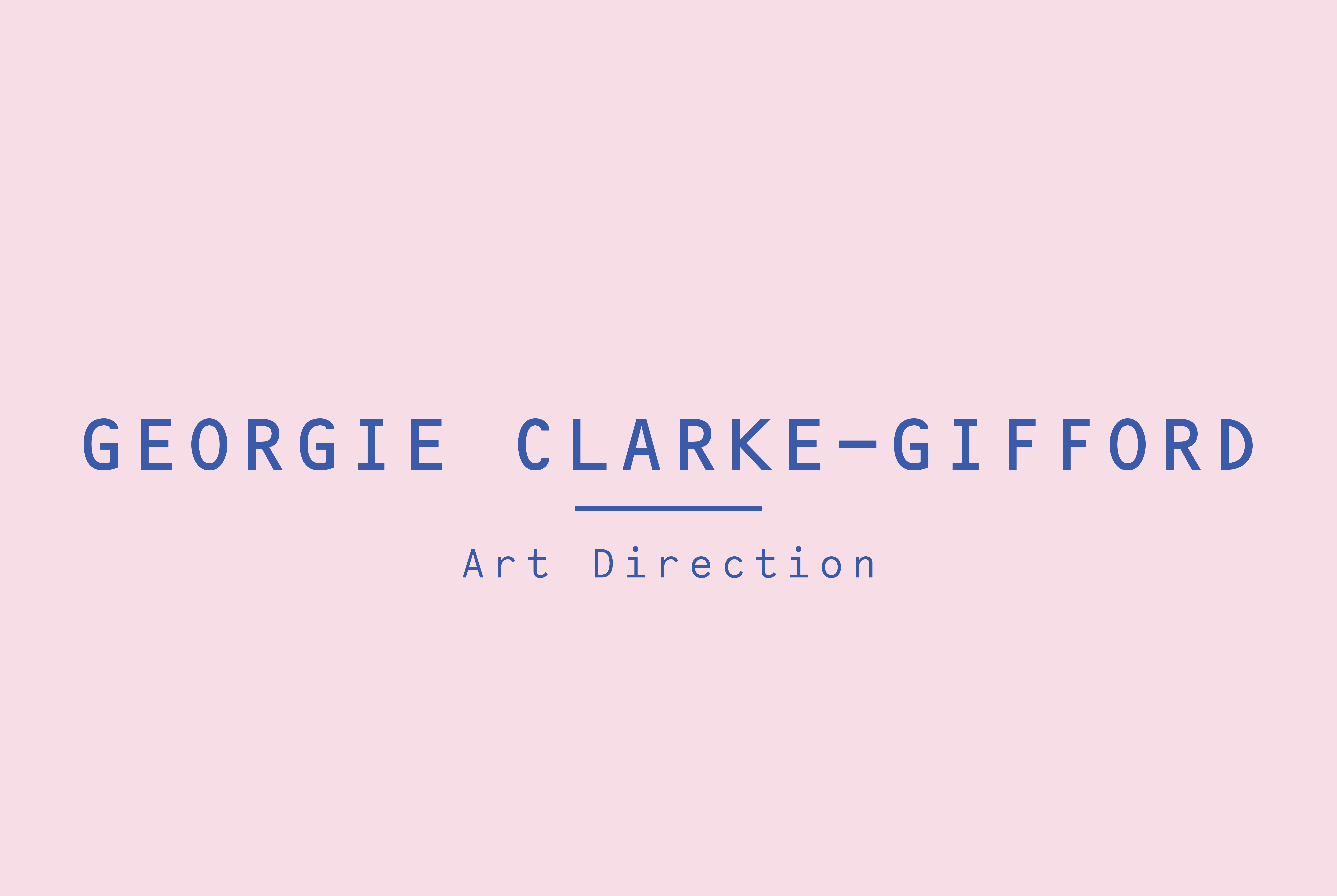
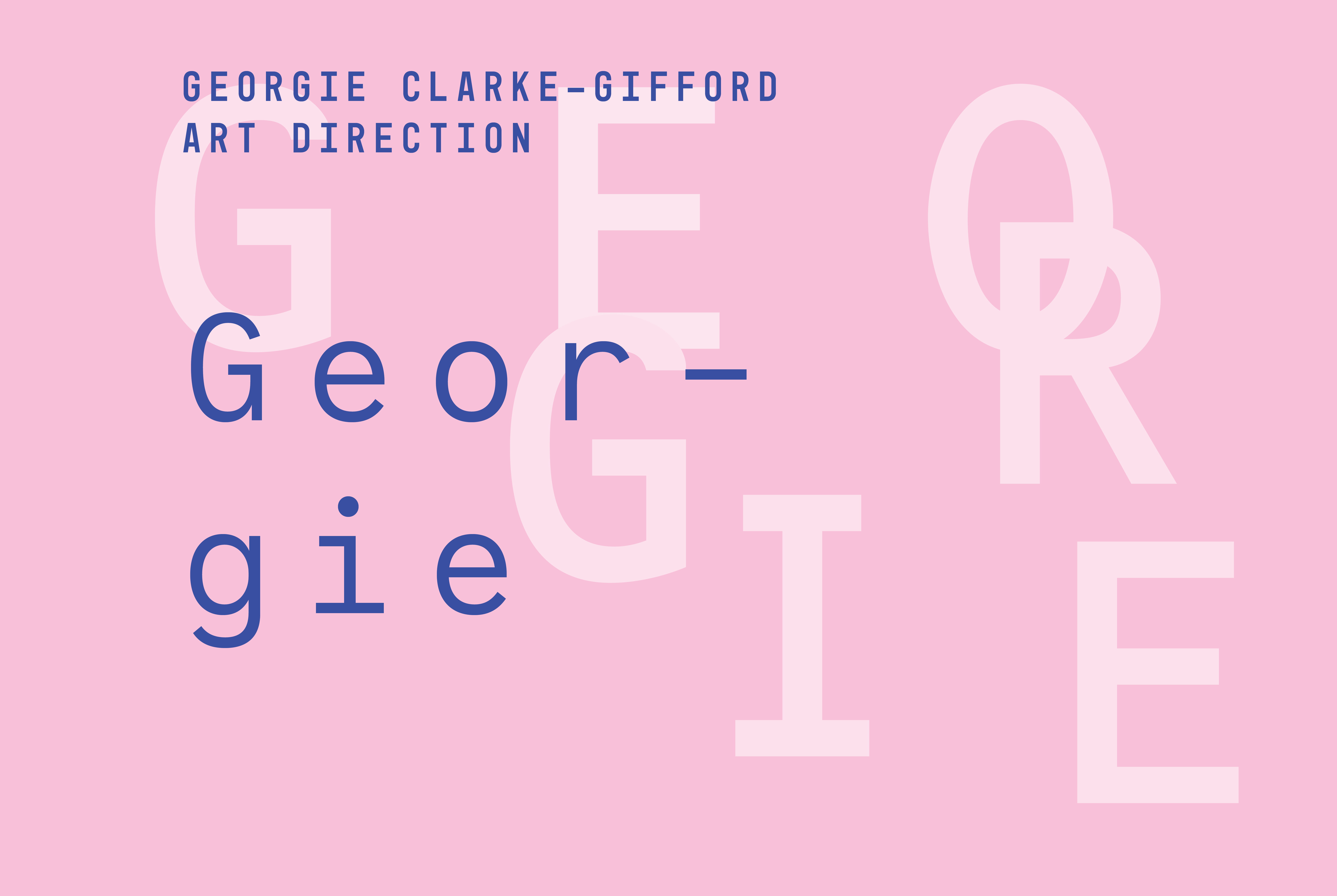
In order to come up with a final business card design, I decided to experiment with a few designs. I wanted to explore my chosen fonts/typography, colour choices and layout in a visual way through mock ups. I have chosen to use Mono-45 headline, code saver and OCR B std as my three fonts. To ensure there is a sense of consistency, I aim to use these three fonts on my postcard, cv and online portfolio too. I chose to use pink and blue as my main colours to tie in with a few images I had in mind. Overall, I am pleased with these mock ups, however I feel there is a clear sign of the ones which work better than others. I think the designs with the larger typographic design is a bit too dominating for a business card. I chose to do landscape rather than portrait as I felt it would suit my potential designs better as well as taking into consideration that my full name is fairly long, particularly when I use a spaced out font as shown below.


