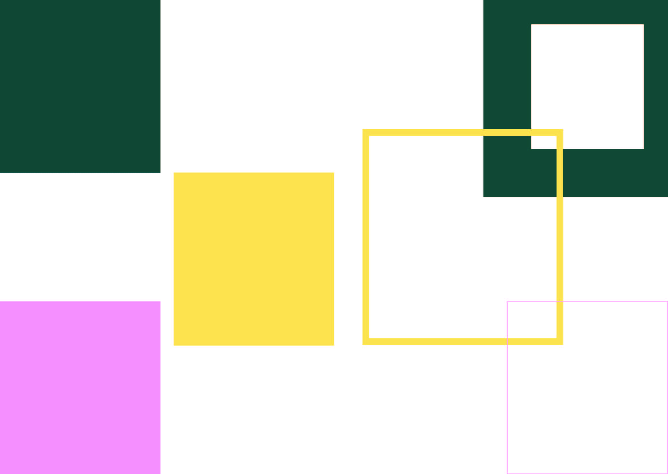
During the first part of the workshop, we were asked to create an InDesign document and experiment with either triangles, squares or circles on the page. This was a task for us to explore layout through an abstract form. At first, we just experimented with creating spreads using one shape in black and white. After this, we began to introduce colour. This task helped me to think about the flow of a magazine, design, use of space and colour.
I chose to use a square. My designs are shown above. Some of my experiments were more abstract than others. For example, some of the experiments were considering magazine layout and others were more abstract looking at colour/ graphics.


