Email marketing is becoming increasingly popular and a great way of collecting and analysing big data. But what is it that makes a successful email and what factors draw customers attention and make them actually open it. Email marketing is a way of building and maintaining closer relationships with customers (Ellis-Chadwick & Doherty, 2012). There are certain guidelines and tactics that can be followed to create a successful email, but what are they?
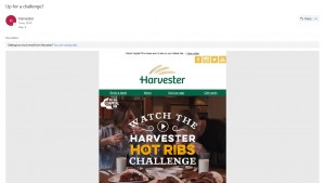
I focused on an email i recently received from Harvester. This email is in the style of a house-list campaign email, advertising a new ‘meal deal challenge’. The main reason i chose to open this email was due to it’s subject line: ‘Up for a challenge?’ and straight away i saw this and was intreguid to see what this challenge was. Below is a screenshot of the email i received:
The content of a subject line should be used for grabbing attention (Ellis-Chadwick & Doherty, 2012). The most popular subject lines would usually include: Discount/saving/Sale/Money off/ Bonus offer etc. However this subject line didn’t follow these convential guidelines and i think in this case it worked successfully. This was appealing due to my curiosity and wanting to find out more about what was this challenge? and could i actually complete it? However, people would disagree and say there isn’t much detail to what the offer or new product was. However, following on below this was the Headline stating ‘Watch Capital FM’s Aimee and JJ take on our hottest ribs..’ Which then explained in more detail what this challenge was.
The email was of a reasonable length and wasn’t too long at all. As it is a promotional email it should be short in length to clearly state what it is being promoted and where to find it or how much, On the other hand, if it was a newsletter you would expect it to be lengthier. This would also be the perfect length to open on a smart phone, studies show there has been a 500% incline between 2011 and 2014 in the amount of emails opened from a smartphone, (Jordon, 2015). The design is simple and easy to navigate and includes mainly images with only a short amount of text included.
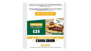
The main visual used is an image of a link to a video. However, this can only be viewed on the landing page. The other images used, you can see below in the screenshot, it is an image of what the product is. Pictures help engage the readers and sustain attention (Ellis-Chadwick & Doherty, 2012). I feel as this is the main product being advertised this image should of been included at the top of the email so it is clear to see what the challenge includes and how much this costs.
Personalisation of emails is one of the key tactics of email marketing and is used to work on building customer relationships (Mohammadi, et al. 2013). One of the negatives i found with this email is there was no personalisation at all included. They could of focused on my geographical location (Brighton) and personalised this email to promote the Brighton’s Harvester branch. Without any personalisation it is unlikely that i would of usually contiuned to read into this email more.
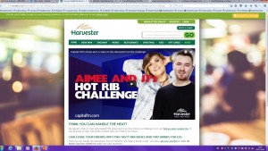
The Call to Action of this email isn’t extremely clear as when you click on the video link to watch the video of the challenge being completed, below is the landing page for this link.
However, from this page you can follow another link to receive a voucher to get this challenge deal and find your local harvester. This is very effecient way of allowing customers to focus on this deal only and to get booking straight away. It clearly states the price of this deal in clear bold text and shows exactly what is included in this meal deal. One critique i would make is that it’s not very clear how long this offer is on for and what the urgency is. The information on when the deal ends is only in small text, which this should be of more importance. More examples on successful call to action can be found following this link: call-to-action-examples.
Overall, i feel this email was a successful form of marketing their new product/deal as straight away it grabbed my attention and explained what this challenge included and had a great visual example of this challenge being completed. I would improve it by creating more urgency in how long this deal lasts for. But also to have more personalisation within this email and maybe include my nearest Harvester branch so i know exactly where to access this product from.
References:
Ellis-Chadwick, F., & Doherty, N. F. (2012). Web advertising: The role of e-mail marketing. Journal of Business Research, 65(6), 843-848
Jordan, J. (2015). 53% of Emails Opened On Mobile, Outlook Opens Decrease. [online] Litmus Software, Inc. Available at: https://litmus.com/blog/53-of-emails-opened-on-mobile-outlook-opens-decrease-33 [Accessed 3 Oct, 2016].
Mohammadi, M., Malekian, K., Nosrati, M., & Karimi, R. (2013). Email Marketing as a Popular Type of Small Business Advertisement: A Short Review. Australian Journal of Basic and Applied Sciences, 7(4), 786-790.


