On the 1st of August 2017 the document viewer in Turnitin, which is currently where essays are reviewed and marked, will be upgraded to the new Feedback Studio. This change will be implemented across the UK, some British HEIs have moved to the Feedback Studio already, as have HEIs in the United States.
This post provides a summary of the main changes. However, we do encourage that you to consider attending a forthcoming training webinar or to request in-person training from your LTA.
The changes are mainly to the visual design, so most of the functions that you have come to expect from the document viewer are still available. Having tested the new Feedback Studio will some gracious volunteers, we are hopeful that the transition to the Feedback Studio will be an intuitive experience based on your prior knowledge of using Turnitin for paper review and eMarking.
At Falmer we offered a ‘sneak peak’ session over lunchtime at the ExploreStudio (D229) on Thursday 20th of April (12:00-13:00). Depending on interest/response we may run more of these. We recorded the session for you.
Summary of the upgrade to Turnitin Document viewer
- The Feedback Studio is mobile compatible for students
This a major step forward as it means that students will be able to view their feedback from their mobile devices via a mobile web browser such as Safari for iOS or Chrome for Android. Please note that the Turnitin for iPad app reports that it can be used by students however, this only applies to institutions that use Turnitin at their main site (turnitinuk.com and turnitin.com), not via integration (aka via studentcentral) as we do.
Turnitin Feedback Studio – student view on an iPhone 5s - The Originality Report is referred to as the Similarity layer
In the window where the student’s paper is shown, the originality checking tool is now displayed as the similarity layer. The PDF version of the report that you can download is still entitled, originality report but we anticipate that this will be renamed to similarity report in future for consistency and to match the help documentation. No other changes have been made to this tool.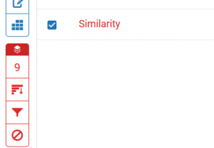
Screenshot showing the Similarity layer and associated tools - The Similarity Report and the eMarking tools are displayed in the same window and can be on at the same time
As I implied above with reference to the similarity layer, all overlays on the students’ work now live on distinct layers. So the originality checking tool lives on the Similarity layer, the QuickMarks and free comments live on a Grading layer with sub-layers named for each marker who has applied the marks/comments. These layer options mean that you can keep the complete version of the originality report turned on while you mark, no more switching between views; so that is a good thing!
Screenshot showing the different layers that can be turned on in Turnitin. - All eAnnotation tools are available at one click
For those of you have used the iPad app, this will feel very familiar! All of the the annotation tools, including your QuickMark sets are available by left-clicking on the paper once. You can still see the QuickMarks sets via the tool area on the right as well.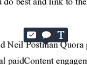
A single left-click will bring up the QuickMark tools - Each marker has their own layer – QuickMarks/Comments are labelled per marker
Each marker has their own marking layer as a sub-layer of the Grading layer. This means that you can hide a colleagues’ marking layers as you complete annotations on the paper. This does not provide true blind second marking though, as you would have to go in and turn off the layer first and turning off the layer does not hide the first marker’s General Comment (the longer form comment), audio comment, or the rubric.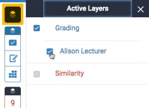
The check boxes allow you to turn the layers on and off 
Each mark is labelled with the marker’s initials – if you hover your mouse over the mark then the marker’s name will be shown
- Rubrics are easier for students to find
The rubric has been re-positioned so that it now one of the first things that students see when they go to review their feedback. It is shown directly above the General Comments.
The rubric is easier to find! - Rubric tool has had a minor makeover
The rubric now has sliders instead of what were, essentially checkboxes. Due to the way that the rubric displays we still recommend using the full screen mode for easier viewing of the large number of columns in the template rubrics.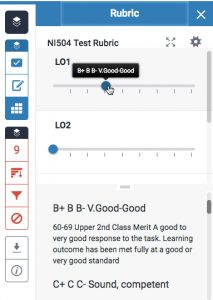
Screenshot showing the new rubric design 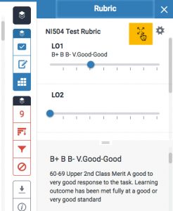
You can click the full screen mode to see the full rubric as a table - Rich text editing is available in all the comment areas
You can include bold, italised and hyperlinked text in the free comments and general comments. - Better accessible technology support for navigation of the right-hand tools areas
The tools on the right-hand side can be keyboard navigated and can also be read by screen readers. The text of the student’s paper, QuickMarks, free comments and inline text are not accessible using a screen reader. This is the case with the current version of Turnitin as well. Where screen reader support is needed, alternative arrangements should be made for delivery of electronic feedback (for instance a written document overview or audio feedback). The similarity report does have a version which can be accessed via a screen reader. - Changes to in-paper navigation and guidance for eMarking
The comments list feature has been removed from the Feedback Studio. This means that the students need to scroll through the paper or use the page navigation tool on the left to move through the pages and locate your comments. While students get used to this, it is worth including a comment at the top of the page reminding students to read through the pages of the paper in order to locate their feedback. We also recommend including the bulk of the feedback in the general comments area rather than in the QuickMarks.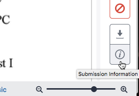
You can find out how many QuickMarks that you have applied in the submission information
For more in-depth information, do check out Turnitin’s newly revamped help pages for instructors.
Navigation in the Feedback Studio
https://guides.turnitin.com/01_Manuals_and_Guides/Instructor_Guides/Feedback_Studio_for_Instructors/23_Navigation_in_Feedback_Studio
The Similarity Report
https://guides.turnitin.com/01_Manuals_and_Guides/Instructor_Guides/Feedback_Studio_for_Instructors/19_The_Similarity_Report
Commenting Tools
https://guides.turnitin.com/01_Manuals_and_Guides/Instructor_Guides/Feedback_Studio_for_Instructors/17_Grading_Tools/Commenting_Tools


Be First to Comment