Workshops

Emma Stibbon:

No description available.

Water Colour Tree

No description available.

Water Colour and Ink wash Jar of plants

No description available.

No description available.

No description available.

Coffee Textures

No description available.

Ink wash Plant in Pot


No description available.

Ink and Crayon Crystal

No description available.


No description available.

Cross Hatching with fine liner


No description available.

Ice with pencil


No description available.

No description available.


Moon and Clouds – purple and black ink wash
No description available.

Waves – black fine liner and pencil


Explain the Unexplained

For this project, I was in a group of 7 people.
Our text was from Korea, named The Toad – Bridegroom.

Our group decided to make a Microsoft Teams chat to talk about the project. We all decided to have a call, and read through the text together and analyse/talk about what we could do with it.

I highlighted all the important info from the story to make it clearer.

No description available.


No description available.


No description available.


Here is a screenshot of the MSchat where we decided who would create what background.

We decided it would be more authentic if we all created our backgrounds with our own style instead of a set style.


No description available.


I got a background to create, some people got characters to create.

I chose the mansion, and used Pro Create to digitally illustrate.

Here is the process of creating the Mansion.

No description available.


No description available.


No description available.

and here is the final illustration for the background.

No description available.

Folklore Texts

For this project I got text 8, which was ‘The maypole Song’

I decided to add it into a word document and analyse it, highlighting key info and annotate.

Below is the link to the word document.

Folklore text


After this, I decided to research art on fertility, the circle of life, growing and nature.


After researching, I have created some designs.

This is a piece which combines the idea of the male and female with the nature and trees.
I digitally edited the colours on photoshop, adding a green hue, the emphasise the idea around nature.


I decided that because my text was revolving around nature I photographed some leafs from my garden.

I cut out these leaves and photoshopped these overlayed on my drawing. Adding some shadows.


I also decided to write out in rough the first part of the poem, so I could use this as a background to my piece.

Here is my final product


Other designs I created surrounded the idea of pregnancy and fertility.

This first piece is created with oil pastels, using a pregnant female as the subject of the piece. I added vines around the woman to incorporate the ideas from the text of tree’s and nature. I also used earthy, warm tones.


Here is the second piece, I created a base of watercolour and then enhanced the colours and shapes with oil pastels. I used warm tones to present the idea of Autumn. Red, yellow and orange leaves that flow well with the pregnant woman in the branches. It’s as if she is part of the tree.

Here is another version of this piece but the colours have been altered on Adobe Lightroom.

Chang’e

The myth that stood out to me and what I became most interested in was the chinese myth of Chang’e and the moon rabbit.

I decided to use digital illustration to create my poster on Chang’e.

I initally started by drawing the Female character. From my research I had taken into consideration her outfits in terms of colours, details and general style.

Chang’e is always presented in a flowing, traditional Chinese dress. The colours seem to range from yellows, blues and reds. She always has an outer shawl/gown.
Her hair is always black, long and flowing. With a hair bun that looks like bunny ears. Always with ornamental flowers in the hair.
Chang’e is always accompanied by a rabbit, the moon rabbit. This animal is portrayed in many ways for instance a white rabbit, a brown rabbit, a hare etc.
The moon is always in the art of Chang’e, of course.


Here is a draft version with alternate colours (above)

Here is my version of the character Chang’e with her rabbit, in a poster form.
I created a decorated cool toned dress with blue and purples, with a cooler yellow coloured shawl above the dress with a decorative collar. I added the long, black hair with flowers the same colour as the shawl to tie the outfit together. I added highlights to create a shining, silky and reflective fabric. This is to enhance the idea of the bright moon, and also typical Chinese fabrics.  I added this reflective effect onto the face of Chang’e as well. I did this by using a lighter colour, such as a light purple, blending this out and then adding a hard line of white over the top.
I drew a rabbit on her lap, and I made the two characters face each other lovingly to create the idea of a bond.


When worlds collide

Here are some other pieces where I combined part A with part B to create juxtaposing ideas.

For this sketch (Above) I decided to combine Folk Tales with Entomology (the study of insects).
Whenn researching folk tales, the common themes where mermaids, imps and fairies therefore I created a scientific appearing design inspired by Entomology but instead of insects or butterflies I used a mermaid. I decided to use coloured pencils so I could create the shining/metallic effect of the mermaids tail.

For this design (Left)  I used the same idea of Folk Tales and chose Fairies. I decided to combine this with Future Visions. In my research, fairies were very delicate, pretty and ethereal therefore I created a tattooed and pierced fairy that would juxtapose everyone’s idea of what a fairy would look like.


For these three thumbnail sketches, I decided to continue the Victorian Horror combined with Gossip Magazine. I used female models because they are commonly seen on the cover of gossip magazines. In the first image I used a female version of Dracula, a common Victorian Horror/Gothic horror story. I also used a female version of Frankenstein for the same reason. I also sketched Dracula’s castle with a female figure.

Left I used black ink and red paint
Below I used black pen and coloured pencils.


For these ideas, I combined the wild west with concrete jungle.
For this design (Below) I created a silhouette of a horse out of black charcoal.  I then used warm toned chalks such as yellow, orange and red to create the background shapes of the buildings. I used these colours because In my research, the wild west has very earthy, rustic tones such as browns, oranges, dark greens, reds etc.
I then scanned this charcoal image into procreate, I adjusted the colours so the background paper was a bright green. I also used a charcoal pen on procreate to outline the red shaped buildings, to add some detail.


When worlds collide – Screen Prints

For this part of the ‘worlds collide’ project, we worked in partners to create screen print templates and to go into campus to print them.


I created this template from group A – Pattern and Geometry

Here is a combination of two templates.
The first layer from the pattern and Geometry and the second from my partners group B – Human cells.
The first layer was a yellow ink colour. The second layer was a Ombre effect of blue, green and pink.

Here is a template from group B – Symbolic Mask.
We made a plain silk screen page of yellow as the background, then printed the mask template over the top with the gradient blue, green and pink.


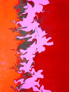
Here is from the pattern and geometry template, with a gradient of orange and black.


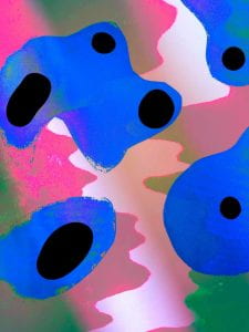
Here I used photoshop to digitally edit some of the prints I created.
I altered the colours and added extra details.