Mobile + QR

As my brand identity has been interconnected with the QR code routing on all my CV’s, post cards and business cards to my website- I thought I should check and adjust my websites layout. The mobile version of the website is great, offering a more limited home page- the navigation section opens separately and is really simple to use. This is the view on an iPhone XS so of course different screens will wary slightly- but I think the website is fully functioning. The mobile version is not perfect- it doesn’t display all of the information where I planned on having it, but it all works almost perfectly and it looks good. It’s very important that my mobile website is at a good standard because all of the QR codes on my documents will make it much more likely for people to visit the site on their phone compared to on a laptop with full view. This is the QR code that I have been linking on all the documents- I just think its such a persuasive way of tempting people to visit my site and for it to feel quite effortless.

qr-code.png

Screen Shot 2020-05-17 at 12.22.21.png

Screen Shot 2020-05-17 at 12.22.32.png


Instagram + Insights

I have those Instagram to be my most active social media platform because it is extremely visual- perfect for displaying work digitally. I have stated following more accounts in hope of gaining more profile views and interactions with my potential audience. I have my website linked in my bio and my logo as my profile icon. I have been posting final pieces of my work and have just target doing more promotional posts, such as telling my followers that my website is now live. This is my first business account, I’m registered as an artist- meaning I now have access to Instagram insights which is the analytics of my profile. I have been find some really interesting things out about my audience. I have learnt that my audience is majority female from London. I can see how many profile views I have had, how many account clicks and at exactly what time it is most popular each day. This is a really powerful tool that will be able to scope my target audience and process what types of work they interact with the most/ what gets the most response. I will be monitoring my insights in order to get a better understanding of the natural viewing times and what kind of people are interested in my work.


Screen Shot 2020-05-17 at 12.07.32.png

IMG_1535.PNGIMG_1533.PNG

IMG_1537.PNGIMG_1533.PNG

IMG_1536.PNG

Business Cards and Postcards

I opted to make both the business cards and postcards as part of my promotional platforms. The two cards have very similar layouts- the front displaying one of my photographs or illustrations with my name and logo above. On the back of the cards they both have my name and logo repeated, a QR code linking to my website, my contact information and social media handles. The business cards also display ‘photography, illustration, promotion’ to specialise myself within industry when making connections. The back of the postcard also has the return address at the top, a post-stamp mark,  space for a message and the recipients address. I opted to use a colour for my cards as I wanted to make my brand identity a bit more fun and less monochrome- as I think my work communicates that. I chose to match the colour of the cards to the pink in the logo- I think this ties it all together nicely and works well with my pastel colour background in my creative CV.


Screen Shot 2020-05-15 at 13.27.31.png

Screen Shot 2020-05-14 at 18.33.14.pngScreen Shot 2020-05-14 at 18.31.28.png

Screen Shot 2020-05-14 at 18.35.56.pngScreen Shot 2020-05-14 at 18.35.09.png

Social Media Accounts

In my survey I asked my audience what kind of social media platforms they would expect a creative to be present on. I looked into all of these platforms and decided which ones would be most beneficial for me to have. I have listened them below and started making progress to uploading all my work and connecting with other creatives.

INSTAGRAM: https://www.instagram.com/azragenevievekaliniewicz/
WEBSITE: https://agkaliniewicz.myportfolio.com/
BLOG: https://blogs.brighton.ac.uk/azragenevievekaliniewicz/
PINTREST:
https://www.pinterest.co.uk/azragenevievekaliniewicz/boards/
BEHANCE: https://www.behance.net/azra-gekalinie
LINKEDIN: https://www.linkedin.com/in/azra-genevieve-
kaliniewicz-6b34831a9/
DRIBBBLE: https://dribbble.com/azragkaliniewicz
THE DOTS: https://the-dots.com/users/azra-genevieve-
kaliniewicz-737414
ARTS THREAD: https://www.artsthread.com/profile/azra-
genevieve-kaliniewicz/

Creating my CV’s

After looking at both creative and traditional CV’s I first decided to make a creative CV as I thought it would better represent my artist style and brand identity. I chose a simplistic format with bold titles and capitalised font. I actually went ahead and did a self illustration for the CV is a simple style that didn’t overpower the whole page. I chose to draw from an image that wasn’t really appropriate for a CV so made some changes to my outfit ect. I have all my relevant information provided including my logo, name, email, phone number, social media handle and a QR code to my website. I’ve listed both my personal and technical skills and given a brief introduction in the ‘About Me’ section. Like in the creative CV’s I saw in the research stages, I decided to use a diagram as well to display my software skills. My education and location is also highlighted, as well as some of my interests which is something employers will be interested in as well. I wanted to make the CV a bit more fun, so created this very simple colour blocking pattern for the background which I think really amplifies the CV and makes it look a lot more creative. I decided to keep a copy of the plain background as well, just incase it suited some employers more.

my face for logo .png

CREATIVE CV.pngNEW CREATIVE CV.png

While I am pretty confident in my creative CV’s, I decided to update my traditional one that explores my previous placements more- even if they are not related to my ideal pathway. This format also keeps all of the same header, including social information, logo and the QR code to my website.

Screen Shot 2020-05-17 at 11.47.28.png

Screen Shot 2020-05-17 at 11.47.44.pngScreen Shot 2020-05-17 at 11.47.44.png

Building my website

After some more research into different creative platforms and website hosts, I decided to make my professional online portfolio on Wix. I chose Wix because I have had some previous experience using their website builder and a lot of my friends use it for their website blogs. While I was sorting out my selected images and creating the page layouts- I just used a black background theme and chunky white text. After all of my files were uploaded and in the right page layouts I experimented with the style of the blog- including fonts and and colour pallets. I think I started overcomplicating things as I had not really decided what kind of website would better suit my brand identity. I was caught between the two and my website was looking quite confused and unprofessional.

Screen Shot 2020-05-13 at 18.59.18.png

My page layout was completely confused! I had white and purple fonts on the black background. I had used a circular cut out of three images which led to different sections of my website (photography, illustration, magazine ect) next to a square image of myself for the ‘About Me’ section. The shapes looked very awkward next to each other and the whole layout felt wrong. I decided to go back and do some more research into the kind of styles I like, but also consider what my brand identity is to me and try to define that in terms of aesthetic. I at this point had finished creating my logo, which helped me move fast my wobble in the website design and visualise a part of my brand identity.

Screen Shot 2020-05-13 at 19.00.22.pngScreen Shot 2020-05-13 at 19.00.50.png

I did like some aspects of the Wix website, such as the photo-gallery of all of the photographic projects. I think the main problem with the website was the colour pallet and the over complication on the home page. I also really like using Wix because it’s compatible with almost every file type- making it really easy to display pdf’s such as magazines or books ect. After some consideration I decided to completely start over and try out a new platform. I opted to use Adobe Portfolio, as I had seen a few websites that I liked made with their templates. I found it really easy to use and i opted for a minimal aesthetic to really allow my images to take centre stage. I opted for a side bar navigation instead of at the top, as I thought it gave a more gallery feel to it, rather than an online display (if that makes sense?).

Screen Shot 2020-05-14 at 16.00.18.png

The page titles follow underneath of the logo and then contact information and social links. The home page opens on the photography section, because this is my largest body of work. I wanted to have this as the home page but the other pages titled first so the audience see’s that the website is more than just photography. I really like the image layout and the simplistic text.

Screen Shot 2020-05-13 at 19.13.05.pngScreen Shot 2020-05-13 at 19.13.39.png

Screen Shot 2020-05-13 at 19.29.05.png

Screen Shot 2020-05-13 at 19.14.23.png

Adobe Portfolio doesn’t accept all file types, so I could not upload all of my work without an extension. I used a free alternative to issuu publishing, called YUMPU. It’s really easy to use and just work as an embeded link into the website. The only think I don’t like about the link is that it comes with a dark boarder around the media. This does make my website look slightly more unprofessional, as I couldn’t find a more subtle way to add the PDF files- but I thought this would be better than multiple flat images going down the page. YUMPU also has a page turning effect which makes it feel more realistic than a sudden jump between pages. The Adobe Portfolio also has some really nice self promotional features to use. I chose to use this ‘You may also like’ feature which randomly selects other pieces of work they might want to view. Overall I’m really happy with how the website turned out and I think it was the right idea to move my site to Adobe.

https://agkaliniewicz.myportfolio.com/

Logo’s

In my sketchbook I have already been experimenting with different typefaces to visualise how my name, or initials would look in the style. It’s really important to pick a font that is clear to read, not overly complicated but something memorable. I was considering signing my name in my handwriting, and digitalising it on Illustrator. However I feel as though my brand integrates technology quite a lot of the time- whether that be through the use of AI and QR codes, or digital illustration or pattern making. Due to that, I feel as though a hand written font wouldn’t well represent me or my brand identity, so I should look into picking a more graphic typeface instead.

While I have been carrying on with my experimentations, I did think it could be a good idea to experiment with my logo, as I may want to integrate some sort of illustration or geometric shape in the design. While experimenting with the logo, I could change the typeface very easily to see what fit the space or shape. I experimented with both my full name, initials and a shortened title.

Screen Shot 2020-05-13 at 17.01.00.png

I really liked the two outlined ‘AK’ logo with the flowers on. I think the outlining really represents my illustrative style, as I work with thick line-work. I thought the flower illustrations showed off my style of illustration and gave it a youthful, fun look. After a tutorial with Chris, he did point out that the logo could be misunderstood and mistaken for a different kind of business (he said it could look like a florists logo which I can completely understand). I thought that the flowers would represent my brand identity but I have learnt now that I need to be really careful with my branding- as the logo is the first thing someone is going to be faced with when they come across my promotion. After reconsidering on my logo designs, I decided to start again and try to obtain a different aesthetic. I wanted a more graphic, simple and modern logo to better represent my brand identity.

LOGO.png

I am much happier with these designs and think they better represent what my style is. I have used more chunky, stiff fonts that look more relevant to tech and graphic work than a handwritten font, like i was think of using before. After analysing some selected fonts that I really liked, I decided to use the black square background logo with pink typeface in the font ‘Bebas Neue Regular’.

Screen Shot 2020-05-14 at 14.34.57.png

I again wanted to experiment with different typeface options for the ‘design’ section of the logo. I tested out three new different typefaces from the original. I firstly tested all the text in ‘Bebas Neue Regular’ but decided that it was too clunky for the logo- not looking as real or professional. I didn’t really like ‘Silom’ either, I felt as though the two texts together felt a little bit awkward. My favourite font to use in my digital sketchbooks is ‘Andale Mono’ because of it’s petite style and small detailed serifs. I did like this font with the ‘AK’ section, but overall I thought the original typeface suited the logo the best because of the juxtaposition between the chunky and fine fonts.

Screen Shot 2020-05-14 at 14.56.56.png

I experimented with some minimal font layering to create some depth to the logo. I think this really improved the font with very minute changes. I experimented with a white layer of font on top of the pink font, but felt as though the ‘design’ font colour should match the more powerful colour from the ‘AK’. I chose the original font because I liked how the black background looked with the pink typeface. I decided to revert this back but with the layering and this because the final logo.

FINAL LOGO.png


Survey

I conducted a survey as I wanted to get a better understanding of what people expect or would be impressed by in a creatives resume or brand identity. I think it really helped me understand and reconsider what the most fundamental aspects of the portfolio are. My next stage of research can now be more directed in some areas, as I know what my audience would prefer to see.

Screen Shot 2020-05-17 at 22.14.40.pngScreen Shot 2020-05-17 at 22.14.52.pngScreen Shot 2020-05-17 at 22.17.21.png

Creative CV’s

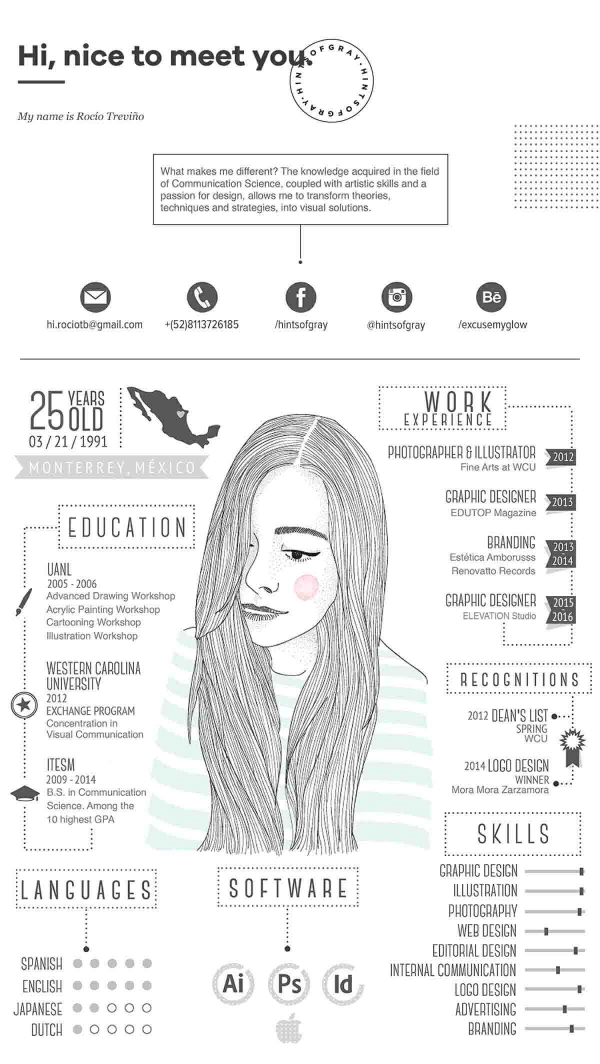
I was initially expecting to create a traditional CV in the standard formatting. Since researching more into creative promotion, I have discovered a lot of examples of creative CV’s. I’m really drawn to this as it seems like a much more relaxed, experimental and genuine reflection on the individual- rather than a list of skills on a sheet. Épinglé sur Resume design16+ Creative Resume Templates (with Bonus Advice)

The creative CV’s do come in all different kinds of layouts- some have even been created in small booklets or leaflets. I really like the idea of having a self-portrait illustration on the creative CV as it shows your style and ability, but also represents yourself visually. The CV’s information usually consist of education, experience, all the relevant contact information and links- but most fundamentally the skills section. It is very common for people to create a skills range table and identify how accustomed the individual is with the software or skills, such as Adobe Suit, photography and logo designing. Something else that has caught my attention is the logos that people have created. Although this was not stated as an essential part of the portfolio project, i feel as though it would give a stronger sense of brand identity and would help to bring continuity to all my platforms.

Although I really do like the creative CV’s, I have more experience with creating traditional CV’s + I know how to explain how my previous positions have benefited myself. I already have an old CV which I could use as a template and update with my new skills set. One thing that I am worried about with the CV, is that I do not have a huge amount of experience in industry- only within University. That is another reason why I think a creative CV would be beneficial for me; as it would distract away from the fact that I do not have much experience, but will show employers that I am still talented. I may decide to make both types of CV just to make sure I could apply comfortably to any employer.

PORTFOLIO PROJECT: RESEARCH

I have decided to start the project by researching different styles of portfolios, CV’s, business cards and websites to try to identify how creatives have assembled a consistent brand identity. I want to produce a body of work that reflects me as an artist and allows me to experiment with different layouts and concepts. I firstly went to Instagram to create some mood boards on different style options. Here I was looking at formatting, type face, illustration, layout and colour- which are all important parts to play in a brands identity portrayal.

PINTREST PORTFOLIO BOARD: https://www.pinterest.co.uk/azragenevievekaliniewicz/portfolio/

After looking at multiple different artist content, I decided to closely look at the difference between minimalist and maximalist websites and the different types of functions each one has. I think that a minimalist websites gives a more effortlessly professional appeal, all the focus is on the content rather than the functionality of the website. On the the other hand, maximalist websites are a great way for your audience to interact with you, there is a lot more freedom with layouts and extra features as well. These are some of my favourite websites…

http://nolbert.com/

https://stereocreative.com/

https://www.maisiecousins.com/

https://toyfight.co/

I think I am still pretty torn between a minimalist or a maximalist website as I could envision me having either. Part of my work is quite still, sleek and simple, but some of it is also very catching, bright and explosive. I think I will understand what is better suited to me once i have done some more extensive research and have experimented on a few different platforms.