Cards: Contemporary Magic

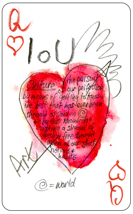
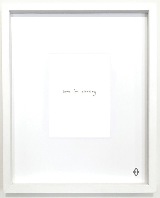
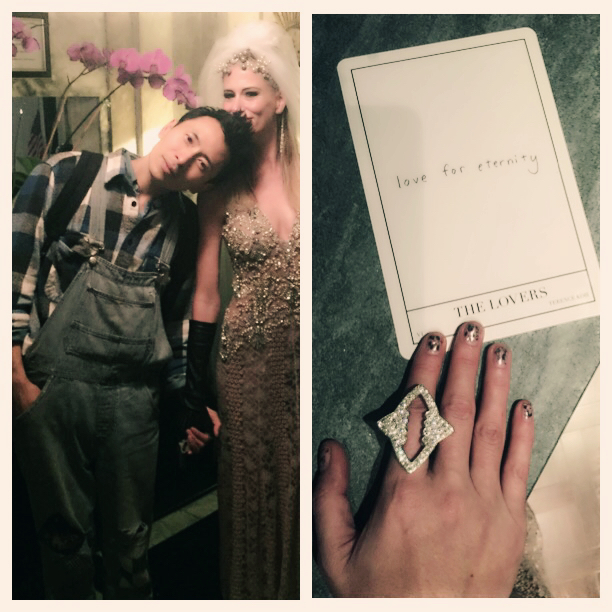
‘Contemporary Magic: A Tarot Deck Art Project’ is a multi-disciplinary, inter-artist exhibition / project that was was set up by Stacy Engman. Engman matched 78 renowned artists with a tarot card based off patriarchal themes that their work otherwise focuses around. The ‘reinvented’ cards were created in multi-media formats including photography, paint, collage and illustration ect. I found the whole project quite interesting; from Engman assigning the cards, to the finished products where the individual artists style or iconography is still very much present. Engman has clearly divided the cards by which artist she thinks suits the tarot card most. For example, ‘The Lovers’ card was given to Terence Koh due to his extensive research and contributing body of work that focuses usually around the topics of lovers, romance, the self and the body. Engman wants the artists to exercise their brand identity while combining it with the new topic of tarot symbolism and iconography to create a body of work that mixes art and magic.

I really do love this project and think the artists involved would have really enjoyed the process of research into tarot cards and how people view them or perceive their meaning. Ultimately it is down to the artists own personal reflection on their card and not about what people would expect the cards representation to look. I really like ‘The Sun’ by Richard Phillips in particular as he has chosen not to include the image of the sun itself, but a subject that appears to have the sun beaming down on their tanned, rosy skin. I love the hyper realistic style of his paintings and would love to look into his work more, to better understand his technique and inspirations.

Contemporary Magic: A Tarot Deck Art Project Autre Magazine

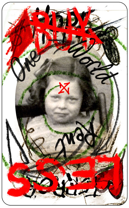
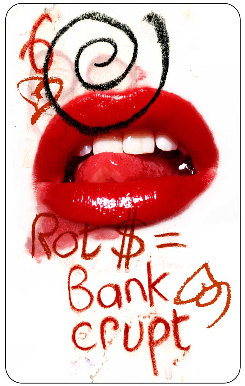
I looked into this project as I wanted to test how far I could take this idea of playing cards and whether it could be adapted to follow the outlines of tarot deck symbolism. I think this concept would well represent the restrictions and rules we have socially constructed and embedded into the representation of gender. While I do think taking it in a tarot deck inspired route may confuse my mission, as tarot reading is somewhat based on prediction- while I want a concept that is more focused on direct and confined symbolism, such as in the standard playing cards.

Artist Research: Americana-inspired

I have come across some photographers that I believe have a very similar style and focus point in their work. I have previously looked at Nadia Lee Cohens work which was a point of inspiration for my ‘Twisted Playboy’ shoot. I have continued to look into her work, read interviews and articles about her to gain a deeper insight into why she creates these dark humour images. In an interview with her, Cohen was asked about her opinion on fellow creative Alex Prager, as both share quite similar aesthetics. Cohen believes her work takes a more fashion-forward approach, but she purposely doesn’t use ‘model-model’s’ as she prefers to work with real people with real bodies (captures more raw, awkward shots that work well for her concepts). Both artists look at the ‘ugly-pretty’ concept to create juxtaposition in their images, as well as contradicting their stereotyped concepts, offering a new view on people, eras and socially constructed notions. The idea of deconstructing, destroying and remoulding social ideals, stereotypes and ‘dreams’ are all concepts in the artists’ work. To me they discuss how constrictive and regulated society is- by basing their work off old Americana (besides the dainty, pretty aesthetic) they heavily challenge the ideals set in real time, for example a burning house with a picket fence sends the message of the destroyed American Dream. Suburbia is often pictured in the work, as suburban locations are often used in cinematography and film as a symbol for isolation, loneliness and disappointment (not living up to expectations).

How Alex Prager made the world stop and stareHow Photographer Alex Prager Creates Her Cinematic Images - Artsy

I have now started looking at Juno Calypso, a British photographer most known for her self-portraits as her alter-ego called “Joyce”. Her main topics of focus are based around isolation, loneliness, feminism and being ‘self-sufficient’ as a woman. Her most recognised and praised work is ‘The Honeymoon’ series, where she took Joyce to a romantic themed hotel in America. Posing as a travel writer, Calypso managed to gain access to all of the rooms in this eclectic hotel and created a series of images of a lonely honeymoon. Joyce is the only subject in the work, it is meant to be quite funny- like in some shots where she lays in a heart shaped tub by herself. Calypso makes Joyce half attractive and sexually appealing, and half off-putting, which is something I experimented with in the Playboy inspired self portraits I took in the lead up to the FMP project. I really like the image of her stood in the tub, with multiple angel mirrors, as she stands quite seductively with her green skin.  This is an image I am constantly thinking back to, as it captures all the ideas and feelings I want my playing cards to embody.

Juno Calypso's solitary exploration of femininity – British ...junocalypso

Artist research: Olivier Kugler

In a tutorial with Chris where we were reviewing my illustrations, I was introduced to the illustrator Olivier Kugler. Chris was reminded of Kugler because some of my illustrations used blank space/ negative space to create the presence of isolation and disconnection- which is something Kugler often uses in his work. Oliver Kugler is a reportage illustrator renowned for his unique style which has got him recognised by the likes of The New York Times, The Readers Digest and Harpers. His pieces work by having some sections heavily detailed, while others stay quite bare- making the viewers eyes move around the piece to understand the full concept or story Kugler is telling. Most of his work is heavily accompanied by text which explains the very serious topics Kugler usually reports on- I think this is essential as the illustrations alone would not make enough of a statement without. The text often appears as speech; giving us a raw, real and honest explanation of what the people he meets are experiencing in different countries. This can often be laid out in quite an unorganised, chaotic manner which accentuates the severity and importance of his topics. The same way Max Milly would illustrate in mostly line work, with sections block filled- Kugler also uses the technique to create depth and layering (again making the viewer more drawn in). His colour pallet stays quite neutral and earthy but only some sections are in full colour (this usually being the subjects he interviews/talks to and some of the surroundings around them). I have found looking at Kugler’s work to be very helpful and insightful because I was unsure if the blank space in my card illustrations made them feel too detached- but now I can see that this can actually be a technique to add more to the outcome. I will continue to experiment with this technique and aesthetic in my future work.

Olivier Kugler's Portfolio

Arts Foundation | Kugler, Olivier


Artist Research: Max Milly

Although I really liked the outcomes of the AD394 project, I wanted to look into different artists and illustrators to gain some inspiration or to pick up some tips, as I am working digitally which is new for me. I wanted to explore artists that use different techniques, software’s, styles and focus points- I believe I have looked at a well-rounded selective of illustrators that will really help me to define my own style as a creative. Some of the illustrators I have looked at are: Tomas Markevicius, Max Milly, Sammy Slabbinck, Manny Robertson, Panthea, Sara Anderson, Oliver Kugler.
I really liked the work of Max Milly as she layers her outline illustrations over the image itself. This creates a ‘shifted’ effect, but also the illustrations ground themselves by having some areas in the simple line-work coloured in. The close-up shots of the subjects create quite an intimate feeling between the artwork and viewer. Shooting with studio lighting means that Milly is able to capture an image very easy to illustrate from, by having defined and clean photos to work from. She keeps the colour palette very neutral and earthy which works well with her simple illustration style- this may be a technique to balance the attention between photograph and illustration. Her illustrations are really fun and unique, but I feel as though the dainty, bright style would not suit my subject matter. I may experiment with her illustrative style just to test out new techniques.

Double face digital art by Max Milly | The DNA Life

*ADDED LATER*

Although I have not used Max Milly’s style when illustrating the models in my images, I did test out the outline style layered on top of a photograph and I do really like the outcome. Originally I did the flower shoot (see Scanography: Flowers)`to illustrate flowers/leaves from for my ‘organic matter’ part of my concept, but after a tutorial with Chris where we discussed using photographic images under ‘echoed’ illustrations- I got this outcome. I really like the image and think Max Milly’s influence is present in it.

Research into Playing Cards in Fashion + Climate Revolution

The template of the ‘playing card’ has been referenced many times within the history of fashion. I wanted to get a better insight into the brands and their designers that have been inspired by their symbolism, aesthetic , representation and why they chose the concept of the playing card. I came to find that Vivienne Westwood has used the format of play cards many times in her campaigns and designs. I really liked her Climate Revolution playing cards that were designed in effort to discuss and protest against climate change and the lack of action taken against it. Westwood said she wanted people to “collect the cards, connect the cards” which explores how she has purposely designed a deck of cards that when placed together tell a story and also voice a message. When talking about the design for the back of the playing cards, Westwood explains that she decided to use a picture of a child (actually of herself at four years old) to make the point of the future being ‘so uncertain’ and that children today are not going to be living in a world that they are familiar with, that they will be facing problems that we have not yet experienced and that they are in danger. Wanting graphics and a written message on the back of the cards, Vivienne thought back to some of her most important sayings and messages she has created- her favourite being simple- “buy less”. She goes on to explain that the cards are aimed to prompt people to “tell kids the truth” and then asks us “what is the truth? What else can we do?”. She leaves us with “when you start doing it you become an activist” which I think is a very striking message and will inspire many fans and customers to really take action. The cards are all quite different in terms of visual imagery and layout, but this is cohesive with Vivienne Westwood’s aesthetic and used on purpose to echo her chaotic message. She mostly uses the traditional colour pallet of playing cards (red, black and white) which keeps the playing cards looking uniform and realistic in some ways. I think I will be really inspired by Vivienne Westwood’s cards and I can already see some things that I will be able to emulate in my deck of cards.

Climate Revolution

QUEEN OF HEARTS

Final Major Project

I was quite pleased with my outcomes from the FMP research project and created multiple illustrations that reflected my initial focus points surrounding Playboy, the portrayal of women and ‘the self’. I initially envisioned my FMP outcome to be somewhat of a photobook/zine that built on my illustrations to construct the idea of ‘families’ in a mundane yet twisted way. As I started to research more into this concept, I quickly found myself becoming less motivated with the idea- as I wanted to keep my illustrations focused around the portrayal of women only. I was unsure of how to develop my illustrations more and create a deeper, well-rounded discussion from them. I went back and forth on the concept of families and tried to redefine how I could discuss the topic in my work. A few evenings later, my housemates and I were playing card games and it led to us having a discussion about them, what they represent and their visuals. I started to think about the suits (restriction and segregation), the ‘house of cards’ (families) and the rules we must follow in card games- (a lot like the constructed gender boundaries placed in society) and thought this would be an amazing symbol for my FMP concept!

Twin Peaks Queens Playing Cards Digital Print by 60ftVenus on Etsydata.cards.specialjackdiamonds526.imageAltText

Ace of Hearts - would be cool for a medical person to have this deck of cards!Custom playing card of King.  #crown #king #playingcards #playingcardsgame #printingcards #designerplayingcards