ZINE

Finished?-1vy5yrs

^^^^^^^

CLICK LINK FOR MAGAZINE

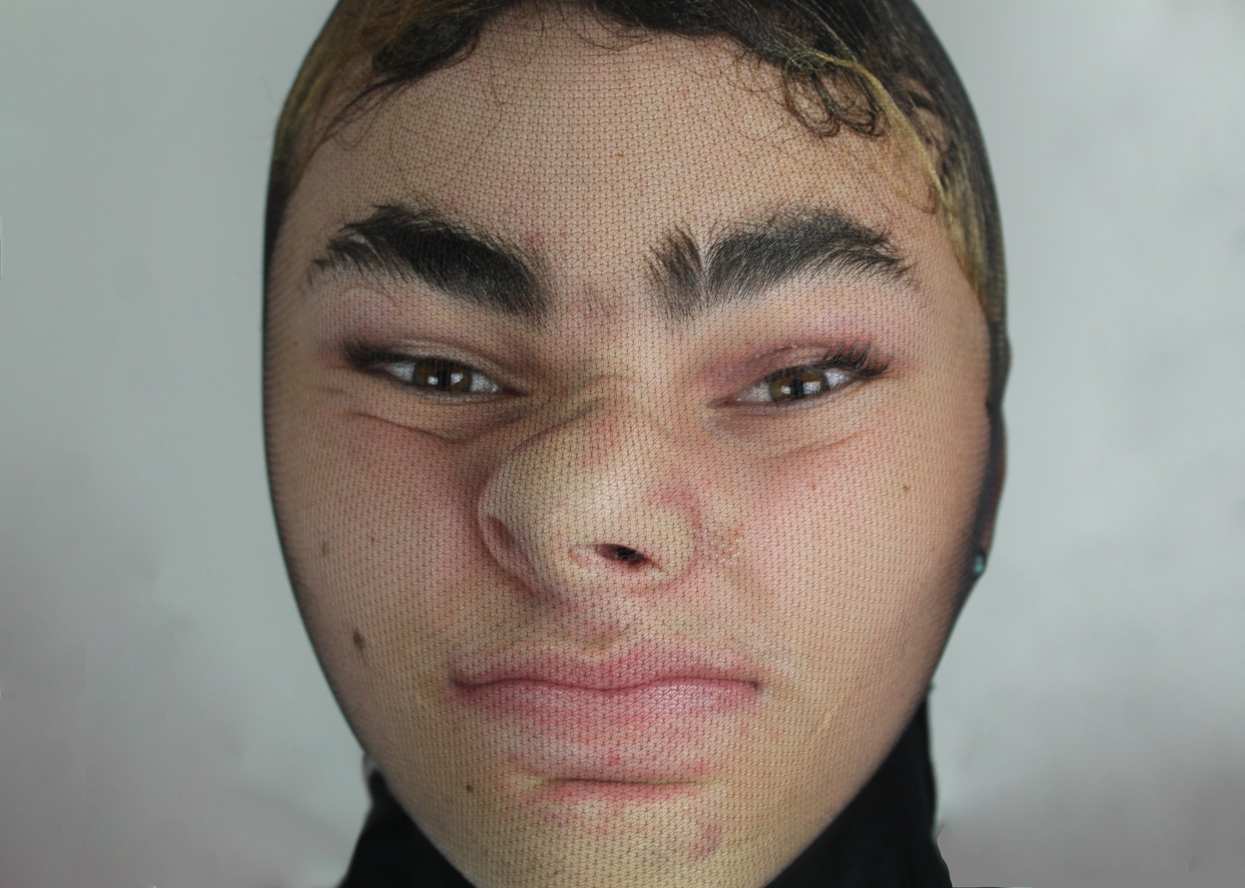
I am quite happy with the way my zine came out. I feel like its a mix between an old school gritty zine and a polished magazine. I think it has a nice mix of photography, illustration and text- I wanted a mixture of all things inside so it could kind of appeal to everyone. I called it “POISON” in terms of people’s negative energies projecting onto us and ‘poisoning’ or disfiguring our true identity. I also showed that this was the first issue, something that most zines would display on the front. I then repeated the title down the side of the zine to create pattern and depth to the front cover. The image itself is a scan of my moving my hands over the screen on the scanner to create pattern. These are a few of my favourite pages from my zine to show what it entails.


These are some of the illustrations from my two sketchbooks. Some of them are illustrations of my own photography, other artists work and some are just made up. I think i’ve used a variety of medias and materials to create these illustrations- and I think it’s really helped me with my skills and confidence when it comes to drawing.

Scans

Scans contact sheets-1n472w0

CLICK FOR SCANS PHOTOSHOOT

I think these images came out okay- it’s quite hard to be very experimental on a scanner besides the way you position yourself on the screen. I tried a few different techniques on the scanner such as pressing my face a lot into the screen, moving my hands in a certain movement or pattern and placing objects on the scanner. I found this really fun to do because the scanner captures everything; all the lines, imperfections, creases and folds in the skin- it’s a very raw and truthful reflection on someones physical identity.

The idea behind it is quite similar to the tights photoshoot- but I wanted to do it in a different way with new materials. I wanted to create quite a depressing, scary atmosphere for the protagonist to be in. This is why the background is very murky and dark- the night from the scanner is the only light within the picture. It almost looks as though the character is trying to escape this world and making their route back into reality- where the viewer is.


Tights Photoshoot


The tights photoshoot came out better than I expected. I put the tights over the face to disfigure or morph the face of the model into something he doesn’t actually look like. This is to put across the idea of not being able to breathe, feeling suffocated or overwhelmed by ourselves. I think the thinner tights look better because the facial features are more pronounced- and you can tell that the person looks strange.

Gold Photoshoot


The gold photoshoot was a poetic way of illustrating the idea that the identity that people presume we embody, is not always the real thing. Gold is a colour that is seen as very precious and enriched which I thought would portray a sense of worthiness or idealism. I contrasted this with my facial expressions and actions, showing that the outside is not a representation of my mental identity. Im really happy with the way the images came out, i like the texture of the skin and the way parts reflect of the skin reflect the light.

Bathing Shoot

I really am happy with the way this shoot came out. I put milk in the bath to discolour the water and make it look more murky and mysterious. By doing this the body parts nicely faded away into the water instead of having a very harsh cut off point. All of the colours in the image are very neutral, almost toned down and slightly depressing. This makes the red, hot fingertips really stand out as these are the brightest parts to the image- they almost looks sore or tender.

The idea behind this shoot was to act like the ‘ritual’ of bathing is the only time of the day that this character is fully stripped bare of all materialistic or fake possessions that manipulate the identity. This is a way of showing the true identity of someone- being taken away from all other things.


Gallery Visits

I went to see North: Fashioning Identity at Somerset House in London. I found the exhibition really interesting as it explored fashion identity in the North of England- and gave us insight on a certain demographic. I really liked the images on show as a really raw and gritty side of street style photography was displayed. There were also a lot of magazines and zine that gave me a really broad understanding of layouts, typography and structure- which is something that I need to start looking more into for my own zine.

Stitching and Scalpel Work

I got this idea from the book binding workshop, where we sewed pages together to create booklets/ zines. I started off by using magazine clippings to stitch through onto the features of the face. This had the same concept of drawing, but with string and pattern. The paper was very thin so I found it quite difficult to sew through the paper and not rip it- however it was possible and I was happy with how it came out. I then went on to sew one one of my past images; that was printed on proper photographic paper, so it would be thicker and easier to sew through. This made it so much easier to get the needle through and create a precise pattern/line. I’m much happier with how it came out and think that if I were to redo this for my zine- I would print on this kind of paper again.

I also played around with scalpel work and was seeing what kind of effects I could create. I carved feature out of some images; also cut out geometric shapes, patterns and scratched into others. I think my favourite effect was the scratching as it created a really cool look- almost like an engraving. Also; if I chose to do more of this style in my zine along with the white threat stitching- the colours will match and create continuity within the finished product.


Ink Spills

I don’t really know how I came up with this idea, but I thought it would be interesting to see what kind of deigns or shapes would come out from trying this out. I started dropping pipettes of ink onto paper and used different techniques to shape or move the ink around- this creating a line that I could base illustrations off of. This method of course does not work out every time, so it really is down to trial and error. I think I got quite a few good images out of this- they don’t relate to my idea completely but i do think they are useful to show experimentation with different medias.


Collage

Collaging is not something that I regularly do as part of my work. I find it much easier to draw or pose models/object in the way I want them (based on my mental vision)- than to work from other peoples artwork and try to construct something that way. However, as it was part of the workshop I gave it a go and tried my best to create something interesting. I managed to create 3 outcomes; but my only problem with this method and technique is that I base an image off of what I think looks good and fits together- rather than what would make sense and create a deeper and clever story/ narrative.

I am glad I did this as it shows experimentation and use of mixed media and techniques- however I don’t think it’s something I want to develop or carry on as I don’t enjoy this method of illustration. I think for the direction that i’m taking in this project, other methods such as painting, sketching and digital media would be better.