Final Shoot Full selection

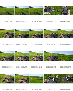
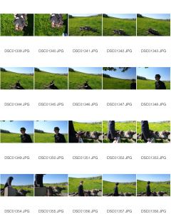
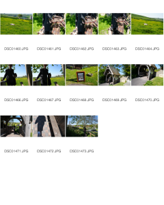
Unrefined Contact Sheets :


Previously I have found website design and building intimidating and something I would deem myself quite bad at despite having confidence in many other digital areas. It did take me a long time, several templates, and some patience, but I do now have a functioning website! It is simple but does everthing I need it to do currently. Building the website has taught web design skills, and reminded me to give myself the freedom to experiment and take risks with graphic design more, but also the relationship between my work and how I should be communicating it on a platform that is more formal that instagram for example.
amylinkinchandler.co.uk

Look 2: Exploring Time for Tea concept/ritual incorpertating tea cup and table, shooting the model from a far with flash gave the most effective result, however the overall feel of this look, feel slighlt to unoriginal, styling the brown boots instead of black was a mistake as it has made the model look as if she has been dressed like a tree which is very predictable. Getting the model to pose her arms following the tree branches did create an interesting affect though.

Look 1 :
Whimsical pre-rapholite inspired
Within the time of this look I had the best lighting which meant I was able to create the more “idyllic” feel I have been exploring. The best images from this look and shoot where the ones below, where the model in making contact with the plants and objects and within her environment rather than posing next to it. I was also aware to selecting the images in which the model is looking away from the camera rather than into the lens, creating a look that is more curious than pretty.
Best Image: Connection with tree, Good composition Flash has caught leaves in bottom left nicely and trees have framed the image through different tones of green and the blue sky in the foreground. Branch shadow on dress, further burrowing model into greenery.


Look 3:
Exploring darker tones earthy warm brown tones.


Within this look I found this still lifes on the stick bouquet on the wooden table where a success as they added to the narrative of bringing outside objects in and vice versa. However the model images compared to look 1, have come out a lot weaker as the background is less densly natural and more articially placed in the scene.


With 1 week to go until the final deadline I have been focusing on how I can work most efficiently managing my time to avoid a last minute panic, or at least make the panic organised! Right now I am focused on completing the outcome its self. I am hoping to do this for Monday. This will give me time to get it printed in time for hand in as I feel having a physical copy to look at will convey the book The Stix and its meaning how I want it to, with the idea of it being an artefact and the value in the preciousness of having something to hold if I have time to do so. Before printing again with a hard back cover for exhibition.
I have also been looking through a lot of photography, surrealism, fashion and landscape books (documented in sketchbookn and bibliography) this has given me knowledged and a greater insight into layouts, graphic design choices and the way text and photography can be used to compliment each other. The one I find most inspiring being Tim Walker Storyteller, although I have loved his photography and sense of storytelling/depicition of the British Countryside for a long time, I really like the skethcbook style scanned layout he uses to display his work within the book, with even the references and image descriptions being documented in a academic style way, as well as having the heavy text at the front of the book to give the reader context before delving into the rest of the book visually.
Following on from my exploration comparing my photography to landscape paintings and nature, I visited thr Rosetti’s exhibition in the Tate Britian.


Today I visited the repographics department to look into the process of getting my book (The Stix) printed. I had planned and been a working on a indesign document, in a landscape format. I had planned on making the images landscape as I felt due to my work greatly being set in rural or natural landscapes, this would show case it best and be the most escapist format for the reader. The layout I havee created is landscape A4 pages, making long A4 landscape spreads when the book is opened, which I thought would be a unique format that would encourage the readers to take time looking into the images and turning the pages. However I was told have landscape A4 side by side as a spread isn’t something that can be done easily/within university. However there is an option to create an indesign document consisting of A4 landscape spreads that when printed could be trimmed down to create a smaller A5 landscape booklet. This would mean risking the image I wanted to create within my work through scale and restrict my graphic design choices to suite a smaller format, this being said I am also seeing it as oppurtunity to challenge myself into making this smaller version of my book. Although I love the idea of scale and getting lost in photography, the idea of my work being an artefact is something that is also important to me and I feel a smaller format has the possiblity to create a more intimate and precious documentation of my work. Infitting with my influence of storytelling and fantasy. I am also aware that I will be displaying my work on a large scale at the Final Show giving me an oppurtunity in both a very large and smaller intimate format, allowing me to see how it looks and fits in different contexts.
-Take the risk and print on a smaller scale, Consider medium mg weight natural paper. Artifical Glossy not fitting with nature themen and could create glare under exhibition spotlights.


Visiting the Ditchling Museum of Art + Crafts current exhibtion Signs of the Seaside curated by Justin Burns. was a great source of inspiration for the exploration of typography and how it can be used to convey certain meanings, as well as how it works paired with certain colours and the change in relationship and messages this can make, that I can use within my own work – Both in my photobook Stix and Portfolio work and Logo. The “R” letter below was once the “R” that sat above and helped spell out Brighton Pier, Instantly recognisable by its funfair style Serif font, that gives it a retro classic style in the most playful way. The R given a new lease of life by artist artist Andy Doig is so recognisable that it is now its own artefact and piece of history itself due to instant nostalgia and recognisablility of the font.


Nostalgia and Connotations of the seaside – Seaside Typography is enhanced by the pastel sea and sand yellows and blues, and seaside fish and chips stereotype to bring it to life.


