Since post noughties emailing phenomena, infographics has lodged its way into the hearts of marketers as a way of communicating tremendous amounts of otherwise boring information. What appears to be a hallmark of the digital medium, was in fact merely popularised by it as visual-centric networks such as Pinterest and Instagram go crazy for these posteresque looking artefacts.
In this post I will be looking at examples of infographics and specifically why they should feature within your marketing strategies for the future.
Visual Learningternet live stats, 2015) the pressure has intensified to polarize ones digital offerings in a fiercely competitive environment. In fact according to data from Tony Haile of Chartbeat (2014), the average user spends fewer than 15 seconds on a webpage. What’s more is that rather reading your websites content, they are visualising it to evaluate whether it’s worthy of further engagement.
Sounds like a tough obstacle to overcome right? The truth is that something as simple as a picture can outshine words a hundred fold – this is where infographics plays a central role in a brands marketing strategy.
What are infographics?
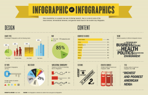
Infographics are the cool picture looking artefacts you see hovering around the web. The likes are you’ve probably stumbled across one lurking within your Twitter feed on several occasions. It’s usually a collection of data presented in it’s condensed, visual form – you can’t really fail to notice it.
The following definition by Mark Smiciklas should give you a more comprehensive idea:
“An infographic (short for information graphic) is a type of picture that blends data with design, helping individuals and organisations concisely communicate messages to their audience” (Smicklas, 2012).
Essentially infographics are the crossover point between information and graphic design in order to create a “visual learning experience”
How infographics deliver results
(1) Condenses timely information
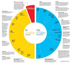
Let’s be honest here, none of us (or very few at least) are going to read over the entire tory manifesto this coming election. Who really wants to read a large and somewhat confusing list of our governments spending? Too much to digest right? Well thankfully the guys and gals at The Guardian newspaper have designed a breakdown of our countries ingoing’s and outgoings for 2014 with an intriguing visual:
Fostering a creative use of colour, content and data, The Guardian have embedded a set of important financials with a visual stimulant aimed to abbreviate and magnify the government’s spending. Thereby dulling down on the key financials, even those of a basic political understanding can draw their own judgements into how much the government’s spending without filtering through pages of financial documents. This makes it a massive time saver for users and allows access to the information that matters most.
(2) Improves consumer comprehension
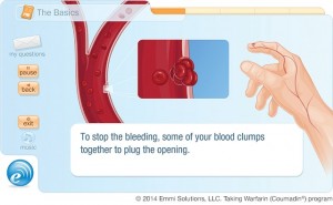
Infographics have become a staple of healthcare communications. According to a report from aafp, (2011), words often fall short of influencing real changes in health. Showcasing a visual dialogue however, can give a patient a complete concept in seconds (Forbes, 2014). The infographic below, provided by Emmi Solutions (2014) provides a visual cue to orchestrate instructions for taking Wardarin:
Visual cues can often make a process seem more informative and, in effect reinforces desired behaviours (Turley & Millman, 2000). This instructional visual improves comprehension by being archived and immediately accessible to the patient.
(3) Presents attractive data
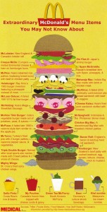
How many of us who have been to McDonalds can say we’ve tried a Big Mac with 8 beef patties? Well according to an infographic by medical insurance.org, the ‘Monster Mac’ is one of the fast food chains “secret items” that can be purchased upon request.
Illustrating an effective use of branded colours and coordinated information, this visual condenses down information which isn’t typically found on a McDonald’s menu. Even if these dishes were put forth by the brand, would they be featured in the same light as this effective infographic? The motionless design technique implemented in this visual not only enhances consumer awareness but it releases attractive trivia for any McDonald’s goer.
(4) Brings information into clear focus
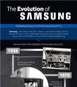
Interested in creating or reinforcing your brands narrative? In celebration if their GALAXY S 4 model, Samsung released an infographic showing the brands historical journey since its inception in 1938. This provided fans of the technology giant a visual insight into the brands long lasting journey. Identifying only the brands key milestones brings into focus the positive aspects of the brand and subsequently keeps the content compelling and engaging.
Benefits of infographics
You’ve heard that rather annoying phrase that a picture can speak a thousand words right? Well it turns out that by actually incorporating infographics into your content strategy improves SEO value. While written articles might have a higher place in Google’s algorithms, pictures do not. Infographics on the other hand are defined by their capacity to quickly convert to links and shares the benefits of SEO (practicalecommerce, 2012). This in turn, enhances its position within search engines providing it has sufficient link bait potential.
Some quick tips for designing your infographics:
• To fully maximise the benefits of infographics, you must ensure that it’s hosted on your domain in order to get the link credit (econsultancy, 2010).
• For social media, infographics can be a match made in heaven. Integrate your infographics with visual-centric networks such as, Pintrest, Instagram and Vine to extend your initiatives reach.
• Infographics should be fun, informative and even in some cases interactive. Ensuring that it’s easy on the eye is a great way of forwarding your business initiatives. Guarantee your success with smart, interesting ideas that are comprehensible and above all share worthy. Thousands of intelligent designs are posted daily and people won’t repost nor heed discussions if your visual isn’t interesting.
• Lastly it’s important to know your audience. Designing your infographics with them in mind can boost brand credibility (Forbes, 2013). Studies show that credible graphics have a positive impact on consumer response time (Pasternack & Utt, 1990). This leads to a rapid increase in eWOM discussions across different online communities and subsequently the potential to go viral (Baek, et al., 2014; King, et al., 2014)
References
aafp, 2011. Encouraging Patients to Change Unhealthy Behaviors With Motivational Interviewing. [Online]
Available at: http://www.aafp.org/fpm/2011/0500/p21.html
[Accessed 15 April 2015].
Baek, H., Oh, S., Yang, H. & Ahn, J., 2014. Chronological Analysis of the Electronic Word-of-Mouth Effect of Four Social Media Channels on Movie Sales: Comparing Twitter, Yahoo!Movies, Youtube, and Blogs. The 18th Pacific Asia Conference on Information Systems, pp. 1-12.
Econsultancy, 2010. Using infographics for social media and SEO. [Online]
Available at: https://econsultancy.com/blog/5638-using-infographics-for-social-media-and-seo/
[Accessed April 15 2015].
Forbes, 2013. Why Infographics Rule. [Online]
Available at: http://www.forbes.com/sites/tjmccue/2013/01/08/what-is-an-infographic-and-ways-to-make-it-go-viral/
[Accessed 15 April 2015].
Forbes, 2014. Seeing Is Believing: Infographics Revolutionizing The Patient Experience. [Online]
Available at: http://www.forbes.com/sites/nicolefisher/2014/06/03/seeing-is-believing-infographics-revolutionizing-the-patient-experience/
[Accessed 15 April 2015].
Hailie, T., 2014. What You Think You Know About the Web Is Wrong. [Online]
Available at: http://time.com/12933/what-you-think-you-know-about-the-web-is-wrong/
[Accessed 15 April 2015].
Internet live stats, 2015. Total number of Websites. [Online]
Available at: http://www.internetlivestats.com/total-number-of-websites/
[Accessed 4 April 2015].
King, R., Racherla, P. & Bush, V., 2014. What We Know and Don’t Know About Online Word-of-Mouth: A Review and Synthesis of the Literature. Journal of Interactive Marketing, Vol 28(Issue 3), pp. 167-183.
Pasternack, S. & Utt, S., 1990. Reader use & Understanding of Newspaper Infographics. Newspaper Research Journal.
PracticalEcommerce, 2012. The SEO Benefit of Infographics. [Online]
Available at: http://www.practicalecommerce.com/articles/3836-The-SEO-Benefit-of-Infographics
[Accessed 15 April 2015].
Smicklas, M., 2014. The Power of Infographics: using pictures to communicate and connect with your audience. 1st ed. Vancouver: Pearson Education.
Turley, L. & Millman, R., 2000. Atmospheric effects on shopping behavior: a review of the experimental evidence. Journal of Business Research, Vol 49(Issue 2), pp. 193-211.
Infographics have become a powerful tool in the digital age, making complex information easily digestible and shareable. At the best digital marketing agency, we specialize in creating visually engaging infographics that capture attention and drive engagement, transforming data into compelling visual stories.