Push notifications are arguably by far the most powerful form of marketing that you can use to increase your mCommerce sales. As Shankar et al. (2010) suggest they allow you to reach out your customer wherever they are, to engage them with your app, build a relationship, and lead them to the right offer, making them an ideal method for consumer communication. This blog post is going to explore 5 top tips for retailers to get the most out of using push notifications.
But first, what are push notifications?
A push notification is a message that pops up on a mobile device. App publishers can send them at any time and users don’t have to be in the app or using their devices to receive them. Push notifications look like SMS text messages and mobile alerts, but they only reach users who have installed your app. Each mobile platform has support for push notifications — iOS, Android, Windows and BlackBerry all have their own services. (Read more on the technical/programming side of push notifications HERE)
And how effective are they?
A 2014 Aberdeen Group report, found that marketers who use precision push notifications outperform those who do not on key metrics. (such as higher company revenue, brand awareness, average order value, ROI, and visitor engagement)
In addition, Forrester Research, in an October 2013 report, found that push notifications “make the most of mobile’s unique benefits: intimacy, immediacy and context.” By giving consumers what they want – relevant, timely and personal information – Resulting in higher rates of traffic, app usage and shopper to buyer conversion.
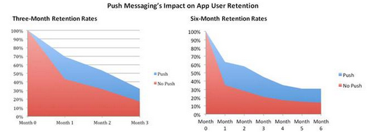
Overall push notifications have been proven to increase engagement and retention – They result in up to 26% higher mobile app open rates and 92% higher retention rates. (De Vere, 2012)
Push notification’s impact on retention rates.
So know we know what push notification are and how effective they are as a marketing tool, what are the top tips for retailers using push notifications?
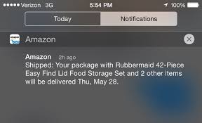
Tip 1: Start small
By focusing on transactional or purpose-driven messages, you can encourage users to trust push notifications. Start with notifications about delivery information and payments — things your customers will appreciate being notified about, they are then going to be much more likely to pay attention and act on future notifications. From there, you can move on to more personalised deals and messages.
Amazon are doing it right!
Tip 2: Personalisation/Segmentation
It’s not enough to just use push; you need to put intelligence behind those messages. According to O’Connel, (2015) users are three times more likely to convert from a push message when it’s personalised. Don’t assume every user wants to hear about the same thing. Sending a notification that is valuable to the user isn’t just about a 10% coupon – it’s about presenting a relevant offer. The most compelling offer is one that contains information that the user deems important.
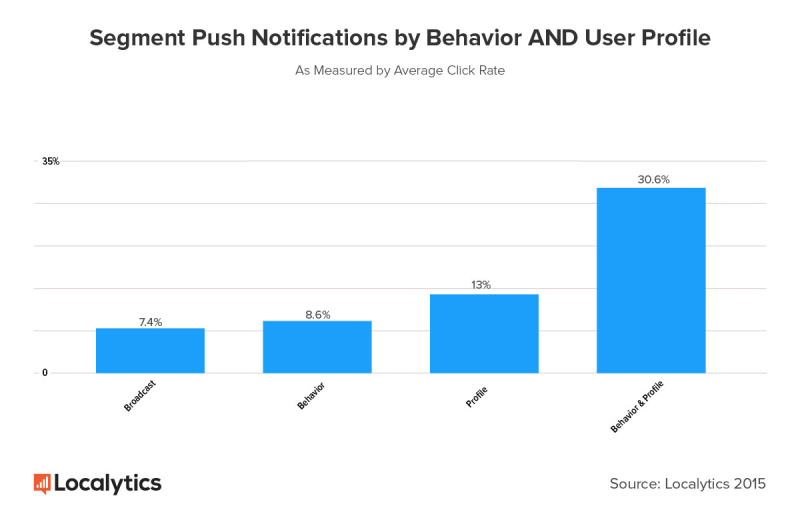
One way to achieve intelligent personalisation is through a solid segmentation strategy. For example, you can start by segmenting users based on their in-app behaviours or known information about them from your CRM (customer relationship management). This is a great way to start as click rates are shown to increase to 8.6 percent for behavior-based personalization and 13 percent for profile-based personalization, compared with the “send to everyone” average of 7.4 percent.
The real gold comes at the next level of segmentation when you segment audiences by both user profiles and behaviours. The average click rate for push messages sent based on behavioural and profile data is an impressive 30.6 percent.
Average click through percentage based on segmentation (Source: Localytics)
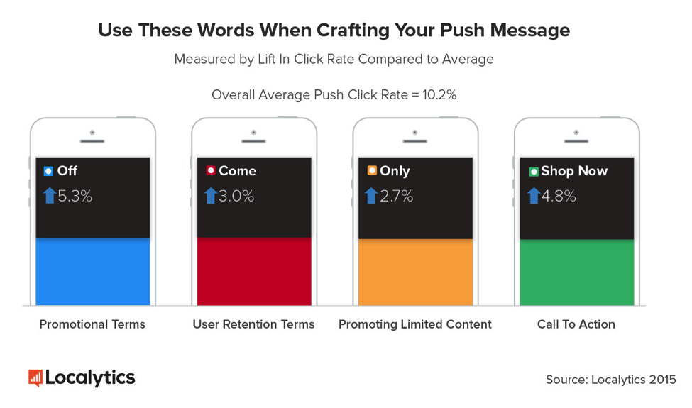
Tip 3: Use proven words and CTAs to entice users to take action
Depending on the app category, (even within the sub-categories of retail applications e.g fashion vs home furnishings) the content of a successful push message can vary dramatically. There are, however, keywords and tones that can make a huge difference in click rates.
Some of the top words included “off” (for discount promotions) — which resulted in an average click rate of 15.5 percent, a lift of 5.3 percent compared with the average. Additionally, “come” and “only” showed great click-through rates too, with 13.2 percent and 12.9 percent on average — likely because they showcase new features that might be available only for a short time. (Localytics)
Keywords and CTAs (Source: Localytics)
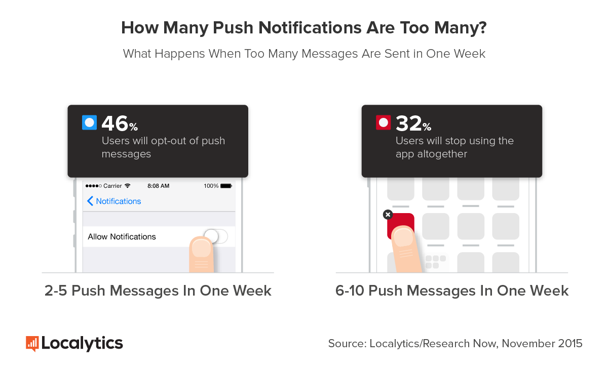
Tip 4: Value over quantity!
InMarket has found that one too many push notifications from an app can cause users to simply delete the associated app. (Emamian, 2014) Push notifications are more about content value than quantity.
There is no one set rule as to how many push notifications is too many, notification tolerance varies across app industries and individual users, so make the most of your notifications. Not all apps should be sending push notifications once a day, and engaged users have a vastly different tolerance for notifications then new users or dormant users. Rather, it’s about sending the right message to the right person at the right time. In many cases, the elegance is in knowing when not to send a message.
(It is also advisable to make it easy for users to turn off notifications. Therefore if users really don’t like receiving push notifications they will at least keep your app on their phone through this option rather than deleting it.)
Value, not Quantity (Source: Localytics)
Tip 5: Timing is everything
Not only is the number of push notifications a key factor of success, but the timing of these notifications also plays a big part in engagement and click through rates.
Great timing should consider both user behaviour and urgency. Notifications that include urgent information need to be sent at a time that is relevant to the context of the message (such as limited time deals & offers.) For notifications that are not critically urgent, the goal is to minimise disruption and maximise delight.
If you want to go the extra mile even timing can be personalised to individual users – Considering every user keeps a different schedule, push notifications can be tailored to the time when each user is most likely to engage with the app. Kahuna data reveals that customising delivery time based on user preference results in an average conversion uplift of 384%.
Timing is Everything (Source: Localytics)
A final thought
Push notifications let you speak directly to your customers to make a personal connection. When they’re done well, users won’t view your notifications as an annoyance. They’ll see them as helpful and informative messages that inspire engagement, repeat visits, and spontaneous purchases. It is important to therefore really focus on understanding what your users value about your service and tailor your messages to their unique needs and interests. You’ll see push engagement skyrocket, and your users transform into rabid advocates.
Two great articles I would recommend if you want to read further about push notifications as a successful digital marketing strategy are:
– Push notifications explained: the beginner’s guide – Available here – Time to Opt Into a New Mobile Messaging Mindset – Available here
References
De Vere, R. (2012) How to double user retention with push notifications: Urban Airship shares best practices [Online]
Emamian, B (2014) 5 Ways Retailers Should Use Push Notifications [Online]
O’Connel, C (2015) 2015: The Year that Push Notifications Grew Up [Online]
Shankar, V., Venkatesh, A., Hofacker, C. & Naik, P. (2010) Mobile Marketing in the Retailing Environment: Current Insights and Future Research Avenues, Journal of Interactive Marketing, 24(2), 111-120.
Todd, J (2016) 5 must-do push notification best practices for mobile marketers [Online]
There have been copious amounts of research and worrying news articles recently arguing the new digital age might mean the end of our high street shops. (Rigby, 2011; Weltevereden, 2007; Rimer, 2013) However, this is not necessarily the case, in some circumstances, retailers have actually been using digital marketing strategies to entice customers into their stores and enhance the consumer’s shopping experience. This blog is going to explore successful ways retailers have been doing exactly that.
Using digital to pull shoppers into stores – Readily available information
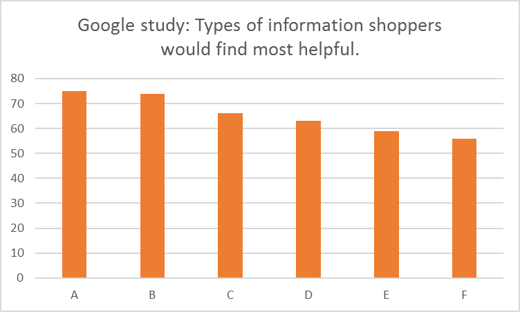
Digital is a great way for local retailers and retail giants alike to encourage store visits. A study by Google revealed that 3 in 4 shoppers who find local information in search results are more likely to visit stores, and the top two places shoppers head to search include search engines (64%) and the retailer’s website or app (46%). The types of information shoppers would find most helpful in search results include:
75% – A: Price of item at a nearby store
74% – B: Item is in stock at nearby store
66% – C: Location of closest store with item in stock
63% – D: Details about local stores (hours, phone number)
59% – E: Map showing which stores carry the item searched for
56% – F: What else is available at the store that carries the items searched for
Google study results
Therefore by having this information readily available for your customers online (either through a mobile friendly website, an app, or/and search engine optimization), digital can greatly improve your ability to draw customers to your stores.
One retailer that has successfully taken this approach a step further is Macy’s. Macy’s use a program that works with Google’s proximity marketing platform so shoppers can search for an item on their phone and see what’s stocked at their nearest Macy’s location. Alongside the images are product details like price, size and color, directions to the store, and a link to the item on the retailer’s website. According to Macy’s Group Vice President of Marketing Strategy Serena Potter, the idea is that “A shopper can then take immediate action if she sees that there are three pairs of shoes right now, in the size and color she wants, at a Macy’s that’s five blocks away.” By creating this synergy between online and their physical store Macy’s have seen some “encouraging results” with every dollar invested in search driving $6 in store purchases. (Rodrigues, 2014)
Enhancing the in-store experience – Smartphone sales assistant
Digital is not only transforming the way consumers act outside of stores but also inside stores. A study by Google shows that 42% of in-store shoppers search for further information online while in-store. This presents a powerful opportunity for retailers to impress and engage with consumers in new ways—and prevent them from turning to the competition. For example, within the store’s app or mobile friendly website, retailers could offer deals that shoppers can use only at their current location or provided shoppers with promotions for related items that are also in stock at that store, or alternative fulfillment options, such as free home delivery, should the product they’re interested in not be in stock.
Savvy retailers such as Sephora are already using mobile to deliver a better in-store experience to consumers. Sephora found that its customers rely on their smartphones while shopping in-store to help them find the perfect products. It designed its Sephora App to assist shoppers, giving them direct access to product ratings and reviews. Bridget Dolan, vice president of digital media at Sephora, says, “We think one of the biggest opportunities that we have in retail is for our customers to leverage their phones as a shopping assistant when they’re standing in the store. Having access to this information is that perfect new moment for customers to find everything they’re looking for and get advice from Sephora.” An interesting article that further analysis how Sephora integrates retail & digital marketing can be found here.
Taking this even further Amazon Go have been developing ‘just walk out’ technology where customers can purchase items through an app making the need for sales assistants redundant altogether, making the whole in-store process digitalized.
Enhancing the in-store experience – Digital displays
Modern consumers have learned to ignore traditional signage and banners so retailers are switching to using digital displays and interactive in-store marketing to encourage shopper engagement, increase the length of stay, and capture data. This, in turn, grabs the customer attention and enhances their in-store experience. (Wayin 2017)
There are several ways digital displays can be used, for example:
Engage visitors with touchscreen walls, photo uploads, polls, quizzes, and surveys
Showcasing top trending products based on up to date social media trends or online reviews
Digital catalogs to enable easy browsing and selecting, then adding items to virtual baskets.
Up to date advertisements which can be changed with ease
One company in particular that have adopted this strategy rather innovatively is Burberry. Burberry’s flagship London store aims to bring some of the web experience to the high street, featuring mirrors that double as video screens and staff armed with iPads. As well as other clever digital tricks such as the use of radio-frequency identification technology (RFID), which triggers related catwalk footage when some products are taken into a fitting room, or near a video screen. An interesting article that explores the digital aspects of their London store with comments from Christopher Bailey, the firm’s chief creative officer can be found here.
A final thought
Digital and online shopping will either replace the need for physical stores or enhance the whole shopping process by creating an omnichannel experience, such that the companies mentioned in this blog have been striving for or that Rigby (2011) states in a necessity for future survival.
Savvy brands will look at how the retail experience can marry the best of online – its scale and convenience – with the tangible experience shoppers know, love and be wowed by. (Rigby, 2011) If retailers are investing in digital only with the mindset of supporting their eCommerce business (or channel-specific sales goals), they are missing out on the opportunity and benefits a truly omnichannel experience can bring to both consumer and retailer. Although no retailer has completely nailed this omnichannel existence yet, many are beginning to experiment with a variety of creative ways, creating success through the synergy of digital and physical and the potential rewards are enormous. However, brands need to look beyond just digitalisation and ensure that the overall experience encompasses both online and offline. The store itself will then become another digital marketing channel, and appealing to customers digitally through unique store experiences may become more important than ever over the next century. (Gil, 2015)
Gill, K (2015) The Retail Experiences of the Future. Link
Rigby, D. (2011) The future of shopping. Harvard Business Review, 89(12), pp.65-76.
Rimer, D (2013) The end of retail as we know it. Link
Rodriguez, A (2014) Macy’s Links With Google To Show Mobile Users What’s In Stock Nearby. AdvertisingAge Link
Wayin (2017) Drive in-store revenue in the digital age. Link
Weltevreden, J.W., 2007. Substitution or complementarity? How the Internet changes city centre shopping. Journal of Retailing and consumer Services, 14(3), pp.192-207.
Mobile applications are a tool of innovation that are transforming the retail world (Rigby, 2011) with interface design becoming an increasingly important factor in the success of an eCommerce app. (Cyr et al. 2006) The sensory experience and ease of use are key factors in determining whether a user stays and shops, and in-turn their loyalty to the application and their level of future use. (Jiang & Benbasat 2003) This blog post is going to highlight five top tips to create the perfect user interface experience.
The top five tips for an effective and successful app design are:
1.A simple and uncluttered interface – Bearing in mind that the screen size of a mobile is much smaller than a desktop/laptop the apps interface must be tailored to the smaller dimensions of a mobile phone. A study from Duchnicky and Kolers (1983) noted the effects that design on different screen sizes had on user’s comprehension and their perception of the apps. For example the size of text and the arrangement of buttons must be suitable for the size of screen they will be viewed from in order to make the users experience as easy as possible. One aid to keep in mind when designing this interface is the ‘thumb-friendly-zone’ which highlights the key areas and functions that are within easy reach of the thumb. (Apptentive 2016)
However there is a danger this tip can be taken too literally. The ultimate goal is to simplify the interface and make it more functional and usable. That doesn’t mean hide/miss out key functions. It’s important to maintain a balance between a clean and efficient interface while still containing the require/appropriate information, and functions. (Babich 2016)
Thumb-Friendly-Zones (Apptentive 2016)
3. A condensed & consistent navigation – Navigation is an important part of every user interface however unlike websites where you commonly find expansive menus that list all categories, sections, and promotions, this option is not suitable for the smaller mobile device. Menus must therefore be condensed and easy to navigate, containing only the most important categories/sections. And although it maybe an obvious point, the menus must be made to look interactive! Users may not even realize that it’s a menu if the options don’t look clickable (or tappable). Menus may seem to be just decorative pictures or headings if you incorporate too many graphics, or adhere too strictly to principles of flat design.
ASOS navigation menu example
3.Contrast for view – What a big pain it is to your eyes when you receive a mail full of bizarre color fonts and backgrounds from a newbie who has a recently discovered the word art. Same is the reaction when you come across applications that are very difficult to read and navigate. To avoid such a scenario, decide on high-contrasting color schemes that makes design and content stark clear.
Contrasting colours example
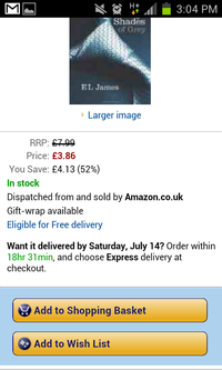
4. A prominent ‘add to cart’ button – One of the key aspects of design for any eCommerce app is to feature a prominent call to action. If a customer finds a product they want to buy they must be able to easily and quickly complete the purchase. If they have to take too many steps, they are less likely to finalize the process. On product screens always having a view-able and easily distinguishable ‘add to cart’ or ‘buy now’ button will help make the purchasing process simpler and increase conversion rates. (Andrew, 2016) (An excellent blog from Econsultancy on creating the best call to action buttons can be found here)
Amazon CTA example
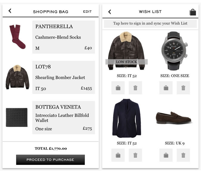
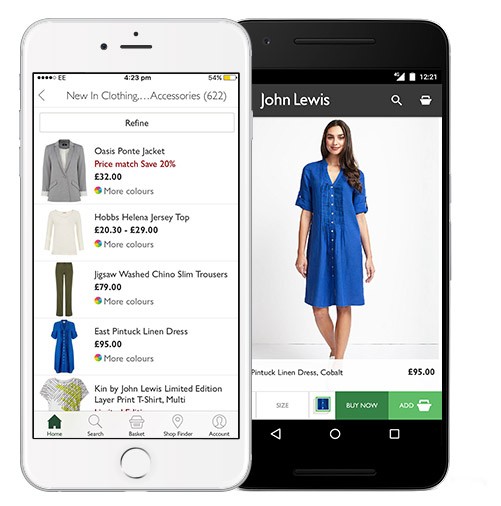
5. Fit the format, minimize the number of images – I’ve previously touched upon the impatience of users, one aspect of this is that users expect that mobile app screens load instantly. A simple method to improve app loading speed and improving the usability of your interface is to limit the number of weighty HD images and ensure your are using the appropriate format the device can support, especially on product screens where you are tempted to have multiple images.
John Lewis product page example
One final piece of advise…
Adhere to the multiple guidelines that have been underlined for user interfaces. Innovative and unique UIs can be great but there are strict guidelines. The guidelines vary version to version on which your app will appear, and for this you must include alternate resources to suffice multiple guidelines. The apps will be scrutinized properly before they are made open on major app stores like Apple Store and Google Play. So, it is important to follow these rules. The norms cover everything from icons to widgets to menus and activities. (Pal 2016) Apple’s guidelinesGoogle Play’s guidlines
If you want to see some further examples of both successful and ‘unsuccessful’ UI design follow the below links.
Cyr, D., Head, M. and Ivanov, A. (2006) Design aesthetics leading to m-loyalty in mobile commerce. Information & Management, 43(8), pp.950-963
Duchnicky, L. and Kolers, A., (1983) Readability of text scrolled on visual display terminals as a function of window size. Human Factors, 25(6), pp.683-692.
Jiang, Z. and Benbasat, I. (2003) The effects of interactivity and vividness of functional control in changing web consumers’ attitudes. ICIS 2003 proceedings, p.93.
The Bake Off is a British favorite, attracting an average of 14 million viewers to this years season final! (BBC) Therefore it is no surprise companies are jumping on this trend with their marketing campaigns.
As I slumped into the sofa with a cup of tea ready to watch the GBBO I quickly scanned my social media and emails, I came across what I thought was an amazing example of event triggered email marketing done right. I received the below email from JustEat, a service I use shamefully often.
I usually open JustEat emails as soon as I see them as they often contain deals and takeaway recommendations that have proved useful to me in the past. Their subject line also enticed me in by referencing the Bake Off; ‘On your marks… get set… bake! – Are you ready for the Bake Off final?’
The email was of-course event triggered as I received the email 3 hours before GBBO, It also maintained the theme of Bake Off throughout. It very tactfully linked the love of GBBO and desserts with their takeaway services with a focus on dessert restaurants. I especially like the big image of brownies with a little British flag, it’s very topical and creates an emotional connection, who isn’t made happy at the thought of a lovely warm brownie! (A survey of the effectiveness of email marketing carried out by Ellis-Chadwick (2012) highlights the importance of images in emails as they engage readers and helps sustain engagement, and my response to JustEat’s email is a clear example of the effect images can have!)
The body of text is minimal but to the point, it’s inviting and I caught myself reading the whole email, something I would never normally do with long winded and busy emails.
The post the email linked to.
It also contained a link to a previous JustEat tweet labeled ‘remember this ‘perfect’ version of Dorett’s masterpiece in 2015?‘ this was a clever way of using humor to get the viewer to follow the link, and in turn getting the viewer to interact with the company’s social media page. This sort of tactic is extremely effective in increasing an email’s conversion rate and click rate. People are going to want to follow the link, and they may even want to share the content if it’s funny enough.
The Landing page(s)
Any savvy inbound marketer “gets” that once you’ve done all that hard work to get visitors to your website, the next big step is to convert them into leads for your business. But what’s the best way to get them to convert? Landing pages, that’s what!
JustEat’s email has two effective calls to action leading to landing pages. Firstly a hyperlink to ‘ideal desserts to order in‘ which takes you to the landing page pictured on the right. The landing page follows the format of the email. It’s simplistic but informative and to the point, it makes easy reading. It maintains the theme of GBBO with another mouthwatering image at the top of the page, and a strapping headline ‘Showstopping desserts to help you celebrate GBBO.’ It then lists a number of dessert restaurants, disappointingly however, the restaurants aren’t personalized and shown in relation to my location. As a result I would never actually make an order based off this landing page as none of them are near me.
The second call to action is an obvious large order now button, and takes you to the standard JustEat website as the landing page which is not tied to the GBBO theme but is familiar to the customer if they order often. Unlike the other landing page it is personalized to the user as it shows the restaurants closest to your location. It is simply laid out with clear searching options which makes it extremely user friendly.
Overall the email and landing page combination definitely makes me hungry and tempted to order from JustEat!
References
Ellis-Chadwick, N.F. Doherty / Journal of Business Research 65 (2012) 843–848
This blog is all about my journey through Digital Marketing as one of my university modules.
It is important however to understand what is digital marketing and why has it become so important.
In simplistic terms, digital marketing is the promotion of products or brands via one or more forms of electronic media. (SAS 2016)
In the modern age people are becoming more and more glued to their screens. with the list of available technological devises increasing everyday, mobile phones, tablets, laptops, computers, game consoles… I could go on.
Inevitably this has thrown digital marketing into the spotlight, it is become an increasingly vital aspect of a companies marketing campaign. This blog will look at different types of digital marketing and how companies have effectively or in some cases ineffectively used digital marketing.