Petra Collins from Canada is best known for her pastel tinged photographs that celebrate and empower women. She’s currently based in NYC and has worked with huge names in the fashion industry including Wonderland magazine. My favourite thing about Petra’s images is her use of pastel tones in most of her photos. Also, I like that a lot of her photographs look natural even though they most likely took a long time to stage. Petra doesn’t sexualise women in her images which is also something that I admire in a world that is constantly demoralising women.
Oyster Magazine
Oyster magazine is published quarterly and from Australia. The magazine features international fashion, beauty, music and pop culture. Oyster showcases the works of leading photographer and also young emerging talent from all over the world. Their online presence is also great because they have sections for each of the theme’s they have in their magazine, so if you loved the magazine but didn’t want to buy it in print, the online platform is a good source.
Dazed
Dazed is a monthly British fashion, art, film, music and culture magazine. Founded in 1991 by Jefferson Hack and photographer Rankin. Formerly called “Dazed & Confused” the magazine has recently changed it’s name to just “Dazed”. As well as having a print magazine they also like Oyster magazine has a really strong online presence, with a feature that allows fans to subscribe to weekly newsletters. Dazed is said to be one of the current most influential fashion and culture magazines around. Meeting underground with pop culture Dazed has a huge readership that is mainly youth culture. As our magazine will also be about youth culture, Dazed is a good sense of inspiration.
Defuze Magazine
“DEFUZE Magazine is a trendy, fresh and totally independent photobook for young fashionistas, photographers, musicians and artists. It’s a breath of fresh air on the newsstands filled with over-commercialized magazines.”
This was the online issue that I looked at for Defuze magazine. I feel that the cover of this issue is good and having “cherry bomb” on the cover makes it apparent that the main feature will be about rebellious youth culture.
I found that the main feature was a little disappointing because I thought that the styling wasn’t great, and the model looked slightly awkward in some of the shots. Also I felt that some of the images were taken at an angle that wasn’t very complimenting, although that could have been the look they were going for.
On the other hand I thought this editorial was a lot stronger because the styling was more intricate and the use of light and shade was much, much better.
Fashion Editorial History
Fashion photography dates all the way back to 1856 when Adolphe Braun, French photographer, created a photo-book for Virginia Oldoini, Countess of Castiglione. Virginia was the first model to ever be portrayed in official clothing.
In 1867 Harper’s Bazaar created the first fashion magazine and shortly after in 1892 Vogue followed and created their now best selling fashion magazine. Both of these magazines were first illustrated by hand an in 1913 portrait shoots of models and actresses began to feature in Vogue as fashion editorials.
Photography being used as an advertising tool didn’t become popular until early 20th century when fashion became more accessible to a wider audience.
iD Magazine
i-D magazine is one of the best selling fashion magazines currently in the UK. It started as a fan zine in London during the 1980’s punk era and earned it’s respect as a well established fashion magazine. i-D encourages creativity and freedom in all aspects of fashion, music and culture.
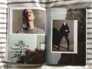
The front cover’s for iD magazine always consit of the cover model having one eye shut whether that is by winking, use of accessories or props or shadows. It is a graphic representation of it’s logo and it has become a huge part of iD magazine’s identity. The covers always vary in colour and style however the same wink is consitent throughout. The cover for the issue I am looking at, issue “345 The game changing issue”, was photographed by Anna Ewers and the fashion director was Alastair Mckimm.
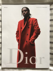
The back cover features A$AP Rocky for a Dior advert. The back cover is usually the most expensive part of the magazine to buy in advertisment.
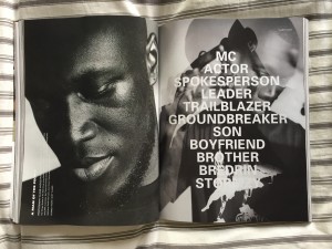
This particular double spread stood out of me because of the layout. The use of little white space and a linear approach is very contemporary.
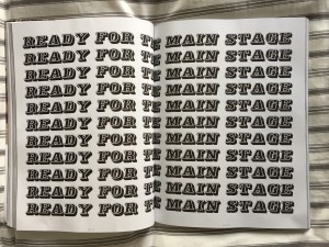
I found this page interesting because it is so simple yet pretty eyecatching and effective.Graphics and typography are as important or more as photographs in a magazine.
The main article feature in this issue of i-D Magazine was about the hit grime artist in the UK at the moment, Stormzy. ID magazine is well known for it’s features on current music affairs and having this detailed interview/article about Stormzy is perfect for their target demographic.
Haunt Mag
Haunt Magazine is an online fashion magazine based in London, founded in 2012 by Emily Beard and Rebecca Hawkes. It focuses mainly on fashion editorials, but also contains art, interviews as well as a beauty section. They accept submissions in addition to their commissions which makes the magazine a great source for new up and coming talent within the fashion editorial world. This fresh online magazine is a great source of inspiration for fashion editorials and is where I tend to look into when I am researching.
Starting Points for Magazine
Target Audience
- 18-25 Female/Male
- Creative
- Open minded
- Fashion interested
Editorial Policy
- Commentary of modern youth culture
- Taboo topics
- Fun lighthearted approach
- Showcasing up and coming creatives.
Competitors
- Zeum
- Dazed and Confused
- iD Magazine
- Grunge & Art
- So Yung
- Oyster
Funding
- Advertorial (Monki)
- Adverts (Depop, Too good to go, Pitchfork)
Visual Identity
- 10×7.5″
- Minimal
Fashion Direction
- Not focusing on trends, nice about style.
- Detail shots
Potential Stockists
- Magazine Brighton
- Urban Outfitters
- Wardour news
- Magma
- Bats, Unis, coffee shops
Promotion
- Social media accounts.
Initial Ideas – Mood boards (Styling Workshop)
Planning and mood boards are a vital part of achieving a successful photoshoot. Inspiration for styling can come from a variety of different sources and usual the stylist and the photographer work together to create concept/mood boards to use as reference in a photoshoot.
Different Sources of Research
- Runway shows (historical and contemporary)
- Films
- Musicians
- Other editorials
- Art
- Documentary photography
- Sketches/collages
Moodboards Corresponding to Research
This mood board contains images that I find inspiring due to the person in them.
These images are all taken from current editorials on Haunt magazine. These images caught my eye because of the lighting and composition used in the shots.
This mood board withholds images from collections that inspire me in a styling aspect. The more recent collection is the Hermes Resort 2017, and a more dated collection by Helmut Lang Fall 1998 collection.
Zeitgeist – Visual Research
Initial visual research taking photographs in the North Laines, Brighton in a way that I find aesthetically pleasing, thinking about lighting, composition, and colour palettes.
Typography – I found this image aesthetically pleasing because of the colour palette and the use of white text against a bold colour. The composition of this picture is also eye catching to me because of all the angles and lines.
Contemporary Functional Object – This image shows some contemporary every day functional objects, some plastic tubs. I found this interesting also because of the colour palette. The use of a pop of colour green put with neutral colours and black works well.
Food – This shot i took from a forward facing angle, to capture all of the packets aligned and paralell to eachother, and also creating a colour scheme of mainly whites, pinks and greens.
Object that represents fashion – This image was taken in Wolf & Gypsy situated in the lanes. The composition of this photo is what makes the photograph aesthetically pleasing, as all the objects in the shot are placed carefully and make it easy for the eye to follow the picture. Also the colour palette again works extremely well as it is mainly neutrals.
Drink – I took this photo from an angle to line up all the bottles of Ciroc, and make the colours from behind them stand out through the glass and clear liquid.
A Curiosity – This curiosity found in the lanes caught my eye because I didn’t know what it was.
Vintage Object that is Trending – I chose this object as my “vintage object that is trending” because denim dungarees are an item of clothing that is mainly associated with the 90’s, however dungarees are very much back in fashion and as trendy as ever. The pop of colour against the black works well and gives the image a retro vibe.
Object that Represents Music – In a music store in the laines I found this object that stood out for me because of the purple lights against the black background.


