These images by Erika Bowes are a big inspiration for our main editorial photoshoot as we also plan to use the location of a cinema. I liked how these photographs are lit and the shadows they create. Also I liked the colour scheme of the shoot using mainly reds, giving the shoot a fun sensual feel. The second image is interesting because it has a sense of mystery behind it, we don’t know what’s happening behind that chair, all that we can see is the model’s head and leg leaving the photo with a lot of suggestion.
Monki
Monki is a fashion brand that started in 2006. Over the last 10 years it has grown immensely. The clothes they supply are contemporary and cool consisting mainly of wide leg trousers, baggy jumpers, and a tailored style. This kind of store is a shop that our target demographic would shop in, so we are creating an advertorial for our magazine featuring the same vibes that Monki already portray. The images above are taken from their website. They all have a bright bold colour as a backdrop which is an aspect we aspire to keep the same as it creates a fun and young atmosphere. They also tend to use a diverse range of models from all different races. I like that the backdrop is plain as it doesn’t take away from what we are supposed to be focusing on which is the clothing.
“Celebrating our 10th b-day by putting our foot down and our banners up! ”
Monkifesto was the Monki way to celebrate being successful for 10 years. The manifesto is to voice the issues that have always & continue to be around for women. Topics such as periods, masturbation, LGBT rights and body positivity are spoken about and shown through a series of pictures.
For this reason and many others is why Monki is a chosen retail store for our chosen demographic.
Lea Colombo
Lea Colombo from Cape Town is 19 year old photograper, currently living and working in Paris. The images above were some of my favourite from her artist profile. Her use of composition was my favourite thing about the images, alongside with the vintage film look they have.
This image was also taken by Lea Colombo and styled by Carlos Nazario to go in their feature in Dazed magazine about the LGBT comminuty. I found the tones in this image compliment the concept of the photo. I will take inspiration from this for one of the photoshoots I am doing about men experimenting with makeup.
Petra Collins
Petra Collins from Canada is best known for her pastel tinged photographs that celebrate and empower women. She’s currently based in NYC and has worked with huge names in the fashion industry including Wonderland magazine. My favourite thing about Petra’s images is her use of pastel tones in most of her photos. Also, I like that a lot of her photographs look natural even though they most likely took a long time to stage. Petra doesn’t sexualise women in her images which is also something that I admire in a world that is constantly demoralising women.
Oyster Magazine
Oyster magazine is published quarterly and from Australia. The magazine features international fashion, beauty, music and pop culture. Oyster showcases the works of leading photographer and also young emerging talent from all over the world. Their online presence is also great because they have sections for each of the theme’s they have in their magazine, so if you loved the magazine but didn’t want to buy it in print, the online platform is a good source.
Dazed
Dazed is a monthly British fashion, art, film, music and culture magazine. Founded in 1991 by Jefferson Hack and photographer Rankin. Formerly called “Dazed & Confused” the magazine has recently changed it’s name to just “Dazed”. As well as having a print magazine they also like Oyster magazine has a really strong online presence, with a feature that allows fans to subscribe to weekly newsletters. Dazed is said to be one of the current most influential fashion and culture magazines around. Meeting underground with pop culture Dazed has a huge readership that is mainly youth culture. As our magazine will also be about youth culture, Dazed is a good sense of inspiration.
Defuze Magazine
“DEFUZE Magazine is a trendy, fresh and totally independent photobook for young fashionistas, photographers, musicians and artists. It’s a breath of fresh air on the newsstands filled with over-commercialized magazines.”
This was the online issue that I looked at for Defuze magazine. I feel that the cover of this issue is good and having “cherry bomb” on the cover makes it apparent that the main feature will be about rebellious youth culture.
I found that the main feature was a little disappointing because I thought that the styling wasn’t great, and the model looked slightly awkward in some of the shots. Also I felt that some of the images were taken at an angle that wasn’t very complimenting, although that could have been the look they were going for.
On the other hand I thought this editorial was a lot stronger because the styling was more intricate and the use of light and shade was much, much better.
Fashion Editorial History
Fashion photography dates all the way back to 1856 when Adolphe Braun, French photographer, created a photo-book for Virginia Oldoini, Countess of Castiglione. Virginia was the first model to ever be portrayed in official clothing.
In 1867 Harper’s Bazaar created the first fashion magazine and shortly after in 1892 Vogue followed and created their now best selling fashion magazine. Both of these magazines were first illustrated by hand an in 1913 portrait shoots of models and actresses began to feature in Vogue as fashion editorials.
Photography being used as an advertising tool didn’t become popular until early 20th century when fashion became more accessible to a wider audience.
iD Magazine
i-D magazine is one of the best selling fashion magazines currently in the UK. It started as a fan zine in London during the 1980’s punk era and earned it’s respect as a well established fashion magazine. i-D encourages creativity and freedom in all aspects of fashion, music and culture.
The front cover’s for iD magazine always consit of the cover model having one eye shut whether that is by winking, use of accessories or props or shadows. It is a graphic representation of it’s logo and it has become a huge part of iD magazine’s identity. The covers always vary in colour and style however the same wink is consitent throughout. The cover for the issue I am looking at, issue “345 The game changing issue”, was photographed by Anna Ewers and the fashion director was Alastair Mckimm.
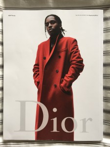
The back cover features A$AP Rocky for a Dior advert. The back cover is usually the most expensive part of the magazine to buy in advertisment.
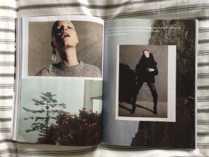
This particular double spread stood out of me because of the layout. The use of little white space and a linear approach is very contemporary.
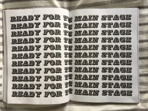
I found this page interesting because it is so simple yet pretty eyecatching and effective.Graphics and typography are as important or more as photographs in a magazine.
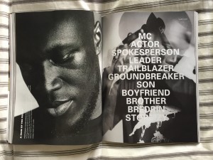
The main article feature in this issue of i-D Magazine was about the hit grime artist in the UK at the moment, Stormzy. ID magazine is well known for it’s features on current music affairs and having this detailed interview/article about Stormzy is perfect for their target demographic.
Haunt Mag
Haunt Magazine is an online fashion magazine based in London, founded in 2012 by Emily Beard and Rebecca Hawkes. It focuses mainly on fashion editorials, but also contains art, interviews as well as a beauty section. They accept submissions in addition to their commissions which makes the magazine a great source for new up and coming talent within the fashion editorial world. This fresh online magazine is a great source of inspiration for fashion editorials and is where I tend to look into when I am researching.


