Digital Marketing Audit
Channel Audit
Missguided’s landing page is a prime example for website digital marketing.
The homepage includes a ‘25% off your first order’ pop – up box in order to build a mailing list.
The homepage also features various promotions and adverts in order to secure sales. This includes a 20% student discount,30% xmas discount and next day delivery for £1.99
Site engages audience by including customer reviews and feedback for reference.

How is the firm using digital marketing?: Website builds rapport with customer through friendly/informal text. Uses a mailing list to interact with customers and create more personalised service. Graphics used create friendly/approachable vibe, feels like you are conducting business with a friend rather than a formal specific company.
Three things done well: Good use of graphics,website design is attractive and simplistic, promotions stand out and are hard to miss.
What could be improved: The site could include a personalised message, for example a name established with an IP address could be presented everytime that IP visits the site, i.e ‘Welcome Back Rochelle.’
Social Media Audit
What SM sites do they utilise? : Twitter, Facebook, Youtube & Instagram.
Three things done well: Posts are aesthetically pleasing and informative. Friendly/approachable ‘vibe’ is maintained across all social media platforms. Users are engaged by content via funny and relatable captions/posts. ‘Contact’ messenger automatically opens when FB page loads, this is good for customer interaction and customer satisfaction.
What could be improved: Platform could utilise customer photos to further promote the brand, raise awareness and engage customers.
Influencer Search
Keywords Used: Missguided Clothes,
Influencers Identified: High saturation of content from ‘not yet established influencers’. Those building a reach/audience/content but not necessarily the voice and image of brand.
Top 10 content creators: Cosmopolitan, Guardian, Business Of Fashion, Marketing Week.
Created by Rochelle Garcia-Rodriguez, Bsc (Hons) International Business Student.
Keyword Analysis
Chosen Sector: Fashion, Chosen Firm: Missguided
Importance of Keywords
What do they offer?: Keywords allow for information to be stored and retrieved quickly & efficiently.
How are they found?: Keywords are often displayed via #Hashtags or via words placed in the HTML.
In the case of Missguided, what are their customers looking for?: Female clothing. Tags therefore could be ‘Top’, ‘Clothes’, ‘Shorts’ etc.
Keyword Research
Keyword list search: Missguided ranks organically 3rd for the term ‘tops’, 1st for ‘Clothes’ and does not place on the first 2 pages for ‘Outfit’.
Google Trends Related Topics/Queries:


Competitors:

Competitor Analysis
Who else shows in your search space?
- Competitors: Topshop, PLT, River Island, New Look, ASOS
- Influencers: Both paid & not paid.
Who shows up with paid ads? Topshop
What other keywords are they optimised for? Jumpsuit, Top, Skirt, Rompers, Dress.
Created by Rochelle Garcia-Rodriguez, Bsc (Hons) International Business Student.
#1: Audit of Missguided.co.uk
Chosen Company
The company I will be researching is Missguided, an online women’s fashion retailer.
Competitors
Two of Missguided’s main competitors are Topshop and ASOS (Owler, 2018).
Competitor Benchmarking

Figure 1 makes apparent the scale of Missguided‘s revenue against that of its competitors. ASOS would be considered its greatest rival with a sales revenue of $2.5B to date.
Market Segmentation
Missguided’s market segment reflects that of ‘High Street’ and/or ‘Economy’ (Figure 2).

Target Market
Missguided’s target market would be considered 18-24 year old females, who are looking for up to date, fast fashion at affordable price points (Wood, Z, 2018 and Aldridge, 2018).
Missguided’s Customer Touch Points
Before: TV Adverts, Magazines, Billboards, Online Ads, Social Media, Word Of Mouth
During: E-commerce (Website), FAQ, Help, Customer Service
After: Social Media, Reviews, Billing, Email, Customer Service, Newsletters
(Wots The Big Idea, 2018).

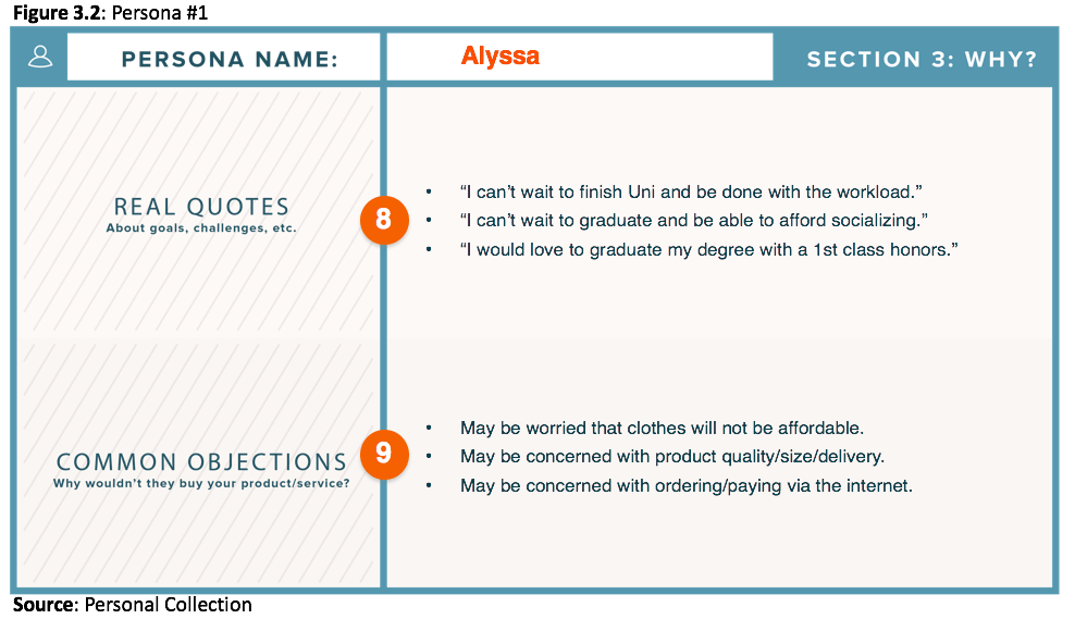
Buyer Personas #1: Alyssa


Customer Journey #1: Product Purchase

Missguided’s homepage follows an ‘Inverted Pyramid Pattern’. The top of the page displays the greatest quantity of information, “with an expectation for the longest gaze duration” (Hernandez and Resnick, 2013).

Using the navigation bar, Alyssa has hovered over ‘Tops’ and selected ‘Going Out Tops’ from the associated drop down menu (Figure 3.5).
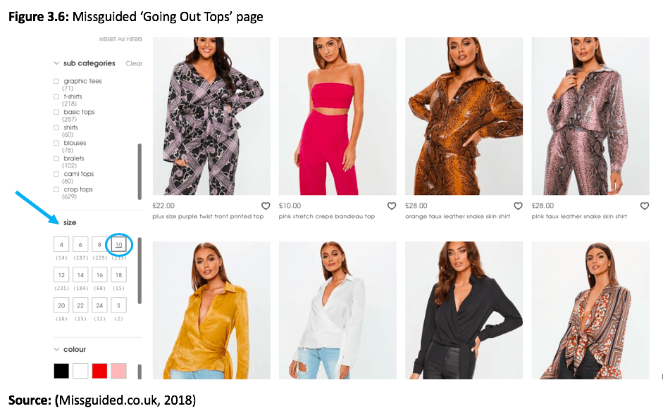
Figure 3.6 displays Missguided’s ‘Going Out Tops‘. The filters that can be applied to the search are located to the left of the search results.
Alyssa has scrolled down the page and selected ‘Size 10’ in order to refine her search results.

Figure 3.7 displays Alyssa’s product choice. She has selected ‘Size 10’ and ‘Add To Bag’.

Figure 3.8 shows the ‘pop up’ box that appears when ‘Add To Bag’ is selected. Alyssa has then selected ‘View Bag/Pay Securely’.
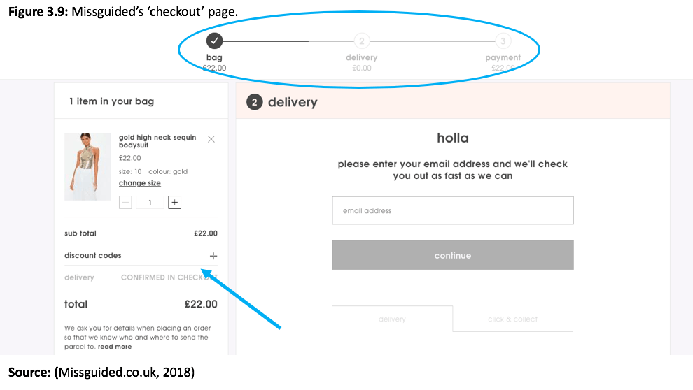
Figure 3.9 is Missguided’s ‘checkout‘ page.
Alyssa can apply a student discount code at this point.
After ensuring the shopping bag is correct, Alyssa can enter her email, click ‘Continue’ and provide her shipping and payment details to complete the process.
Customer Journey Analysis #1
What worked well:
- The site design is user friendly.
- Items are displayed in a grid format.
- The navigation bar is easy to use.
- The search filters allow for refined results.
- The checkout process was clear, last minute changes could be made if necessary.
- Delivery instructions informal and friendly.
- Useful checkout ‘timeline’ to display the steps involved in purchase process.
Critiques:
- To improve the search by ‘size’ filter touch point, a web chat could be initiated to engage with the customer. This web chat could ask if assistance with sizing is needed (Solutions, 2018).
- To add the top to the ‘Shopping Bag’, the size needed to be stated again, despite already being entered via the search filter. Forbes.com (2018) emphasises the importance of only asking a customer once for their information.
- The ‘Going Out Top’ was added to the basket for means of demonstration and no checkout was made. Missguided could implement ‘Exit Intent’ pop-ups offering discount codes on abandoned baskets to generate sales (Ding et al, 2015).
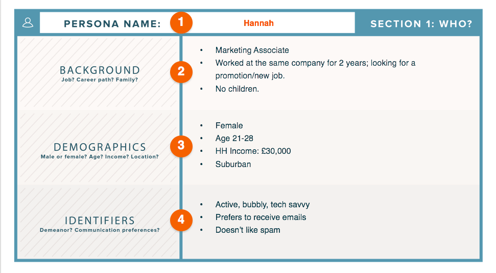
Buyer Personas #2: Darcy


Customer Journey #2: Order Tracking


Darcy has scrolled down Missguided’s homepage to display the footer. She has then selected ‘Where’s My Order?’ to start the tracking process.

To complete the tracking process, Darcy needs to enter her Order Number, Post Code and click ‘Go’ (Figure 4.6).
Customer Journey Analysis #2
What worked well:
- Layout of site is simple.
- Footer is clearly labelled.
- Use of colouring and font is aesthetically pleasing.
- Footer features links to social media platforms.
- ‘Track My Order‘ page is user friendly, includes box graphic.
- Text adopts a friendly/informal approach.
- Details needed to track order are clearly displayed and labelled.
Critiques: N/A
Word Count: 598
Created By: Rochelle Garcia-Rodriguez ~ Bsc (Hons) International Business student.
References
Aldridge, S. (2018). Missguided Analysis. [online] Sophieaaldridge.blogspot.com. Available at: http://sophieaaldridge.blogspot.com/ [Accessed 29 Nov. 2018].
ASOS. (2018). About Us | ASOS. [online] Available at: https://www.asos.com/about/who-we-are/?ctaref=aboutus|whoweare [Accessed 29 Nov. 2018].
Ding, A., Li, S. and Chatterjee, P. (2015). Learning User Real-Time Intent for Optimal Dynamic Web Page Transformation. Information Systems Research, 26(2), pp.339-359.
Erika Hanson. (2017). Fashion Market Levels. [online] Available at: https://itserikalouiseannehanson.wordpress.com/2017/11/26/fashion-market-levels/ [Accessed 29 Nov. 2018].
Forbes.com. (2018). 12 Ways To Improve A Customer’s User Experience. [online] Available at: https://www.forbes.com/sites/forbestechcouncil/2018/07/24/12-ways-to-improve-a-customers-user-experience/#5245ddf71fc7 [Accessed 5 Dec. 2018].
Hernandez, A. and Resnick, M. L. (2013) ‘Placement of Call to Action Buttons for Higher Website Conversion and Acquisition: An Eye Tracking Study’, Proceedings of the Human Factors and Ergonomics Society Annual Meeting, 57(1), pp. 1042–1046. doi: 10.1177/1541931213571232.
Missguided.co.uk. (2018). Women’s Clothes | Fashion Shopping Online – Missguided. [online] Available at: https://www.missguided.co.uk/ [Accessed 2 Dec. 2018].
Owler. (2018). Missguided Competitors, Revenue and Employees – Owler Company Profile. [online] Available at: https://www.owler.com/company/missguidedau#competitors [Accessed 29 Nov. 2018].
Solutions, A. (2018). Customer Touch Points: 4 Simple Steps for Improving Experiences. [online] Astute Solutions. Available at: https://www.astutesolutions.com/blog/articles/customer-touch-points-4-simple-steps-for-improving-experiences [Accessed 5 Dec. 2018].
Topshop.com. (2018). Topshop – Women’s Clothing | Women’s Fashion & Trends. [online] Available at: http://www.topshop.com/?geoip=home [Accessed 29 Nov. 2018].
Wood, Z. (2018). Young, quick and very hip: Missguided and PrettyLittleThing hit the big time. [online] the Guardian. Available at: https://www.theguardian.com/business/2016/dec/17/missguided-pretty-little-thing-hit-big-time-fast-fashion-generation-z [Accessed 29 Nov. 2018].
Wots The Big Idea. (2018). How to identify customer touchpoints | Wots the Big Idea blog. [online] Available at: https://wotsthebigidea.com/identify-customer-touchpoints/ [Accessed 2 Dec. 2018].
Bibliography
Digital Marketing Institute. (2018). The Beginner’s Guide to Defining Buyer Personas. [online] Available at: https://digitalmarketinginstitute.com/en-gb/blog/2017-4-27-the-beginners-guide-to-defining-buyer-personas [Accessed 30 Nov. 2018].
Investopedia. (2018). Target Market. [online] Investopedia. Available at: https://www.investopedia.com/terms/t/target-market.asp [Accessed 29 Nov. 2018].
SurveyMonkey. (2017). Identifying Your Customer Touchpoints | SurveyMonkey. [online] Available at: https://www.surveymonkey.com/mp/identify-customer-touchpoints/ [Accessed 2 Dec. 2018].
SurveyMonkey. (2018). The best way to map the customer journey: take a walk in their shoes | SurveyMonkey. [online] Available at: https://www.surveymonkey.com/curiosity/map-customer-journey-keep-customers-happy/ [Accessed 2 Dec. 2018].
tutor2u. (2018). Market Segmentation | tutor2u Business. [online] Available at: https://www.tutor2u.net/business/reference/market-segmentation [Accessed 29 Nov. 2018].
Tarte: A Critical Email Analysis
Chosen Email:

Critical Evaluation
Would you ever open the email? – Yes
When/why? – I would open the email when I was completely available. This is because the email is for marketing purposes only.If the email had involved information regarding my recent purchase then I would open the email on the go. I would open the email because although it is marketing based, it contains some benefit to myself the reader, this is the incentive to get a free birthday gift.
Is there any personalisation? – No but the email is advancing onto this. i.e in order to create a personalised experience with free birthday gifts, the consumer needs to submit this information.
Template/design? – The design is simple with large user friendly text. This makes for a great viewing experience. The colours used are feminine, pastel and attractive to my demographic. Below the main email content, the email tactically includes headlines such as ‘new arrivals’ and ‘best sellers’ – a great way to further market their product portfolio. There is also a feature at the bottom of the email to unsubscribe from the reading list if you so choose.
Call to action? – The call to action is a ‘BLOW OUT THE CANDLES >>>’ banner presented above the birthday cake prompting the user to click.
Use of images? – The use of imagery is attractive and makes the email interesting. The colourful birthday cakes features moving flames on the candles to enhance user experience
Critique
What is good, what works well? – The use of colours and imagery are perfect for my demographic. I would consider my demographic to be female, 18-24, girly girl. The candles with the moving flame graphic are a great addition to the email, making the email attractive and interesting. The email also contains an informal text tone which aids in building a rapport with the consumer, as well as creating a friendly and approachable ‘vibe’.
What is less good, how does this compare with guidelines from lecture 3, and your reading? – The email could have considered personalisation. This could have been done via the subject header or even the first line of the email. For example the current subject line is “Tell us your birthday for a sweet treat…” when it could be changed to “Rochelle, tell us your birthday for a sweet treat…”
What could be improved? – More value could be delivered in the email, for example tips and tricks about makeup, or even perhaps information about the special birthday gifts on offer.
Landing Page:

Landing Page Link? – https://tartecosmetics.com/EU/en_GB/welcome-email-birthday-form.html?contact_eid=1a839f96-1c16-4854-ac3e-0bc1e766167e&utm_campaign=trigger%20postpurchase%20em0%20bday&utm_medium=email&_bta_tid=19950337905476402930932196245391620133267729894690781176629049684548615018530394084184417035182864195645&bxid=1a839f96-1c16-4854-ac3e-0bc1e766167e&utm_content=trigger&utm_source=bronto
What does it offer? – It would appear that the ‘call to action’ link is faulty. When the link is clicked, the site has no main text body and only the header and footer are presented.
What does it do? – As of present not what it had intented. However you can still surf through the site due to the remaining header and footer.
Calls to action? – As there is no main text body the main call to action would be the banner present above the header. This banner adertivises the ‘cyber monday’ sale with the discount code. The call to action therefore is to utilise the promo code and make a purchase.
Personalisation? – None present.
Critique? – The company need to review email attached links, this link however could have ‘expired’? If so the company need to look into avoiding this problem, as essentially once the link is broken, the email marketing content is useless and remains a waste of resources. However, contradictingly you could argue that this email would still ‘market’ the company through the use of branding, imagery and appereanc ein your mailbox. The reader could then go on to google ‘Tarte birthday’ to see if the link would appear, but generally consumers are lazy and so the leads you would loose due to this link area would be considered substantial.
How could it be better? – The link should be fully functioning, main body should be present, as should personalisation.
Academic Finding – (based on the work of: Hernandes and Resnick, 2013)
It could be argued that the original email features an ‘Inverted Pyramid Pattern’. This is because “the top of the page is designed to present the greatest quantity [of text] with an expectation for the longest gaze duration” (Hernandes and Resnick, 2013). This is made apparent in Tarte’s email, as ‘Birthday cake anyone?’ is the largest size and source of text at the top of the email, before the text funnels down.The email is designed to ensure that the user gazes at the top of the email and slowly browses down, as represented in the diagram below.

(Image sourced from Hernandes and Resnick, 2013)
References
Hernandez, A. and Resnick, M.L., 2013, September. Placement of call to action buttons for higher website conversion and acquisition: An eye tracking study. In Proceedings of the Human Factors and Ergonomics Society Annual Meeting (Vol. 57, No. 1, pp. 1042-1046). Sage CA: Los Angeles, CA: SAGE Publications.
Created by Rochelle Garcia-Rodriguez, a Bsc (Hons) International Business student.
Virgin Active: Online Persona

Created by Rochelle Garcia-Rodriguez, a Bsc (Hons) International Business student.
Critical Analysis – Virgin Active Website.
- Role Of The Website
Transactional: Landing page has clear ‘Join Us’ button – to allow for swift process to payment.
Service oriented / relationship building: Landing page has clear ‘Get In Touch’ button – to allow for communication with the company. ‘Our difference’ tab and Blog provides more conversational approach to sharing information.
Brand building: Landing page promotes wellness, motivation, passion through the uses of imagery and text. ‘Our difference’ tab allows for insight into company – building brand image.
- Important customer segments
Geographics – offline (gym) and online website
Demographics – 18-55, male and female, families, working/ middle/upper class – prices begin from £100 a month.
Behaviour – usage patterns – want to gym 3-5 days a week – flexibility – classes – personal training – individual sessions – swimming – sports – spa
Psychographics– full time work – healthy – need time to relax – busy – mum – family
Webographics – high web experience, UK, laptop, daily, health/fitness/weightloss/toning/spa, mobile/laptop, during lunch break, after 5pm.
- Key website persona
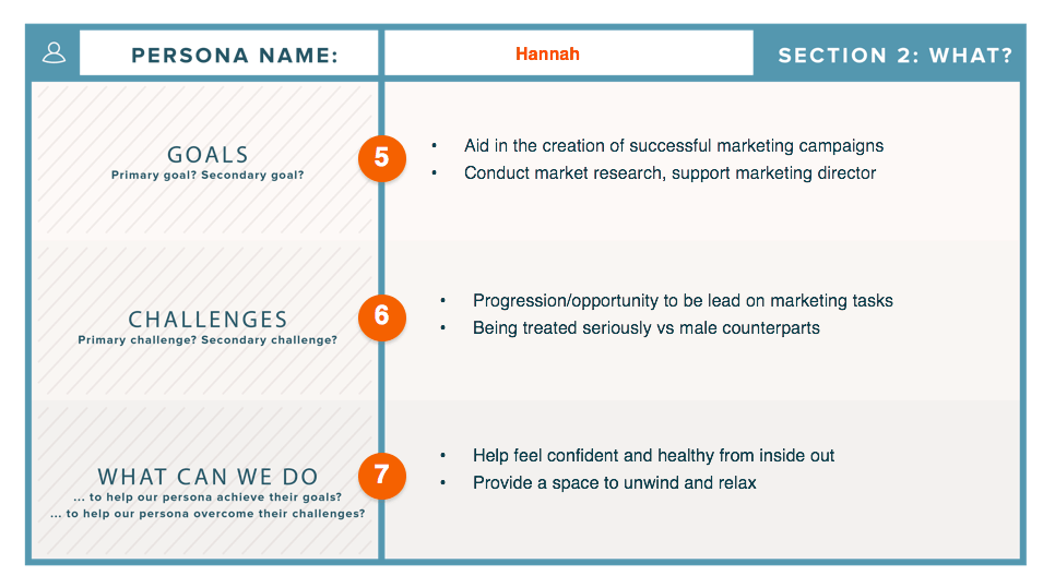
Persona name: Katy Hannah
What is their demographic information? 26, Female, Single, No Kids, Flat
Background: Enjoys movies, wines, festivals,
What is their job and level of seniority? Marketing Developer – Middle Class
What does a day in their life look like? Healthy breakfast, work from home on some days, midday meetings, gym class, food shopping, healthy dinner, netflix.
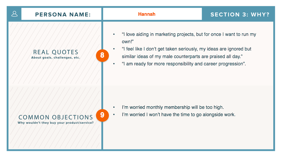
What are their pain points? What do you help them solve? Feel inadequate, not comfortable with body, looking for flexible fitness, wants personal involvement with others i.e classes
What do they value most? What are their goals? Friendship, films, ambition. Wants to run own personal marketing company, wants to slim down dress sizes, wants to find a family and settle down.
Where do they go for information? Cosmopolitan, BBC news, The economist, Daily Mail, Social Media – Mix of authoritative and friendly resources.
What are their most common objections to your product/service? Expensive, not many locations, membership cannot transfer from location to location.
Keyword research – skincare, spa, weightloss, exercise, diet, healthy, quick, shred, 90 day fitness plan,
How we help: flexibile gym membership, varying on time, day, variety of class conducted and equipments.
Marketing message: Here for you when others are not – reliable friend – escape the day – relax in the spa
- Critical analysis of Virgin Active website : https://www.virginactive.co.uk. Links to the resources used:
On approach the landing page is a vibrant red (eye catching) with an implicit call to action -“Find your workout – join us – get in touch”. For the technologically savvy this website is easy to use, but for those older it could be argued that the layout is not simple but rather overwhelming. Before seeing any real content you are asked for action – which is something you may not want to do if you are a new user and unfamiliar with the site function.
Humour – “we use cookies, not the chocolate chip kind”. Humour is useful to create a more friendly conversational vibe, key in relationship building.
Site Layout – As you scroll down the site more information appears. This is easy to use for the tech savvy, but for those not computer literate could be overwhelming. It creates a crowded, busy, feel not beneficial for a site wishing to relax.
Shortcuts are available at the bottom of the screen for easy user reference. Grey font on a dark background allows for a reprieve from the red and easier accessibility. Business partners are also linked at the bottom via the use of their logos to provide for a marketing stream.
“GET OUR LATEST FITNESS TIPS & NEWS” The website provides direct links to the company’s Facebook, Twitter and Youtube account. This allows for quick and easy access to social media platforms and valuable for customer engagement and brand image.
Headers at the top of the page when hovered, provide images for customer engagement and ease of use. This makes the site more interesting and provides a ‘quick look’ into the sites contents.
Consistent colour theme, fonts and text throughout the site.
Site contains sign up/sign in option for personalized service. This is a great way to attract and retain customers as well as recieve invaluable marketing information.
Blog option allows for further interaction and content between the consumer and user.
Overall the site is considered to be modern with a fresh, updated look. It is quick and easy to use with graphics and visuals to make the experience more engaging. This technique whilst seeming effective could be considered cluttered by non tech savvy users and as result could potentially be isolating a market/consumer type.
Written by Rochelle Garcia-Rodriguez – Bsc (Hons) International Business student.
Workshop One: IKEA Case Study
- What can you learn about the application of data to marketing?
Data is crucial to the development of a marketing plan. Through the use of the data collected by Brandwatch, IKEA’s digital development team were able to adapt their marketing and outreach on social platforms to remedy areas in the business to which they were failing. Through the use of Brandwatch’s data capture software, IKEA was able to delve into the customer service experiences talked about online, seperating the negative from the positive. Interestingly, they were able to identify which social media platforms were most used dependendant on country and because of this were able to develop a more targeted strategy. For example, data collection found that US consumers were far more likely to air concerns on Facebook, wheras UK consumers would utilise public forums instead. It was through this customer orientated data that IKEA were able to implement plans to boost their brand image and which topics to focus on to increase their reputation.
- What can you find out about Brandwatch?
Brandwatch is a “social media listening and analytics technology platforms.” They liaise with companies looking to help dissect their public image and look for areas of improvement. From Brandwatch’s data collection, marketing plans can be implemented.
- Are there other comparable services?
Yes. Mention, Brand24, Radarly, Sysomos.
- What other companies could benefit from the work of Brandwatch?
‘Social media listening’ companies could be utilised by public services e.g government, teachers, schools to gauge public perception. Although they might not have the budget to hire such a company, proffesionals using such a service would be a new and innovative shift in how activities are peformed, epseically with the encorporation of data colleciton to put consumer experience at the forefront of business experience.
- Case Summary:
This case study delves into the partnership between IKEA’s digital development team, The Socializers and Brandwatch. It identifies how IKEA initially reached out to The Socializers before liasing with Brandwatch for their social media listening and analytics tools
- Bibliography:
- Ikea.com. (2018). IKEA – Shop for Furniture, Lighting, Home Accessories & More. [online] Available at: https://www.ikea.com/gb/en/ [Accessed 8 Oct. 2018].
- Brandwatch. (2018). Brandwatch: World-leading social listening. [online] Available at: https://www.brandwatch.com/blog/tag/ikea/ [Accessed 8 Oct. 2018].
- Thesocializers.com. (2018). The Socializers | Buzz Brand Build Boost. [online] Available at: http://thesocializers.com/ [Accessed 8 Oct. 2018].
You can find out more about how IKEA was introduced to Brandwatch here.
Written by Rochelle Garcia-Rodriguez – Bsc (Hons) International Business student.