Portfolio navigation

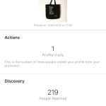
As I am printing my portfolio on A3 300gsm paper and placing into a box I have decided that I need to somehow signify how the user needs to navigate through it. As there is no bind, I think an arrow on the front page will help to ensure they know how to open it.


Initially, I tried a straight arrow pointing to the left like this:


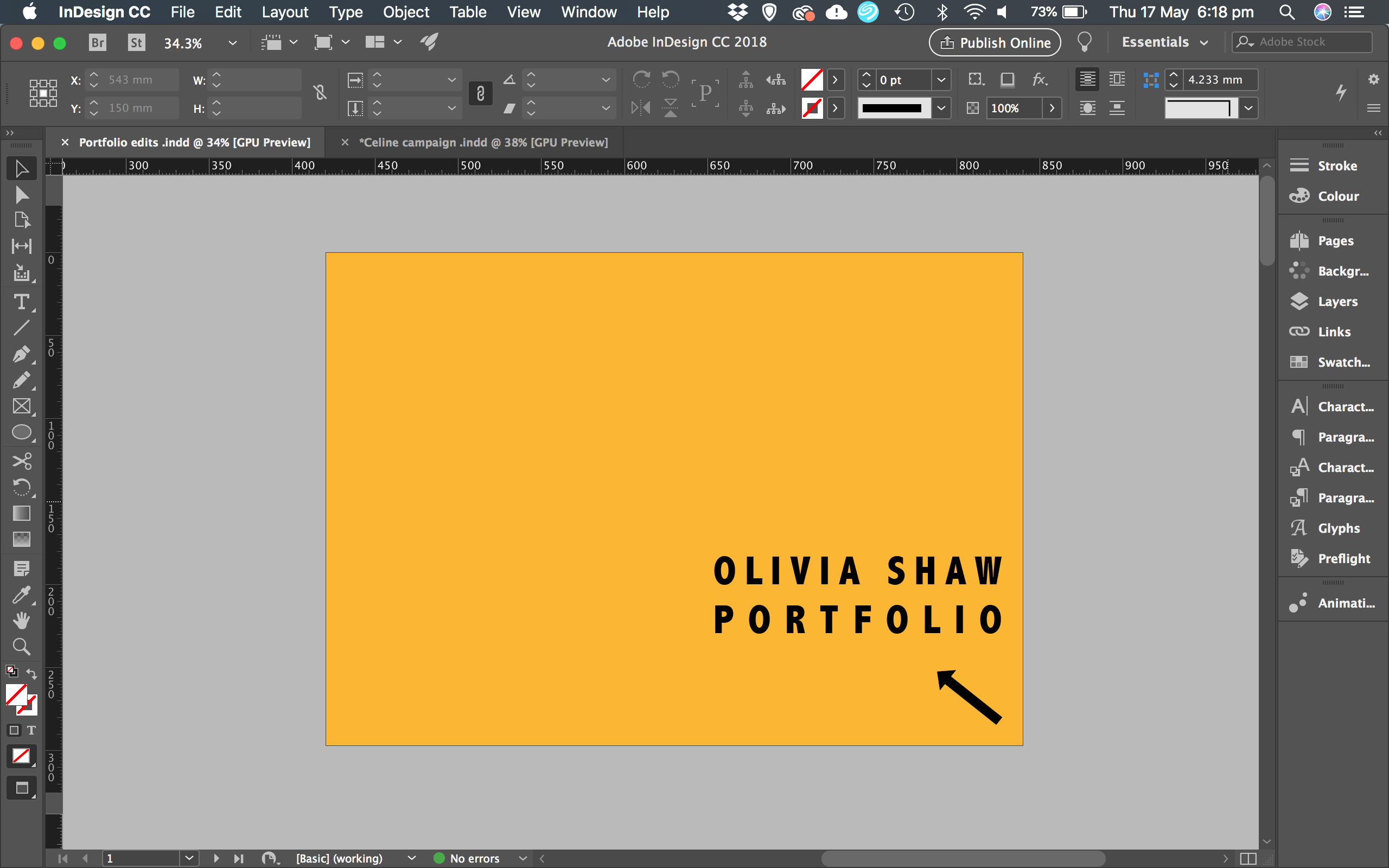
But then I realised this could look like a logo and so I’ve decided to make is diagonal and face towards the left top-hand corner as this is a universal sign that I hope will signify that pages need to be opened from right to left! I’ve also shortened in so that my title doesn’t have to sit any further up the page.

Final design:
 

Ad boosting test results

This was the original posts interactions/reach/data results

Vs the adverts interactions/reach/data results

The results show:

  • The promotion reached over double the original the post 99 vs 219.
  • They both only resulted in 1 profile visit
  • The promotion increased the amount of male followers. Usually this figure is around 20% whereas with the promotion it increased to 36%
  • The engagement was 7 for the promotion which is good considering my following is only at 150.

Overall I spent £1 and therefore this was a worth it investment.


I am going to run a longer one for 7 days to see if the difference is worth it or whether it is more effective to boost a post for the day/day after it is posted.