Chapter 5: London Transport
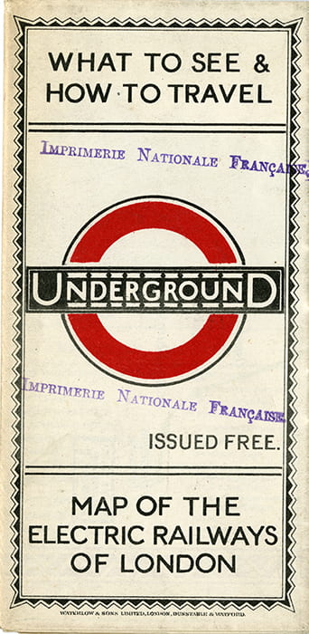
Front of the “Map of the Electric Railways in London” (1924).
London’s underground railway system began as a fragmented collection of rival independent companies. In 1902 they were united under the banner of Underground Electric Railways of London Ltd, which later evolved into London Transport. By 1908 it was known simply as ‘The Underground’ and a year later, Frank Pick became the Underground’s Traffic Development Officer. He was a visionary who at once set about transforming the system’s public image. His aim was to create a branding that was distinctively different and based on the best principles of design at every level. Pick excelled in the task and was soon promoted to the post of Commercial Manager. His stated task was ‘the establishment of goodwill and good understanding between the passengers and the Companies’.
He began with graphic design, commissioning a series of striking posters. Some were informative, while others were intended for decoration or amusement. Max Gill’s ‘Wonderground’ map of 1914 was not meant to be a guide to the system: its function was to keep passengers amused while waiting for the next train. It succeeded so well that the newspapers carried reports of people missing their train because they were too busy studying the map!
In 1913 Pick commissioned the calligrapher Edward Johnston to design a modern and easily readable typeface for underground signs and posters. He also redesigned the ‘bulls-eye’ logo into its present familiar form. When Johnston’s former pupil, Max Gill’s brother Eric, produced a modified version of the Underground type, it created a revolution in typography. Known as Gill Sans, it is used throughout this exhibition.
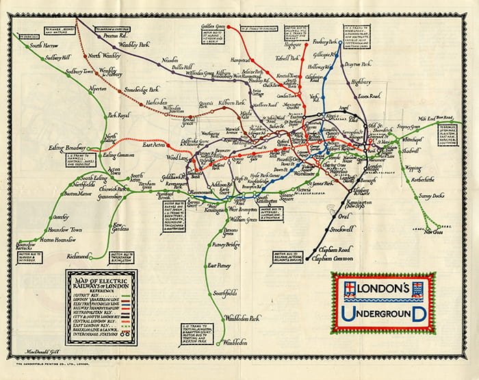
“Map of the Electric Railways in London” showing British Empire Exhibition Stations, 1924.
Charles Holden, the Thirties architect, was a later addition to the Pick ‘stable’ of iconic designers. The clean curves of his stations have become symbolic of Thirties architecture and complement Edward Johnston’s simple lettering. By contrast, Max Gill’s work presents a labyrinth of intriguing detail and introduces a lighter note, which Pick also saw as an important part of ‘humanising’ London’s transport system.

“Wonderground”, 1914 (detail). Poster map of London. Produced for London Underground Railway Company. London Transport Museum Collection.

![]() Sirpa Kutilainen • November 12, 2015
Sirpa Kutilainen • November 12, 2015