AGP479- April Break

In this break i have made my photoshoot and fashion film. This time I worked with 2 friends and I used my flat bedroom for the shoot.

I feel a bit regret that I didn’t prepare enough before the shoot, I have to do the shoot earlier than I want because one of them will leave the UK. Therefore I feel like there are a lot i can improve if I have time to prepare more about the props and styling. In order to prepare for this shoot, I also send to my models the board that consists of hairstyles and posing I want to achieve. I attached the link here https://drive.google.com/file/d/1j1inMTnjnmBt-2AUD-wm3EkqCGEObTr_/view

At the moment I do almost everything by myself so I only ask my models to do their own makeup and hair. In the future I hope to work with makeup artist and hair stylists so that my work will be better.

However the good things is I got all the scenes that I want and the lighting is very nice. I also filiming some scenes for the short film as well, it happenned quite quick but I’m happy to get all the scene that I want.

AGP479 week 6

This week I learn about content creation. I come up with some ideas with my classmate to make a short video to post on reels or tiktok. Even though i did some short reels before, i feel like it is very important to make something unique and choose the right music so that the video can be viral. The content of this video is about the transformation, I will add more items of clothe whenever the elevator open the door.

FinalVideo_1651944442.038038


APG479- week 4 and 5

This week I define the trends for the sub-brand. We have an exercise too describe and market for an object in class.

In week 5 we focused on Social Media Campaign. The exercise I got is to create a campaign for a male perfume. I have never research about male area therefore this is quite interesting. Finally I came up with a schedule for social media promote. I find out this need lots of work and cohesive in order to attract new customer as well as improve the reputation.

AGP479 Week 3

In this week, I have identified my parent brand is Margaret Howell. Her brand is focus on natural, relaxed look. Brand colour palettes are mostly earth-tone. Her prioritize is durable and functionally. Howell really care about the material and sustainable fashion. However, her brand mostly suit for people aged 28 and above.

Therefore I feel it is good to create a sub-brand that aim for a younger generation around 16-24. I research that she has lots of outlet in Japan, so the sub-brand will be focus on Asia market.

This week i learned about the art direction and I have a chance to make different ideas in 10 mins. This is such a good way to think of many ideas as possible, and also i can use some of them in my future project. Also I had a chance to go around and see other classmates ideas which I think it’s a good way to learn from each other and develop own ideas.

AGP479 Week 2

In this class, I learned about trend forecast and how to access to WGSN. WGSN is the world’s leading trend forecaster which provide global trend insights, expertly curated data and industry expertise to help our clients understand consumer behaviour and lifestyles, create products with confidence and trade at the right time. I can access it through university library. WGSN has a lot information about Future driver and Webinar. I will look through it more to to generate my own macro board

In class, i used some materials to create images for my trendboard. This is the oceanic board I did in class. I will need to add more of my own images into this board

On Friday, I learned about the manifesto and SWOT for my brand. In order to write a manifesto I need to find out the key words of my brands, the aim and what i want to tell to my customers.

We work in a group and create a sub-brand for Acne studio called Spot focused on younger generation. I forgot to take the picture of the manifesto we did in class, however we focus on the spirit of youth, break the norm and authentic.

AGP479 Week 1

After submitting the Zine, I was introduced to the new project which is visual promotion. For this module, I have to make 4 marco trend board and create a promotion campaign for a sub-brand.

At this stage I am not sure which brand I will choose. I just research around some brand that I like. Furthermore, it is unnecessary to create a sub clothing brand, i can make a sub-brand about well-being, furniture or accessories.

PROJECT RELFECTION

Overall I have learned lots of things through this project. This is the first time I works in different position such as photographer, art director and stylist and graphic designer. Also i learn to manage time in advance and  make detail plan before I have a photoshoot. I have hard time to organize my  ideas because the idea i based on is quite psyche theory. I am not major in psychology so I don’t think I should put lots of text about this into my Zine. I prefer to transfer my perspective into images or illustration. I most satisfied with attaching leaflet i put inside the Zine as I want my reader to have interaction with it.

This is my first time working with Indesign, which took me lots of time to practice first but gradually i know all the basic enough to make my Zine. I also research about the layout, how the text and image affect the meaning I want to transfer. In this Zine, I try to use different fonts to represent various people because my interview was anonymous. Also this somehow make the reader feel the sympathy because it doesn’t point out any specific name.

If i can do that again, i would like the include article about how audience expect the celebrities to be and their real life.  I also want to have a video or interview. Because I did 3 photoshoots which took me much times to edit. I want to do more gatefold (open pages) in my zine or include different types of paper such as print on brown paper or transparent paper.

The result I receive is not bad, i found it interesting and difficult at the same time to manage all the content and the the edit for the Zine. I really enjoy this project and I hope I am able to make my own Zine in the future.


Movie Research- Editing

I would like to include some movies related to my theme. I have researched and watched some of them.

For the first chapter Persona, I chose the movie Blackswan 2010 and Persona 1996. The movie Blackswan is a good example of a person suffer from the inflation of their social mask, the main actress totally lost herself and cannot figure out what is real what is fake.  I haven’t watched the PERSONA 1996 but i read the review about it and it totally fit with my theme.

The second chapter I choose Joker 2019 and Dark City 1998. Joker, this man is put in the situation where he has to deny, forcefully suppress his own Shadow. It is denying as well as holding onto this , becoming the Joker is a great liberation for him. Dark City is more like science fiction but it is also talk about how people change and what affect them.

The third Anima/animus. I put 500 days of summer and Eternal sunshine of the spotless mind . These two movie all talked about a man refuse their anima and imagine another perfect match but they didn’t take care of that girl well

The last chapter is The Self. I choose How to become myself 2007 this is a Japanses movie talking about accepting yourself. Also Brave is also a good example for this.

I editing most of my work in Photoshop and Indesign. For illustration I made in Procreate. I also Download free font and use it in Procreate then transfer to Indesign.


Zine research- Reflection

I have looked at the layout of different zine and magazine to learn how they set up and organise text and image. In this Brick Magazine, i can see they are very mimimal in layout with black or white text. But I think it very effective especially with short paragraph. This is what I can apply for my Zine

However, I love colour so I definitely use various typography and colour in the text as well as the background.

Brick Magazine

https://www.dazeddigital.com/music/article/31467/1/brick-magazine-will-have-you-re-think-hip-hop-culture-asap-ferg-vince-staples


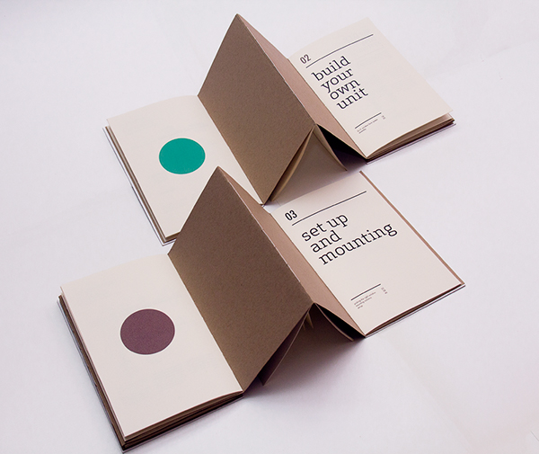
Another example I am looking at is Jiani Lu for the combine of my Zine. I can see that she made this booklet handmade and it consists of folding paper and leaflet. I really want to include those in my Zine as I want my reader interact with it. Therefore, this is a good example for me to learn.window farms information design infographics book print Urban Agriculture urban farming binding saddle sewn Hand Bound Graphs illustrations vectors icons

However, there is no print company can do it for me, they just able to make them seperately. Therefore , I choose to print the folding paper/ leaflet seperate then I will attach it inside my Zine. I want to have a page with WHO AM I in reverse and I will have mirror paper for reader to read it. However, the place I bought the paper is not exactly what i need, so I still just leave it there and maybe my reader can read it with their phone. That is one of my biggest regret.

I feel like the process of printing is more exhausted for me. I want to use different type of paper depends on the page, but i don’t know how to do that. I just adding different type of leaflet inside. One more lesson that I learned before printing is check the work several times to make sure every page is good.