
Developing ideas for a new layout system instead of magazine..
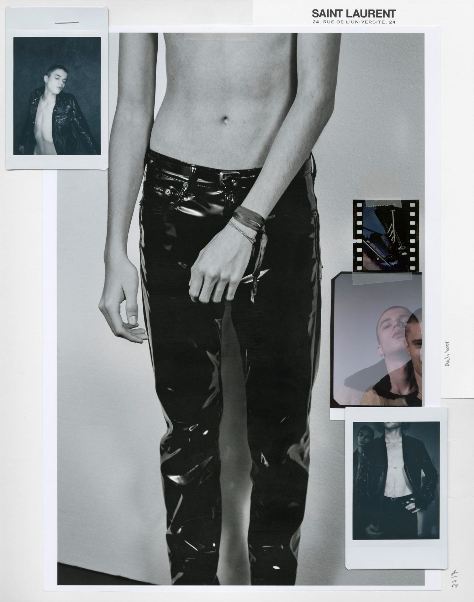
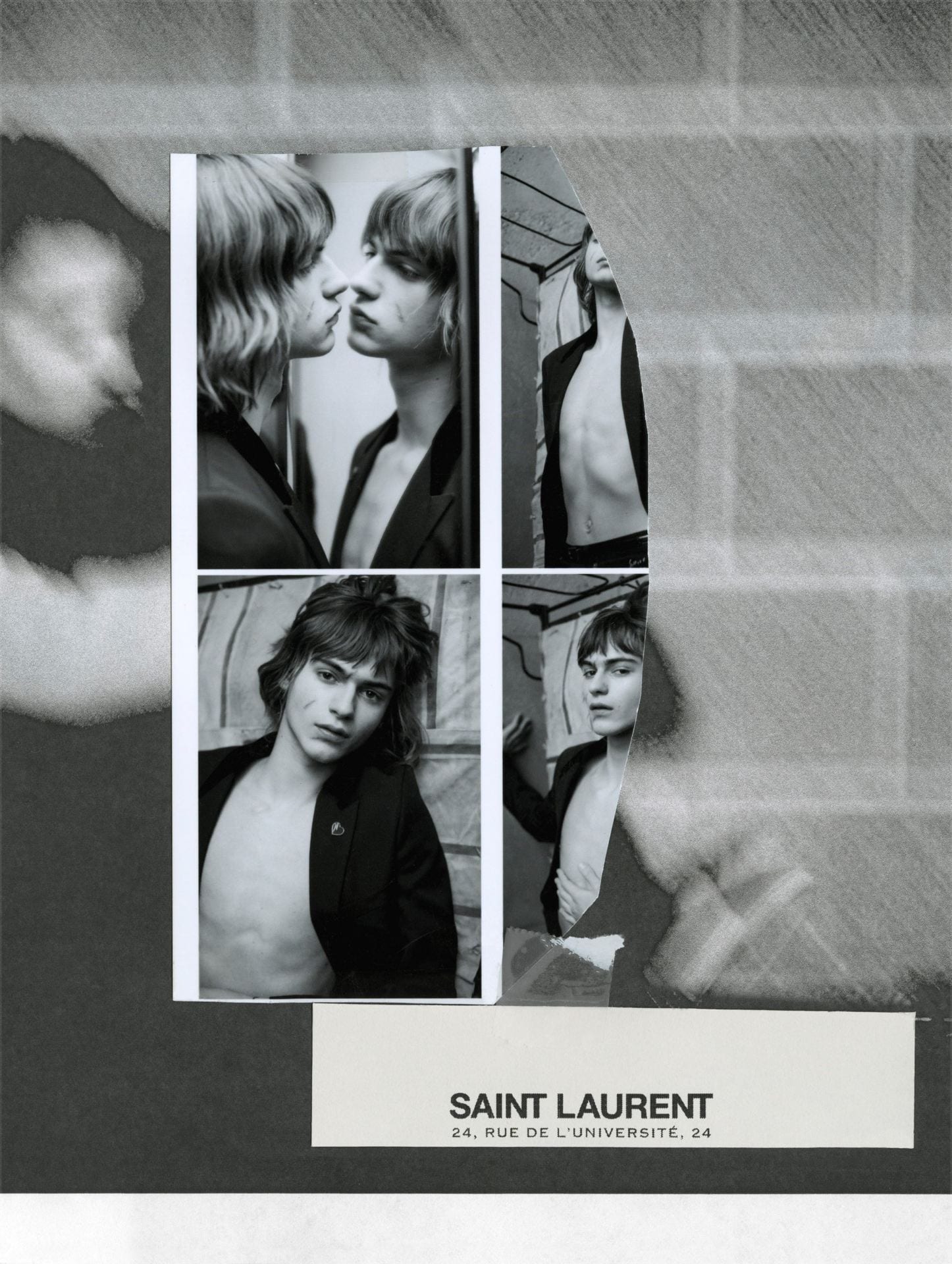

Whilst i am studying Helmut Lang’s design image, it has also become very evident of the brand’s promotional and imaging techniques, which i am very fond of. I really feel that the way the designs or adverts for the brand are a lot more personal to my own style and i think using this influence could be a much more unique way of presenting my work for FMP over a magazine. After discussing this in my tutorial, i have decided its best to research into various layouts that could be effective in portraying my work through the idea of an old archive. I came across this YSL lookbook layout which coincidently had pages laid out in this sketchbook format that i also want to incorporate within my own work. The lookbook uses various mediums of materials such as scanned images, originals, polaroids and films – all tied together to form this archive look of YSL’s season. Definitely shooting on film for the rest of this project or making digital pictures seem old or grainy through post production will be most beneficial to me in recreating an old archive folder. I also need to remember to use this mix range of materials including maybe typewriter text that would create a solid, statement heading for each shoot (or theoretically, each season or advert). Getting hold of a vintage polaroid or something similar could also be really fun and help me adapt to more of a playful sketchbook format.