RIOT OF PERFUME EDITORIAL

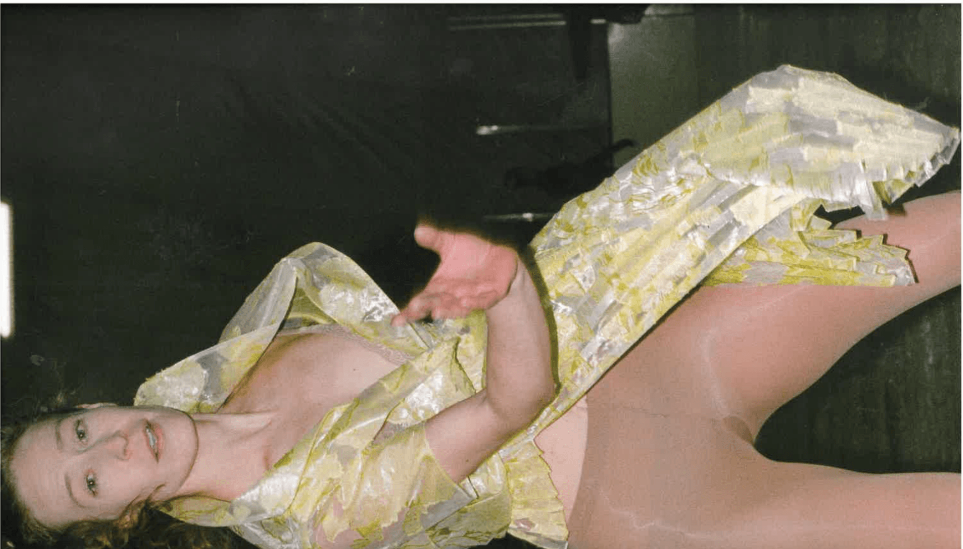
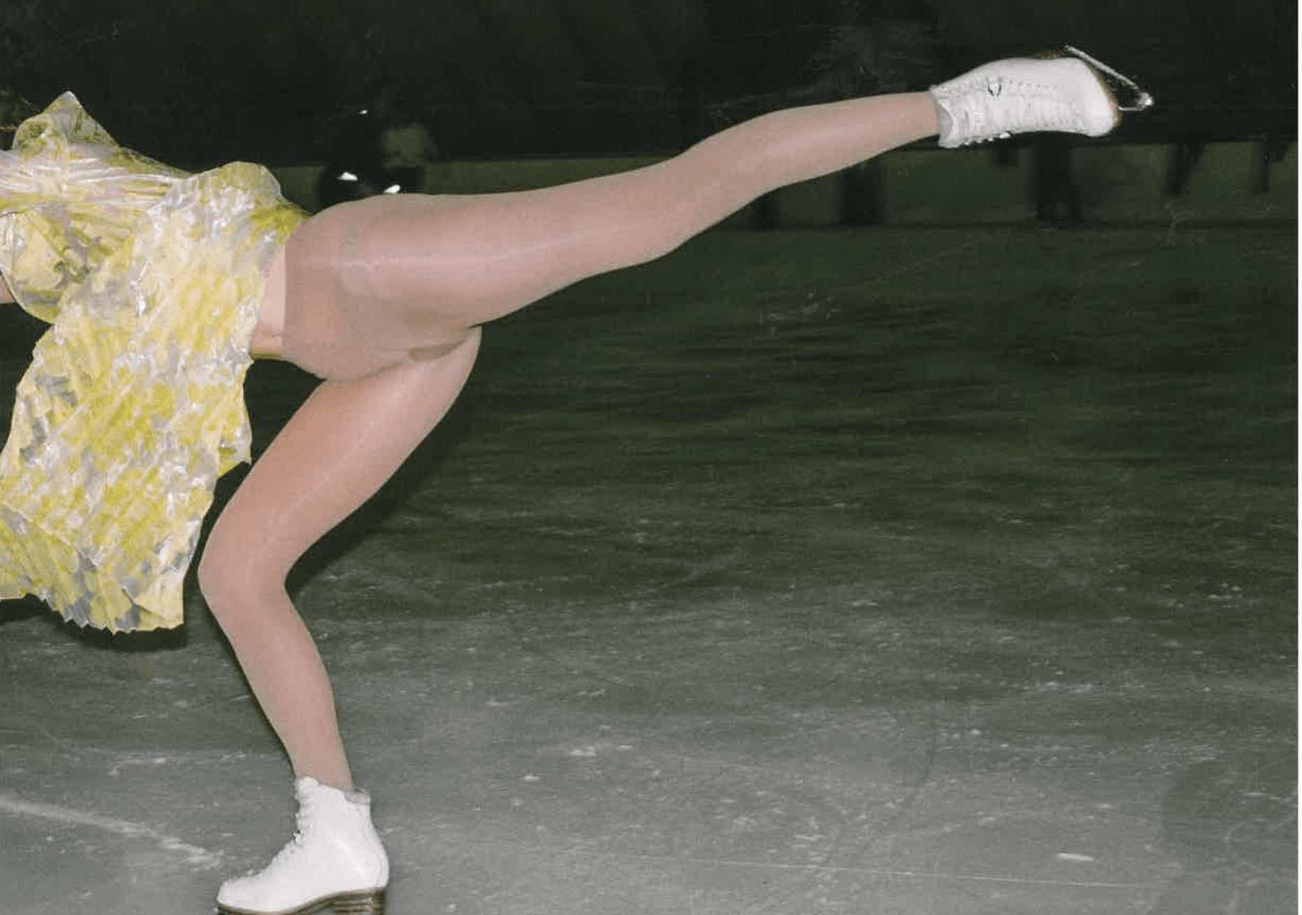
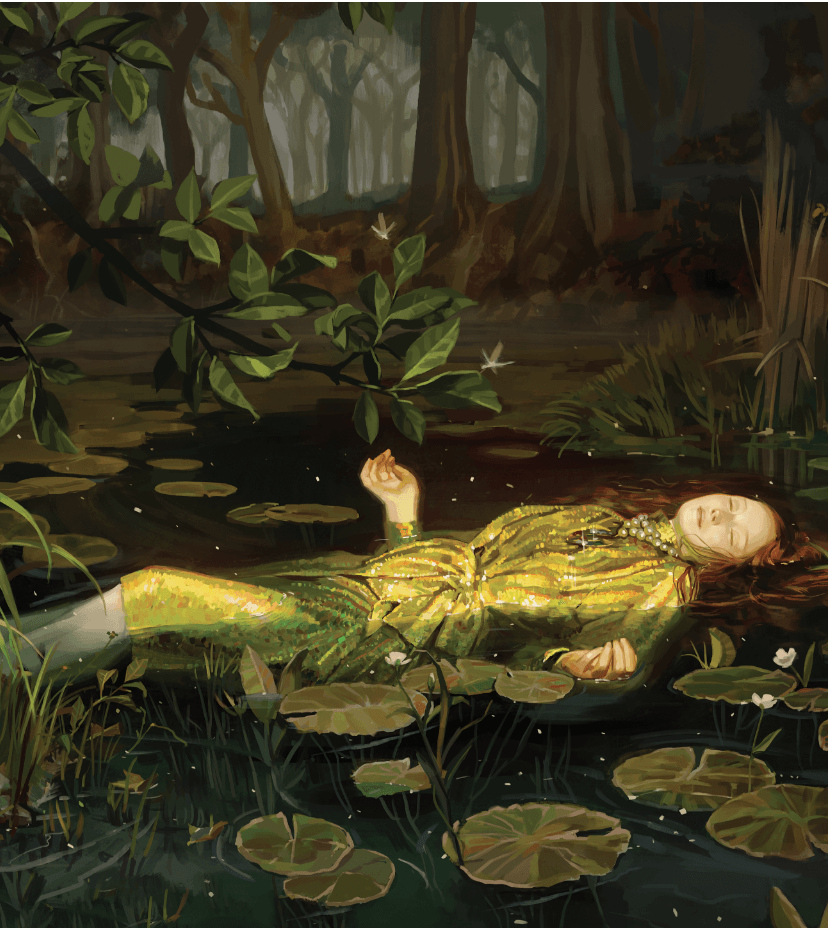
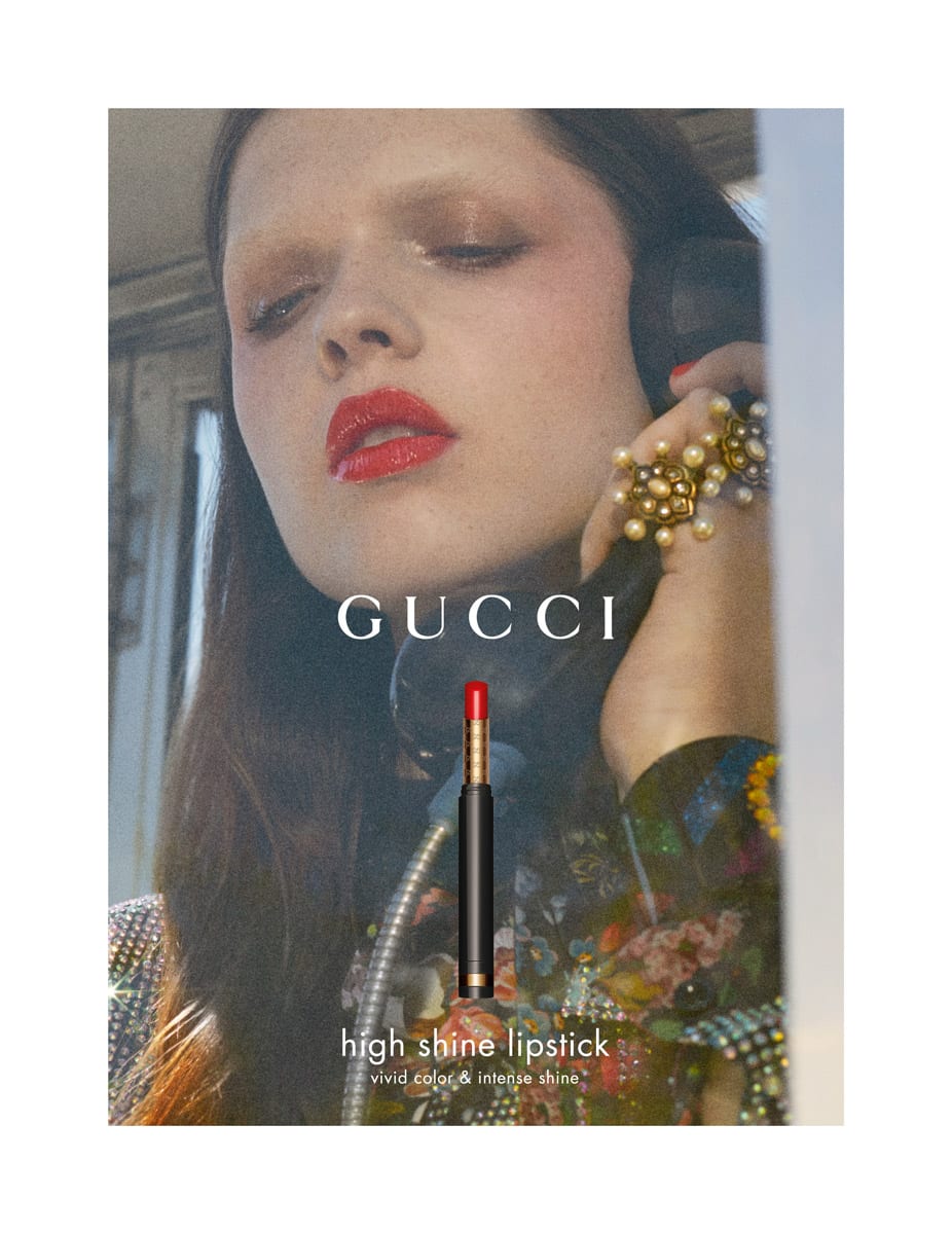
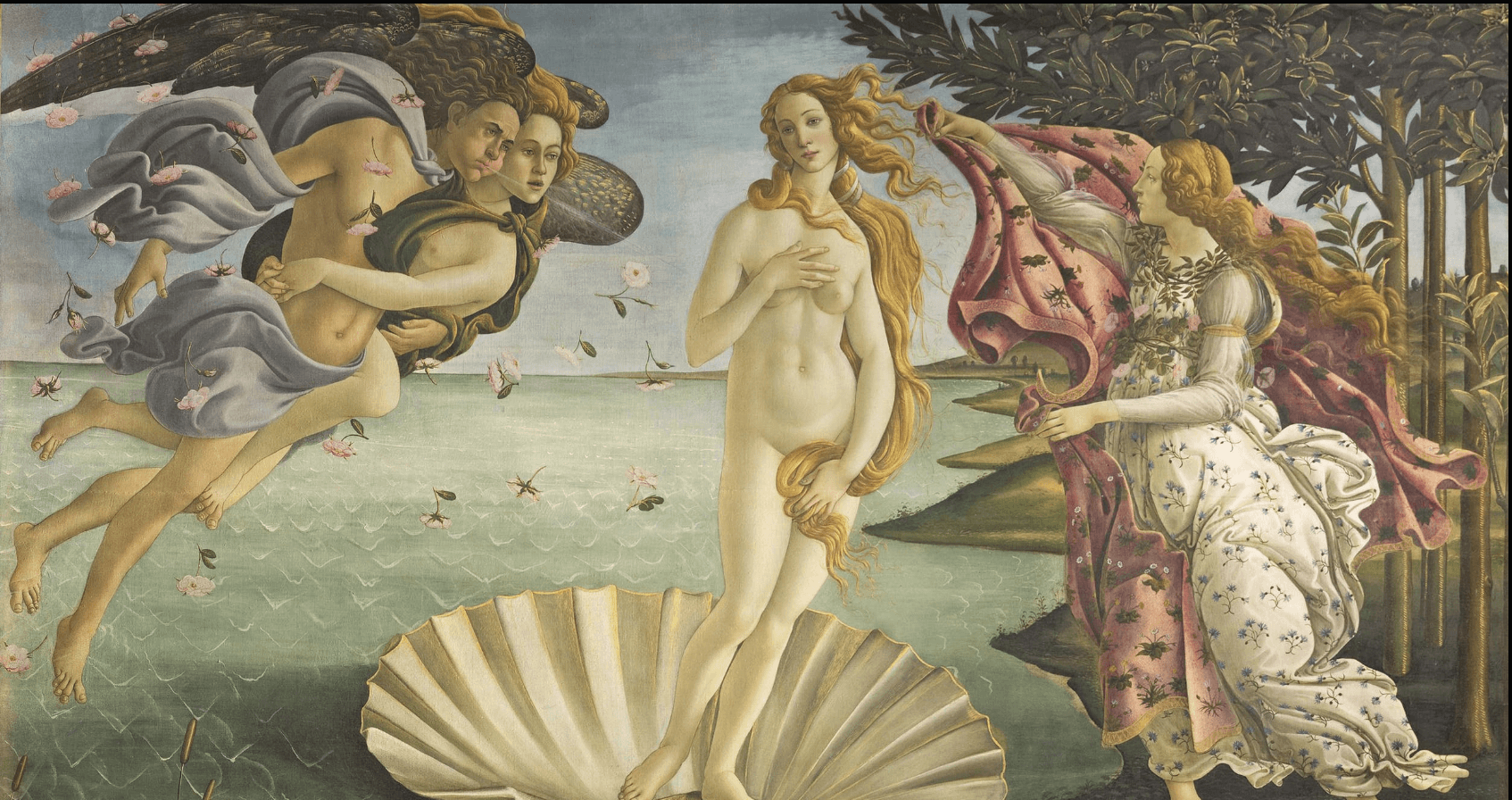
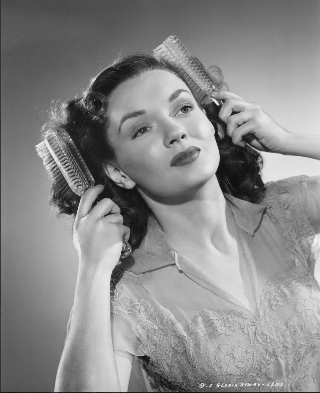
I then came across this editorial when revisiting the magazine “Riot of Perfume” which gave me my initial validation towards my entire theme. I have used this mag as a constant helpful balance between current trends and blending them with the past. This editorial focuses around using an 80s feel to the styling by depicting a sort of ice rink disco. The whole concept seems very unconventional and has completely changed my view for the beauty ad into leading from the 1960’s to the 1980s which i now feel is a lot more similar to my typical styling and techniques and is an era that i can effectively filter through the unconventions in fashion. Im interested in how the posing is used here to seem very casual and makes the viewer feel as if we are actually there in the shoot. Maybe i could use the model in positions of similar poses like a dance / exercise routine. Lacing of the tights is additionally an effective attribute to the photography and something i will take inspo from. It can be a subtle way in replicating the patterned blanket in the renaissance painting  along with other patterns used across the garments that will both fulfil the idea of the 80s and the material of the blanket.


HARPERS BAZAAR 2014

The initial attraction for me towards this image was based around the location and in particular, the middle image showcasing the chester field sofa. I feel that the clothing is really exaggerated in boldness and vibrance with the clever use of pastel and patterned backgrounds. I am also interested in the oversized shiny shirt that is matched with elongated block pink trouser which gives off an 80s vibe too. The colour balances used in the styling is another way to highlight the garments against the background which is something i need to take away for my choice of accessories to really market them correctly.


HANNA YATSKO – for Chagal


After discovering that Gucci was going to be the brand that i wanted my beauty shoot to mostly portray the aesthetics of, i wanted to look into clothing used in editorials that could be seen as similar to Gucci. I wanted clothing that maintains a luxury style whilst also involving elements of a past era trend such as the 1960’s/70s. I knew that these two eras expose a lot of pattern within their typical styles which could be my link to the blanket within the Birth of Venus and also the block colour palette that is also seen within the painting. This editorial highlights a fashionable vintage feel and the location works perfect against the clothing too. It almost reminds me of a typical ‘nans house’ which actually reinforces these motives of Gucci and its traditional perspectives! Im interested in how their are various block colours within the outfits which each completely clash with the patterns used on the dresses, hats or even the carpet. This causes the images to seem really loud and fun which is an effective marketing technique to sell beauty / accessory items. However, an element i would fault about this editorial is the concept of the outfits might eventually get lost within the multiple locations / clashes of colour and pattern and become a bit “samey”. I could adapt on this though, by involving my sense of unconventional fashion and making such typical outfits of this vintage era to seem maybe more futuristic?


GUCCI – UTOPIAN FANTASY

This campaign is relevant to my entire theme. Gucci have recreated certain paintings by having the models pose in the exact same way and then instead of photographed, painted. The painting idea really helps to reinforce the periods of which they were originally made in. Maybe the sense of specific posing could be a useful technique in portraying my chosen painting and initiate a renaissance theme whilst filtering through other various elements i want to achieve such as “unconventionalism” and a specific past era fashion trend. The paintings are obviously adapted to be modernised with the gucci clothing which also relates to my theme – so from this, Gucci will probably be the main brand i will revolve the beauty ad around.


GUCCI HIGH SHINE LIPSTICK

I thought this ad was effective in portraying a certain retro theme for Gucci and links back to my vintage ad research. Not only the make up looks vintage / old but the golden effect or editing reinforces this era because of the lighting used. I think the composition could be useful to take inspiration from because it could link to the still life portraits i initially looked into and i could additionally filter through symbolic items such as shells or pearls again to relate to the Birth of Venus’ aesthetics along with the beauty or accessory products. The pictures are so simple composition wise but so pleasing visually because of this golden hour effect which also allows the images to feel a lot more luxurious.    

BIRTH OF VENUS – SANDRO BOTTICELLI

Birth of Venus is obviously a very popular and well known painting which is a reason why i wanted to start to try and develop onto both the hidden concept and aesthetics. The idea behind the painting is based around how Venus was born as the goddess of beauty and love which completely fulfils the reasonings behind the colour scheme and the soft palette used; its meant to be romanticised. Her father was overthrown to sea which caused the water to become fertilised and then she was born, which is why she is seen on half a shell. I really want to play on the idea of beauty (an advantage also as it is meant to be a beauty shoot) because to fit into my modern style for the painting, i could stylise / direct the shoot to be very unconventional and use these values to help me practice breaking down the fashion norms! Im also interested in the use of this blanket being thrown over the nude body which to me is a massive highlight within the painting and my eyes are immediately drawn to it. I feel that the use of pattern like what is shown on this blanket can help me link my styling and overall ideas to a more retro theme like Gucci does too.

GUCCI ACCESSORY CAMPAIGN

I thought this accessory campaign was an effective and interesting idea to promote the accessories specifically. Gucci has placed the items in unusual scenarios which enable the eye to fall upon them as we found ourselves noticing the location they are placed in first. They then become the main focus. Im also interested in how the brand has used their typical identity of portraying a certain era which in this case reflects the 80s. They are a perfect brand to look at for the theme of the renaissance and how i can bring in a make up or accessory branding. Gucci still uses a various range of outrageous patterns and shapes within their accessories to keep up a constant brand identity so this would be something i needed to reuse in my work. Looking into this idea of recreating a vintage / retro theme, i should research into some Gucci campaigns further so i can respond to the similarities between this and my work own!    

VINTAGE BEAUTY ADS

After looking at the various chanel ads that ranged from past years to current day, i thought to reflect the renaissance (as a vintage period) better in my work i should research into vintage beauty ads to see how things such as the posing or composition or colours varied. For my portfolio, i want to focus a lot of my shoots on the specific styling of the outfits however this doesn’t mean beauty / accessories aren’t a main focus of this too. I think to involve both of these ideas, i will need to style an entire outfit for the beauty shoot but focus a lot of the photography on either the accessories or make up – this way sticking to the guidelines but fulfilling the styling opportunities too.


What i have noticed from these 4 images is that the face is obviously used as a focus point of the composition with the actual beauty product on show too. Although this is an effective idea for marketing the product, it will be hard for me to filter this through as i want to keep my styling / branding choice high fashion which unfortunately i have little of accessory or beauty wise!


CHANEL NO 5

To start my research into the beauty / accessory ad, i thought it would be best to look into various high end brands that have been successful in marketing their beauty items. The first i thought of was Chanel’s no.5 perfume, one advert that i have seen for a very long time that is still progressing and developing into a more modern day as the years go on. For me, Chanel’s n0.5 marketing is very successful as not only myself but my friends and family all have the fragrance and you immediately know the perfume when you see it the adverts online or in magazines.