- Contrast – Contrast refers to opposites. Contrast creates impact and provides a focal point. For example the focus could be large vs. small, dark vs. light, thick vs. thin, rough vs. smooth or complimentary colour systems.

- Hierarchy – Visual hierarchy refers to the apparent order of information with respect to its importance. Hierarchy creates order, differentiates information and makes it easier to understand.

- Alignment – Alignment refers to the underlying structure of design. Aligning elements with one and other helps to create order and visual relationships. Alignment should always be used to organise graphic elements. There are two major types of alignment – edge and centre.

- Repetition – Repetition refers continuity. It simply means reusing the same or similar elements throughout your design.
- Balance – Balance refers to the visual weight of the page. This is reflected by two formal structures – symmetrical and asymmetrical. Balance ties strongly with movement, tension and contrast. It is all about where the eye is lead through the design and how it’s supported by negative space.
HVASS&HANNIBAL


I discovered Hvass & Hannibal from Monki magazine where they did an editorial work for Monki. The theme of the issue was technology so the illustrations are based on strange colour-distorted lanscapes combined with patterns of the Monki collection SS13. I really like the whole aesthetics of the whole editorial. A floating object/rock with a scenic background that looks really surreal.
XBYO – Adidas Collages

 The XBYO – Adidas have created a free zine/book showcasing their collection and so I used those images to create collages with.
Japanese Bookbinding
I had so much fun at the bookbinding session today that I went ahead and learned Japanese Binding afterwards by watching this video on YouTube. It’s pretty easy and straightforward but I really like this type of binding. It looks neat and simple and also adds to the handmade element to it that I really like.
Photographers Gallery

Above is a part of a photo series photographed by Annegret Soltau. She calls the thread wrapped around her face like a ‘cocoon-like envelopment’. A metaphor of her changing not necessarily becoming beautiful like caterpillars to butterflies. However, the force off taking off the thread by cutting it using scissors seems like she wanted to free herself from the tangled thread rather than changing into something ‘beautiful’.

These photos were taken by Lili Dujourie. Of what seems like a woman lying down on the floor posing quite sensually, it is infact a man with long hair. I was surprised as i genuinely thought he was a woman as the poses are quite feminine and the shape of his body also looks feminine. I only knew this was the case when reading the description in the booklet. I was drawn to the photos because of the great lighting against his body. How the light and shadow defines and outlines the shape of his body.
Visual Inspiration
Hair Dye

Hair extensions are usually used to change ones’ appearances and so dyeing you’re hair to a different colour would dramatically change your look.
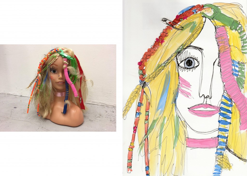
Illustrations with Watercolour


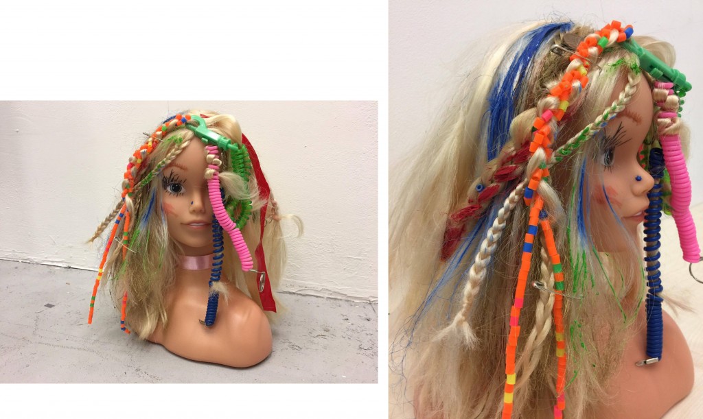
Doll Head

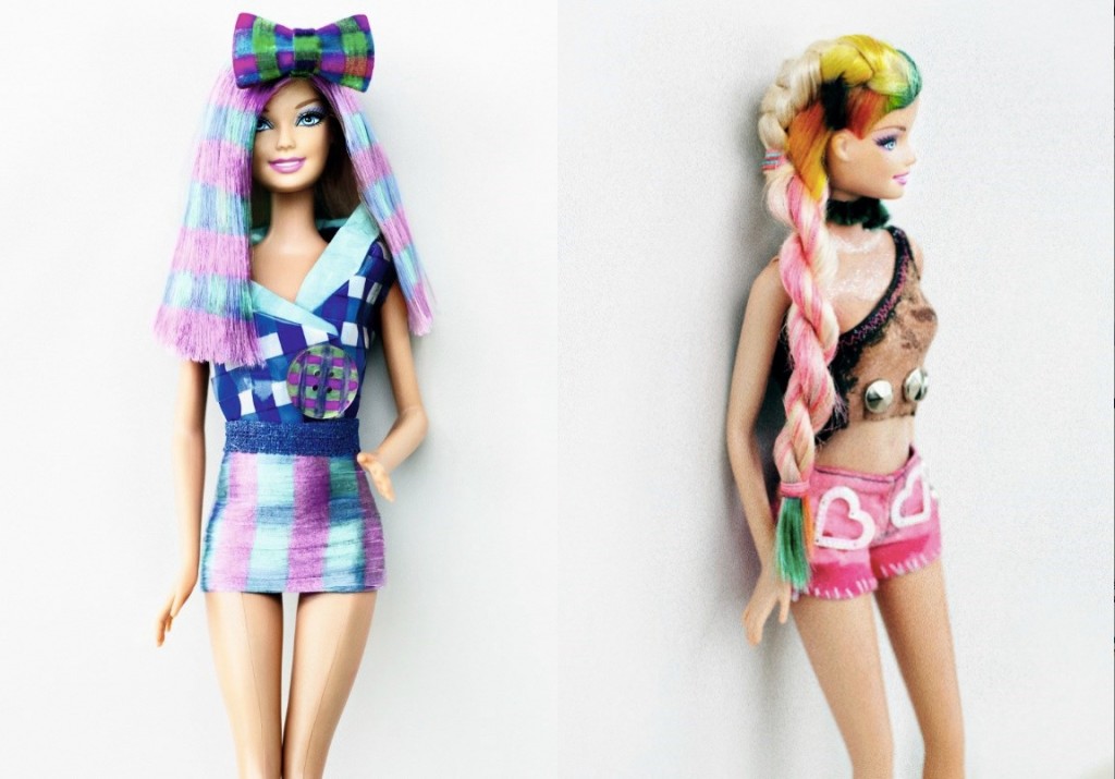
As a group, we took inspiration from the Barbie x BLEACH collaboration so we managed to get a Barbie doll head. Instead of trying to print or dye on it’s hair, we decided to braid the hair, add ribbons, beads and adding some spring key chains. Aiming to recreate dreadlocks. We also used paints and spray paints to add colour to the hair and we also tried to style it by cutting pieces of its hair.
Barbie x BLEACH
Dalston salon BLEACH collaborated with Barbie doll brand as they’ve recently released Barbie Design Printables, in which a range of patterns and colours can be printed on Barbie’s hair.

