 I’ve really been into natural dyeing lately after learning about the environmental impacts of chemical dyes and so on. I thought of dyeing some fabrics myself and so I experimented on coffee to dye with. I was trying to get different results by leaving the piece of fabric longer than others and of course the longer it’s in the dye bath the more intense the colour is.
Category: AD139
Flower Pounding
I was initially researching natural dyes and I came across an image of a fabric printed with actual flowers using a hammer and I looked for tutorials on online and conducted the experiment myself. I got myself some flowers and started arranging them on a fabric then putting tape on top to secure it in place. I didn’t have a hammer so I used anything I can from what I had to pound the flowers on to the fabric. And these were the results. It didn’t really transfer onto my fabric well but that’s probably because of what I used to hammer. I was imagining the colours to be a little bit more vibrant but overall it was a fun little experiment.

Faustine Steinmetz
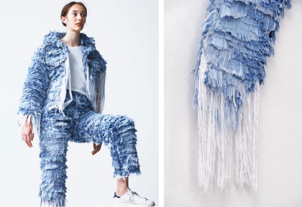 Faustine Steinmetz creates basic garments that we wear on a day to day basis but with a difference. Her team spin, dye and weave recycled denim to make their own fabrics with each garment made by hand. She makes it her own and remake them into unique pieces. She says in an interview, “A great piece of clothing without a vision will never be anything more than a piece of clothing”. Faustine also has a sustainability core concept in her brand.
 She treats her garments as an art piece- object. That’s why she never presents her collection on a runway and rather have a small exhibition/presentation format so that she can be even more creative with how she presents like the one above, the garment is hung with a simple, straightforward information beside it. Below was her SS16 presentation where the models are ‘coming through the wall’ .
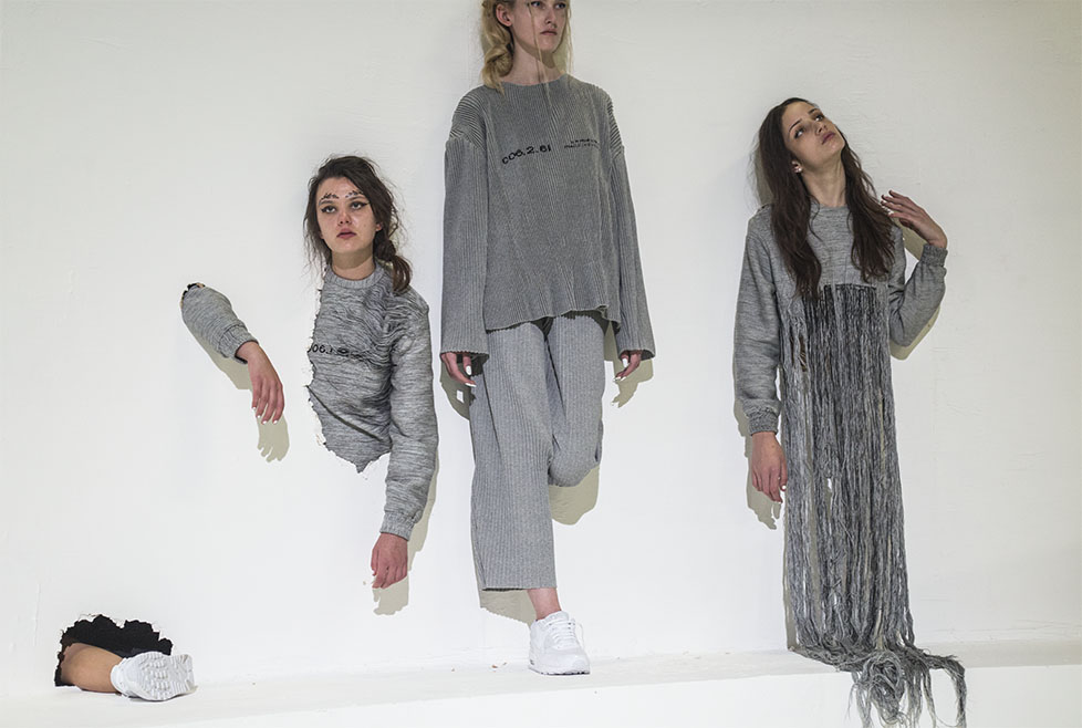
Macro-Trend: Rekindle
 As we delved ourselves in technology throughout these years, we often forget our beautiful planet that is on the brink. With all the catastrophes happening around the world, it becomes clear to us that we are responsible for these environmental impacts and that it is time to care for our planet.
Macro-Trend: Surveillance
 With cameras everywhere on the streets and the introduction of having a small chip inside us, the question starts to haunt us whether we still have privacy and security. Below is a fashion film by photographer Nick Knight. It features footage from security cameras and presenting Kate Moss as she does her daily routine. Watching it like in a stalker’s perspective.
Styling Workshop: Outcome


Styling Workshop: Moodboard
 For the styling workshop I wanted to take inspiration from construction workers uniform. Taking colour ideas from the hi-vis garments, brightly coloured caution tapes etc. As I don’t have hi-vis clothing for the workshop, I plan on buying hi-vis tape and use it to create stripes of neon coloured tape onto the clothes.
Tate Modern: Wolfgang Tillmans


These are some of the photos that I admired the most from Wolfgang Tillmans. I love the two images shown above of a flower and a close of a neck as a ‘set’ as the juxtapose each other in size but both create a feeling of delicateness and fragile-ness. And they also have similar tones in terms of colour. I also liked the image of a fly on crab shells, it looks disgusting in a way but beautiful at the same time. The images of the ocean and the sea creates a calming and tranquility vibe, and it feels home to me as I grew up near the sea.
Saatchi Gallery: David Salle, Richard Aldrich and David Brian Smith
 Richard Aldrich
Walking into the wide and well lit exhibition space, the first thing that I was drawn to was this portrait shown on the right (above) titled ‘Stranger in a Strangeland’ because it had more details and depth compared to the other works like the one on the left (above). They are both minimal but the ‘Stranger in a Strangeland’ makes you look at it for longer, more in detail. These canvases are really big with a lot of negative spaces.
 David Salle
Above is close up image of ‘Dean Martin in “Same Lame Running”‘ and it was the first thing that I saw that stood out to me the most because of the contrast between the dark portrait image and the light coloured painting around it. I was also drawn to the detail of her face and hands of where the shadow and highlight sits.

David Brian Smith
Unlike the spaces for the other artists at Saatchi Gallery, the room for David Brian Smith was a little gloomy compared to other spaces but it works well with his neon/pastel coloured paintings. It gives a little contrast. Also, being in the darkly lit exhibition, the painting gives light to the room. Immersing yourself while looking at the painting, as if you’re right there – part of the painting.