After talking to the client and understanding their requirements, creating posters to use in Support Local’s PR campaign was our main task in this project. Competitor analysis proved to be a constructive task as we were able to draw inspiration from posters that we, and the client liked. A lot of what we had learnt in the previous meeting influenced our design process. Before we started to ideate in any way, the first thing we did was to summarise what the client wanted and the direction the posters would take. The branding was something we were unsure about at the start of the project but was resolved after the interview meeting. Using the stylescapes that we had previously made helped us to think of ideas as the client had told us which one she preferred and why. The bulls eye technique outlined what had to be included and proved to be an excellent co-design method where the client could voice their wants and needs. We also used semiotic analysis as a co-design technique because the client was able to place how much information was needed on the poster and how serious or fun the poster should be.
When creating poster designs, we used the 635 method to quickly develop a large number of different ideas. We repeated the process 3 times as there were only 4 participants taking part in the exercise and we ended up with 19 different poster designs. These were drawn on paper which made the process quicker and easier, however, it meant that drawing ability affected the designs and each drawing had to be photographed. Despite this, I think hand-drawing quick ideas is still the best method as the designs do not need to be polished at this stage. We used the 635 method because it is efficient at collecting a number of different designs quickly and the non-verbal nature means all ideas are equally valid.
We organised the designs in Miro and using what we had learnt from talking to the client, chose 8 designs to develop. We took 2 posters to develop each. The developments involved improving the posters graphically, and making them clearer. It was worth doing this process using computer software as the posters needed to communicate a point clearly and it was important to be able to visualise what the final design would look like for our next design process. There would be no point developing the posters on paper as it would be time consuming and they would have to be digitalised anyway.
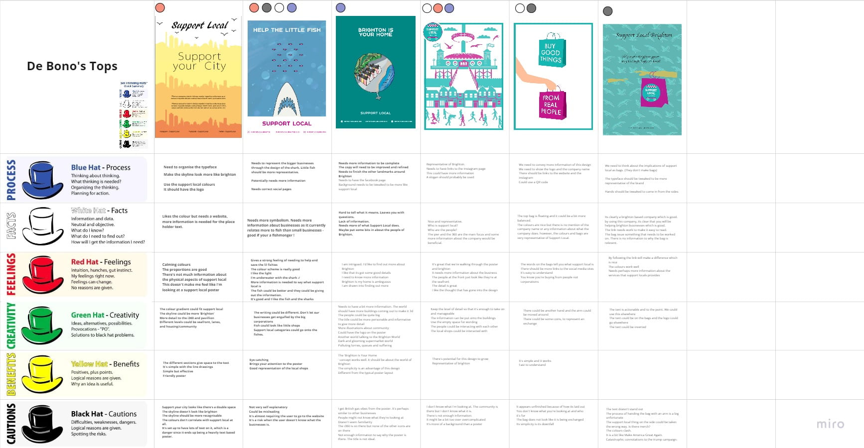
We decided to present to our client 3 posters to make their decision process as easy as possible. This was decided as a team member found an article explaining how 3 concepts is the optimum number of ideas to present to a client as it gives them choice without being overwhelming. To narrow our designs from 8 to 3, we used De Bono’s 6 hat method because it is a non-bias way of analysing ideas, considering each poster is made by one of us in the team. Despite not being time efficient, the information gained from this method was plentiful and it even allowed us to consider future possibilities for each poster. This was documented in Miro and conducted during a group video call. Using the 6 hat methodology findings, we then voted again on which 3 posters would be taken forward and presented to our client.
Before the pitch meeting with the client, the 3 designs were further developed to be more visually appealing, better communicate the points and include social media links. The posters were also mocked up in situ using photoshop. We did this to give our client a visualisation of how each one would look in real life. Adobe InDesign was used primarily to make the posters although Illustrator was also used to make icons and different elements of the poster. We decided to use the Adobe suite exclusively as it is industry standard, each program is compatible with other Adobe programs and the end result is of high quality.


