Portfolio Layout :: Visual Identity


Similar to my business cards i want to create an engaging portfolio that reflects my ability in art direction and imaging.

I have looked at displaying my work in a minimal aesthetic using varied size formats of images to create a dynamic visual representation of my most recent work. This will also allow for my work to be clear and will meet a diverse market in the industry. This would also trasblate well if i were to add a more diverse selection of work in the future; the design would cater for this. As my work is more photographical, it will help with the layout of multiple series on same pages.


https://www.instagram.com/drawdownbooks/

http://www.fabianbremer.com/

pastafrola.tumblr.com

https://kisa1986.tumblr.com/


Week 15 :: Business cards visual identity


For my promotional material I want to create playful and vivid cards that reflected my work over the four years of university. I have looked at typographical ideas and coloured papers as well as embossed texts and varied formats. For my initial research, i have looked into various companies to see what option they have in terms of shapes and styles. The company with the most appealing options at the minute is Moo who offer a wider range of sustainably sourced papers, such as cotton business cards and recycled paper postcards. I feel that keep sustainability at the forefront of all my projects is important so looking for the ethical options is key. However, the addition of aesthetic and professionalism is also important, so i have looked ta other companies such as Mixam who offer a wide range also.


http://byisabel.com/sva1/

https://www.instagram.com/gfsmithpapers/

http://www.peopleofprint.com

www.creativebloq.com


Social platforms & Postcard mockups

postcard_option 1

postcard_option 2 

postcard_option 3 

This i also looked at social media and promotional material.

As the publication is going to be solely on print, I wanted to keep the social platforms to a minimum, so the concept was as natural as possible and was manipulated by the nature of social media. The magazine will only have instagram where the majority of the selling will be to allow for simplistic retailing as well as using the platform to share instant content to keep the reader engaged in the concepts and using it as an outlet to engage with other creatives and communicate with other readers.


Week 14 :: Draft Magazine edits


Coming back from easter i had my draft magazine delivery. I went through every page and made amendments but i had already started making them before i had the magazine back as i wasn’t happy with how it looked when i sent it off. Whilst looking through the magazine, i carried on making the media pack as-well as furthering my sketchbook. I also began to think about my portfolio and what work i want to show.

Week 13:: Shoots & Draft Magazine


Whilst shooting all the magazine content before easter i had been putting it into the indesign document temporarily laying it out so over easter was when i started to finalise the layout and making final edits. The first weeks in easter i shot one more ‘fashion’ shoot that was the redo of my trend shoot. i did this on location and found that it went better with the other content. The last weeks of easter is when i sent my draft copy of my magazine off and started creating the media pack.

Interview Transcripts

This week i focused on content, including interviews for the magazine. I wasn’t initially going to include interviews but felt it was important to build context in the magazine as well as have engaging information and facts from industry professionals about the topics in the magazine. I have never interviewed anyone before i was a little apprehensive however i found it really interesting to listen to these ladies talk about sustainability and waste.

Cat Fletcher

Orsola

mia

Week 12 :: food photography and interviews

My initial thoughts on my publications was to be more of a image book that was a almost like a diary of my waste experiences and findings however, whilst looking at my aesthetic and target audience i felt like making it into more of a magazine that might see more issues would be appropriate. I carried on with shooting moving further into waste by looking a food waste. I created a series of images inspired by Maisie Cousins that was made up of my own food waste.

I also decided to feature a couple of interviews in my publications so contacted several appropriate industry professional however found that only two came back; Orsola De Castro ( Fashion Revolution)  and Cat Fletcher(waste prevention)

Week 11 :: Test Shoots

I followed on into this week doing more shoots for the magazine alongside annotating my sketchbook. I wanted to work on the idea of trends and waste, so i looked at recreating trends out of household items or recycling. These images are from the shoot which i think came out nice however don’t the aesthetic of my magazine. This shoot will be reshot.

Week 10:: Shoots

This week i focused on shooting my first features for my magazine. I booked out the whole day at the Day light studio in Brighton to get different shoots done as they have a nice natural aesthetic. This time included fashion shoots and still life imagery. Th fashion images were styled with second hand clothes which i feel worked well. The still life imagery didn’t come out how i planned which was disappointing and i also found i only liked a couple of the images from the fashion shoot so decided to shoot on location in the Brighton Flea Market allowing me to have a mixture of images for my publication.

Week 9 :: Publication Competitors, Shoot Moodboards, Visual Identity and Film photos


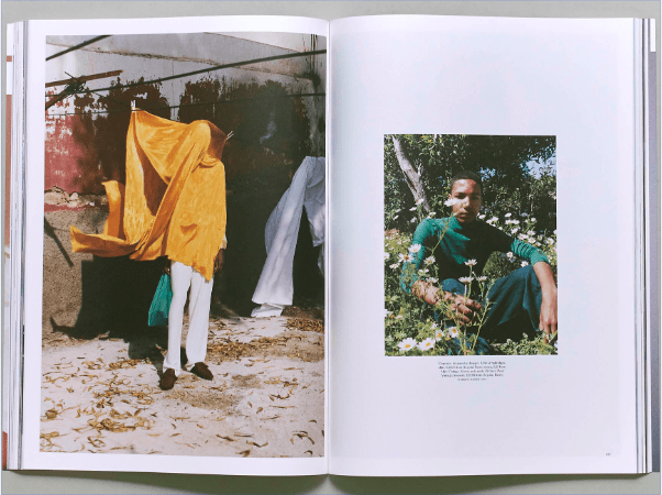
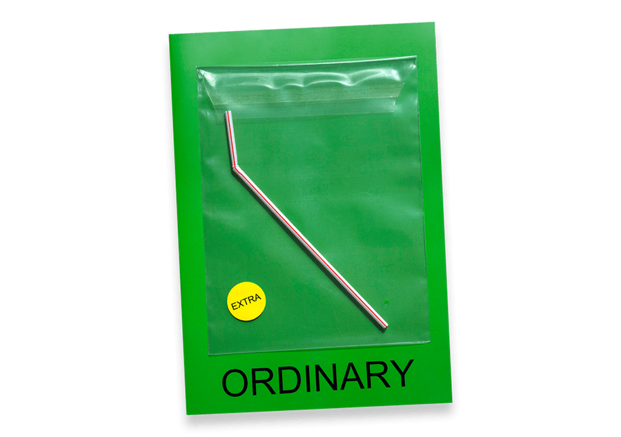
More or Less is a magazine that highlights the areas of consumption through engaging fashion and lifestyle imagery using photography and still life as well as creative concepts expressed through styling and stylized fonts. I also looked at Ordinary Magazine who are a quarterly photography and fine art publication that works with various artists to create unique content that is centre around one object that accompanies the magazine. Another competitor who i though matched my publication well is Hot Hot Hot! Magazine who are a new publication that uses fashion photographing to make contemporary and innovative solutions through visual stigmatism that explore the new future.


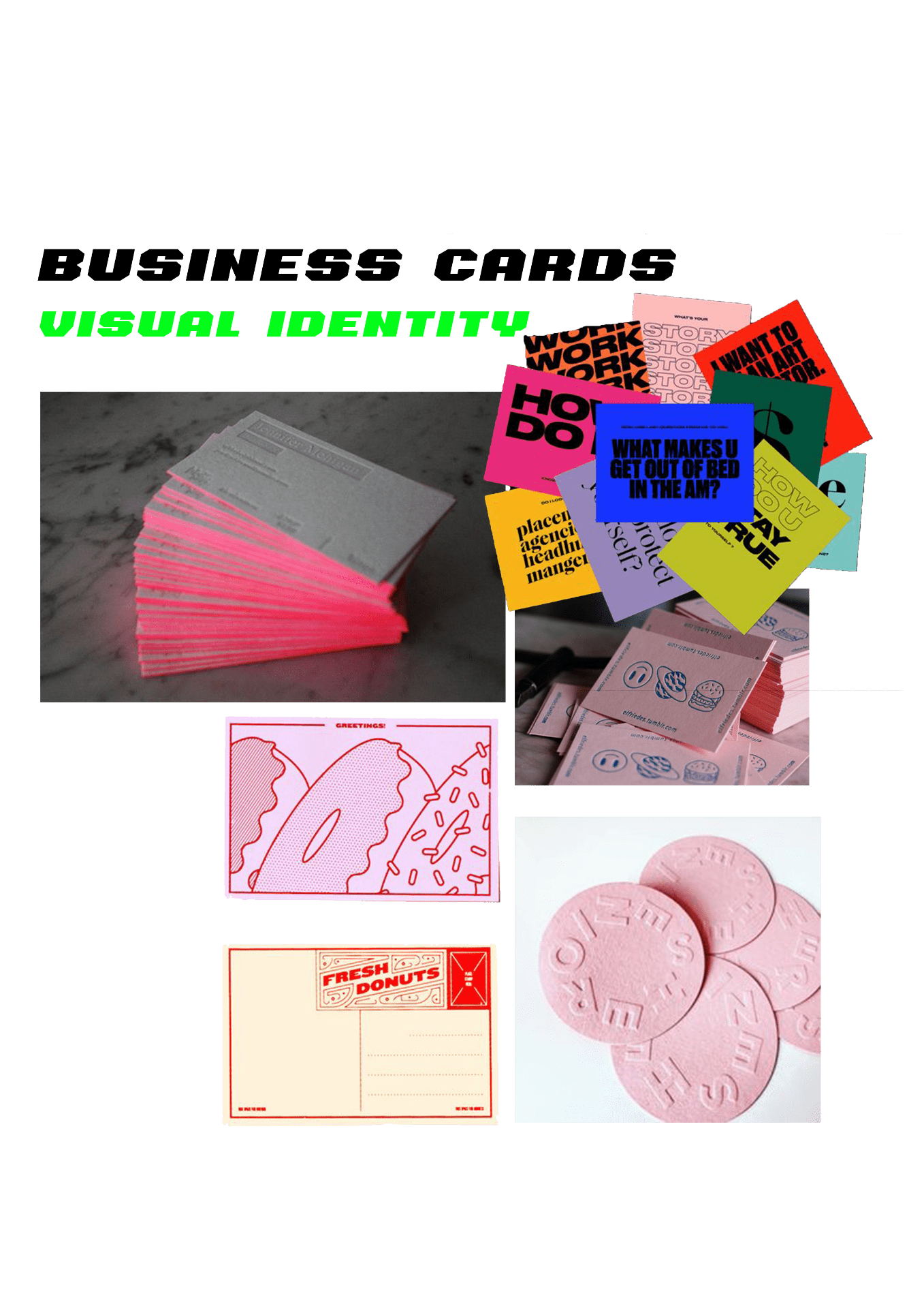
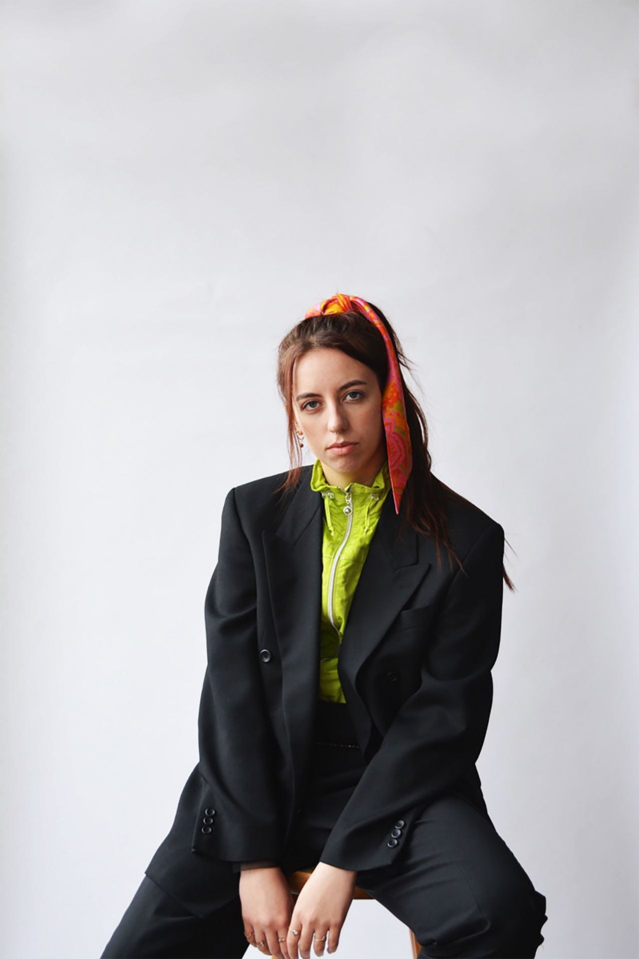
With the analysis of different topic areas within sustainability that capture waste in different ways, I began to build some initial ideas for editorial shoots and spread contents. I have looked at different style in ways that I can represent this relevant topic in a way that will suit my main demographic. Whilst looking at making my content quite vibrant and playful, i wanted to create a very minimal and typographic publication so created a moodboard that incorporated very sporadic layouts and large text that build impact.


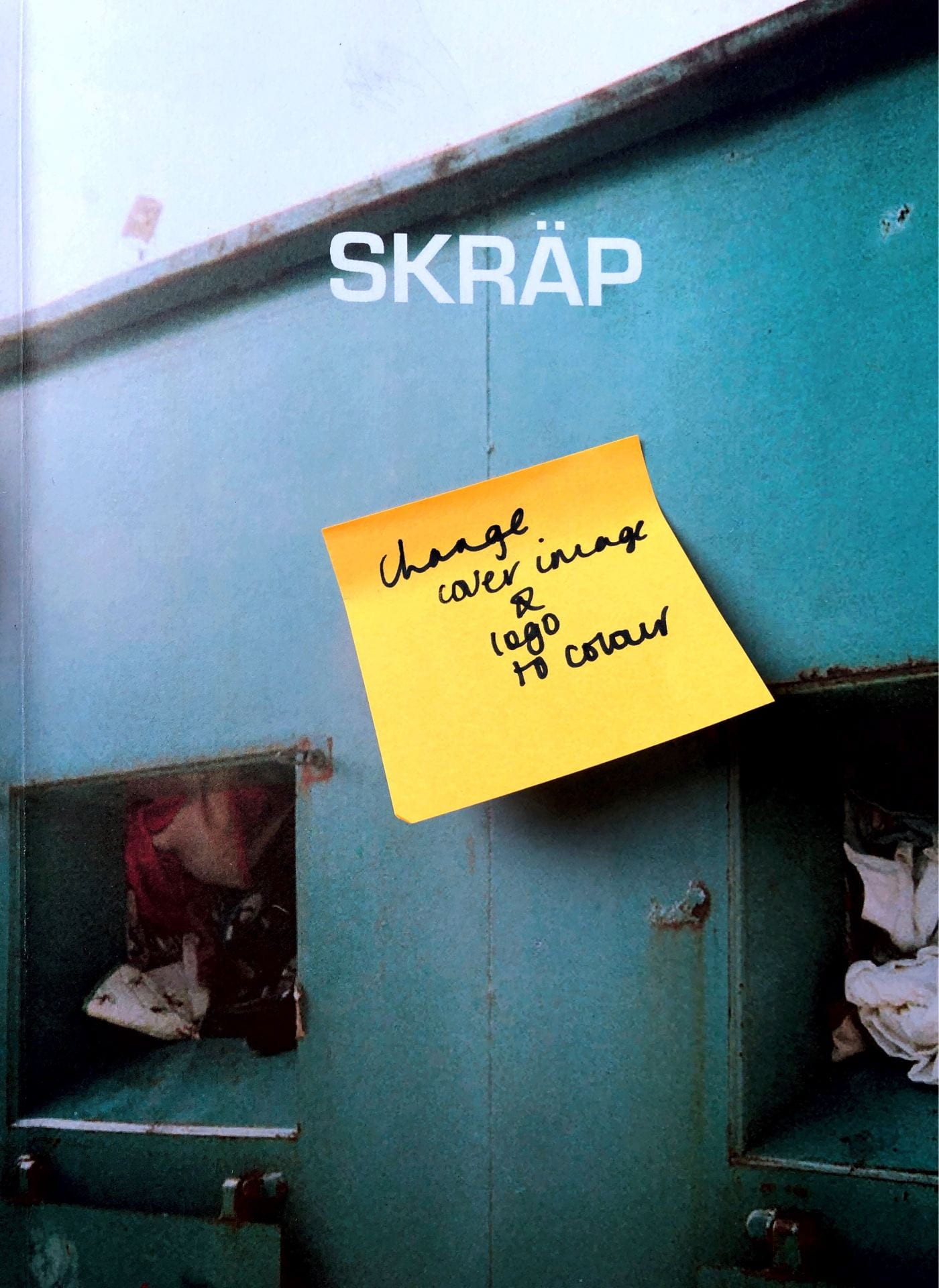
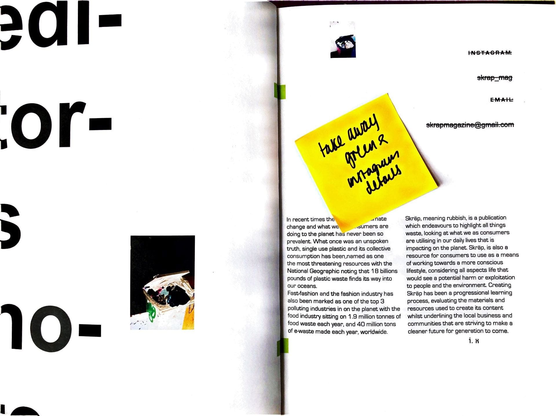
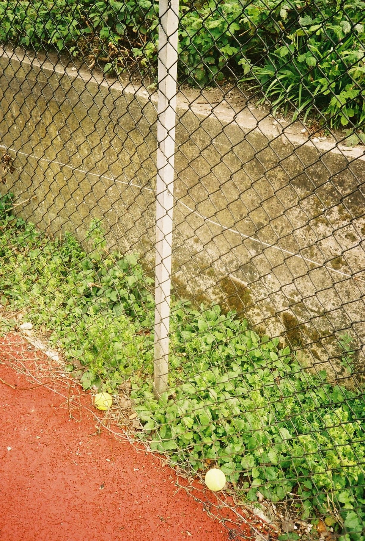
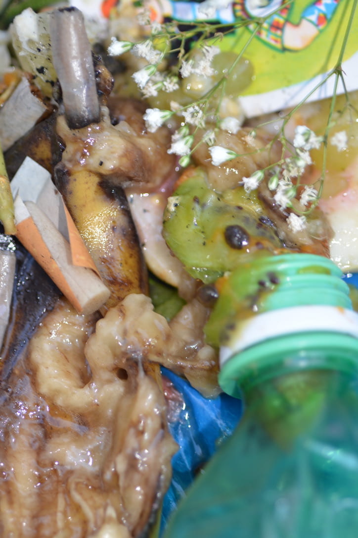
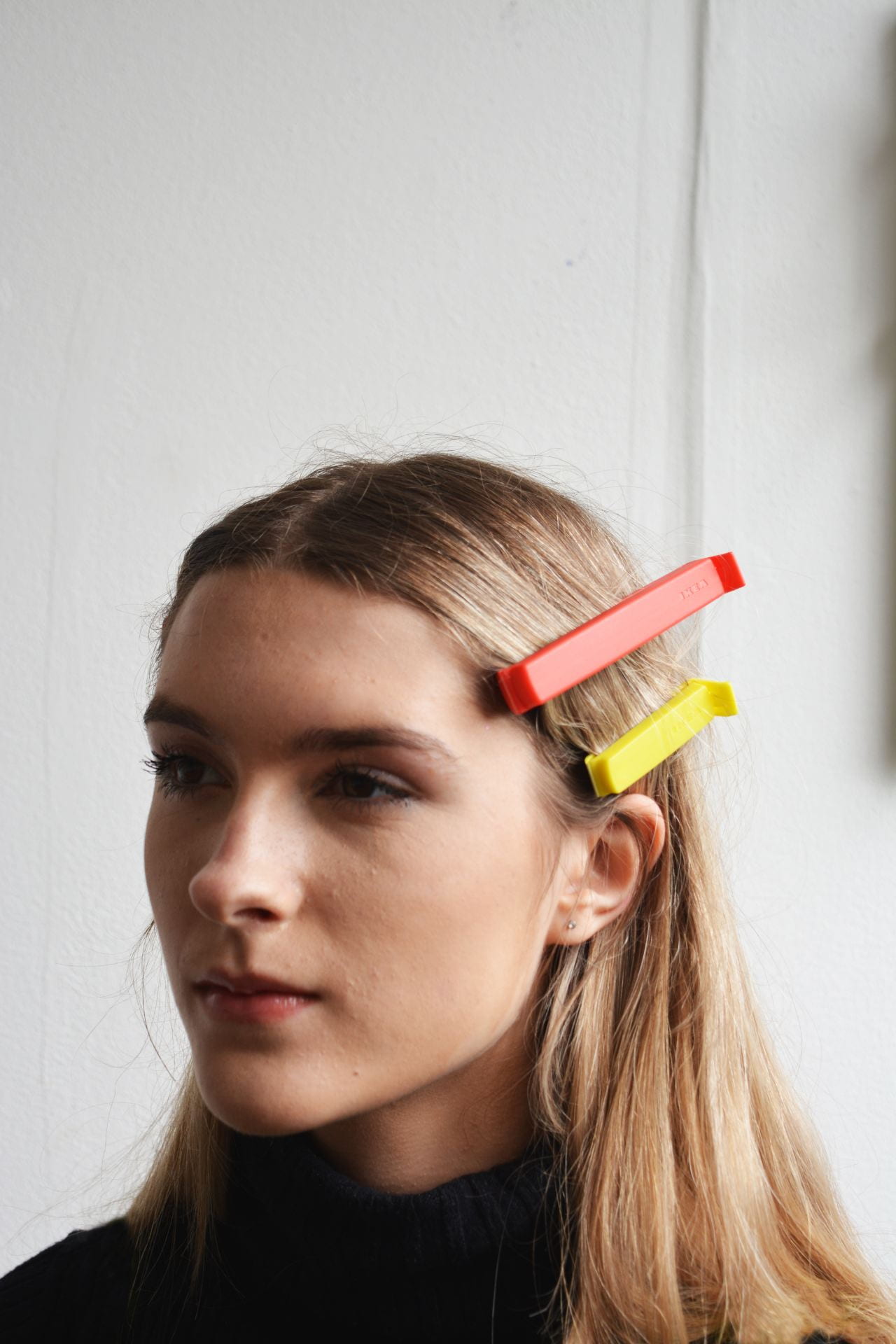
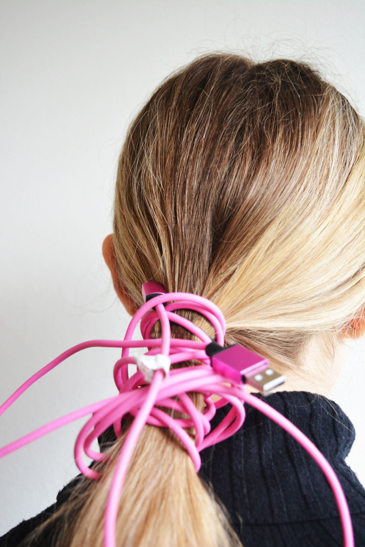
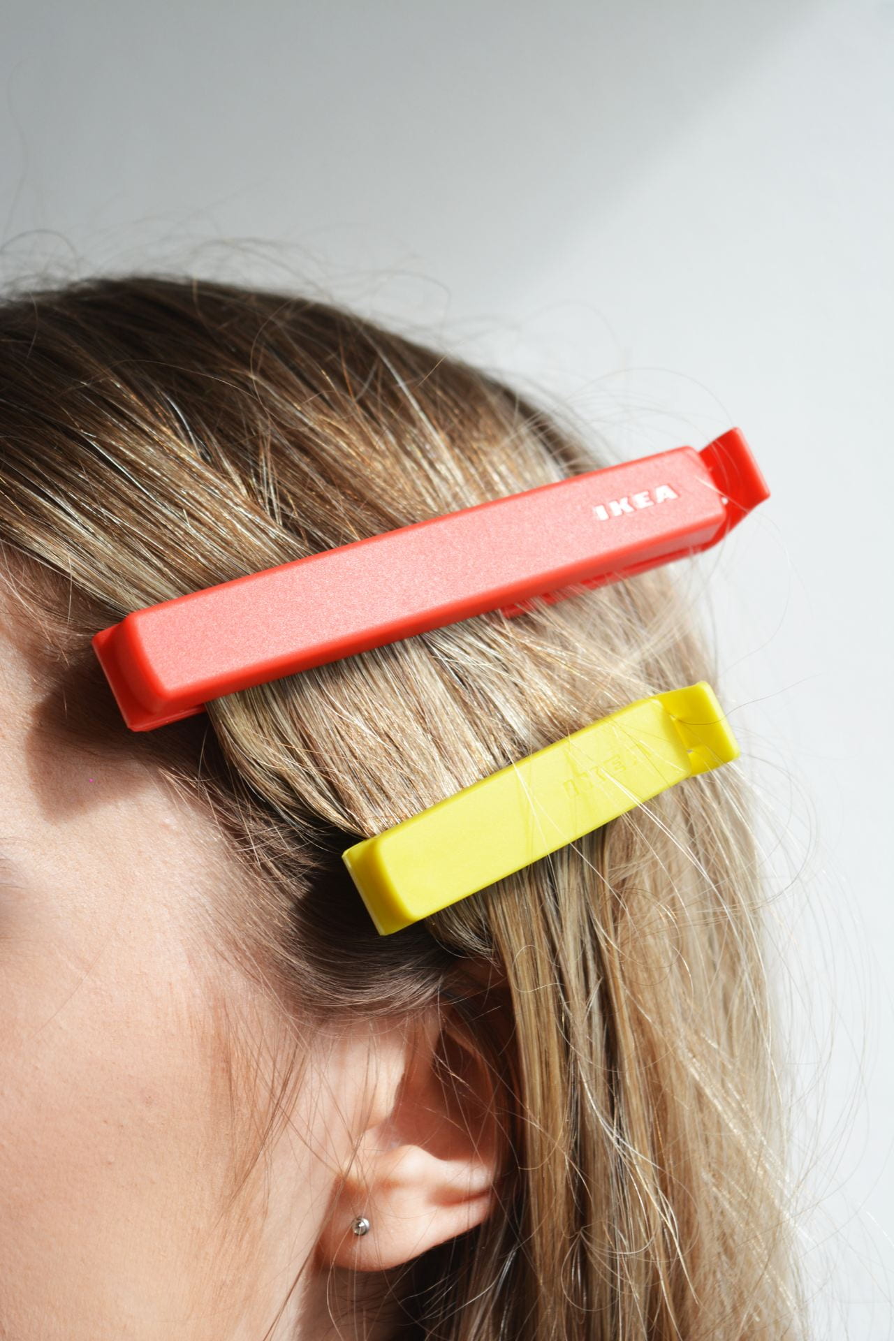
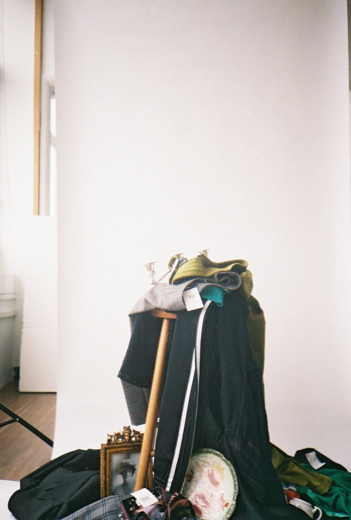
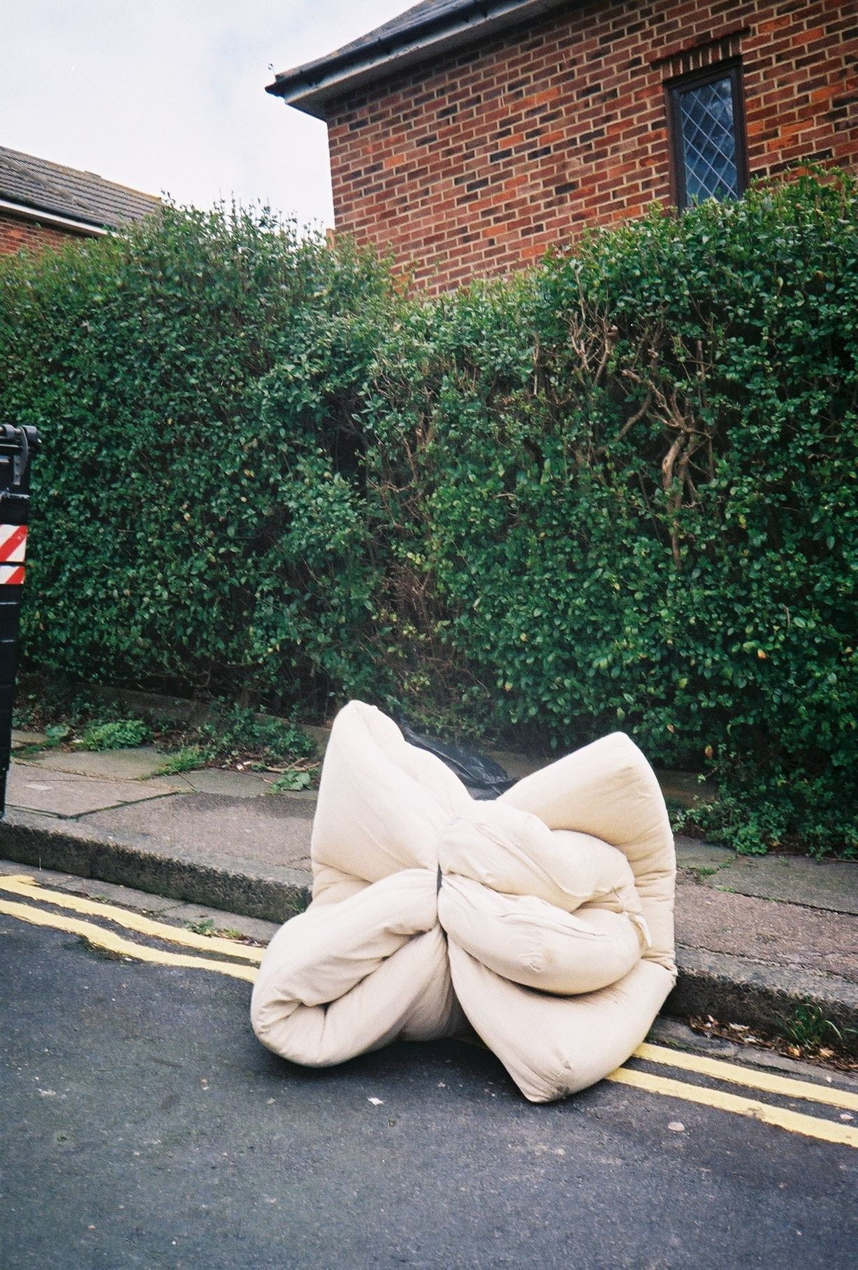
Over the course of the last few months i wanted to include images of discarded items from the streets of Brighton so have been taking my film camera around with me and capturing things I find. This has been a long process as i found there was a real repetition of items that people had left.