Publication Layout// Twin magazine


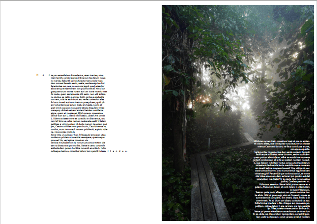
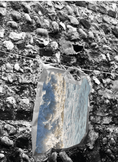
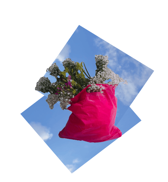
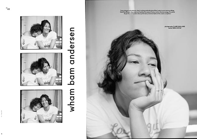
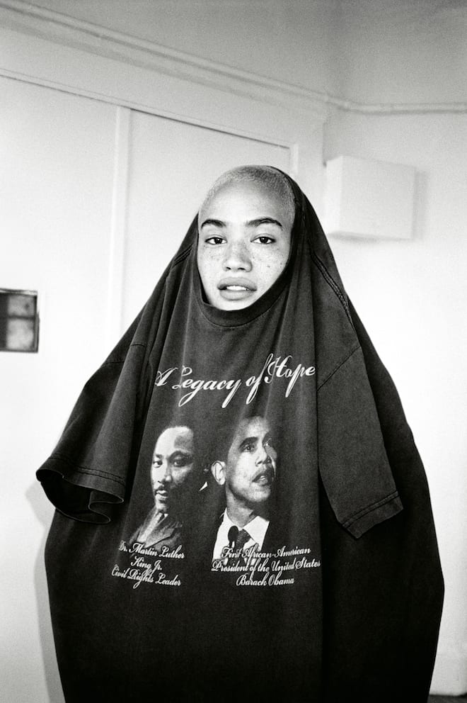
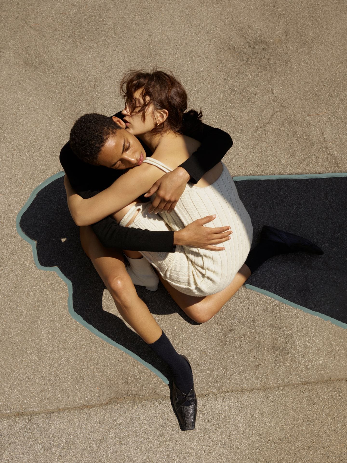
Whilst looking at direct competitors, I have looked at fashion/editorial magazines for layout ideas and photography/image composition. I decided to look at Twin Magazine as it is an a3 hardback publication which his quite unusual for a magazine. Linking back to work in the Hayward gallery and the Tate Modern, scale for a magazine is important as it can have an effect on how the image is portrayed. The visual content throughout Twin magazine is very modern and simplistic with a coherent style throughout. I like the subtle distortion in some of the images.

Publication Layouts// Fashion Revolution Zine


Fashion Revolution is an organisation that raises awareness on fast fashion and its impact in the industry. They produce fan zines annually which feature contributors globally creating media such as illustrations, articles, infographics, photography that is collated into a small publication. Fashion revolutions zines are so diverse with it being directed through the contributors, it means the layouts and aesthetic of each page is completely different. Each spread features a large quantity of content either solely imagery or text accompanied by photography or graphic. From this publication, I want to create something similar that is engaging through graphics but still features strong pieces of writing that educates the reader.  This zine plays with different fonts, use of photography and distorting which I am interested in including in my project.

Layout Experimentation


In the workshop, we experimented with layout using shapes shown in Figure 38 which allowed us to focus on the distribution of the shapes and how they accompany each other on each spread. This helped with our second task of laying out existing images.

These spreads were created in a workshop looking at layout and the importance of visually reflecting the content that you are displaying. I used images taken by Noah Sheldon as his photography captures how nature has been left to over take human structure of the biosphere. For these layouts I used fake text to show how the layout of this would work with the images and typography. I distorted some images to give a pixelated effect to represent the unpredictability of the plants within the biosphere.

Fashion Revolution & Green Peace event // Fashion Revolution Campaign Shoot


Working in industry in my placement saw me furthering my exploration into sustainable fashion. As this is a strong interest of mine, I worked with fashion revolution which features in the Fashioned by nature exhibition. These images were taken at the Disco Make event in collaboration with Green Peace which featured a number of stations that incorporated the use of old clothes such as a styling workshop, visible mending of old denim pieces and crochet and knitting workshops using sustainable wool.

Fashioned from Nature// V&A


V&A showcased the Fashioned By Nature exhibition which presented how nature has been carried through fashion from early 20th century to present day, looking at the use animals in relation to fabrics and accessories such as fur whilst also covering how dyes were processed. The exhibition went on to look at how fashion today is incorporating natural and ethical practices into the industry featuring designer such as Stella McCartney and Christopher Raeburn. A collaboration with Stella McCartney and Bolt threads produced innovative technology such as Mycelium (underground root structure of a mushroom) to create modern garments.

Hayward Gallery// Space Shifters


Alicja Kwade’s ‘WeltenLinie’ installation at the Hayward Gallery explores different visualising illusive techniques combining various materials such as numerous metals and other rigid, coloured objects. I found this piece engaging due to the minimalist approach to its execution but the as you made your way around the installation the various reflections from different objects created depth.  Narcissus Garden by Yayoi Kusama displays simplicity through a sea of silver  reflective orbs. Yayoi Kusama explains that this installation is to signify ‘infinity, self-obliteration, and compulsive repetition in objects and forms’. This particular installation conveyed the idea that there is a wider concept of thought behind an abject that is portrayed as very minimal which I feel can be translated into my work.

Throughout the shape shifters exhibition, the installations that featured were constantly testing the idea of architectural complexity, particularly looking at Monika Sosnowska’s work Sosnowska begins by posing as part of the gallery then works its way into creating an oversized piece suspended on the wall. The use of existing building features meant that the final outcome was unexpected with the sole focus of the installation is the individuals investigation into the contrast of the structure of the building.

Tate Modern// Exhibition Research


A visit to the Tate modern, saw an exploration of various sculptures and paintings which a reflection of complex topics and ideas were. Joseph Beuys ‘The Social Organism a work art’ which looks at the idea of nature being the centre of society. In comparison to other pieces in the exhibition space, his work it very minimal using lines and faint sketches to portray his idea of our naturalistic instincts need to be regarded. In contrast, Jannis Kounellis with her work of ‘Untitled 1968’ showed a large wooden frame layered with various woollen fabrics. This piece was explored whilst creating other sculptures out of ‘un conventional ‘non-art’ pieces’. I liked this piece as I feel it reflected the idea of nature and using natural resources similar to Joseph Beuys work. Using natural materials and the natural world is something that I would like to further research as it is a large contrast to what society is like today whilst also combining this together.

Helen Kirkum


I decided to look at Helen Kirkum as she is another designer who uses waste products to construct new products. Kirkum utilises ‘disregarded’ shoe parts to assemble a completely new design. She uses her pieces to explore the idea that we are living in a highly commercialised society. Figure 179 has a clear design layout, using an image of the garment or product with the what the item looked like beforehand. This concept is strong, making the consumer aware of the transparency as well as making an impact.

Layout & Graphic Experimentation


I created a series of experiments in layout using various images. These images have been distorted, extracted and reconstructed in photoshop whilst also looking at scale that has been researched through artists work.

For various graphics i started looking at how plastic has become a major pollutant of our oceans. This image was originally in colour, using photoshop, i edited the colour whilst also cutting out the center of the image to expose the separate image underneath.

Typography Ideas


Figures 254 and 255 see a series of experiments made with font using Photoshop and illustrator. I used a variety of fonts and colour, whilst also using simple fonts and illustrative ideas.  I found that the typography in Figure 254 were more successful than the other as they look more powerful than the ones created on illustrator.

For typography experimentation, I looked at using various fonts that reflected sustainability. I used more handwritten styles as a contradiction of the ferocity¬ that the topic areas project. I used block colours as well as layering to make them look 3D. I experimented with different names looking at how the variation of letters sits differently depending on the typeface. Overall, i prefer the look of the bold text as it projects its self clearer.