Tagged: kitsch

launch party still life: food display

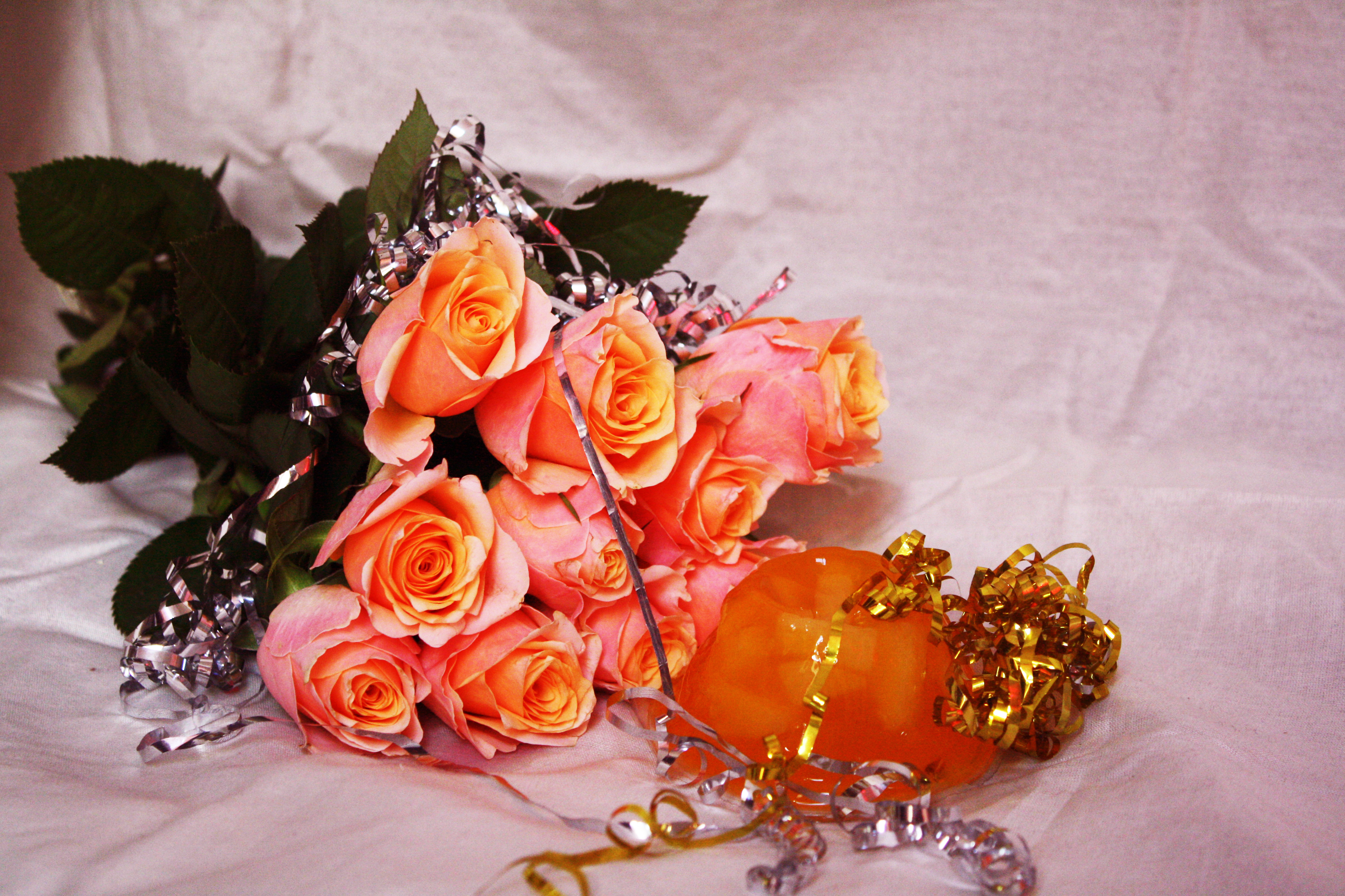
Me and Immi wanted to create a more solid vision of the launch party, and as we’ve used our mutual interest in still life a lot in this brief, we continued that by creating and shooting examples of creative food and drink displays that may appear at the event. We wanted the products to still have the kitsch, garish look of our previous work, but also look appealing and form a stunning display – the point would be that the food is there to look at and be appreciated and engaged with playfully as a sort of installation, but also still needed to look like something people would want to eat.

We took classic childish party foods and snacks, and arranged them into playful displays and combinations to match the over-the-top, colourful identity of the magazine itself. The cocktails we designed would be available on the night, also resembling the colour scheme and themes of Nookie magazine.

Continue reading

sexualisation of food: final images

img_1405-edited img_1416-edited

This editorial that I shot with Immi stemmed from our love of still life, and by taking inspiration from artists we love such as Rebecca Storm and Prue Stent, as well as looking at Bompas & Parr’s creative use of food to create sensual moods and environments, we based this editorial around the sexualisation of food in contemporary art and culture and how particular foods and their shapes, colours and textures can be provocative or resemble sexual imagery – for example our selection of very sweet and sugary foods to convey romance, aphrodisiac properties and even using food in sex. e.g. drenching objects in honey and capturing it dripping down and pooling around the objects, using squirty cream and documenting it slowly deflating and running off jelly, the placement of fruit and berries which have often been used to depict fertility or female genitalia.

We wanted our images to be quite kitsch and created bizarre set-ups of edible and non-edible objects. Our images began quite clean and minimal but we found that when we added more and more to the arrangements the images really came alive and had the appearance that we wanted, and fit our concept more.

Continue reading