Investigating a Retro Marks and Spencer Biscuit Barrel

Kay Lawrance, Third Year BA Fashion and Dress History student, shares her research into a charity shop find.

M&S biscuit barrel

Marks and Spencer Biscuit Barrel. c2004-2014. Stoneware. 18cms x 15cms diameter. Personal photograph.

As part of our Third Year module The Past in the Present: Retro, Vintage and Revival, we were asked to choose and research an item directly related to the themes of the module.  I chose this stoneware biscuit barrel produced for Marks and Spencer.  The exact date of production is unclear, but from the style of the backstamp, it was produced sometime between 2004 and 2014.  I bought it from a charity shop a few years ago so I am unable to date it any more precisely than that.

At the time this was produced there was a trend in homeware and home furnishings which is commonly called Mid-century Modern.  Interiors were heavily influenced by the 1950s, with Ercol furniture becoming desirable, and the sludgy browns, dark teals and mustards of this biscuit barrel reflect that.  The Pantone colour of the year 2009 was Mimosa, a sludgy yellow, and 2010s was Turquoise – slightly lighter than the mugs on the biscuit barrel but a similar shade.  In 2009, Sanderson, manufacturers of furnishing fabrics and wallpapers, released a design by Fiona Howard called Dandelion Clocks which they describe as ‘a fun and funky 50s retro design‘, available in similar colours.

The underglaze design on the biscuit barrel is printed with a black outline and colour infills that are deliberately mis-aligned.  This captures the style of the scourer pot in the image below, which, coincidentally, I also bought in the same charity shop as the biscuit barrel, but at a different time.  This small scourer pot by the Toni Raymond Pottery in Devon was produced somewhere between 1956 and the mid-seventies.  However, unlike the M&S biscuit barrel, the designs were all hand painted and the “approximate” painted infills were part of the style.

This images is a scourer pot and is copared with the M&S biscuit barrel

Toni Raymond Pottery Pot Scourer Holder. c1956-1976. Ceramic. 7cms x 9cms diameter. Personal photograph.

In Retro: The Culture of Revival Elizabeth E. Guffey suggests that the term retro ‘serves as shorthand for a period style situated in the immediate post-war years’ or ‘material culture at mid-century’ and that is exactly the feel of this design (2006: 9-10).  She describes how ‘retro does not seek out proud examples of the past; it shuffles instead through history’s unopened closets and unlit corners.’ (2006: 14) Although the pottery produced by studios such as Toni Raymond was hugely popular, it was domestic and reasonably cheap and not what I would describe as a “proud example of the past”.  Many homes had a piece, or something similar, but it was usually something as useful and at the same time as unconsidered as this scourer pot.  Items that were used and seen have become an almost half-forgotten memory.  I was struck by what Guffey wrote about the word nostalgia originally being used to describe a kind of homesickness, but that it has now come to mean a ‘bittersweet yearning for things […] of the past’ (2006: 19), a kind of time sickness, and it seems to me that this is captured in the feeling of this design.  And yet, the retro design is just slightly too good.  The misaligned print is too precisely done.  The edges of the infill are too sharp to be hand painted.  It is a knowing copy designed to be read by knowing consumers.


Developing subject expertise – from undergraduate to postgraduate study

Slyne and Co pearl satin and gold lame lace gown, circa 1937. Photo author’s own and taken with the permission of Caroline Quinn of Dirty Fabulous, Monaghan.

Emma Kelly, 2018 BA (Hons) Fashion and Dress History graduate reflects on her journey as a student from undergraduate to postgraduate study, finishing her MA during lockdown and developing subject specialism along the way. Congratulations Emma!

I graduated in 2017 from BA (Hons) Fashion and Dress History and have recently completed my MA in Design History and Material Culture at National College of Art and Design, Dublin.  What I most enjoyed about my time at Brighton were studying the rich and varied topics covered in the lectures and seminars and how tutors encouraged primary research including visiting archives and using the University’s Dress History Teaching Collection. Working with the collection was amongst the highlights of my three years of study, uncovering stories of the trends, makers, sellers and wearers of fashion. One of my favourite projects was researching Bradleys of London, beginning with a 1930s ensemble from the department store. I encountered Bradleys again during my postgraduate studies whilst researching Sybil Connolly, the Irish couturier who worked at Bradleys in the 1940s. What I wouldn’t do to spend an afternoon back in the collection!

Throughout my undergraduate studies, I was fascinated by Irish dress history, though I never had the chance to delve into the topic. So much of the material discussed in lectures and seminars centred on Britain, France, America and the Soviet Union. In comparison, the field of Irish dress is very underdeveloped, a problem I first encountered during my undergraduate and an issue that remains to this day. Touching on the topic briefly in my BA dissertation made me all the more determined to focus on the field in my future work, beginning with a Masters.

I decided to return to Ireland for my postgraduate studies, informed not only by my desire to tackle Irish dress but also the uncertainty caused by Brexit. In September of 2018, I began my study on the Design History and Material Culture MA at NCAD in Dublin. I was immediately drawn to its multidisciplinary nature and the freedom it offered to tackle a wide range of topics. My tutors were extremely supportive of us pursuing our own research interests and developing our own writing style. Every assignment offered up a new opportunity to tackle a different theme, topic and time period, whilst also allowing me to call upon my experiences from Brighton, particularly my work with the Dress History Teaching Collection.  One of my first assignments centred on a Ballet Russe inspired satin and chinchilla tunic dress from the mid to late 1910s and enabled me to research a Dublin-based dressmaker, Mrs McAsey, the influence of and the reaction to Parisian fashion in Ireland in the 1910s. An essay focused on a 1950s Sybil Connolly suit offered an opportunity to examine the presence of Irish fashion in the domestic and international print media.

My thesis, echoing some of my undergraduate and postgraduate work, began with a dress, a satin 1930s gown attributed to Slyne and Co, a Dublin-based fashion establishment. Set to the timeline of 1885 to 1937, my thesis centred on the business as a multi-faceted, female-led establishment located on the main shopping street which sold custom creations, copies and ready-made goods in line with the latest Parisian and London fashions.

Finishing my Masters in lockdown was not expected and definitely had an impact but I have been so lucky to have studied on two amazing programmes that have equipped me with strong research skills and a deep understanding of my field that were called upon time and time again.

Slyne and Co pearl satin and gold lame lace gown, circa 1937. Photo author’s own and taken with the permission of Caroline Quinn of Dirty Fabulous, Monaghan.

Winning the prestigious Design History Society Student Essay Prize 2020 in the postgraduate category

Karen Fraser MA History of Design and Material Culture graduate (2019) reflects on winning the Design History Society Annual Essay Prize 2020.

Family photographs in the author’s cousin’s home, Vancouver. Personal photograph by the author. 9 Feb. 2016.

In July, I submitted a revised version of my dissertation, “‘That link to life, so to speak’: Older Women’s Expressions of Keeping through Photographs and Jewellery”, to the Design History Society (DHS) postgraduate essay prize, relieved to have made up my mind for the final time about how the sentences should flow. The prize provided the motivation I needed to reduce my 20,000-word dissertation by half and incorporate the feedback I had received from my assessors. I also reflected on comments from other readers – relatives and friends who wanted to know what had consumed my attention for so many months – and edited my work with those in mind as well. I was partial to the section on photographs and ended up leaving out jewellery for my essay prize entry.

In my dissertation, I took an anthropological approach to material culture in later life, studying what women keep and use to construct their homes in seniors housing, formerly known as sheltered housing. I interviewed three residents of a block of flats in Hove and took photographs of some of the objects they spoke about. I listened back to our recorded conversations and pored over the transcripts to identify common objects that held meaning for the women. My supervisor, Louise Purbrick, encouraged me to focus on photographs to start with and then to consider another set of objects, such as jewellery. I became very interested in how these objects emerged in our conversations and how the material forms of photographs and rings embodied the women’s descriptions of their meaning. What was particularly striking to me was the power these objects had in communicating the presence of close family members, especially during a time in the women’s lives when loss was a common experience.

My interest in the movement of objects in families and what happens when people make decisions about what to keep, gift to someone else, or throw away stretches back to when I was living with an older cousin of mine and her husband in Vancouver, Canada. They were in their late seventies when I took up residence in one of the basement suites in their Arts and Crafts-style home. So many objects there held family history and were rich with personal and shared memory. When it came time for my cousins to move into a residence with more care, it became important to decide which objects would help them create a meaningful new space in which to live. I took part in this difficult, emotional experience and ended up being the recipient of many items. Later, engaging with anthropological theories related to gift exchange for my dissertation, I developed an understanding of how things circulate when we are sensitive to the ways that objects and people are interconnected.

Though my research interests have their roots in Canada, they really developed in Brighton. I am grateful to my landlady’s mother, who generously offered to be my first participant and share stories over tea in her flat. She connected me with the two other women in my study who also shared their stories with me. Now, I hear little clips from the interviews in my head when I look at everyday objects, especially photographs. I am currently teaching an undergraduate course for the first time, and as I experience the pressures of the job and facilitate classes from home, I find comfort in the meaning I know to be in the things that surround me.

Karen Fraser in the garden at Charleston. Photograph by Natalie Carman. 28 Aug. 2019.

I am also grateful to the students, academics, and staff on the MA History of Design and Material Culture programme at the University of Brighton. It was rewarding to work with people who are engaged in furthering our understanding of design history and material culture. The opportunities I had to share my work-in-progress, whether through informal conversations or at the Brighton Postgraduate Design History Society symposium, expanded my ideas and improved my work. Finally, it was wonderful to connect with members of the DHS on Zoom at their AGM in early September. I am thankful to the Society for facilitating this annual prize and generously supporting students.

Winning a Breakthrough Award: Susanna Connolly reflects

Susanna Connolly won the Anne Clements Breakthrough Award in 2019-2020. She is currently in her Third Year of study on BA History of Art and Design.

Furniture: Japan. Two easy chairs with bamboo frames and woven or strip seating, 1949.
Design Council Archive, University of Brighton Design Archives

Earlier this year I was shocked and honoured to have won the Anne Clements Breakthrough Award. Having been unaware of the award beforehand, I was surprised to have received the news and have been asked to share my experience about it on this blog.

The Anne Clements Breakthrough Award is a £500 cash prize, generously donated by Anne Clements herself, who previously had a career in design history. It is given to well-performing second year students to provide motivation as the course enters a more challenging and rigorous stages. The Award also serves to celebrate the student’s progress and offer recognition of hard work.

The Award is organised through University of Brighton’s Philanthropy service and is part of a broader university-wide scheme to encourage students through their second year of study. A celebration ceremony is usually held in December to invite donors and students to meet each other and others across the university. Sadly, due to the current climate it is unknown if this year’s ceremony will be taking place.

Winning the Award has helped boost my confidence dramatically and made me feel more secure in my choice to pursue a career in the arts industry. I have been enjoying the course immensely so far and am very grateful for Anne Clements’s generosity in supporting careers in art and design history. I thoroughly enjoyed the second year of study as the course began to focus on the art movements of the 20th century. A key reason for me choosing the Art and Design History course at Brighton was its focus on modern art and I found the core module, Modernism, Ideology and the Avant Garde, fascinating. An aspect I really appreciated was how we explored Modernism across the globe and not solely about its impacts in Europe. I did my presentation on Modernism in Japan, specifically in advertising, a subject I doubt I would have come across had I not been on the course.

I plan to use the prize money to help continue my studies and pursue a Master’s degree. In these uncertain times, it has become increasingly important to demonstrate solidarity with the arts and education industries which have been especially vulnerable due to the current global crisis. I am inspired by Clements’s support to those in her field and am once more thankful for the opportunity to study a subject that interests me deeply.


“Folkestone in a Crab”: A Photographic Souvenir

PhD student Jayne Knight reflects on a curious find on a trip to a seaside town.

Folkestone in a Crab, unfolded. Photograph by Jayne Knight.

I first spotted Folkestone in a Crab in the shop window of Rennies Seaside Modern, in the Kentish town of Folkestone. At first glance it was hard to determine what it was; the crab shaped object lay flat and its interior was hidden, presented in the window display alongside other curious collectables for sale. What exactly was Folkestone in a Crab?

Opening the crab and pulling on its tab, a series of folded photographic images were revealed. Small enough at 13 x 8cm to be posted in an envelope or kept as a small memento of a trip to Folkestone, the fold-out photo souvenir would have been purchased at desirable Victorian and Edwardian seaside locations, sold alongside more standardised picture postcards during their ‘golden age’.

The crab was made by Edward Thomas West Dennis (E.T.W.D., Ltd), a well-known postcard printer and publisher based in Scarborough, and later London. Dennis sold his first picture postcard in 1894, becoming the first to privately publish postcards, a commercial venture made possible by changes in Post Office regulations. At the printworks in Scarborough, Dennis who founded his stationery and printing business in 1870, began printing postcards, both illustrated and photographic, capturing the landmarks and popular views of seaside destinations. Dennis expanded his family business to publish view-books and novelty items and later exported postcards internationally. The company closed in 2000 after 130 years of business.

The crab design was registered by E.T.W.D in 1908, and used as a template for different seaside towns. A second example, Margate in a Crab, identical in format, presented photographic images of another Kent harbour town, both were historically popular with tourists and those seeking the advertised health benefits of seawater bathing. The crab was a design suitable for harbour towns with strong fishing identities, representing one of the town’s main industries and a popular pastime of tourists.

Folkestone in a Crab, close-up of contents. Photograph by Jayne Knight.

Folkestone’s popularity soared with the Victorians and Edwardians, the grand Victoria Pier, harbour, Leas Lift and the elegant Leas promenade walk that offered views of France on a clear day, were all recognised landmarks of the town. These sights provided postcard publishers with desirable images to be used on their products, ideal for customers wishing to keep such images as souvenirs or to post in an envelope, sharing what Folkestone had to offer as a leisure destination. Many of the landmarks remain unchanged today, with the exception of the pier, having been defined by turn of the century popularity and cultural significance, contributed to by the sharing of popular imagery through postcards and novelty objects such as the crab.

The twelve black and white photographic images folded inside the crab use the more unusual format of the novelty cover to present Folkestone’s landmarks, differing from the more common two-dimensional singular image postcards. The series of images featured were company stock photos, used by postcard publishers to mass produce inexpensive postcards for sale. Unlike postcards, these novelty fold-outs did not have a designated writing space, although blank space was given on the inside cover, instead they relied on the photographs and their presentation as a form of visual communication.

A fascinating object, these mass produced souvenirs are scarcely found in comparison to the number of picture postcards for sale in the realms of online auctions, collectibles shops and flea markets. In part, it can be assumed that they cost more to produce and purchase, resulting in fewer in circulation or because as an object that required physical handling, folding its image component in and out for viewing resulted in wear and tear, and disposal. This example was a gift “from aunty,” as written on the inside cover, its broken paper clasp reattached with tape, perhaps kept in a scrapbook or family collection, a treasured memory of a great day out. Over one-hundred years in age, the crab’s value as an object for exploring photographic souvenir culture is intriguing. This unusually designed photographic souvenir captures Folkestone’s seaside charm and Edwardian culture in one little crab.

Volunteering in museums and conservation, with university support

Fig. 1. Storage mount bodice insert in progress. Zenzie Tinker Conservation, Brighton. Personal photograph of the author. 26 Feb 2020.

I’m from the US, so my first year was a big change and I was pretty homesick. In my second year, I decided to try new things and take every opportunity that came my way. I saw that The Old Police Cells museum were advertising a volunteering role through the university’s volunteering service, so I made an appointment with a member of the team called Kat and she set up a placement for me.

As well as knowing of my subject knowledge in fashion history, Kat took note of my broader interests like sewing, which was great because she was then able to assign me a further work placement at the specialist textile conservation company Zenzie Tinker. The photographs [Figs. 1-2] show aspects of the mounting process for historic garments under conservation.

Fig. 2. Storage mount arm inserts. Zenzie Tinker Conservation, Brighton. Personal photograph of the author. 26 Feb 2020.

I’ve also completed a volunteering placement at the Brighton Museum in preparation for the Queer the Pier exhibition. Fig. 3 shows me preparing a mannequin for garment display in the Museum Lab space.

It’s been great to know one of the benefits of using the volunteering service is that if there were a problem, the university would be able to directly support me.​ ​

Fig.3: Costume Mounting for Brighton Museum’s Queer the Pier, Brighton. Personal Photograph of the Author. Jan 2020.

From undertaking work placements and volunteering I have gained so much. I now have real work experience on my CV and knowledge that I can apply to future jobs when I am finished with university. But more than that, I have made so many new friends and connections that I feel a lot more tied to the Brighton community.

I have learned so many different things, beyond technical skills, including people skills that you can really apply not just your future job but to everyday life too, and that is what is great about it. ​I now have a much clearer idea of what I want my future to look like – and I realise everything that teachers say about volunteering is actually very true!

Stitched in Place: Dissertation research from a Dorset museum to a Brighton prize

Anne Roberts, winner of the History of Art and Design programme’s 2019-20 Dissertation Prize, reflects on her subject and its delivery under Covid conditions.

What did you do during lockdown? Perhaps you rediscovered a hobby, took up yoga or home-schooled your family? Amidst all the confusion in society I was still completing my University dissertation, for submission in May, as part of my BA in Fashion and Dress History. In the uncertain days of early lockdown, I had struggled to find motivation in what felt like Armageddon. It was a challenge to balance the demands of the ‘new normal’ with the ongoing rigour of academic drafting. For me and many of my friends, ‘getting it in’ suddenly meant something even more challenging than before, and under such circumstances I never dreamt that my dissertation might win a prize. My hurriedly changed surroundings in the countryside also seemed a world away from Brighton’s support network, and in the rush to lockdown I had left behind all of my primary source material and many of my research papers.

Figure 1. A selection of aprons made using Dorset Feather Stitch. C. 1950s. KOP Collection. Dorset County Museum, Dorchester. Personal photograph by the author. 8 July 2019.

However, after a few weeks of adjustment, my dissertation stopped being a torment and actually became a welcome form of lockdown solace, providing me with clear objectives and  a fixed submission date. Louise Purbrick’s blog post for the Centre for Design History described her realisation that world events had made her teaching appear more relevant, and I had the same sensation about my dissertation subject. Suddenly, in lockdown, so many women were starting to sew, discovering that embroidery could provide them with a pleasurable pastime at home. This neatly, if rather disconcertingly, reflected some of my own dissertation conclusions which asserted that upheaval and uncertainly could act as a catalyst for female creative endeavour.

My choice of subject had originally been inspired by my own curiosity about local references in my West Dorset village to something called Dorset Feather Stitch. Research in Dorset County Museum last summer led me to hundreds of examples of this beautiful embroidery, alongside many boxes of related leaflets, photographs and notebooks.  I remember being completely daunted by the sheer amount of ‘stuff’ that I had to try and make sense of in a very limited time frame. When I came back to Brighton in September 2019, I  consulted a wide range of primary source material, and relevant academic theories, to uncover and explain the origins of Dorset Feather Stitchery. To find out how the craft was developed, I studied the relevance of the Women’s Institute movement, embroidery as a gendered practice and the importance of Dorset as an imagined space to the women who lived there. As little had been written about the practice, I realised that I would not be able to reference anyone else’s research and that my conclusions would be my own.

Figure 2. Mary Welshman. Apron detail. C. 1950s. KOP Collection, Dorset County Museum, Dorchester. Acc.no. 2007.228. Box D. Personal Photograph by the author. 8 July 2019.

My dissertation, entitled Stitched in Place: The Origins and Development of Dorset Feather Stitch 1945-1970, argued that Dorset Feather Stitch was not just an enjoyable pastime, but also an expression of subtle feminism within a traditional rural society. The women who stitched it were inspired by its originator, Olive Pass, to engage in a practice that was defined by social purpose and female values, evidenced within the confines of a traditional rural society. My research discovered that Dorset Feather Stitch was indirectly influenced by both the Arts and Crafts movement and the Peasant Art movement, and that Pass had combined her interest in Balkan craftsmanship with English rural craft skills to create a new hybrid style of embroidery. Described in 1951 as a ‘revival’, Dorset Feather Stitch was actually a re-imagined tradition, developed solely by women for women, which combined a strong sense of social purpose with female intentionality and craft skill.

Figure 3. Detail of a photograph of Olive Pass and two of her daughters. Undated. KOP collection, Dorset County Museum, Dorchester. Archival photograph by the author. 24 June 2019.

I really enjoyed researching my dissertation and, now that the print shops have finally re-opened, I intend to give a copy of my findings to the Dorset County Museum. I hope that my research conclusions might encourage them to mount a permanent display of Dorset Feather Stitch, as it is a unique example of post-war creativity which can be identified with many of the individual Dorset women who created it.

I intend to return to Brighton to study for a History of Design and Material Culture MA and hope to further develop my academic research and writing skills.  Having found out that Dorset Feather Stitch was also practised in Africa, Canada, and New Zealand, I would like to research the reasons for the export of this uniquely English cultural practice. It might also be interesting to test my theories by interviewing some Dorset women, who remember being taught the work as teenagers.

Fig. 4. Some of the Women who made and sold Feather Stitchery in Dorchester in 1951. KOP Collection. Dorset County Museum, Dorchester. Archival photograph by the author. 24 June 2019.

In this Covid environment I shall have to adjust to Uni life happening online, but I am looking forward to a resumption of at least some kind of teaching normality. I can’t wait to get back into the library! As a result of my dissertation experience I am particularly interested in uncovering more stories of women’s lives through objects that may have been overlooked in museum collections.

From Oslo to Brighton: An Erasmus Exchange

Charlotte Andora Hylland, an Erasmus exchange student from University of Oslo, details her experience at the University of Brighton in the History of Art and Design programme.

As a Norwegian, it’s hard not to be fascinated by England, as samplings of British culture is so present in our own. Our second-grade teachers ask us “What’s the weather like today?” in the most English accent they can muster; our parents read Harry Potter to us on our bedside and Christmas isn’t really Christmas until the whole family has sat down together to watch Dinner for One. My own personal fascination with English royal history, as well as the faint hope that my Hogwarts letter had simply been lost in the post, made my choice to be an Erasmus exchange student in Brighton quite an easy one.

Poached eggs and tea: my very first English meal in Brighton.

I remember the feeling of standing on the train station about to board the train to Brighton. I was nervous, excited, terrified and quite frankly clueless. I had never been to the city before, I had no idea how Oyster cards work (and still don’t), and I didn’t know where the University was. This is one of the first things I learned about English people. They are always ready to help you! Norwegians are notoriously shy, held back and highly allergic to confrontation. We might consider someone asking us for the seat next to us on the bus to be a confrontational situation. We are private people who don’t generally talk to strangers. But I had no idea what bus to take to the University or where I could get groceries, and so I simply had to put the lid on my Scandinavian anxieties and ask. English people are rumoured to be very polite and, in this instance, I was not disappointed.

Before long, the hiccups began. First, I learned that the University of Brighton has to separate campuses. The City Campus and the Falmer Campus. Depending on the modules you sign up for, you either attend the City Campus in the city centre, or you attend the Falmer Campus on the countryside of Brighton, roughly 35 minutes away from the city by bus. My modules were Women’s Fashion from 1740-1914, The Cultural Politics of Dress and After Modernism: Postmodernism and Beyond, modules from the first and second year of the BA programme in History of Art and Design. This meant that I was to attend the City Campus. I had, however unknowingly, applied for student accommodation at Paddock Field Halls near the Falmer Campus. Furthermore, when I arrived at the accommodation office at Paddock Fields, there was no sign of my application for a room. After a few hours, they did find a room for me, and things were looking better. And then, later that evening, I got very ill. I was ill for days, which resulted in my not being able to attend activities for the exchange students to get to know each other.

Watching the waves on Brighton beach.

The reason I mention this, is that Dr. Annebella Pollen, Principal Lecturer in the History of Art and Design programme, as well as Bernie Happs, the programme administrator, made such an effort to make me feel welcome when I felt like the city and the exchange experience was rejecting me like a bad organ transplant. As I missed out on the activities for exchange students in Brighton, Annebella made sure some of the students got in touch to meet with me later on. When I confessed I wasn’t happy living in Paddock Field halls, she was very hands-on in finding me different accommodation. Any student who decides to exchange to the University of Brighton can rest assured that they will be well taken care of!

In Brighton, a lot of things are different from Oslo. I am not used to thanking the driver when I exit a bus, I am not used to be called “darling” or “love” by people I don’t know. I gradually got used to poached eggs, but I never quite got over my fear of sounding like the Norwegian Nobel Committee every time I opened my mouth. But the thing I find differs the most is the educational structure. To be frank, at the University of Oslo, students are responsible for themselves. You sign up for modules, buy the books, study independently and attend lectures in huge lecture halls. No one keeps track of you, and your learning outcome depends on you. I found the academic studies at the University of Brighton to be more seminar-based. In all three of my modules, our class would consist of roughly 10-15 students who had all read the recommended reading and came prepared to discuss it. My tutors at Brighton seemed genuinely interested in discussing and digesting the material together with the students, and have us think like actual historians, rather than have us memorize the material. In Norway I am used to being one of sometimes a hundred other students in a lecture hall where no one asks questions (because we are Norwegian). At the University of Brighton, you are not only encouraged to ask questions and participate, you are expected to and assessed on it. This was a challenge for me at first but I found that I learned so much more from this way of teaching.

Charlotte Andorra Hylland outside the Royal Pavilion, Brighton.

My time attending the University of Brighton was sadly cut short due to the outbreak of the COVID-19 virus. I had to rush back to Oslo after only five weeks in Brighton. But in those five weeks I got to meet so many wonderful people and make so many friends for life. My roommate from Brighton and I still keep in touch and my tutors were such an inspiration especially as they took me to Brighton Museum to introduce me to some wonderful exhibitions. I am so sad I had to leave early. Still, I think the University did a great job, keeping the academic semester on track via the conference app “Microsoft Teams”. I was luckily able to finish all my modules.

I learned a lot from my stay in Brighton. I learned the value of reaching out to find people are there to help you. I’ve learned the joys of exposing myself to a different culture and making friends across borders. In all, I advise all students to consider taking the exchange experience.

Reflections on a Curatorial Research Opportunity

MA History of Design and Material Culture graduate Sandy Jones reflects on the study stages and career steps that led to a curatorial role in the Design, Architecture and Digital Department at the Victoria and Albert Museum.

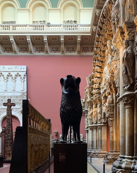
Fig. 1: The Cast Courts, V&A. December 2019. Photograph: author’s own.

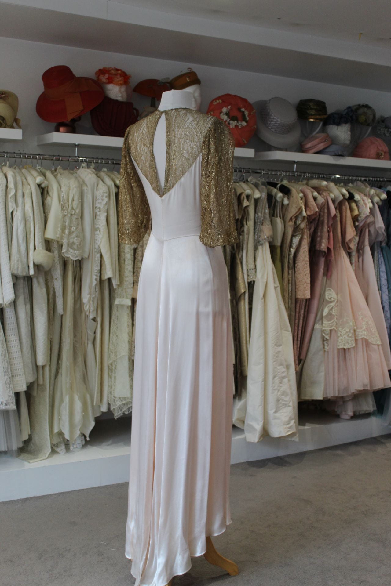
I had arrived early and wandered through the cast courts at the V&A. Passing time before the meeting with curators, I paused to take a photo of an intricate stonework frieze for a friend, texting it with the words, ’can’t believe it, working here’. The brief for the job was exciting: a three month curatorial research project to explore the design history of an everyday manufacturing material, working alongside another researcher who would, in parallel, identify the objects in the museum’s collection to tell the story. It also involved looking through an entirely different lens at a collection close to my heart, the Jobbing Printing collection of commercial print at the National Art Library, to find the contextual objects that would best illustrate the material’s cultural significance and use. This early stage scoping research was a proof of concept exercise: ‘what was the story, did the museum have the objects to narrate it and were there opportunities to reframe the way we think about this material?’ I reflected that my BA/MA study had, of course, enabled me to apply for this role yet there were other factors too: field specialisation, volunteering, the encouragement of tutors and colleagues, and right place/right time opportunities.

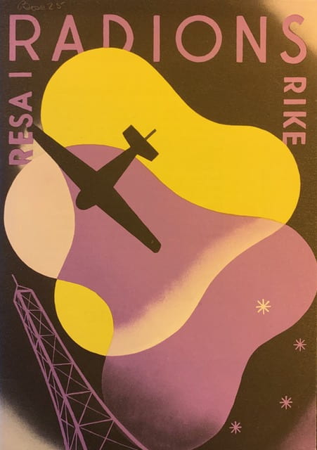
Fig. 2: Luxor Radio, Sweden, publicity material. 1930s. JP Box 25. V&A National Art Library Jobbing Printing Collection.

My interest in graphic design began when I worked in the design industry. As my Museum and Heritage Studies BA progressed I became particularly interested in design during the interwar period. Lectures such as Jonathan Woodham’s ‘American Design Between the Wars’ in 2012 (my notes to this lecture: ‘Streamlining. Speed whiskers. Aerodynamic corners. Faster, better’) brought into sharp focus how artists and designers were imagining this brave new material world. Commercial art, as it was called then, also underwent a radical transformation as modernist designers embraced new technologies such as photography and print production processes, and organisations began to recognise its value as a powerful tool for business and recovery following the Depression. An assignment to research an exhibition display from Britain Can Make It (V&A, 1946) extended my interest even further to the post war period and led me to discover the University of Brighton Design Archives. It was here that I found photographs recording the wartime exhibitions of emigré designer F. H. K. Henrion for the Ministry of Information and US Office of War Information, which became my dissertation topic.

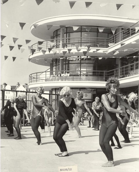
Fig. 3: Aerobics at the De La Warr Pavilion. The People’s Pavilion: Our First 80 Years (2016). Photograph: Bexhill Observer, September 1983. Image: B2226/22. Courtesy: DLWP/Bexhill Museum.

I began volunteering early on in my BA to gain experience of working in the cultural sector and was briefly a gallery assistant at The Towner and a volunteer at the Design Museum, responsible for cleaning and packing objects for their move from Shad Thames to Kensington. I was also a regular volunteer at the iconic modernist building by the sea, the De La Warr Pavilion in Bexhill. Whilst there, I wrote the gallery guide for a Hayward Touring exhibition, helped out with admin and co-curated an exhibition, The People’s Pavilion: Our First 80 Years (2016). 

Fast forward to the first term of my part-time History of Design and Material Culture MA when the DLWP asked me to undertake curatorial research for their exhibition, The New Line Works: from the Jobbing Printing Collection (2016/17). A collaboration with the V&A’s National Art Library (NAL), the exhibition showcased some of the treasures from this commercial art collection assembled by Keeper of the Library, Philip James, between 1936-39. On display were works by some of the most prominent international designers of the period, such as Edward Bawden, Barnett Friedmann, Edward McKnight Kauffer, Herbert Matter, László Moholy-Nagy and Serge Chermayeff, the joint architect of the Pavilion.

Fig. 4: Installation shot, ‘The New Line: Works from the Jobbing Printing Collection’ (2016/17). De La Warr Pavilion. Photographer: Nigel Green. Courtesy: dlwp.com.

Once I’d completed this research, I knew I wanted to continue and hoped to make it my dissertation topic. I wrote to NAL curator Deborah Sutherland to ask whether there were aspects of the collection that would benefit from research. She generously invited me into the NAL to discuss three proposals. One in particular stood out, a collection within the collection containing rare Czech, German, Russian and Swiss works sold to the library by exiled German typographer and educator Jan Tschichold in 1937. It was significant as the only collection purchased for Jobbing Printing at a time when the museum did not actively collect Modernist material. I was also fortunate because Professor Jeremy Aynsley, my dissertation tutor, knew the collection well, having written about it in 1995 and exhibited works from it.

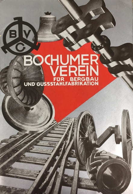
Fig. 5: Bochumer Verein publicity material, ca. 1925. Designer: Max Burchartz. JP Box 34 (a). Museum Number: 38041800366916. V&A National Art Library Jobbing Printing Collection.

In order to gain access to the objects I was sponsored by the NAL as a volunteer, this took a few weeks of paperwork relays and security checks. Even though I completed my MA dissertation in 2018, I have continued as a volunteer researcher whilst working part-time, cataloguing the works and contributing a blog post about one of its objects, a ticket to the party to inaugurate the Bauhaus school’s new buildings in Dessau, 1926. The collection continues to surprise us. Having shared a research presentation I gave at the Bard Graduate Center with the NAL team, a colleague discovered Philip James’ works list for his exhibition, Modern Commercial Typography (V&A, 1936/37), the catalyst for the Jan Tschichold purchase. This was such a find. Previously we had relied on press articles to tell us what he had displayed; finally we knew for certain.

The opportunity to work as a curatorial researcher for the Design, Architecture and Digital Department (DAD) at V&A was advertised in 2019.  The role was a part-time job share and I was responsible for design history research and uncovering some of the more unusual stories. My research partner was John Williams, Collections Moves Officer who was seconded from the Blythe House Decant to identify the objects in the collection that would best illustrate this narrative. We met on Tuesdays in the research department and used WhatsApp to share images, research and snippets we had discovered. I used the online resources of the museum and accessed contemporary journals, images and texts in the NAL and St Peter’s House Library to understand the cultural context.  We met regularly with senior curators Corinna Gardner and Johanna Agermann Ross, who provided direction and urged us to be critical. We visited specific exhibitions in order to analyse curatorial approaches and provoke questions about the different viewpoints we might take.

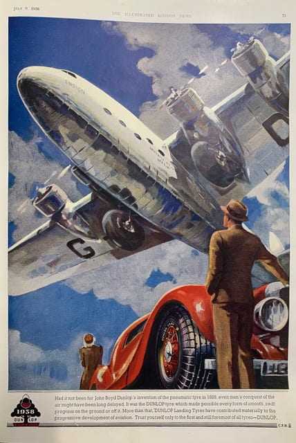
Fig. 6: Dunlop advertisement. The Illustrated London News, July 9, 1938. St Peter’s House Library, University of Brighton.

My deliverable was a timeline, report and slide presentation; John’s was a detailed object list containing images and descriptions. We shared our presentations with the team together with an online repository of our resources that John coordinated. What would I do differently next time? Set clearer parameters. With a subject so broad and endlessly fascinating, it was at times overwhelming. Working together remotely worked really well, although more face time would have perhaps produced a more unified final presentation.

I look forward to returning to the museum as an occasional volunteer when it re-opens, it will be great to see the team and Jobbing Printing. Having this project on my CV will be a great talking point as I continue to pursue other opportunities and personal research interests.

‘Chemicals Give Bread, Beauty and Prosperity!’

Lisa Hinkins, artist, student of MA Curating Collections and Heritage, and Gallery Explainer at Brighton Museum, tells the complex political history of an artefact in the collection.

This is a tale of East-West relations during the Cold War told through a lesser-known design classic, the Garden Egg Chair, on display in Brighton Museum & Art Gallery’s Twentieth Century Decorative Art and Design gallery. The chair reveals relations between East and West Germany in the period now referred to as the Thaw Years (1953-1964).

The post-World War II division of Germany meant that the East of the country inherited the nation’s extensive chemical industry. It gave what was then the Communist-ruled German Democratic Republic (GDR) a great position to compete with new synthetic materials. Inspired by the Space Race, futuristic designs were achieved. With the death of Stalin in 1953, the new Soviet Leader, Nikita Khrushchev was motivated to outdo the West. At the heart of the Communist future was to be higher living standards. Western designs, technologies and materials were viewed as products of a treacherous world but they could be adapted to a Socialist vision.

To compete with the West’s flow of goods crossing the border from West Germany, which was enjoying an economic miracle enabled by US loans, a ‘friendship pipe-line’ connected East Germany (GDR) with Soviet oilfields. The Council for Mutual Economic Assistance permitted GDR factories to supply industrial and domestic plastic products  for GDR and the Eastern Bloc, while the Kremlin used oil as a way of propping up the GDR economy in the face of Western competition. GDR leader Walter Ulbricht announced it as an essential element of the socialist cultural revolution’. At the 1958 Chemical Conference he proclaimed, ‘Chemicals Give Bread, Beauty and Prosperity!’

Newer thermoplastics such as polyethylene and polypropylene were preferred products for GDR designers. The possibilities of a new world challenged the dominating official Stalinist aesthetic, which had imitated rococo and Chippendale styles. These were expensive and not suited to mass production, but at the same time Bauhaus-style modern design was viewed as dangerously international, cosmopolitan and a weapon of imperialism. In 1956 Khrushchev proclaimed that he wanted to build ‘better, cheaper, and faster’. The stylistic tide was changing in favour of the Bauhaus-influenced designers. Modernist designers gained control of the aesthetic discourse in East Germany, though many in government found this hard to reconcile. Designers used plastic in unity of form and function. It was manipulated to fit the functional needs of the product, not to cut overheads and increase profit. Most of the GDR population saw plastic as a quality material and a sign of technological progress.

Peter Ghyzczy, Garden Egg Chair. c. 1968. Brighton Museum & Art Gallery. Photograph by Lisa Hinkins. 2018.

Designer Peter Ghyzczy was born in Budapest, Hungary in 1940. After the 1956 political unrest he moved to Vienna, and then to Bonn. He studied sculpture in Düsseldorf and then architecture. After graduating he produced many designs for furniture including the Garden Egg Chair, one of the earliest examples of a hinged chair. The political Thaw did not last and by the early 1960s the ultimate ‘check on freedom’ was the construction of the Berlin Wall in 1961. The East German leader Walter Ulbricht called it an ‘anti-fascist protection barrier’. Ghyzczy’s design defied the barrier with new materials testing carried out in West Germany. Cheaper labour meant the chair could be produced in East Germany. This border-crossing practice was not unique, but it was not publicly acknowledged. The flood of people fleeing East to West threatened the national economy and revealed the GDR’s inability to match the West in the consumer boom. The Garden Egg Chair demonstrates these problems. In the GDR, the chair was unaffordable for the general consumer. Officially one third of production was sold in West Germany, while the rest was for the domestic market and for export.

Expectations raised by the Eastern Bloc were not alleviated when hard currency shops selling Western consumer goods opened in the mid-1960s nor when factories churned out cars and stereos for the domestic market. There were great design accomplishments in the Eastern Bloc, but they did not reach consumers. Production of the Garden Egg Chair ceased after about three years, in part due to its problematic lacquering process. Shortages continued  for people living in the Eastern Bloc and promises could not be fulfilled by the communist regime. Cracks also appeared in design discourse with further outbursts from Khrushchev in Moscow and Ulbricht in East Germany on the subject of modern art and ceramics. Some designs were just too modern, even for those in the vanguard of socialism. Ghyzczy moved to the Netherlands in the early 1970s. He developed new ways in fixing glass to metal, resulting in his signature designs for furniture including tables of frameless glass secured with a single brass screw.

After the fall of the Berlin Wall in 1989, followed by the re-unification of Germany in 1990, scholars started to dispel the myths that Western capitalist countries had no contact with Eastern Bloc countries during the Cold War period and the full story of these design exchanges could be told. Brighton Museum & Art Gallery acquired its Garden Egg Chair in 1999. The Twentieth Century Gallery offers a unique setting for a distinctive chair with a complex history.

Further reading:

Crowley, David and Jane Pavitt, eds. Cold War Modern Design 1945-1970. London: V&A Publishing, 2010.

http://www.vam.ac.uk/content/articles/g/the-garden-egg-chair/

Skip to toolbar