Abstract Experiments

I began by creating abstracts with 6 crops from photos taken in my series of photographs. I began by experimenting with overlaying and warping my images together to see what came out as a result. I wanted to create a collage of surreal images to go with the normal photograph to make a sense of uncertainty and confusion for the viewer. I thought this would be a good idea because it would make the viewer look twice at all the images to figure out what they are and what part of the photograph do they come from.

I got this idea from looking at Rorschach tests, and wanted the viewer to analyse and create their own interpretation of what the abstract was and could be. This could then relate to their own situations and emotions.

I decided on making the grid have 6 images to show a variation of techniques and experiments, following on from my David Hockney research. However, by having 6 images, it makes it slightly confusing and overwhelming. Also some experiments are stronger than others so the weaker ones potentially take away from the successful images. (All photos taken by me)


Lily Abstracts

These abstracts were created from three of the different ‘house’ shoots. For the initial experiment I selected different sizes of square crops to see what kind of effect this would give to the images. I believe it was somewhat successful as it draws the viewer in closely to see what the smaller boxes are. However, after experimenting further I decided that all prints should be the same size, so that they all get viewed equally.

The process I began with was cropping into the images and picking sections which I found most interesting. I then added a black and white gradient to overlay each crop to bring out the shadows and highlights. This was successful however I didn’t think I was getting the most out of this idea.

I went onto continuing to crop into the images, but using the same crop size. I then experimented with duplicating the crop in Photoshop and overlaying it on the original image. I then changed the blend setting to either: multiply, overlay, darken colour, screen or hard light. This however sometimes didn’t work with the images so I would either not use them in the grid or I would use another blend setting. I think the outcome of these abstract edits worked really well because they obscured the original photo and allowed the viewer to create their own interpretation.


Peter Shoot

This series of images is more of a documentary narrative compared to the other shoots I have created. I wanted to document the models daily activities, however keep in theme with my concept of isolation. For this series I wanted to try and keep the models face out of the images to create a suspicion around the images. Like the rest of my collection, I have photographed objects in the foreground and background to create the sense of being a fly on the wall, and allow the viewer to feel the intimacy with the model. This shoot was successful because I wanted it to represent everyday life for people who have full time jobs. I wanted to show the connection between the model and the car because this is where they spend most of their time commuting to and from work.

Shooting in black and white adds to the bleak feel to the images which fits well with my concept. My favourite images from this series are the ones in the car because of the heightened blacks, meaning you cant really tell what’s going on unless you look closely. Or the ones of the model in his room, again for the same reason. I also think that by having the door in the foreground of the images it creates a distance between the model and the viewer, increasing the feeling of isolation.

(All photos taken by me)


Zak Shoot

This series focuses on a musician and his routine. For this set of images I wanted to push my experimentation by playing around with the composition. Unfortunately I forgot my wide angle lens which would have made the images more distorted like some of the other shoots, however I think by having obstacles in the foreground this creates confusion and makes the viewer think why is this a factor in the image? The reason is to keep in theme with my concept and capture the images as if I’m not there. I believe this affects my images in a positive way because it makes the images have more of a personal, raw feel to them.

I wanted to portray this series especially because I feel a true connection with the concept. I have a lot of musicians as friends and they often tell me they prefer to be alone when writing music or even when they just play for fun. I used a lot of repetition with this collection as I wanted to get different perspectives of the same image. I did this because I thought it fit well with the concept of this shoot and tried to match the images with the quote.

(All photos taken by me)


Dad Shoot

For this shoot I photographed a different age group. I did this to show diversity within my book. I decided to stick with the models safe space and capture them when they are most relaxed and comfortable. I did this to get the most emotion out of my images. Another thing which adds to the personal feel to the images is how the model is dressed. The styling was left up to the model, hence the comfort clothes and relaxed attire. However because the model is on his phone it gives the sense that he is a busy, popular man and therefore not isolated, but, in reality, his actual space around him is empty.

I decided on photographing a range of activities in various angles to show a variation of the models life. I wanted to get him doing normal everyday roles to make the shoot feel personal and realistically relatable to the viewers.

(All photos taken by me)


Tom Shoot

For this shoot I wanted to capture isolation/solitude outdoors. I thought by doing this it would add diversity to my final outcome as I am showing that isolation can affect people anywhere and everywhere.

The styling for this shoot was again left to what the model felt comfortable in, which I think adds to the personal feel towards the image. Similar to the other shoots, I used a variety of angles to show the isolation in the scene. I wanted to get shots of the model walking alone, to promote the solitude effect, but I also wanted to show communication through technology.

To improve this shoot I could have got the model to pose in certain ways or experiment more with the scene, for example go to other locations.

(All photos taken by me)


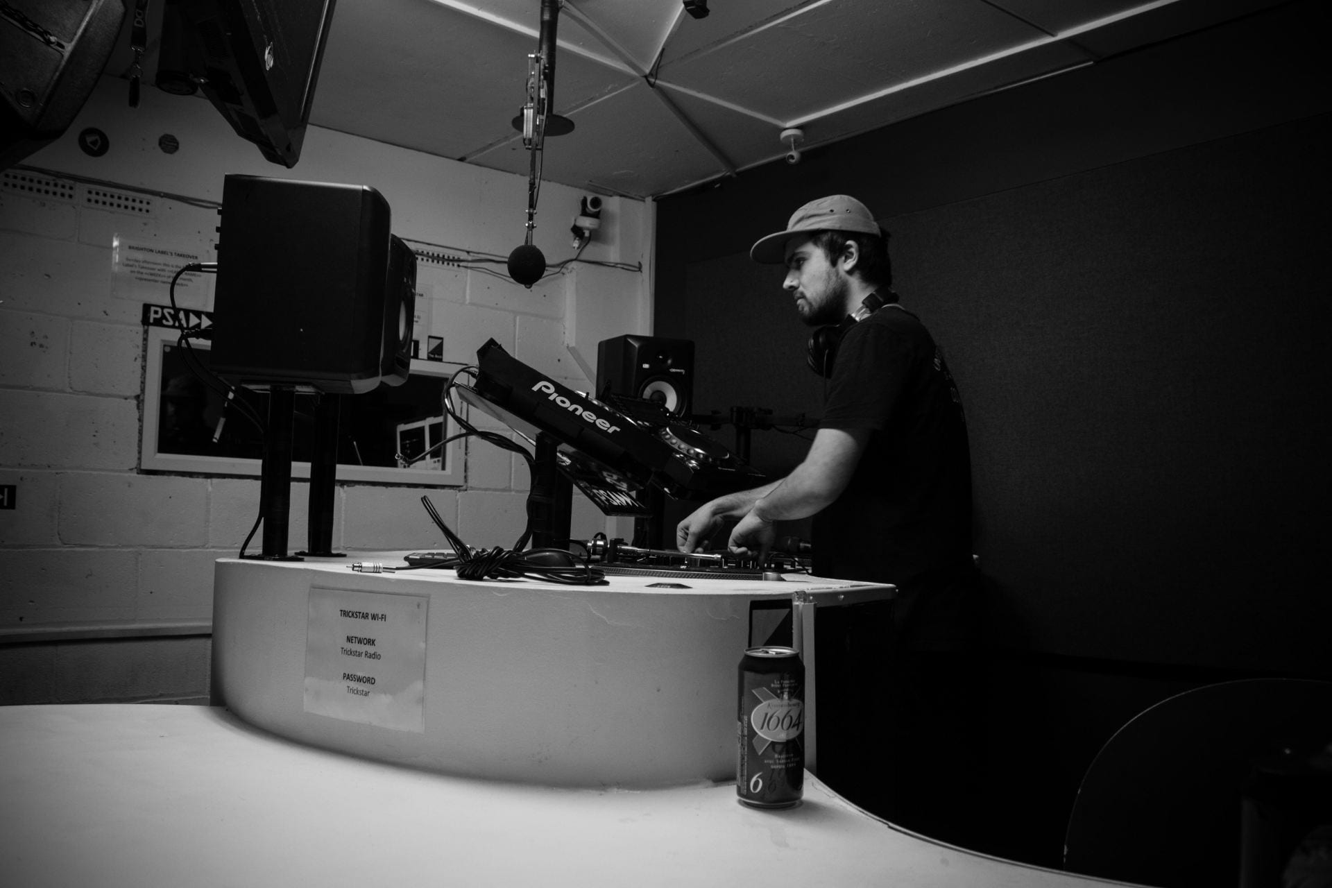
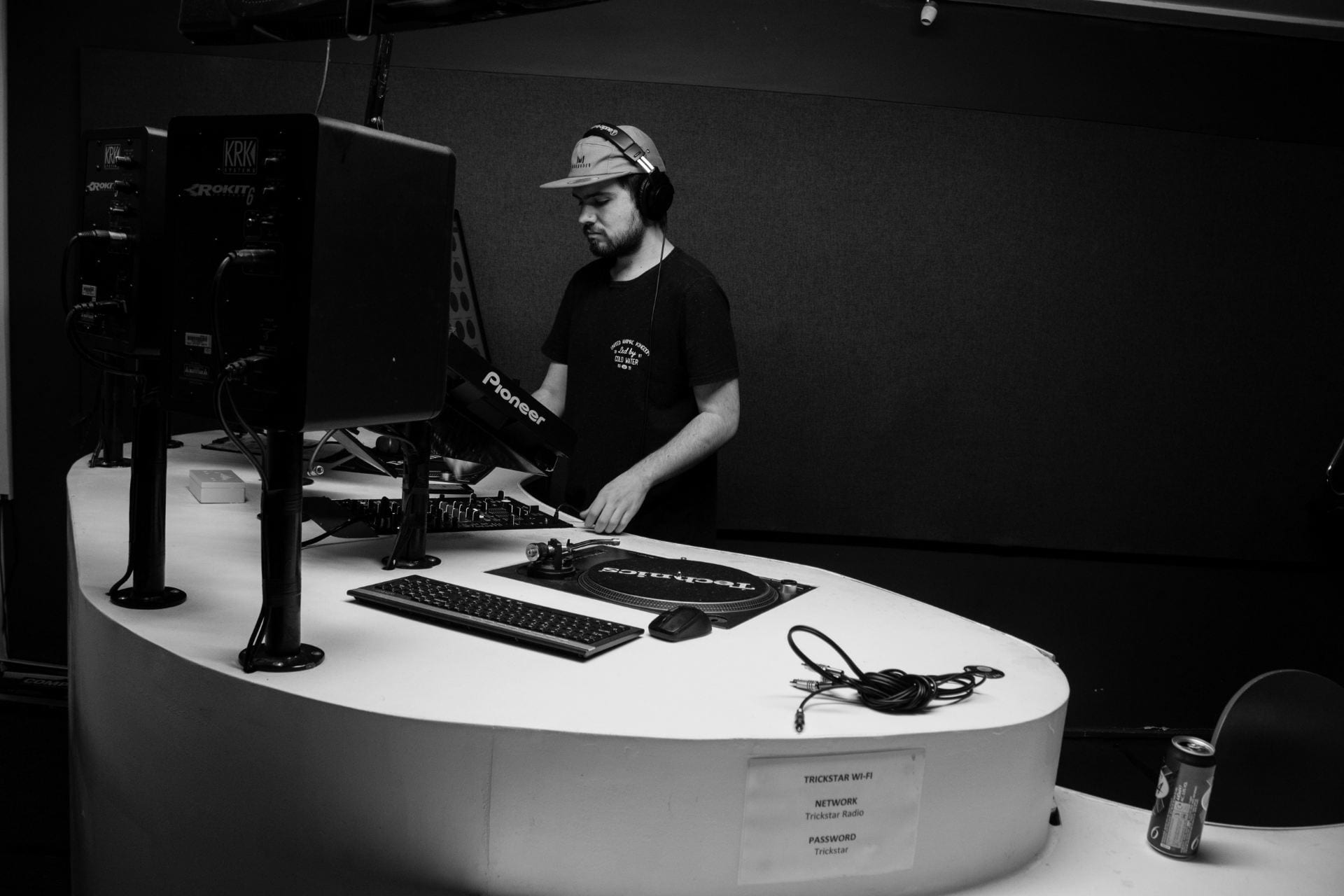
Trickstar Radio 2nd Shoot

I wanted to reshoot this series because the first one didn’t have enough diverse images. This reshoot was effective as it captured the model in an empty, isolated space, but performing the complete opposite.

I wanted to, again, be a fly on the wall in this shoot and just capture real life moments. The styling was down to the model and what they felt comfortable in, which also reflects what they’re doing and the genre to which they’re playing.

(All photos taken by me)

Sam 3rd Shoot

This shoot was set in her flat, and I was just a ‘fly on the wall’ taking photos of her doing her daily routines. I wanted to capture her throughout the day to see her at her most vulnerable state where she has just woken up and doing her morning routine to where she feels more confident as the day goes on and she starts doing work on her laptop.

I wanted to get a range of images with different compositions to experiment with how the final result turned out. A common theme through my images is reflection, whether that be through glass or mirror. I think this is an interesting technique because it’s as though the viewer looking into the subjects lives and routines, like they are a television show.

(All photos taken by me)    

Sam 2nd Shoot

This shoot wasn’t as successful as the others I have produced. I wanted to experiment with having the model outside of her comfort zone, in a working scenario to see what kind of effect and emotion it gave my images. However, because the location wasn’t personal to her my images didn’t have the same feel and sentiment as the others from the series.

I like how I had a variety of different angles, and I think the photos from a higher angle emphasise the sense of loneliness and with having the grate in the foreground, it makes the viewer distant from the model, and as if the subjects isolation is a prison. The location of the shoot makes the images quite busy as there is a lot going on in the background, but the use of vignette on my images draws the viewers eyes to the centre of the image where the model is.

(All photos taken by me)  

Reece Shoot

This shoot, like the others in this series, focused on an important aspect in the models life. He has an interest in gaming and so takes himself away from social situations and instead focuses on his online reality. I used a variety of angles and lenses when taking this series, as I wanted to show a range of perspectives. I wanted to show how technology might make you feel as though you’re being social when really it takes you away from real life moments. Following on from my other photo series, I wanted obstacles in the foreground to separate the viewer from subject to increase the feeling of isolation and solitude. I think this shoot was successful because of the variety of shots and I think I’ve captured his personal isolation through his activity.

(All photos taken by me)

Emma 2nd Shoot

We then moved outside to test how the images would turn out, whilst still sticking to my concept. Again, I think this is one of the most successful series I have shot because, although the model is slightly more posed, I think this makes the images fit better. If I had been a ‘fly on the wall’ I don’t think I would have got the same outcome.

Like the other photos I have taken, this was shot in her space, where she’s comfortable, hence the relaxed styling and comfortable posing.

(All photos taken by me)

Skip to toolbar