500 word manifesto for brand analysis.
I decided to begin researching different companies who were sustainable and ethnic. I found a lot of different companies however there were five that really stood out to me. The first one I found was ‘Indigenous’. This company focuses on supporting and preserving fair trade wages and artisans. It is a very eco friendly company who only uses natural, organic fabrics and everything they make is handmade. However, this company’s target audience in my opinion mostly fit with middle aged people because their clothes were quite mature and they are very expensive. I then found ‘Nomads’. This company had the same values as Indigenous, however due to this company having an interest in the Indian culture this showed in their clothes because they had a very bohemian style compared to the simplistic look that Indigenous had. I then moved onto find ‘Krochet Kids’. As soon as I began researching this company I knew I would focus on it. The thing that interested me most about them is not only their clothes who are aimed at my age group, but the fact that they are a non-profit organization and their sole focus is to “empower people to rise above poverty” and they have statistics and figures of how their company has helped change peoples lives already. I then researched two more businesses which were ‘Mayamiko’ and ‘Symbology’. Again like the other businesses I researched they were quite similar to Nomads for their designs and how they want to preserve the traditional art forms and help artisans.
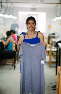
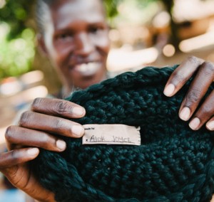
I decided to focus on Krochet Kids because I didn’t only agree with their ideas but I also liked how they have internships where you can actually go and help out or be a photographer or cinematographer. I also really liked the style of clothes they create, probably because it is aimed at my age group. Then I thought of ways to develop the brand and that is one of the ways. I thought they could try and expand their target audience by creating different clothes for different occasions and also try and experiment with different fibres and textiles. Because at the moment their clothes are quite simple, for example when you compare it to Symbology who have influences from India (block printing), Palestine (weaving) and Native America (embroidery) I think they could try and also adapt these styles into their business. Also when I was doing my research I found that some of their clothes are 100% cotton which is known as one of the most polluting products available, so I researched and found that they could maybe experiment with bamboo and spiders silk or other materials like that which don’t harm the environment. However, the only problem with this is they are either difficult to get hold of or too expensive, especially for a non-profit organization. But they could do more promoting of their business and hold fundraising events to try and get more finance to try these ideas.
