Author Archives: Georgina Lowe
Trekstock – Merchandise
Trekstock – Initial Posters
Trekstock – Logo Experiments
Trekstock – Initial Shoots
Trekstock – Concept
After I had finished my researching of the different charities out there I began to think of different concepts for my campaign.
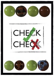
I decided to focus on a more metaphorical concept. My initial thought was about testicular cancer because not only does it not get much publicity like breast cancer, but I also thought that men don’t really like talking about if they have a problem or even acknowledging a problem. I chose to focus on doing a poster for this campaign. For this I wanted to make it eye catching and bold so it would stand out and catch the attention of the target audience.
Trekstock – Research
I began by researching Trekstock and seeing who their target audience is and what kind of things they do for their charity.
Then, I went onto researching their competitors and doing the same thing. A couple of the ones I looked at were specific to different types of cancer – for example Orchid – where as others – such as Cancer Research UK – were involved in pretty much every type of cancer out there.
Trekstock
Diversity – Evaluation
Evaluation
Diversity now, was a very fast and interesting project which allowed me to look into a lot of different pathways when looking at the concept of diversity. I decided to initially look at body dysmorphia and how the fashion industry contributes to female and also male body issues. I looked at artists such as bart hess and Lucy Mcrae and their series which focuses on body architecture. I also looked at Jenny Saville who is a contemporary painter who looks at the real female body. I did a test shot based on my research however it didn’t work out as well as I had wanted it to, so I moved on to one of my other concepts. I also spoke to one of my tutors and they didn’t really understand my concept and how it related to diversity so I decided to change my idea and try and make it relate more.
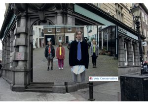
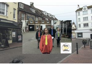
The next concept I looked at was political and how diverse each political party is. The parties I looked into were labour, conservative, green and liberal. I researched the history of each party and looked at who their supporters were to get a better idea of the styling for each shoot, and I also researched why they chose the colours they did. When it came to the shoot it didn’t go as successfully as I wanted because I couldn’t get the models for the time of the shoot so I had to get someone to take some of the photos for me. However a lot of those photos didn’t turn out as I wanted, for example the composition was wrong and most of the models were doing different things and only realised after I had finished the whole shoot. I now know for next time to be more organised and plan ahead and make sure the shoot is when all models are avaliable at the same time. However, I tried to make the best out of that situation and created a different final outcome to my original idea. But, when it came to my tutorial my tutor and I agreed that my message wasn’t coming across in my photos and that I needed to reshoot using a different styling idea. However, there wasn’t enough time so I ended up just combining my photos with some illustrations which I think worked out quite well!
If I were to do this project again I would definitely sort my timings out and get a proper plan and concept for my shoots. I would also arrange my models so that the shoot will flow and work better, resulting in images that follow my original concept and be sure that they have a narrative.


