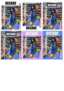
Having experimented with different layouts for my magazine I have chosen this to be my final outcome. I have chosen the blue background as I feel that the white does not represent the brand well, and the pink gives of girl only connotations when in fact the magazine is unisex targeted.
I have also changed the name of the magazine from Eternal to Decade. I have done this because Eternal sounded more high end and better suited to a older audience, where as Decade sounds more youthful. Decade can also be interpreted for the meaning of ten years, or decading material. Both relevant to sustainable fashion.


