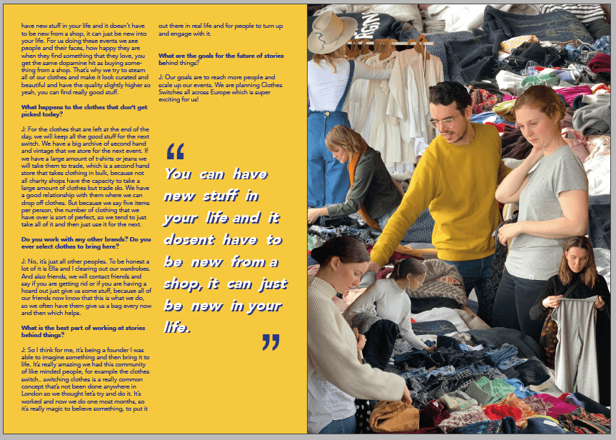
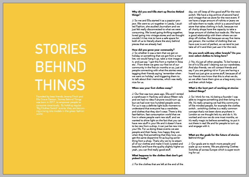
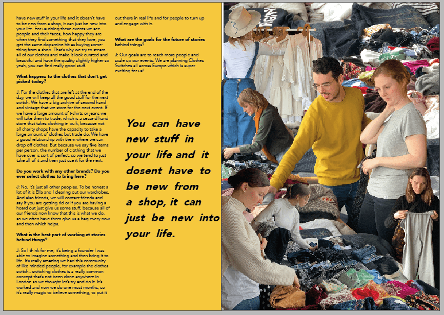
Now I have developed my magazine further I am not sure if the illustration which I created for the ‘Stories Behind Things’ feature is of the same tone to the rest of my magazine. Once taking out the collage, I created these experimental spreads, consisting of one collage, the interview and a pull out quote.


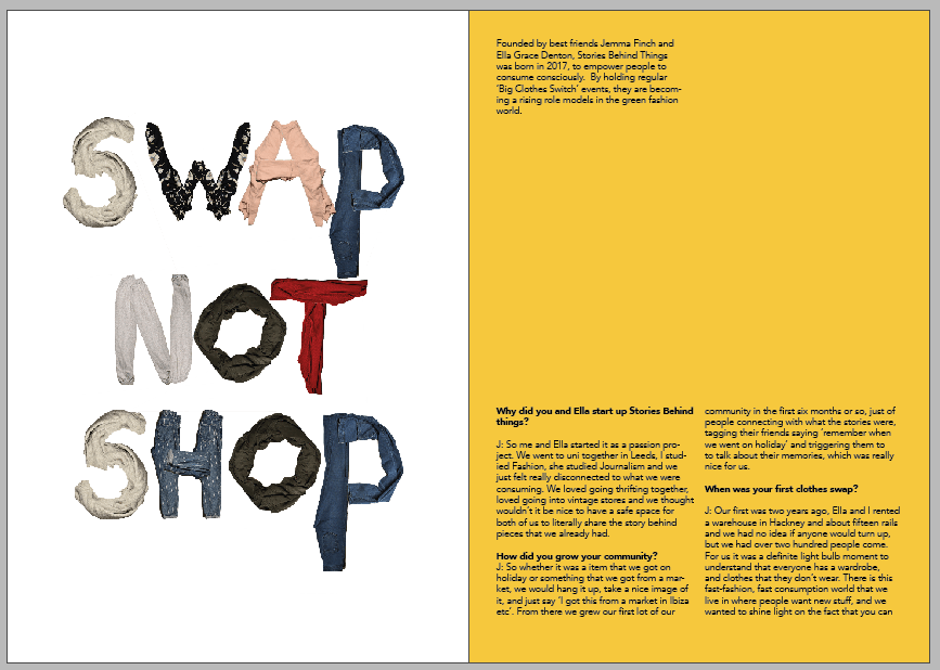
I began to create a page of typography as another way of illustrating the feature. I took these photographs of my clothes and created an alphabet previously yet had no use for them in the magazine as of yet. I am keen to use the phrase ‘Swap Not Shop’ as the previous title, ‘Stories Behind Things’ was the name of the company running the event, yet it did not easily communicate to the reader what the feature is about. I developed the alphabet into upper case letters, as it is clearer to read and more eye catching.


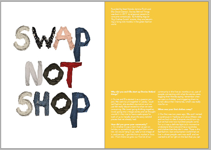
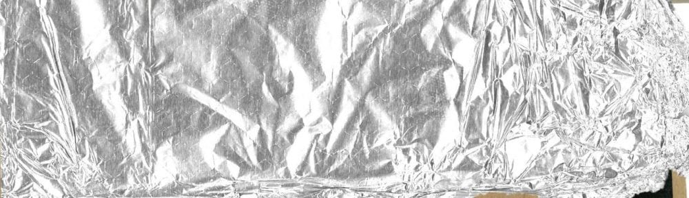
In order to experiment with different textured backgrounds I scanned a cotton t-shirt, and a creased piece of paper. Due to the letters in the typography being of a range of colours and patterns, I want to keep the background plain and of a white/grey scale.


After deciding that the typography looks best in this format and background, I developed further by changing the repeating letters S and P, from other items of clothing. I increased the saturation and brightness of all layers so that there is a higher contrast against the paper.

FINAL PAGES: