We can all relate to receiving 100’s of marketing emails a week, which often will be disregarded and marked as spam if we do not hold a keen interest in the content and offers available. Sometimes this can even be down to an uninteresting title of an email, which makes our mind up instantly!
However, Ellis-Chadwick & Doherty (2012) concluded from their research that in fact email marketing is a very important medium of communication for modern businesses in the new digital age. Successful email marketing allows them to build and maintain closer relationships with customers. In light of my aforementioned comment on email titles, this issue can be eradicated and the relationships can actually be built with appropriate subject lines. This is because it serves as the first point of contact and acts as a trigger for the recipient to actually open the message.
In this post, I am going to examine an event triggered email from Myprotein as I have used their products consistently for the past three and a half years. I receive promotional emails from them almost daily and feel appreciated as being a poor student these savings help me to purchase the protein products without breaking the bank.
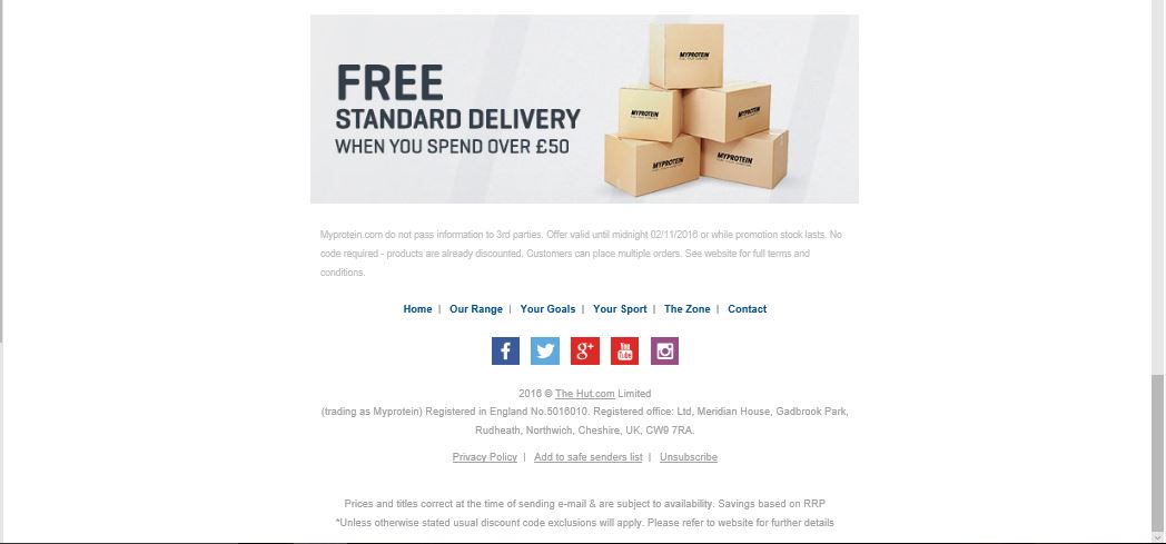
Example of an event triggered email from Myprotein


(Click each image to enlarge view)
I am always happy to open the promotional emails from Myprotein, as they value their customers by providing offers each week to ensure you buy the products you love. Despite the emails not beginning with a ‘Dear Josh’, the personalisation is delivered within the email heading; ‘We’ve halved the price of your favourites for 48 hours’. The use of ‘your’ shows that the direct marketing will show different products to each subscriber, depending on your tastes and preferences from the Myprotein site. The length of the email is also very succinct and to the point which is crucial when marketing their products to me.
Perhaps a bit more personalisation within the promotional emails though would be appreciated in the future though, as this would explicitly show they valued my custom and I was not just an email address on their system. Here is an article to how businesses can personalise their emails in a more effective way.
The use of the pictured products within the email enticed my interest as I could physically see the products I wanted to purchase, even before proceeding to the landing page. This form of permission marketing (whereby I have signed up for the email updates) is a great way for Myprotein to connect with me, and ensure that I continue to purchase their goods for years to come (Godin, 1999).
Although one negative of the products being listed, was that there was not a price listed for each item so you do not initially know the price after the discount is applied.
The design of the email is very impressive though as it cuts a very professional visual image for me as the consumer, and I like the way the blue text stands out with the plain white background. All branding and information is kept within the centre of the page, which is different to many emails I normally receive. The use of the small blue boxes under each product improves the ease of utilising the offers being states, and if I am in a rush then this helps to persuade me to still buy the product. The delivery costs are clearly explained which provides clarity for the rest of the transaction.
The use of quick links to Myprotein’s social media at the bottom of the email is also very useful, as you can further connect with the company and receive updates through different communication channels to the emails.
Landing Page- ‘The Call to Action’

(Click each image to enlarge view)
Critique of Landing Page
Pros;
- The email prompted me to take action and visit the landing page.
- The landing page replicates the offers presented in the email which helped me to easily navigate to the flavour of protein I usually purchase.
- There was slightly more personalisation on the landing page as it automatically logged into my account, which reduces the time of placing the order from the basket.
- The design of the landing page was eye-catching and this increased my interest in exploring the rest of the site after I had added my product to the basket.
- Having clicked the call to action buttons on the marketing email, it would have been useful to maybe add the product to the basket instantly. Especially as I was already logged into my account and expressed my interest by clicking the products blue button (Buy Now).
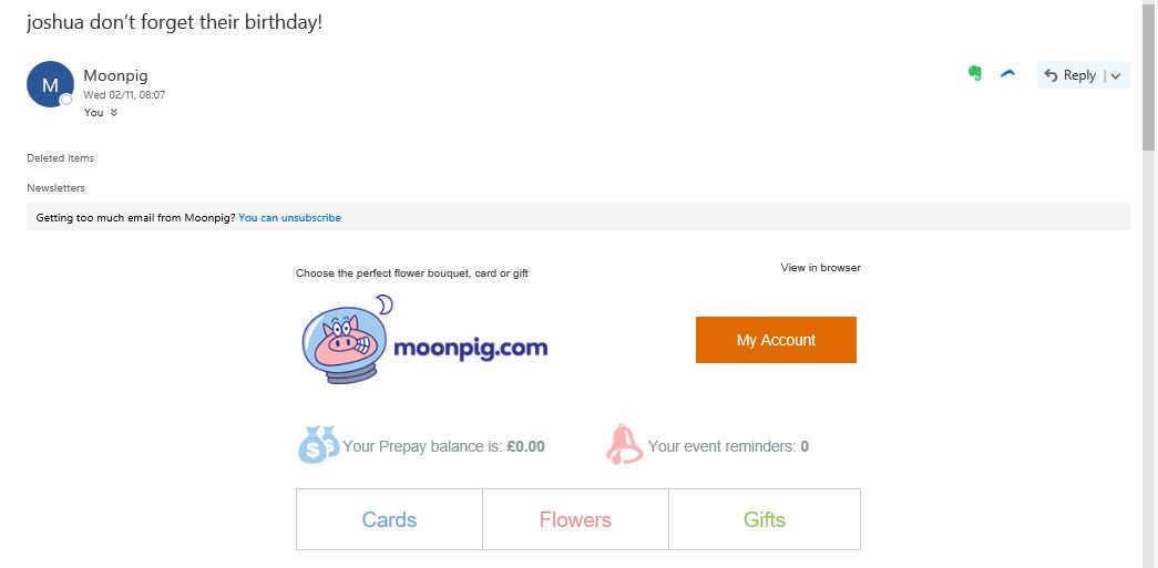
- Also, in terms of improving Myprotein’s approach to personalisation I would recommend they followed Moonpig’s example of using my name in the email subject and landing page. This helps to grab my attention and show it is a more personal experience, each time I purchase goods from them.