Over the summer, I was inspired by the following artists:
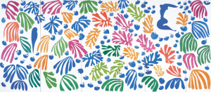
Naomi Vona (IG:@mariko_koda):

I like how this artist plays with bright colours, the layering of patterns on top of each other and the use of simple repetitive shapes. I’ve also always been obsessed with this oval shaped doodle over the top of the image. I love the way it looks and feels to draw. (Visual Research)
Kelly Dombrowski (IG:@kellydombrowski):

This artist uses alcohol ink to create backgrounds then she outline each colour with the black linework. I love the colours she uses and the shapes that are created with the linework. It reminds me of cells in plants or how oil behaves in water. I like the organic feel to the art. The colours make me think of stained glass windows. (Visual Research)
Josh Jensen (IG:@jsjensenart):
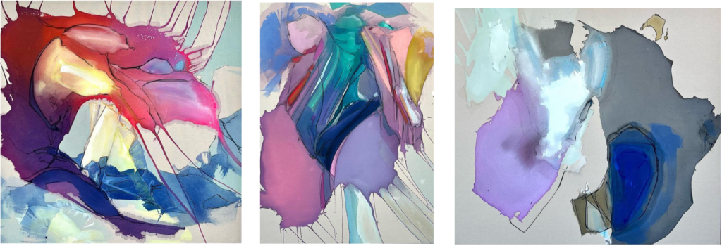
I love the colour palettes this artist uses, and how he lets the colours bleed, creating new shades and tones. I like the use of complimentary and contrasting colours. I like that the artist has kept the medium true to the nature of how it behaves, with washes and drips. I love the negative spaces in the work because it highlights the shapes created by the colour. (Visual Research)
Jenna Kast (IG:@jennakaststudio):
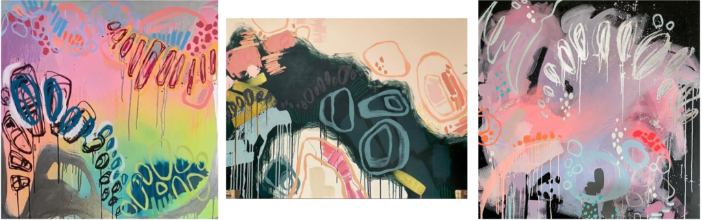
I feel very inspired and energised when I look at the artist. I love the use of colour, especially how the contrasting colours enhance each piece. I really like the use of simple shapes as they feel organic. I this the artist has a good eye for balance, I like how the negative space allows room to the areas of detail, allowing the art to feel balanced. I really love the mixture of blended colour, block colour and patterns. I think the drips work well sometimes but not all the time, I feel they can make the piece look messy if overused. I would love for my work to go down a similar direction to this artists work. I will make some test prints to get familiar with my mediums, compositions and balance but as I develop work, I will hold this artists work in my mind for future inspiration. (Visual Research)
Inspiration continued- SP4:
Tatjana Labossiere (IG: @tatjana.labossiere)
This artist uses the monotype printing method to create this effect.
Finding this artist and her work has really ignited a drive and a passion inside me to create something similar to this. I feel like I’ve always been interested in this type of art, but never knew how to achieve it, so when I found this artist on Instagram, it was like my brain started firing on all cylinders and I got so excited to get into the workshops are start experimenting. I really love this work and how it in a mixture of transparency, texture, colour, tone, layering, natural details– cracks, scratches, broken edges, organic shape and repetition.
I want to make some prints like this and then take them into Photoshop, to edit the colour, composition, and transparency.
From her instagram: “Tatjana Labossiere is a monotype print artist whose works are inspired by the natural materials she work with. Highly skilled in the craft of etching, she develops her own way of doing print work to craft plates like a sculptor and uses them on the etching press to produce her works.
Drawing on her past academic research on natural materials, Tatjana depicts silhouettes of boulders and other rock formations using ink on paper. Viewing natural rock formations depicted in the traditional medium creates a unique experience that evokes awe and wonderment in viewers.” (Visual and Practical Research)


To add texture to the plates, I used some carborundum paste. So I did some research about carborundum prints and found;
Gillian Ayres


Peter Stiles writes about Ayres after visiting her in her studio: “Carborundum powder (an abrasive) is mixed with P.V.A. and painted onto zinc. The carborundum layer can vary in thickness and take on different textures, showing brush or finger marks. After drying, the plate is inked and the surface of the plate wiped so that ink remains in the grain of the carborundum. The plate is printed under a high pressure that presses the paper into and around the carborundum layer. The ink that was held by the ridges and mounds of carborundum sits on the print at the bottom of the pools and craters moulded into the paper. The thicker the carborundum on the plate, the deeper the impression in the paper.
This process forms a base for improvisation.
Once the plate has been wiped, if a rag full of colour is dragged over the surface of the print, the ridges of the plate take that colour so that the ensuing print has both an itaglio and a relief aspect to it.
She sometimes allows the washes of colour to bleed off the edge of the print onto the white paper that surrounds it. While working in the intensity of Indian sunlight, during her stay in Rajasthan in 1990 (sponsored by the British Council), she noted the way in which colour appeared to jump boundaries, bleeding off objects onto the walls and the pavements. Colour was not contained by images or objects and it is that quality of colour that she recalls in the clouds of colour that sometimes bloom from the edges of the prints.”
I really like the process that Ayres uses to create texture in her work, through the use of improvisation and how she allows the colour to behave how it wants, like when she lets the ink bleed off the edges, I also like to let the ink behave how it wants, especially when thinning it with white spirit. However, I don’t like the style of her work, it is too messy and childish.
A quote from a video interview of Ayres talking about her abstract work: “if its figurative, people go on about what is there, people go on about even Rembrandt paints noses. but with abstraction, people go on about other paintings. People try to understand and I wish they wouldn’t. I wish they would just look. its only visual. I’ll go further and say I don’t want an understanding, there is no understanding in this.” https://www.ft.com/video/efa167e8-76fb-31d6-a2cd-92a593cfd579
I really love what Ayres said here because I feel like that with my own artwork. Currently, when I make work, it doesn’t have narrative or a meaning, its purely visual; you either enjoy it or not, and that’s it. Art is for everyone to make their own assumptions but at the end of the day, my current art does not contain meaning. I am inspired by patterns in science such as rounded cell like shapes but visually. (Practical Research)
David Maisel


https://www.davidmaisel.com/photographs
I love how Maisel photos are bursting with colour, shape and pattern to draw the viewer attention, I enjoy the bright, rich colours within the shots. We enjoy these images for their detail until we learn what they are photos of; a poisoned landscape because of man, the leaking and bleeding chemicals onto the once untouched landscapes. I can relate to Maisel’s work because he is investigating the idea I was investigating in the macro photos of my print, revealing hidden detail from close up, but Maisel displays mass detail from high above. He is discovering patterns and colours from above in a helicopter. His work shows the Earth’s surface from such distance, that we no longer recognise it. Just as my photos are so zoomed in, we no longer recognise what we are looking at. I like that Maisel is killing two birds with one stone in these photographs; he is documenting something beautiful but devastating whilst bringing these hidden issues to attention of the public. I believe people should be made aware of how we are damaging the earth with consumerism. (Visual and Contextual Research)
From the website:
The Mining Project
Natural resource extraction and its consequences are themes central to Maisel’s photographic practice for nearly thirty years. Through aerial photography, the interlinked series Black Maps, The Mining Project, and American Mine explore sites across the United States that have been radically and irretrievably transformed by open pit mining. These images encompass documentary and aesthetic perspectives in equal measure, seeking to frame and interpret issues of contemporary landscape and culture. Literally and figuratively, the Earth’s consumption is revealed.
The Mining Project considers sites like the Berkeley Mine in Butte, Montana, whose open pit is filled with severely poisoned water a mile deep and nine hundred feet wide. American Mine features open pit mines on the Carlin Trend, the most prolific gold mining district in the Western Hemisphere. Mines from this region are the source of devastating mercury emissions, released when ore is heated during the process of gold extraction. Both series depict the calamitous practice of cyanide and sulfuric acid heap leaching, employed to extract microscopic particles of precious metals from mined ore, which often permit these deadly solutions to contaminate surrounding groundwater.
Inconceivably, federal legislation governing mining activity in the United States dates from more than 140 years ago. The legacy of the 1872 Mining Law, ratified in an era when America sought to develop the West and exploit natural resources without regard to environmental impact, has left this land deeply scarred. Current mining techniques carve out entire mountains and utilize tons of toxic chemicals at massive industrial sites. According to the Environmental Protection Agency, mining has become America’s largest source of toxic pollution. Further, the mining industry is a globalized one, whose practices are often less regulated in other countries.
Metals extracted from the Earth by open pit mining are used to manufacture products that we global citizens employ on a daily basis. The mines and their surrounding expanse of tailings ponds and cyanide leaching fields are byproducts of the developed nations’ culture of consumption. Our infrastructure, our technology, our transportation systems, and even the medium of photography itself, are all reliant on metals extracted from the Earth’s crust in methods both brutal and complex.
As citizens of an entrenched consumer society, we are collectively complicit in the creation of these depleted and damaged landscapes. Maisel’s photographs are intended to give visual form to the disquieting relationship between contemporary humanity and the Earth, between consumer and consumed. (End)
The photos above are from the projects The Lake Project, The Mining Project, and American Mine because these images demonstrate plenty of colour and are more visually pleasing and rich, however, I also looked at the Black Maps project, and although the images are beautifully taken and contain the same interesting details from the damaged landscape, they are not as interesting and engaging to look at because they are black and white. This sparks the idea that colour is so important in our life, to make us feel happy, sad and even scared. Through my test prints, I have come to the conclusion that colour is one of the most important aspects of my work, and the use of black makes everything dull and flat. I want to investigate colour more. See below for images from Black Maps project:


Art Under the Microscope
https://www.cell.com/pictureshow/art-under-the-microscope
Fire in Her Eyes
In this Picture Show, we continue the theme of beauty in science with artistic interpretations of scientific images. We partnered with the University of Michigan Health System to showcase a selection from the traveling exhibit Art Under the Microscope.
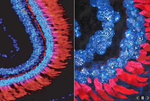
The zebrafish retina, unlike its human equivalent, is capable of regenerating in response to injury. Learning how zebrafish produce new photoreceptors, which are the light-detecting cells in the eye, may provide clues for designing therapies to reverse retinal degeneration in humans as a treatment for blindness.
Image: (Left) A section of the zebrafish retina is shown. The red feather-like cells are the photoreceptors, and the nuclei are marked in blue. (Right) Artist’s rendering using hand-sewn sequins to represent the bands of nuclei and red fabrics and handmade paper to depict the photoreceptors.
__________

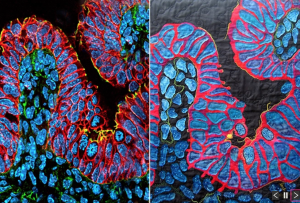
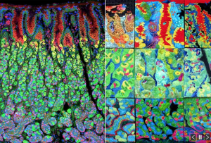
Guts and Glory
To maximize its absorptive capacity, the intestine is organized into billions of finger-like projections called villi. Each villus contains a layer of absorptive epithelial cells on the outer surface with blood vessels, nerves, muscle, and immune cells positioned inside.
Image: (Left) A cross-section of a single villus is shown, with absorptive epithelial cells marked in green and the internal blood vessels, nerves, muscle, and immune cells indicated in yellow and orange. (Right) Using the citrus-colored motif for inspiration, the artist renders the image in fabric.
__________
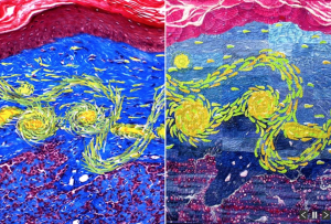
Van Gogh’s Skin
Basal skin carcinoma is the most common form of human skin cancer and can be modeled in mice because their underlying skin structure is similar to humans. Learning about how the disease forms in mice may provide clues to prevent skin cancer in humans.
Image: (Left) A cross-section of mouse skin with basal cell carcinoma is shown. The normal skin surface is stained red using Masoson trichrome stain. The blue dye marks the fibrous layer of collagen underlying the skin surface, and the basal tumor cells appear in the red at the bottom. (Right) Using Van Gogh’s “Starry Night” as inspiration, the artist renders the image with fabric and stitching to simulate the painter’s brushwork.
__________
Visibly Complex
The retina covers the inner surface of the eye and interprets and coveys visual information from the outside world to the brain. Although only a fraction of a millimeter across, the retina contains several layers of cells, which together relay and translate light signals to the optic nerve.
Image: (Left) A cross-section of mouse retina viewed using Nomarski optics reveals the layers comprising the tissue. The pigmented epithelial layer is shown in black, and antibody staining reveals the ganglion cells, cone photoreceptors, and inner plexiform layer in brown. (Right) The artist rendered the image using whole-piece quilting and dyeing/painting the quilt before and after stitching her pattern.
__________
Loch Ness
During embryonic development, the developing intestine undergoes remodeling to form the absorptive surface of the gut lumen. This process generates finger-like projections called villi that maximize the absorptive surface of the gut and are important for nutrient uptake.
Image: (Left) The initial folding of the intestinal epithelium (stained in red) into newly formed villi is shown here. Nuclei are stained in blue, with flower-like structures demarking actively dividing cells lining up their chromosomes. (Right) Inspired by the bright colors and undulating folds, the artist renders the image as the mythological storybook Loch Ness monster, Nessie.
__________
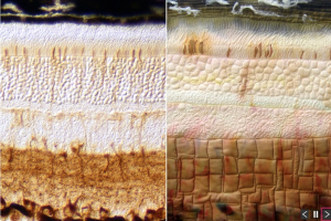
Mellow
Vascular plants contain numerous inner vessels (xylem and phloem) that are important for transporting nutrients and water throughout the plant. These vessels are surrounded by an outer layer of fibrous bundles that provide structural support for the plant and, in some cases, can be used to make textiles and rope.
Image: (Left) An unstained cross-section of the industrial hemp plant is shown here, revealing the plant’s natural pigments, which highlight the xylem vessels (red) phloem vessels (blue) and fiber bundles (greenish-red). (Right) The artist, inspired by the soft colors, circles, and texture of the image, renders the image in fabric.
__________
Gastric Rainbow
The stomach has the difficult task of promoting the digestion of food that enters the organ cavity while also preventing its own digestion. To achieve this balance, internal cells secrete stomach acid and digestive enzymes while the cells lining the stomach surface produce a layer of protective mucus.
Image: (Left) A cross-section of the mouse stomach is shown. The rainbow staining shows the outer layer of mucus-producing cells in red, followed by stomach-acid-producing cells labeled in green and enzyme-producing cells in magenta. (Right) The patchwork of quilts shown here was assembled though the collaborative effort of nine artists, who each independently interpreted a 10-inch section. (End)
In my early test prints, I was very interested in cell-like shapes in my prints, but they were very basic blobs, with no surface detail or texture. I love that these scientific images have been taken out of their natural, scientific environment and taken into an artistic one. I love how each scientific image contains something that is so small inside of us, that we are unaware of, but without them our bodies wouldn’t work properly. This idea link onto Maisel’s work and my macro photos of my prints;- hidden detail because of scale. The artist’s works are inspiring me to develop my work and use more clustering of the ovals I’m obsessed with, more selective colouring and more smaller detail on my plates. I want to push the idea of detail in my future prints. I want to experiment with etching acrylic plates, using textures card/paper, and experimenting with small shapes with stencils (paper and acetate). (Visual Research)
Vasily Kandinsky
Small section of a summary of Vasily Kandinsky’s Spiritual in Art:
“For Kandinsky, the relationship between form and color is particularly important. Their mutual dependence is shaped by the way they influence each other. Color properties, such as its warmth or coolness, stimulate differently, and such influence needs to be considered when combining it with form. Various forms and colors are used in composition in an unlimited number of ways. The expression of an inner feeling is achieved through form. Such expression creates a response in the viewer that can be compared to a vibration. The purity of such vibration grows along with greatness or artistic potential. The experience of the internal structure of form as part of such vibration is possible when compositions are created through with the guidance of an inner feeling.” http://www.bookrags.com/studyguide-concerning-the-spiritual-in-art/#gsc.tab=0
The way Kandinsky works with colour and shape so instinctually is how I work with colour, shape and composition. I really like that he is guided by an inner feeling, his intuition; this is how I like to make art. Its all about the experience you get from the colour and shapes.


In an essay called ‘Wassily Kandinsky: the abstract expressionist Analytical Essay‘ on IvyPanda, I relate to the sections that describe Kandinsky’s working style: “…This encouraged by the fact that he loved paintings, which had its lines, shapes and colors giving the inner meaning of things. He did not want paintings that had objects that easily identified in a painting. His main aim was to create paintings that could stir deep emotions in its viewers.” I enjoy creating visually pleasing work, full of shapes and colour. I love the combination of colourful circular shapes with auras along side straight lines, and how he allows the colours to combine when overlapping. (Visual and Contextual Research)
OLAFUR ELIASSON


The curator of Curator, Matilda Olof-Ors, of Olafur Eliasson’s exhibition ‘VERKLIGHETSMASKINER/
“In his early work Beauty (1993), a perforated hose is attached to the ceiling in a darkened room. A visible spotlight shines on the mist produced by thousands of droplets falling to the floor. But the work appears only when we find ourselves at a certain angle where we see the light refracted by the water. The experience of the visual effects that arise depends on your position in the room. Although the work consists of actual physical components, Beauty is transient and immaterial – an optical phenomenon. Illusions are shattered. The work, like our notions of the reality it recreates, are revealed as constructs.” (End)
I first saw Eliasson’s work when I was a child and I went on a school trip to the Tate in London. At that time, his piece ‘The weather project’ in 2003. I remember walking into the huge turbine hall and being engulfed by the warm light, making the massive room feel comforting, like a big hug of colour. I laid on the floor and searched for myself in the mirrors on the ceiling. I could have stayed laying on the floor for hours, I loved how the warm light made me feel and I love that the artwork its self was so simple but it left me with such a strong feeling of fullness and warmth. This is when I realised colour has such a big part in how the art makes you feel. I believe colour is another form of happiness. (Visual and Contextual Research)
Footage from the scene of ‘The weather project’, 2003, in the Turbine Hall at Tate Modern, London, in 2003. This site-specific installation employed a semi-circular screen, a ceiling of mirrors, and artificial mist to create the illusion of a sun. Aluminium frames lined with mirror foil were suspended from the ceiling to create a giant mirror that visually doubled the volume of the hall – along with the semi-circular screen mounted on the far wall, its long edge abutting the mirror ceiling. Backlit by approximately 200 mono-frequency lights, the semi-circle and its reflection created the image of a massive, indoor sunset seen through the artificial mist emitted into the room. By walking to the far end of the hall, visitors could see how the sun was constructed, and the reverse of the mirror structure was visible from the top floor of the museum.


Eliasson’s work is heavily based upon colour and light refraction. His use of layering colour on top of other colours really inspires me to experiment with a lamp shining though sheets of coloured acetate onto my prints. The piece Seu corpo da obra (Your body of work), 2011 especially inspires this idea.


From the Book The Botanical Mind: Art, Mysticism and The Cosmic Tree: (Contextual Research)
Quote: I am a secret painter, painting for me is a private occupation… It is something that germinates like a seed; in the dark soil and recesses of living coral of mind… They grow like a plant, slowly putting out shoots, they need pruning, meditating on, while the roots grow in the dark. –Eileen Agar
I can relate to this quote because I feel like I do a lot of development and experimentation on my iPad, quietly to myself, letting the idea grow and blossom into something a lot more than what I started with.
___
Quote: I’m trying to focus on something, bring it back alive from the uncharted areas of the inner image, inner space. Intuition is the basis of my aesthetic judgment. The more you allow intuition to speak to you, the closer you are to the truth, and the origins of the universe. –Jordan Belson
I relate to this quote because most of my work does not require registration when printing, I let most of my placement and compositions to happen organically, as each piece is printed, the composition evolves.
___
Quote: The awareness of symmetry is probably ingrained into our consciousness. And as soon as you see symmetry, it is interpreted. It is part of the balance and patterns of nature; minerals, animals, plants, planets… It appears in Renaissance paintings and other art forms through all of the centuries. –Bruce Conner
I feel this quote is important because in nature there is a lot of symmetry and balance. Patterns in plants, from their leaves to their cells, are a part of their structure, these structures can be simplified into line work and that is what I like to take from nature and put into my work.
Inside Out – essays by an art journalist. Essay: colour.
Once a visual manifestation of status, now a subject of Pantone-patented hype, colour is still something we really do care about – a lot. So much that a recent research suggests: switching your iPhone to a monochrome mode might drastically decrease your screen time. This first essay on colour, a fundamental factor in the world of arts, opens a new .ART blog series, written by our “secret agent” in the art world, whose identity we will reveal as the series draws to an end.

Why do we use colour in art?
Colour is really ‘the place where our brain and the universe meet’, as Paul Cézanne put it. Can we imagine painting without colour? Of course not; even monochrome painting actually deals with colour. White is a colour, as is black. Monochrome painting is yet more proof that painted colour is a more powerful medium than the plot in literature or composition in graphic works.
And while painting is unthinkable without colour, colour without painting is triumphant in modern art. Artists no longer need canvas or oils to reproduce colour and dye the ambient medium. They exploit its effect on human perception to create harmonious or disturbing colour spaces.
First, colour is dispensed with the need to portray. It continued as a means of expression only. ‘Many colours have been described as rough or bristly, others as smooth and velvety, so that one feels inclined to stroke them (e.g., dark ultramarine, chromic oxide green, and rose madder). Equally the distinction between warm and cold colours belongs to this connection’, Wassily Kandinsky wrote in his book entitled Concerning the Spiritual in Art.
A founder of non-figurative painting, he believed that the future of visual art would consist in more complicated and personalised colours. Despite being an innovative artist, he followed the tradition in that regard, saying that the painting was essentially the art of mixing colours. Painting in ‘open colour’ was senseless and sordid, and ready-made colour was derogatory to the artist’s dignity.

Edvard Munch, The Scream, 1983
The evolution of colour perception
Classical painting would create colour, among other things – as the pigments multiplied technically (here artists were assisted by alchemists and then chemists) and as their artistic creeds developed. For example, a shade of viridian is still called Veronese green because Paolo Veronese of Venice made ample use of this colour.
Artists no longer had to prepare their colours on their own, as Renaissance masters did. The painter’s palette broadened greatly – in the direct sense of this word. Virtually any shade could go on sale as a ready-made pigment.
Any special colour was now presented as something pertaining to the concept – like in works, and not very infrequent ones, painted with the artist’s blood. But that was rather an exception; painters would be happy to use factory-made colours, including printer’s ink, which op-artists like Victor Vasarely started using and pop artists like Roy Lichtenstein continued.
Just like the Ready Made object appeared to substitute the sculpture, Ready Colour came to replace harmonically mixed colour. Aggressive open colours came into visual arts as a reliable way to grab attention. The riot of reds and fluorescent yellows became a more accustomed means of expression than tranquil ochre, sienna, or idyllic azure. Colours’ names are now invented by marketologists rather than artists, like the orange-red Rouge d’Hermes named after boxes of perfume of the same name.
Modern culture seems colour-laden, and many resist its colour pressure. The best example is black-and-white photography that has become a synonym of art – as opposed to commercial colour pictures. This antithesis is both primitive and unjust, but still many photo artists favour austerity and prefer to see the world black-and-white. ‘I believe that the essence of photography is black and white’, says Sarah Moon, a French photographer. ‘Colour is but a deviance…’ So if she uses colour at all, it’s the artist’s colour, ‘colour without colour’, as she puts it.

Victor Vasarely, Vega 200, 1968
Colour is a subjective category based on personal interpretation
It is also important that the perception of colour is just as personal as the perception of music. This results from different colour stereotypes (for example, the colour of mourning is different in the East and West; we mourn in black, and they mourn in white) and simply from physical and psychological differences between people who are born with a rather primitive perception of colour and develop through their lifetime, like good ear for music is developed.
It is hard to imagine what would happen to classical painting if our colour vision changed one day and coloured objects became monochrome. Perhaps it would not terminate the history of art, but it would certainly make us revise all museum reputations. The Greeks once painted their statues that we now see in white marble. The disappearance of colour has certainly altered our perception but failed to force the art out of existence. Yet the canvases by Piet Mondriaan are too closely associated with colour to survive its disappearance.
The ‘colourful!’ and ‘non-colourful!’ verdicts given by Art Academy professors to their students would make the would-be artist permanently dependent on colour. Hence his desire to tame colour, to get a perfect command of it. In practice, only typographers could do this using detailed Pantone colour maps. Still, even catalogue colours could spring a surprise on their author and deviate from the expected colour when on paper. There has been no ideal colour in nature; it would always be diluted or tinted, resisting the brush, the typographer’s roller, or airbrush. Still, ideal colours would be arranged on both canvas and paper, like elements in Mendeleev’s periodic table. Artists of all times were noted for their desire to parade colours – especially in the past century. We can remember the experimental colour tables developed in the 1920s by artists led by Mikhail Matyushin, on whose basis a special Reference Book on Colour was published in 1933. Those para-scientific exercises were reflected in modern art’s colour points from Damien Hirst or ‘colour tables’ by Gerhard Richter.
It is not just an assumption that more than 200 million people around the world are colour-blind. They see visual art in a different colour scheme but still they don’t renounce it. One of the most cynical but funniest works on this topic belongs to Yury Albert. His series entitled Painting for the Blind consists of big white canvases with relief. In Rainer Maria Rilke’s words typed in Braille they describe canvases by Paul Cézanne. But here canvas is at least retained to carry colour, if ‘colour for the blind’.

Barnett Newman
Colouring the world
In an epoch where spatial installations are preferred to flat canvas, colour bursts out of the plane to fill space and affect our feelings directly. That was essentially predicted by Kandinsky as he spoke about ‘chromotherapy’: ‘Repeated attempts have been made to use and apply the power of colour to treat various nervous ailments, and it was again noticed that red colour stimulates and excites the heart while blue colour can cause temporary paralysis.’
Kandinsky’s colour studies were poetic rather than purely scientific, but at the Bauhaus, where he taught painting, his ideas developed into theoretical works like The Art of Colour by Johannes Itten and practical designer advice by Walter Gropius who said that in rooms carpeted in orange, stenos would catch fewer colds than at an office with blue walls.

The Art of Colour by Johannes Itten
Designers pondered on rational uses for colour’s features, but artists were tugging into the irrational. Op art, pop art and kinetic art used spatial colour that is of no applied meaning and disturbs the viewer rather than balances his feelings.
The modern art museum of the Centre Georges Pompidou houses a most curious work of art: a multi-coloured room. All its walls, floor, and ceilings are covered with coloured geometric patterns, and the entrance is enclosed with transparent plastic screens of different colours. This is a work by the Israeli Yaacov Agam. In 1971 he got this commission from the French President Georges Pompidou, who asked him to decorate the antechamber at his Elysee Palace suite.
President Pompidou loved, gathered and collected modern art; so, he initiated the construction of an art centre in Beaubourg that was to be opened after his death already and named after him. But one can hardly imagine a visitor who could enter such a reception room and avoid a genuine psychological shock. The interior by Yaacov Agam, completed in 1974, indicates how colour can turn an ordinary space into a dramatic, depressive, joyful or simply mad one. Anyway, the following President Valery Giscard d’Estaing wanted this room to be hidden from sight, and finally it joined the Centre Pompidou collection. Visitors are no longer allowed inside, but even having a look at it excites you as much as a sound attack at a rock concert.

The interior by Yaacov Agam
This work is now almost 30 years old, but the ideas of colour space arrangement are quite modern. The spatial influence of light was the theme of a grandiose installation by the sculptor Daniel Buren, shown last spring. He erected it at the Grand Palais, where Monumenta one-man shows by modern monumentalists are held.
The Grand Palais nave is a huge space as large as a train terminus, under a glass vault 45 metres high. Buren suspended transparent orange, green, and sky-blue disks some four metres high above the ground. As the Palais aquarium is flooded with sunshine, light passing through the disks would dye everything underneath – including the viewers – the same colour. It was a striking experience of light – on the ground, in the air and even on the visitors. Paris hadn’t seen so many red-headed beauties – but just as many ugly blue-haired creatures – for a long time.
And the absence of colour is just as shocking as too much colour. This was demonstrated by the 2011 show by Olafur Eliasson at the Pinchuk Art Centre in Kiev. One of the halls was so lighted that human eye could not distinguish colours. Existence in a black-and-white environment, with even live people around discoloured, is one of the most surprising artistic impressions that one can experience.
It actually tells what artists used to say in early last century. Colour is life, colours do affect us; the red imparts warmth and the white chills. A theory applicable to everything, including art and wine.

Art and Biology: How Discoveries in Biology Influenced the Development of Art Nouveau Essay
Art Nouveau is the so-called “modern style” developed at the turn of the 19th century. Although it is dated roughly between 1890 and 1910, its first true recognition as an important new movement in art and design occurred at the Universal Exposition in Paris in 1900. It manifested itself as an international and versatile style that influenced every kind of art and craft from architecture to the decorative arts. Its universal appeal was based on the artists’ effort to explain and express the new era that was ushered in by the incredible scientific discoveries of the nineteenth century. The fields of scientific research that most influenced Art Nouveau were microscopy, the development of cell theory, botany, neurology, psychology, and the theory of evolution. Some of the artists were merely amateurs fascinated by the latest scientific discoveries, while some had actual scientific degrees in biology or geology.
The invention of the microscope had an enormous impact on the way artists viewed the world. The first major breakthrough that led to this invention was the realization that lenses could be used to magnify objects that were to small to see clearly with the naked eye. By 1400 both convex and concave lenses were being used in spectacles to improve vision problems. In 1608 a spectacle maker’s apprentice accidentally discovered that placing two lenses, one behind the other could make distant objects appear closer, thus creating the first telescope. Galileo, hearing of this new apparatus immediately proceeded to produce his own version, and in the process, realized that rearranging the lenses would magnify objects that were close by.
Galileo’s discovery prompted other scientists to build their own microscopes, make adjustments and improvements, and explore the possibilities that this new invention opened up. The microscope brought with it a treasure trove of discoveries in a vast variety of fields. An entire parallel universe, which till now had been invisible could now be observed with the aid of a microscope. Microorganisms such as bacteria and viruses, previously unknown parts of the body such as cells and capillaries, the anatomy of insects which were big enough to see generally, but too small to be examined in detail with the naked eye, all these and more could now be studied.
The ability to see microorganisms and watch their behavior led to the germ theory of disease. In the 1860’s, the French chemist Louis Pasteur who was asked to study a group of infected silkworms. He discovered microorganisms in the silkworms’ bodies and on their food. He concluded that most infectious diseases were caused by microorganisms. This meant that these diseases could be cured by destroying the microorganisms involved or preventing their entrance into the organism in the first place. The use of antiseptics could now help slow the spread of certain diseases before they turned into epidemics, and new drugs could be developed which would effectively target and kill the organism responsible for a certain disease. Previously, doctors prescribed rest and healthy food for almost any disease they encountered. Now that the true cause was known it became possible to research more effective tactics for dealing with diseases.
Another influential discovery was made in 1665 by the English scientist Robert Hooke. While studying a piece of cork under a microscope, he noticed that it was it was made up of tiny compartments which he called cells. Several scientists went on to study cells and their structure in more depth. Finally, between 1838 and 1839, German scientists Matthias Jakob Schleiden and Theodor Schwann put forward the cell theory. This theory stated that all living things are made up of tiny cells. Although cells may vary depending on their function, all plants, animals, and even microscopic single-celled organisms all are built out of the same basic unit of life. In the 1860’s, Rudolf Virchow stated that cells multiply by dividing, so all cells are created by other cells, and all living organisms arise from a single cell, no matter what they go on to become as the cell multiplies.
Cell theory opened up an entirely new understanding of the world. It brought the realization that all forms of life are closely connected on a deep structural level. Artists interpreted cell theory as proof that all forms of organic life share the same microscopic unit. Therefore, plants, animals, and people differ in general shape rather than inner essence. In their eyes, the concept of Ovid’s Metamorphosis now had scientific justification. The idea of transformation became one of the key themes of the Art Nouveau style. Human bodies transforming into plants, insects, or birds became a popular motif. Artistic fantasies brought to life a large variety of composite images of human and animal bodies. Some pieces of art from architecture to the decorative arts show fascinating attempts at representing the cell itself in the process of mitosis, flowing into various shapes and patterns.
This feeling of humans’ connectedness with the rest of the world, and the fascination with transformation was also spurred on by Darwin’s theory of evolution. Charles Darwin published On the Origin of Species by Means of Natural Selection, or the Preservation of Favored Races in the Struggle for Life in 1859. Darwin asserted that organisms did not simply appear in a fixed form and carry on forever, but that they had all evolved from previous forms through the process of natural selection. Certain randomly mutations that occur in an organism may make it somehow superior to other members of its species. This mutation then gives the organism a greater chance to survive and reproduce, possibly passing down the beneficial mutation to its offspring.
They in turn, are given a better chance to survive and reproduce. Over time, as those with the mutation outlive those without it, the mutation may become a trait of the species as a whole, because only those with this trait will survive. In this way, groups of members from a single species, if placed in different conditions may eventually evolve into completely separate species, so different that they will no longer be able to reproduce with one another. Darwin’s theory attracted enormous attention both positive and negative, and generated attempts to either prove, or disprove its validity. Further research in fields such as paleontology soon made it clear that many species, now widely separated had once shared a common ancestor. It was easy to suppose that at some point all living things existing today had evolved from a single species, including humans.
The classification and study of plants and animals also interested the Art Nouveau artists. The nineteenth century brought great improvements in the system of classifying organisms. In the 1820’s, Swiss botanist Augustin Pyramus de Candolle improved the previously used classification system by emphasizing internal structure, not simply outward appearance. This system called for much closer scrutiny of the species being classified and discoveries such as the microscope were very helpful in this process. It also greatly advanced the science of botany and beautifully detailed drawings were made to show the various intricacies and features of a plant.
Artists’ interest in botany is evident on a more factual level than their fantastical interpretations of cells, evolution and microorganisms. Art Nouveau shows a fascination with the natural forms of plants. The famous writer and art critic, John Ruskin in his book The Stones of Venice, proclaimed that: “all beautiful works of art must either intentionally imitate, or accidentally resemble natural forms.” The influential theoretical work Grammar of Ornament by Owen Jones demonstrates a reverence for nature. It starts the quest for “returning to nature for fresh inspiration”, which became the manifesto of the Art Nouveau movement. The work itself was based on scholarly botanical atlases of the 19th century and shows devoted attention to the minor details of every leaf and flower, which was shared by the artists. The work of many Art Nouveau designers reflects a statement well expressed by Augustus Pugin “the god-given natural forms of leaves and flowers must be more perfect and beautiful than any invention of man.” This fascination with natural forms has deep historic roots in Gothic Art.
The revival of Gothic Art became one of the most important stylistic movements at the time of Art Nouveau, based on a common reverence for nature. Some of the artists would collect botanical literature, photographs, and albums of dried plants, and reflect these sources in their art quite literally. This stylistic trend was best characterized in France in the work of Émile Gallé. His glass and furniture often employed very direct references to botanical sources. His every lamp is a rendition of a particular plant with all its scientific characteristics. It is not surprising as Galle studied botany in Germany and did a lot of work as an illustrator for scholarly literature. At the same time natural forms had spiritual meanings for Galle. His cabinet entitled The Fruits of the Spirit is based on symbolic interpretations of natural forms, derived from Gothic Art.
As well as the influence of botany, an interest in the new science of the nerves was reflected in the sinuous appearance of some Art Nouveau works. A glass hand exhibited at the 1900 exposition became a sensation. It is a perfect anatomical model with the surface of the glass crafted into the form of creeping tendons and spreading nerves.
Two French neurologists who influenced Art Nouveau were Jean-Martin Charcot and Hippolyte Bernheim. Their areas of research were mental disorders, dreams, and hypnotism. This research influenced the development of the Art Nouveau interior. Designers realized that certain shapes and colors are beneficial to mental well-being. At the same time there was an attempt to reflect the work of the human mind and emotions in the colors and shapes of glass. The vase Tranquility in Solitude with its rich, swirling color, and shimmering, abstracted, naturalistic decoration was presented by the critics as “a manifestation of dreams and enchantment.” (End)
I like how this essay outlines what an important part science, and more importantly magnification, has had on artists throughout history. I think the quote “the god-given natural forms of leaves and flowers must be more perfect and beautiful than any invention of man” is the perfect way to explain this.
Throughout my prints so far, I have based the shape of the plates on cell-like shapes; very rounded shapes, not many straight line and definitely no corners. I really like that the attention of the prints are based upon colour and balance, rather than subject matter, I feel like science influences art a lot, more than people realise, especially when it comes to symmetry and pattern. Going forward, I still want to make simple shapes, but add more detail to the surface of the plates, and also experiment with other cell-like shapes, or flora based shapes, such as petals and succulent plants etc. (Contextual Research)
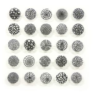
Gallery of Microscopic Cells found online:
https://www.shutterstock.com/search/microscopic-cells?image_type=photo


I love the round shape of cells, and how they can fit together so nicely, even when they’re distorted by being pushed. I don’t know what it is about the round shapes, such as circle and ovals, but I’ve always been drawn to them. I love how when they’re touching/linked together in a drawing, the drawing can take on infinite variations depending on where they are linked/touching.
Rebecca Vincent
I found this artist on YouTube and I absolutely love the way she uses many techniques to create her prints, such as rolling on colour, paper stencils, monotype drawing and non-direct monotype. I especially love how she uses paper stencils over a big block of rolled out ink. Its such a simple but effective way of separating and highlighting areas. Also she smudges her ink together with the roller like I like to on my prints. Her work inspires me to make prints with more layers and textures. (Practical Research)


https://www.rebecca-vincent.co.uk/rebecca-vincent-monotypes
Artist’s writing on website:
What are monotypes?
Known as the most painterly method among the printmaking techniques, a monotype is essentially a hand-printed painting. The appeal of the monotype lies in its unique translucency that creates a quality of light very different from a painting. The spontaneity of mark-making and layering of printing inks creates a surface that is unlike any other art.
I roll or dab oil-based inks onto a smooth plastic surface (perspex or plexiglas) with no permanent marks or indentations. The inks stay wet for a long time and can be manipulated in many different ways. I use cloths, cotton buds, sticks and pieces of card to lift ink away. The ink is transferred onto damp cotton rag paper through an etching press. Some artists produce their monotypes all in one go but mine are built up in several layers working from light to dark. I create patterned areas by cutting and tearing textured papers and fabrics, applying ink and printing them. The large trees are created using a series of paper masks and stencils. The small trees are made by pressing with a hard pencil on the back of the paper with the print face down on an inky surface. Since the colours are applied in layers there are powerful interactions between colours especially in the foreground where the colour and mark-making is at its most intense. Sometimes the colours seem to vibrate with intensity as they play off against one another. The video below gives an overview of how I work on a series of monotypes. This process is by no means typical of monotype but is unique to my artistic practice.
Wangechi Mutu
In a practice that spans painting, sculpture, collage, film, and installation, Wangechi Mutu explores the violence and misrepresentations that afflict contemporary women—Black women, in particular. The effects of globalization and consumerism are also frequent themes. Contorted feminine forms, which seem simultaneously futuristic and primordial, appear throughout Mutu’s mythical bronzes and bricolages of paint, ink, magazine cutouts, and found materials.
https://www.artsy.net/artist/wangechi-mutu


I love the way this artist plays with different mediums. The combinations of thoughtful colour and detail contrasted with areas where the materials are used loosely, such as bleeding ink, create very interesting work, accompanied with interesting subject matter and compositions. This artists work inspires me to use more materials such as ink, watercolour and collage in my prints in future development. I want to create hand-made patterns and detail using the physical mediums and then either scan or collage those details into my other work to enhance and create depth in ideas. (Visual and Practical Research)
Naomi Vona (deeper):


Artist’s writing from website:
About Portal Studies Series
This series includes recent studies of some of my signature abstract pattern designs. The title “Portals” refers to my constant research on space-time portals, and their visual translation from my parallel world/fantasy world into reality. This project will lead into the creation of bigger scale pieces on paper and/or canvas. (End)
The artist uses circular shapes and lots of ovals. These ovals are very similar to the ovals I’m obsessed with. You can tell from the number of different versions of the Abstract Portals there are in the series, the artist defiantly has an obsession with them too. I absolutely love the time and detail that has gone into every drawing, each drawing has so many layers and the longer you look at each piece, the more you see all off the different layers and colour combinations and how they all work really well together. This work inspires me to use more layers and contrasting colours to increase detail. (Visual Research)
Seeing through modernism: transparency, absence and construction | Essay
By Derek Horton
“Tell me what that means. Or don’t. No, don’t.” Don DeLillo 1
“Despite the fact the basis of this approach to art is in reason, its dynamic content is able to launch us on astral flights which soar into the unknown and still uncharted regions of the imagination.” Max Bill 2
In a recent conversation, the artist Daniel Buren maintained that, “colour is the most interesting thing in art because it is the only thing you cannot speak about“,3and a contemporary writer has suggested that when discussing colour, “words tend to appear either too laboured or too breathless. Colour speaks silently for itself, and any attempt to speak on its behalf is bound to fail.“4It is with these warnings in mind that I embark on the task of using mere words to respond to the latest series of work by Richard Caldicott: photographs that resonate with chromatic intensity; in which compositional blocks of colour – sometimes vibrant and incandescent, sometimes cool and muted – define the juxtaposed rectilinear forms that interlock within a precise and rational geometric structure. Colours and forms are integrated to the point at which they become a single entity; a counterpoint of intense hues in which one form generates another in an overall equilibrium, sometimes bringing to mind compositional structures in music (another area where words can be woefully inadequate). Particularly in modernist composition, from Schoenberg and Varese to even more direct parallels in the music of the avant-garde American composers Conlon Nancarrow, John Cage and Morton Feldman, structural components, organised according to a rational system, transcend that order and attain evocative qualities and emotional intensities in a sound world that resonates beyond the boundaries of the architecture that generates it.5
There is a dialectic of restriction and freedom at play in the transcendent potential of such mathematical or geometric structures. Restricting visual perception to the simplicity of planes that define the boundaries of the framing rectangle by subdividing it into nothing other than further rectangles, the articulation of space is simple and ’empty’ enough to throw viewers back on themselves, allowing room for solitude, space for silence, and the contemplation it invites. In this apparently ‘deprived’ space the viewer is freed to ‘experience their own experience’, their direct sensory and emotional response to optical signals of space and colour. “What these can yield us is something far transcending surface values since they not only embody form as beauty, but also form in which intuitions or ideas or conjectures have taken visible substance. .. And despite the fact the basis of this mathematical approach to art is in reason, its dynamic content is able to launch us on astral flights which soar into unknown and still uncharted regions of the imagination.”6So maintained the Swiss artist and designer, Max Bill, a key figure in the history of modernism.
In Caldicott’s earlier works using Tupperware,7what could be regarded as highly stylised photographs of a still-life ‘subject’ evolved into images from which the substance and identity of the photographed objects rapidly receded, emphasising the object-status of the photograph itself. This reduction to the essentials of an image that is practically abstract – and in which the depicted object is being abstracted from its context to the point where any reference to its nature or origin is erased – suggests that the photographic process, conventionally so linked to the reproduction of reality, is shifting towards the autonomous characteristics of ‘non-objective’ art. Caldicott has pursued this direction relentlessly, and in this new series of works the object as subject has disappeared altogether, leaving only what were formerly colour backgrounds arranged in abstract, geometric compositions that constitute autonomous objects in their own right. In several ways, though, it is important to recognise that such apparent abstraction does not necessarily constitute a subjective move away from materiality, physicality, or objectivity, but represents a shift to a different kind of reference to and representation of the material world.
In an important sense there can be no such thing as ‘abstract photography’ – what is recorded in a photograph, even if it is nothing but light (as in another sense it always is!) is an actually occurring physical phenomenon within a fixed period of time. It is significant that Caldicott refers to his latest works as ‘constructions’, a term that simultaneously suggests the manual making of things and a connection to constructivism and architecture. They are made in and of the material world and exist within it as objects. They are constructed using flat blocks of colour by means of a process equivalent to collage or assemblage; these are photographed and the resulting transparencies are superimposed to produce one image that is printed as a photograph that is then mounted and framed in a very particular way as an autonomous object. I have described this process in some detail in order to emphasise that although these works might be described as ‘abstract’, a word that in the history of modernist art has often been synonymous with the ‘non-objective’, Caldicott remains fundamentally both a recorder and a maker of objects that exist in and refer to the material world. His work, incidentally, can clearly be seen to relate to Donald Judd’s category of ‘specific objects’, holistic and unified artworks that are neither painting nor sculpture.8 Amongst the artworks to which Judd attached this term were Dan Flavin’s fluorescent light sculptures, echoes of which are clearly evident in the thin strips of colour that punctuate – perhaps even ‘illuminate’ would not be too strong a word – many of Caldicott’s Untitled Constructions.
Art is always inevitably in dialogue with itself; or, rather, artists are in dialogue with each other, whether contemporaneously or across decades or even centuries. The dialogue invited by Caldicott’s art is clearly primarily with modernism in all its forms; not just with the 20th century tradition of abstract art, from Malevich and Mondrian to Minimalism, but also the open spaces, minimal simplicity and structured rationality associated with modernist architecture and music. This inter-relationship between art forms and disciplines, perhaps best exemplified by the ideals of the Bauhaus, is in itself a modernist principle founded on three basic ideas: “that art based on representation was associable with the old, destroyed pre-war order and should be replaced by a purely non-objective art, emblematic of the new age; that the new art would be both modern and useful by virtue of being composed of purified basic elements of form; and that its vocabulary of basic elements could be used to construct virtually any kind of fabricated object, thus making it possible to dissolve the boundaries between the individual arts, and between them and everyday life.” 9
The architectonic aspects of Caldicott’s Untitled Constructions demonstrate a clear awareness of and identification with the structure and aesthetics of modernist architecture in their definition of space through flat blocks of autonomous colour that never merge or modulate, relating to each other only by steps, edges or boundaries yet creating a continuity of form, an actual, material space; an object rather than an imagined world. Caldicott acknowledges a specific relationship to the architect RM Schindler’s concept of ‘space architecture’, defined by Schindler as a fundamental concern with “the creation of space forms“10in which “the only idea is space and its organisation [and] form no longer symbolises the constructional play of forces; the construction itself becomes form.” 11
Colour-field painting from the 1950’s to the 1970’s (the work of Max Bill, Josef Albers, Richard Lohse, Burgoyne Diller, David Novros and John McLaughlin for example), evidenced not only an aesthetic of rationalism, order, structure and uniformity but the use of industrial techniques and materials in its paints, finishes and supports; materials with visual qualities in and of themselves, sometimes requiring minimal intervention in the studio. These created objectified rather than atmospheric colours and an art that was artificial, urban and industrial. Clearly Caldicott’s work, with its stringent aesthetics, rigorous sensibility and intellectual discipline, is directly related it to this particular form of modernist abstraction, but it also maintains a difference and distance from it, not least in its means of production – not only are these works photographic prints but photography is central to their whole process of construction. In colour-field painting the structure of geometric abstraction emphasises the wholeness of the pictorial field, a tensely frontal compositional plane bearing a holistic composition with the surface of the picture treated as if it were a single unit – a Caldicott photograph is one!
Another significant aspect of Caldicott’s means of production is the dualism of physicality and abstraction that is inherent in the construction of these works by means of transparency: what appear as solid blocks of opaque colour in the final works are actually created by the manipulation of transparent colour. Hence each block of colour is not just a surface but an aperture or window, opening up a space beyond its geometric and structural boundaries. A dialectic of alternating surface and depth is set up by the way in which the solid opaque object has been created by the passage of light through transparent surfaces. Here again there are relationships to modernist architecture: RM Schindler’s pioneering ‘space architecture’12aimed to reduce solid building materials to the bare minimum in his aspiration to create ‘translucent houses’, a concept that reached its epitome in Pierre Koenig’s iconic Stahl House,13identified by Norman Foster as having ” long been a touchstone for contemporary architects“.14
The logic of modernism, Ad Reinhardt argued, was a constant striving to make art “purer and emptier“,15pursuing what his lesser known contemporary, the English artist and theorist Anthony Hill, called “an aesthetic of objective invention and sensation, distinctly rational and determinist” and “not undermined with latent associations“.16Rosalind Krauss has identified the grid as emblematic of modernist ambition in the visual arts, arguing that it “states the autonomy of the realm of art. Flattened, geometricised, ordered, it is antinatural, antimimetic, antireal. It is what art looks like when it turns its back on nature.” In a picture based on a grid structure, “the physical qualities of the surface .. are mapped onto the aesthetic dimensions of the same surface. And those two planes – the physical and the aesthetic – are demonstrated to be the same plane: .. the bottom line of the grid is a naked and determined materialism.“17Krauss also identifies the dialectical aspect of ‘within-the-frame grids’ and ‘beyond-the-frame grids’, the way that they simultaneously define the rectilinear borders of the image and imply the infinite possible extension of the image beyond them.
Despite the gridded architectural framework that defines their structure, the spatial and chromatic variation of Caldicott’s Untitled Constructions are not based on a priori rules or a systematically ordered schema, but are the result of continual choices, sometimes perhaps between accidents or fortuitous occurences. As Donald Judd observed, “freedom and indeterminacy are antecedents to and larger than order. .. [There is an order that] is not one of control or distillation, but of continual choice. .. An activity proliferates its own distinctions: an order forms within these.” 18Caldicott’s process results in just such a proliferation of possibilities between which distinctions are made and order forms. Such an approach is not a descent into subjectivity and aesthetic capriciousness but, on the contrary, a different perspective on objectivity and materiality. As Lynne Cooke has observed, “different notions of order, neither rational nor irrational but something closer to an absence of conventional order have recently occupied many scientists working in different fields, and using different discourses. .. Order has become demonstrably relative, if not relational. The concrete and the actual are revealed to be dependent on the provisional, .. intertwined with contingency [and] relativity.” 19
Historically, modernism represented the search for an expressive form that could answer the requirements of a new industrialised society and its mass culture, founded on a utopian philosophy in which art and design was meant to construct a new world, or at least form the blueprint for one. Following the disillusionments of the 1930’s and later setbacks, modernism inevitably lost some of its ideological certainties and utopian ambitions. But its aesthetic form survived strongly: in over a century of modern art the history of geometric abstract painting has been a remarkably resilient one, and the idea of composing from basic elements using systematically organised abstract relations of colour, line and form, modular geometric structure and spatial definition based on topographical and mathematical principles (perhaps in part because of its resonance with our urban experience through its closeness to architecture) has been a continuing thread in visual art that has its latest manifestation in Caldicott’s series of Untitled Constructions.
For its maker and viewers alike, Caldicott’s art involves looking back to constructivist art and modernist design, referencing its purity of form and, by indirect allusion at least, its utopian agenda. Revisiting such ideas at this distance in time inevitably involves a psychic and conceptual separation from their values and ideological motivations – their strategies are part of a constellation of ideas and images that are difficult now to reference, utilise or manipulate without some degree of irony. Whilst his work may suggest that Caldicott is an ‘unreconstructed modernist’, it is arguable that it is impossible now to make work ‘as’ a modernist – one can only refer to modernism or, to use a term beloved of postmodern theorists, ‘cite’ it. For much postmodern art such citation relies on pastiche that critiques or even lampoons modernism and its values, but for some artists of Caldicott’s generation, who grew up artistically in the 1980’s and were exposed to postmodern pastiche at its peak, it is possible now to look back to modernism from a different perspective, to be outside it but remain in many ways respectful or admiring of it.20To return to the forms and appearances of twentieth-century modernism is to look back to something that itself was fundamentally about looking forward – to a utopian future, a rational and ordered social and aesthetic model for living, that was never fully (and certainly not, as it had hoped, universally) realised. In this sense there are possible nostalgic readings of Caldicott’s modernist-influenced work – not necessarily nostalgia for the form of modernist utopian ideals, but for the very perception of such a possibility in the past; nostalgia for the belief that a utopia might be possible at all. (End)


Above images from: http://www.richardcaldicott.co.uk/prints/2015/1
I really like how this essay talks about colour, transparency and space. I feel like these are my main points of investigation in my work, along with a small amount of line/mark-making. I love the quote by Daniel Buren, “colour is the most interesting thing in art because it is the only thing you cannot speak about“, I feel that my work is purely for the experience the viewer gains whilst looking at it, because of the basic shapes letting the colour do all the talking. (Contextual Research)
Tatjana Labossiere – deeper:
THE POWER OF THE SOUL OF NATURE
Energy is everywhere, it is life itself and can be felt above all in nature. I take this power of the soul of nature into myself and transmit it with my works so that everyone can feel it. I want to help the viewer to find back to nature through this positive energy, especially people who live in big cities need this impulse to return to well-being and balance. With sensitivity I observe nature to understand its essence and hope the viewer can read this in my works. The delicate transparent shades of the prints as well as the powerful forms of the sculptures are an expression of this life energy. (End)
I absolutely love that the artist’s work is focusing on colour and shape, whilst playing with transparency to create a feeling of juxtaposition within the images because they feel like stones and leaves, but are also see-through and each layer underneath the top layer can still be seen with lots of detail. This artist is a very big influence for me.
I have noticed that the artist’s more recent work is more refined and careful, in terms of colour intensity, shapes used, composition and mark-making. I much prefer her newer work but I feel like my work is taking the same journey; from looking amateur and messy, lacking thoughtful composition. I have been developing through experimentation with inking techniques, my prints are becoming more refined and the compositions are improving with larger plates. See below example of artist’s older work (found on instagram):


The images above demonstrate the early stages of development for the artist, such as; simple shapes, simple compositions, basic colour application, and a mediocre use of negative space. Where as if we look at her more recent, refined monoprints, the images below, we see that the artist has developed a style, with careful inking with multiple colours on each plate, more defined edges, more surface detail on the plates, and a lot of focus on ghost prints and layering. I can really relate to the way this artist has developed her skills, I absolutely love this work and I would like to create something similar but with a few more twists, as the development goes on. (Visual, Practical & Contextual Research)


Henri Matisse’s Artwork: Use of Shapes Essay
https://www.ukessays.com/essays/arts/henri-matisses-artwork-use-of-shapes-7507.php
“My choice of colors does not rest on any scientific theory; it is based on observation, on sensitivity, on felt experience.” (Henri Matisse). Matisse had a unique path to becoming an artist as someone that started out in law school, and I feel like this uniqueness stuck with him throughout his career and is apparent in his artwork whether it be with color, balance, or shape. Because of Matisse’s working background, His ability to combine a vibrant color palette in a way that catches your eye without appearing to try to be flashy, and his clean and crisp sense of structure and design in the cut outs created in his later years like The Sheaf, it is evident color and shape have played critical roles in expression through Matisse’s artwork in the 20th century. Henri Mattise used these elements along with balance to become a household name and one of the greatest artists of his era.
Henri-Émile-Benoît Matisse was born on December 31, 1869 and grew up in the small town of Bohain-en-Vermandois, France. As a young man, Matisse worked as a legal clerk and eventually studied for a law degree from 1887 to 1889. Matisse began painting for the first time when he was bedridden with appendicitis. Not long after, when he started working in a law office in Saint-Quentin, he began taking a drawing class in the mornings before he went to work, and the rest became history. Shortly after he started taking this drawing class Matisse moved to Paris for artistic training in the year 1891. Here he learned from famous, older artists as he attended prestigious schools such as the Académie Julian and the École des Beaux-Arts. From the 1920s until his death, Matisse spent much time in Nice, France, painting local scenes utilizing color and line which were what dominated his work in his younger years. In his old age, he was commissioned to design the decoration of the small Chapel of Saint-Marie du Rosaire which he completed between 1947 and 1951. Often bedridden during his last years, he kept himself busy with decoupage, where he created works of brilliantly colored paper cutouts arranged casually on backdrops. His collages were eloquently designed due to his background in painting before his later years where he was unable to paint. This is also when Mattise implemented more shape into his work. Matisse died in Nice, France on November 3, 1954 and unlike most artists, he was a well-known artist across the world during his lifetime.
The Sheaf is one of the cut-outs Matisse made in the months shortly before his passing in 1953. This work conveys a sense of familiarity by using shapes that are comparable to those of leaves off a tree while making use of a vast array of colors. These shapes were carefully organized on a white sheet of paper after much trial and error as Matisse would take his cut-outs and spend hours upon hours organizing and rearranging them until satisfied with a result. What Matisse has done here, even in a somewhat simple composition, is use space to portray the illusion of depth while using the two-dimensional medium of paper. He does so by carefully choosing colors that make the composition pop. The most apparent way that shape is manipulated in this arrangement is by Matisse’s decision to make each shape resemble one another, but not copy another is what makes this artwork feel balanced and unique. I personally believe these silhouettes are exemplary of Matisse’s simplistic cut out style in which he utilized in his later years.
“What I dream of is an art of balance, purity, and serenity devoid of troubling or depressing subject matter… a soothing, calming influence on the mind, something like a good armchair which provides relaxation from physical fatigue. ”- Henri Matisse. Matisse was a passionate believer in the importance of balance in art and you see a phenomenal example of this in The Sheaf. Mattise once said “Fit the parts together, one into the other, and build your figure like a carpenter builds a house. Everything must be constructed, composed of parts that make a whole… (Henri Matisse)” and I believe this awareness of the importance of balance is why the way the colorful shapes are arranged on their simplistic white background in The Sheaf feels very balanced and is soothing to the eye. The shapes are evenly spaced physically, but Matisse also takes advantage of color to create balance in this composition. Personally, I believe it’s the way Matisse sporadically combines warm and cool colors while still achieving a sense of structure in this work paired with the physical balance within The Sheaf is what creates such an inviting sense of balance and appeal to this work.
In conclusion, it’s not Matisse’s background of thinking outside the box, his ability to combine vibrant colors in a way that catches your eye without seemingly trying to be flashy, or his clean sense of structure and design in the cut outs created in his later years like The Sheaf that puts Henri Matisse in the mix as one of the most popular artists of all time, but more so a combination of all these factors that have made him a household name. Matisse had a unique path to becoming an artist as someone that started out in law school, and I feel like this uniqueness stuck with him throughout his career and is evident in his artwork whether it be with color, balance, or shape. (End)


I absolutely love the balance Matisse creates in the above piece, The Parakeet and the Mermaid. Although the composition is too busy for my style (which I established through making busy prints), I love the limited use of colour, how each shape is similar but still unique, the smaller shapes within the small spaces and that you can clearly see why it is named what it is. This work may look simple to the ‘untrained eye’ but the balance of the whole piece is so satisfying and the shapes used are very intricate. I my own work, I want to explore more shapes, I’ve been using very very simple shapes like my most influential artist Tatjana Labossiere, but with my next experiments, I will try different, more interesting shapes, still based around nature. (Practical Research)
Meredith Woolnough
https://meredithwoolnough.com.au/past-work
Writing from website:
Meredith Woolnough’s elegant embroidered drawings capture the beauty and fragility of nature in knotted threads. Vibrant coloured structures of organic shapes hover effortlessly above the surface, elegant and enchanting.
Through the use of freehand machine embroidery and soluble materials, Meredith is creating the natural world anew. The delicate application of the simplest of stitches has been used to create wondrous embroidered networks that revere the beauty of life itself and inspire us to rejoice at the world we live in.
Meredith takes direct reference from physical specimens when creating new pieces, taking care to examine and understand the construction of her subjects.
“The more I work with natural forms, the more I find myself drawn into the science of nature. I am fascinated by the way things are built, the way they grow and function. I often find myself marvelling at the perfection of a single leaf or the phenomenal beauty of a coral reef and it can be quite overwhelming at times, almost spiritual.”
Her embroideries maps the frameworks of the various veining systems found in nature to create work that explores the balance, harmony and connectivity of life on Earth. Inspired by the patterns, structures and shapes found in plants, coral, cells and shells Meredith’s embroideries represent both the robust beauty and elegant fragility of life.
The work has a clear modern aesthetic, both compelling and memorable. To present the work, Meredith has developed a mounting technique using pins on a backing board that makes her work float above the surface. The creation of shadow adds to the organic effect, evoking memories of scientific study and museum objects.
Framed in white shadowboxes behind glass, the embroideries are easy to hang and care for.
_______
Typologies
The ‘Typologies’ series is a collection of monochromatic studies that mimic a range of structures found in the natural world. When the studies are displayed together we naturally group them into patterns, forming connections between the structures. The series explores the balance, harmony and interconnectivity of life on earth.
2015. Embroidery thread. Wall installation
_______
THE CORAL ATOLL SERIES
An atoll is a ring-shaped coral reef which seemed a fitting title for this series of works.
Each created in early 2021, embroidery thread and pins on paper, 63 x 63cm (framed size)
_______
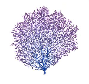
VENUS SEA FAN
A beautiful (and ethical) coral branch you can proudly display on your wall.
Inspired by the vibrant colours and intricate veining structures of Venus Sea Fans (Gorgonia flabellum).
Polyester embroidery thread and pins on paper. Framed in a white box frame without matt board. Embroidery measures: 67 x 68cm (width x height)
_______

CUSHION PLANTS
Inspired by the densely growing varieties of cushion plants found in Mount Field Tasmania, this artwork is made up of thousands of tiny cup-shaped embroideries nestled together to form this circular design.
2021, 73 x 70cm (framed size), Embroidery measures approximately 45cm in diameter
_______
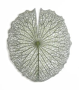
GIANT LILYPAD
Giant Lilypad maps the vein patterning of one of the lily pads I collected from the Hunter Region Botanic Gardens.
Click HERE to view the feature article that I wrote for ‘Down Under Textiles magazine’ discussing the creation of this artwork.
2015, embroidery thread and pins on paper, 95 x 120cm
_______
I love the detail this artist creates with lines of embroidery. Her proportions are fantastic and I think that is an important element that makes her work feel so satisfying to look at. I love the thickness she builds, and the best part is that all of her work is constructed on water soluble fabric, so the background melts away with water once complete, leaving only the built up tread. This inspirers me to create my oval pattern on this fabric and use it to stick on or lay over my prints, or for texture when printing, I could ink up my embroidery. This is an exciting idea. (Visual and Practical Research)