Photoshop photography experimentation

PHOBIAS PHOTOSHOOT : THEME SUFFOCATION


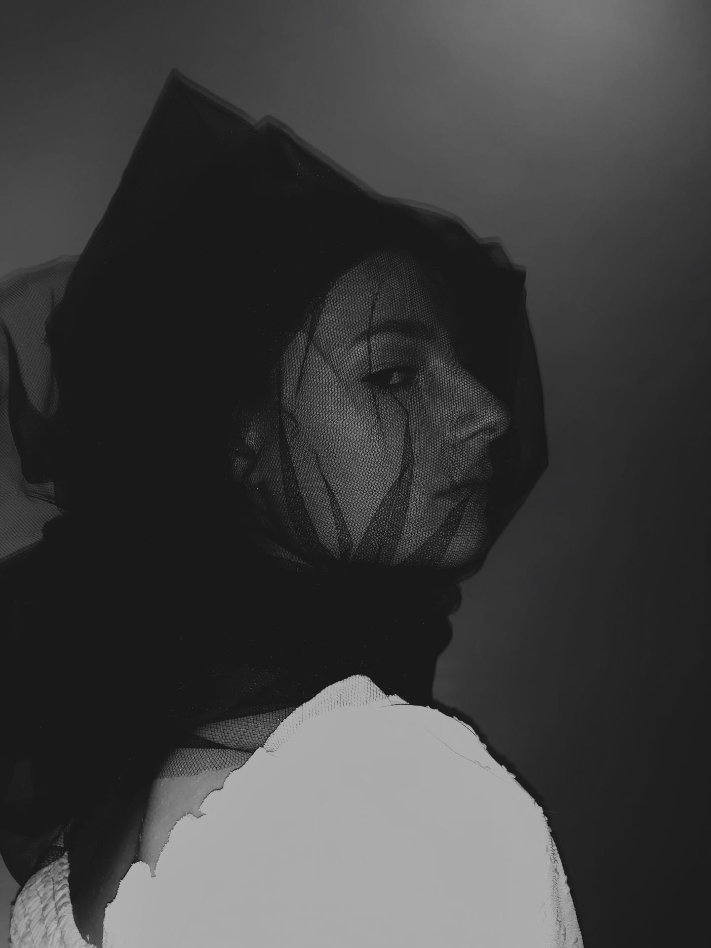

 STYLED & PHOTOGRAPHED BY MYSELF
MODEL: CATERINA BECHELLI
I did a test shoot experimenting with the theme of suffocation & fear. Suffocation is felt by most people with an irrational fear or phobia. I started by researching into different types of phobias, what causes them and who gets them. As fear plays a huge part in phobias I am interested in having a subtly creepy look. I watched the film ‘The Woman in Black’ which is set in the early 20th century as inspiration for this first photoshoot. I wanted the photos to make people feel almost scared viewing them and to have that vintage feel like the film. The styling of ‘the woman in black’ is very dark, and she’s dressed in black with her face covered most of the time. I bought black tulle to wrap around my model’s head to make her look encaged in the fabric. I wrapped it around a few times so the layers built up to look darker in some areas, particularly around they eyes. The materials used in the shoot are monochrome. I found a puff sleeve embroidered white top for the shoot as I thought garments with excess fabric would be perfect for the theme. I used the fashion studio with the white backdrop as I wanted the main focus to be on the materials and textures on the model.
REBECCA HORN


Rebecca Horn: Finger Gloves 1972 (Image from the V&A website)
My research for irrational fears and phobias has led me on to looking at unusual garments and accessories with meanings. I am particularly interested in the idea of sharp objects and itchy materials to represent the feeling of fear throughout my project. This image of the ‘Finger Gloves’ by Horn caught my eye. From looking at the art installation and images of the gloves they make me feel slightly on edge because of the unusualness of them and the fact that they seem to serve no purpose. Horn quotes; “The finger gloves are made from such a light material, that I can move my fingers without effort. I feel, touch, grasp with them, yet keep a certain distance from the objects that I touch. The lever action of the lengthened fingers intensifies the sense of touch in the hand. I feel myself touching, see myself grasping, and control the distance between myself and the objects.
(Quoted in Haenlein 1997, p.58.)” I think this idea of ‘intensifying senses’ and ‘distance between myself and objects’ is really interesting and the idea of using senses in a different form has inspired me to use this idea of ‘touch’ in my own photography.
XIAO LI – SPRING / SUMMER READY TO WEAR COLLECTION

This collection is interesting because of the red and pink minimal colour pallet and the textures used. The styling of this photoshoot for the collection I think is slightly disturbing. The models are wrapped in masses of luxury material but their faces seem to have no expression. My interpretation is that the models look like people trapped in dolls bodies where the expression never changes and there is a strong feeling of being trapped. This feeling is hugely associated with some irrational fears and phobias and I am really inspired by these images for my final project.
TIM WALKER WONDERFUL THINGS EXHIBITION


I went to the Wonderful Things exhibition by Tim Walker at the Victoria & Albert museum. The exhibition showed 10 of his new photoshoots inspired by museum artefacts. These images particularly caught my eye origionally because of the use of texture. The more I look at them, the more chilling they seem. Karen Elson models in these photos. The use of expression in the model makes the photo seem unsettling. This is the style of photography I would like to use for my project, I think I works well with the theme of suffocation and fear.
LIFE IS ART LIVE YOURS IN COLOUR


Life is Art Live Yours in Colour Photography by Hayley Weir, Styling by Julia Sarr-Jamois.
This photoshoot has inspired my theme of irrational fears and phobias. The styling has the large use of textiles which give the feeling of suffocation and claustrophobia. The different techniques used on the fabrics and the bright colours contrasting against each other creates an unnerving feeling. I also think the position of the models’ bodies makes the photos look uncertain of what the shoot is meant to mean. When I look at the photos I think they look almost scary and the models seem to show no expression or feeling. I aim to use this style of photography & styling for my project and I will be experimenting in the studio with different textures and colours. I will be researching what feeling is associated with different colours, for example: Red commonly associated with either danger or love (total opposites).
BALMAIN 2019 SPRING / SUMMER

Molly Goddard A/W 2018 – Ruffles and textures

This Autumn / Winter collection by Molly Goddard works perfectly with my theme of suffocation. The use of large amounts of fabric and unusual shapes and textures makes the garments look as though they are uncomfortable and heavy. The photography by Charlotte O’Shea has the models staring into space with a look of confusion.
TEXTURES & LAYERS
