Nov
2014
My Analysis on Hideout Festival – Email Marketing
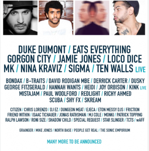
This week’s blog will be looking at Email Marketing from one of Europe’s annual Music Festival held in Croatia, Hideout Festival. I will be using an example I received in the 4th November regarding the release of Priority tickets for the event taking place in June-July in 2015. This was an opt-in permission based email marketing campaign, triggered by an event.
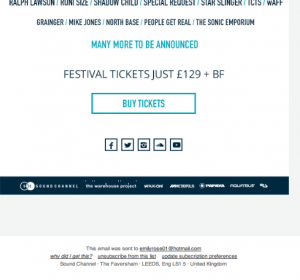
Hideout Festival being something I actively invited into my inbox, with the desire to be ‘in the know’ about upcoming and useful information was a compelling enough reason for me to open this email. The Call to Action is visible even before this stage with the main purpose being to engage potential customers into purchasing Priority Tickets. After a brief scroll this action is immediately made possible with a Buy Tickets link appropriately placed in the centre of the page which will further take you to the again appropriate, landing page. In relation to Hernandez and Resnik (2013), user scan patterns can be of great importance due to the typical nature of following the visual hierarchy of a page. The Inverted Pyramid shows the top of the page as having the longest gaze duration, therefore including information such as the date of the event and the primary intent of priority ticket awareness. With attention funnelling down the page with freedom to break off, information such as the Line-Up is shown. This is reinforcing information from a prior email therefore not ultimately beneficial to be shown in the subject line or within the most volumes part of the email. 
Is this email powerful enough for me to take the action? I have not yet bought a priortiy ticket. This could be down to many external factors although it could also be down to lack of personalisation. It would of been pleasing to have my name within the subject line, or my name within the content of the email, just to make it a little more ‘special’. Perhaps having no facility to ‘share’ this event among social media and my friends, could also be a reason why there has been little conversation in regards to planning this trip.
Overall, this email does what it says on the tin. From the moment it entered my inbox I knew exactly what it would be about. The visuals of this email make it look fun and far from dull to look at, with images and text being broken up. The patterned outlined by Hernandez and Resnik (2013) feels like the best format. Due to the nature of the event, there are a string of follow up emails ensuring every piece of new information available is sent out, therefore having the newest piece at the top matches the path of my eye as I scan through.
Take a look at this blog: http://blog.hubspot.com/marketing/email-marketing-examples-list
Hernandez, A., & Resnick, M. L. (2013, September). Placement of Call to Action Buttons for Higher Website Conversion and Acquisition An Eye Tracking Study. In Proceedings of the Human Factors and Ergonomics Society Annual Meeting (Vol. 57, No. 1, pp. 1042-1046). SAGE Publications.


