
Open Data is the idea that data, mostly data about people and the movement of capital, can and should be collected and shared among companies, groups and individuals for the benefit of wider society. Open Data is based on the belief that accurate, relevant and plentiful data should be easily available for a variety of uses. The Open Data Institute teaches ethical and innovative ways of collecting data, primarily for business use, but it is also encourages smaller groups and individuals to use the data pools also. To quote their website: “We work with companies and governments to build an open, trustworthy data ecosystem.”
I have chosen the Brighton & Hove Community Insight dashboard for my case study. Kitchin et al. argue that city dashboards, “rather than reflecting cities, actively frame and produce them.” (2015: 6) This can be problematic for open data sources. The Brighton & Hove Community Insight dashboard has little transparency on where the data comes from, and difficult to tell if it is updated monthly as it claims. There is no consistency to how the data is presented.
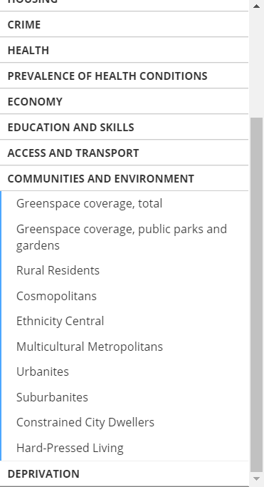
As you change the filters on the city dashboard, the way the data is presented varies wildly. Under ‘communities and environment’, the communities are described in a euphemistic and journalistic tone.
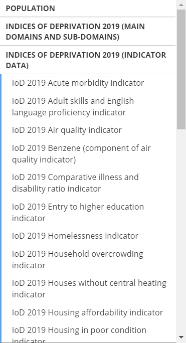
‘indices of deprivation’ clearly comes from a different data source, is more specific and scientific.
City dashboards, as Kitchin argues, are often “assumed to have no inherent politics or ulterior agenda and can be taken at face value.” (2015: 16) When open data is presented in the way it is here, inconsistent and journalistic in tone, the data can be interpreted as face value. Frameworks and actions taken by decision-makers are then re-produced, meaning the inconsistent, journalistic and ultimately biased data is re-produced and re-presented through other indicators, benchmarks and dashboards.
Symons (2016) explores how councils are collecting data on citizens through mobile apps, third party data, social media and low-cost sensors. One example is in Bristol City Council, who are collecting data on damp in houses through ‘Frog Boxes’.

a politically charged frog box
Although the reasoning given for increasing data collection across councils resonates with that of the Open Data Institute and cities who run a city dashboard, the results for the citizens themselves are framed differently. The data collected by ‘Frog Boxes’ aims to “help them solve identified issues of damp and challenge landlords to take action” which empowers residents with data and knowledge to assert their rights as tenants, but also to “give residents the ability and tools needed to fix problems themselves, rather than be reliant on the council.” (2016: 28)
The second point suggests a political ideology that moves responsibility of social housing maintenance away from the state and on to the individual, whatever their circumstance or the state of the building they are renting. The data collected by the council is, as Kitchin illustrates, “full of values and judgements shaped by a range of views and contexts.” (2015: 18)
Brighton & Hove City Council. ‘Brighton & Hove Community Insight’ <https://brighton-hove.communityinsight.org/map/> accessed 11/03/2020
Kitchin, R. Lauriault, T. & McArdle, G. 2015. ‘Knowing and governing cities through urban indicators, city benchmarking and real-time dashboards’ Regional Studies, Regional Science, vol 2 issue 1, pp 6-28.
Symons, T. 2016. Wise Council: Insights from the cutting-edge of data-driven local government. London, Local Government Association.
Hi Meg
Thank you for another fascinating blog post. The inconsistencies and lack of transparency you noted when reviewing the Brighton & Hove Community Insight dashboard were particularly interesting, and your blog post prompted me to reflect on another aspect which is the hidden complexities.
Your blog post highlights the ‘indices of deprivation’, which is also discussed in Frauke Behrendt’s Week 6 lecture. Behrendt quotes Kitchen et al’s (2015:8) section on “composite indicators” and the “deprivation index”. As pointed out by Behrandt and shown in your ‘indices of deprivation’ screenshot, there are multiple single indicators combined to create the deprivation index.
Single indicators such as ‘air quality’ or ‘houses without central heating’ are complex on their own, but even more so when combined. These complexities lead to less clarity when there is no explanation as to how the data sets were used to reach a simple deprivation index score. Bartlett and Tkacz (2017:23) warn that “by their very nature dashboards leave out far more than they include and can present data without the user really knowing how it was created”, and this is particularly true of composite indicators.
References
Bartlett, J., & Tkacz, N. (2017). Governance by Dashboard. Demos, London.
Kitchin, R., Lauriault, T.P., & McArdle, G. (2015). Knowing and governing cities through urban indicators, city benchmarking and real-time dashboards. Regional Studies, Regional Science, 2(1), pp.6–28.