
If I’d happened to stumble through the internet a couple of years ago, and happened upon www.citydashboard.org/London, or any city dashboard for that matter, I would have presumed there was a problem with the webpage loading, and been unable to make sense of what I was looking at. Actually, even just a few short months ago, before MJM20, I wouldn’t have made that much sense of the page.
However, now I know, from reading the work of academics such as Kitchin, et al, that this is their very purpose – to provide citizens, such as myself, with valuable information without needing to delve into the learning of how to handle the data, or any related software (2015, pg.7).
Unable to previously understand what I was looking at (maybe apart from the weather report), I wouldn’t have been able to answer whether I thought the dashboard was an example of ‘open data’. Subsequently, The Open Data Institute wouldn’t have seemed like something I was interested in, at least until now.
The ODI: “connect, equip and inspire peopled around the world to innovate with data,” (ODI.org). At the point of me writing this article, the ODI have trained nearly 10,000 people (including a potential great many ‘me’s) on how to use publicly available data to their advantage. By consulting with their customers, they create a tailored: “visual display of the most important information needed to achieve one or more objectives; consolidated and arranged on a single screen so the information can be monitored at a glance,” (Few, in Kitchin, et al, pg.11).
Open data itself, however, depends on the licensing of the specific data. Quite simply, if the data has an open license, it is entirely open. If it is ‘limited’, there are naturally limitations to its access (and subsequent usage), and so forth (see diagram below from ODI.org).
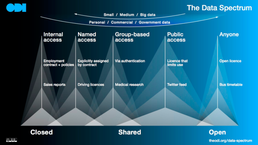
As the image shows, data such as bus timetables is entirely open (and this is reflected in the city dashboard featured image, above). From the London City Dashboard, it would appear that this goes for almost all forms of public transport, at least in England’s capital. Four of the dashboard’s individual data sets (or single indicators) are comprised of public transport data; buses, the underground, and two related to bicycles.
Curiously, if we add the Air Pollution (DEFRA) window to that , almost 30% of the available data relates to elements of Mayor of London Sadiq Khan’s ‘vision’ for the city; creating: “a future that is sustainable … in which travel is accessible and affordable, [and] the air is clean,” (London.gov.uk). In terms of Kitchin’s ‘critical appraise’ (2015, pg.7) of city-benchmarking and real-time dashboard, with so much ‘Good Service’ on the Tube Lines, positive (or at least, green-coloured) pollution and travel data everywhere else, London’s open data is displaying, or at least framing Khan’s vision as one which is being achieved, and appears to be sustainable.
However, Symons highlights the importance of public service data in the identification of adverse and, pertinently here, potential pressures on such services in the future: “Where multiple data sets about the same people of issues can be combined, there is even greater ability to isolate the root causes … This kind of analytics is gaining sophistication and can now provide granular detail about the dimensions of future service demand, helping councils to allocate scarce resources more efficiently,” (Symons, 2016, pg.26).
So, although framing a city to appear a certain way, perhaps to appease the public, it is certainly in the interest of the public and public services to keep this data open. Doing this helps the unskilled data analysts of the world, yours truly included, understand what’s going on in our local communities; allowing us to make better decisions, use data, and manage, or at least anticipate, its harmful impacts (ODI.org).
Khan, S., (2015). Cited in – Mayor sets out his vision for the future of London as population rises. London.gov.uk [online resource, accessed March 2018]. Available at: https://www.london.gov.uk/press-releases/mayoral/mayor-sets-out-his-vision-for-the-future-of-london
Kitchen, R., Lauriault, T., & McArdle (2015). Knowing and governing cities through urban indicators, city benchmarking and real-time dashboards. Regional Studies, Regional Science. 2:1, 6-28.
Open Data Institute [online resource, accessed March 2018]. Available at: http://www.theodi.org
Symons, T., (2016). Wise Council: Insights from the cutting edge of data-driven local government. Local Government Association. Nesta.
Hi Simon, thanks for your expanded review of the London Citydashboard as open data; and sharing the diagram showing the data spectrum (I did not really think of Twitter feeds in this sense but of course it is public access data). Your post makes a solid connection between the dashboard data and the vision of the city’s mayor (governance through visualized facts). This point also connects with Kitchin et al (2015:16)’s critical review of urban indicators, benchmarking and dashboards; where they argue that data does not exist independent of processes, minds, tools and context in which they occur, but in many cases are driven by agendas and open to unconscious bias.
Similar to you, in the past I would not have gone seeking for city dashboards myself, unless I happened upon one and then I would probably only give the data presented a cursory glance. I wonder how many members of the public routinely review these data platforms, and if they (the public) are well equipped to make sense of the data? At what point can ‘open data’ be said to have achieved it’s purpose, at the point of publication or use? I hope to explore some of these aspects of open data further.