Animation 2

link to animation in google drive :

https://drive.google.com/drive/folders/14jMlXh0N6gz2fQWBfD8q_ldAHMV0oZZ4?usp=sharing


My second animation was a bit more experimental. I decided to use the office workers point of view again.
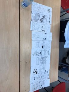
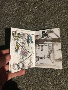
I sketched my own train scene with black fine liner. I then sketched my own characters that I ripped out from the page to create loose ‘puppets’.
I created a stop motio     n by photographing the train scene and moving the characters in it. This animation is more of a gif as it is so short but can be easily used in a loop. I then put these photographs together in procreate.

I then created a second scene of the office workers waiting around the train outside.
This animation is a more abstract interpretation of ‘The fat workie’.


Animation 1

My first animation was created on pro – create.
I decided to create a story from the ‘fat workie’ in the point of view of the office worker.
The scenes entail a bus, a woman coming off the bus and walking home.

(Link to video in Google drive)
https://drive.google.com/drive/folders/14jMlXh0N6gz2fQWBfD8q_ldAHMV0oZZ4?usp=sharing


The animation consists of a muted colour palette such as greys and dusty pink, reds and browns. I wanted the lack of bright colour to portray the atmosphere of the rainy and gloomy environment.

To create a ‘jumpy’ effect in the animation, I created very similar but different illustrations in the sequence so they would not be smooth but slightly ‘glitchy’.
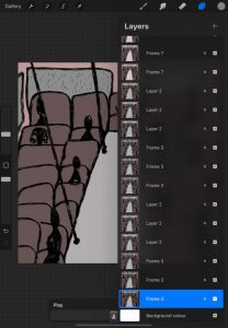
The first scene is of silhouettes sat in a bus with rain pouring in the windows.

To create enough length to the illustration, I made three illustrations of the bus that had rain moving and people drawn slightly differently. I then duplicated these three slides which reduced the time of production significantly.


In the next scene, a woman figure steps out of the bus. the illustration is fairly flat with little dimension because it was easier to make a fluid story with less detail. I like the different shades of grey of the sky and ground compared to the dark red of the bus. The rain is constantly falling in the animation also.

The third scene was my favourite to create, It’s of the woman figure’s feet walking through the rain. I enjoyed it because it was a simple yet effective scene and even with so little detail other than the rain, it is obvious what is going on.
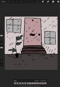
The last scene is of a front door and the woman figure appears in the scene and up to the door.  This scene adds a few pops of extra colour such as green plant and pink door. Although still a muted palette, it’s created to show the relief of getting home from work, as if everything else in the world was dull until you get home. This scene is more comforting to the eye rather than melancholic.


AGP500 – Making the invisible visible – Research 2

Researching animations in Music Videos

Paranoid Android – Radiohead – 1997
Animated by Magnus Carlsson, A Swedish animator known for his adult television shows.

Carlsson was given the song with no English translation and no idea what the narrative was so he created the animation from how he felt listening to the music.

Flat illustrations with little shading and depth.
bold colours.


Feel Good – Gorillaz – 2001
Gorillaz is a digital music group formed of illustrated/cartoon characters.
illustrated by Jamie Hewlett, who’s the co-creator of The Gorillaz.

colour is used to create atmosphere – red is sultry, romantic which relates to the scene of woman surrounding the character.


Breaking the Habit – Linkin Park

animated by Studio Gonzo, an anime studio in Japan and Kazuto Nakazawa, a Japanese anime director and character designer.
The music video features many different anime techniques and styles with dark, muted colours to create a melancholy atmosphere.


AGP500 – Making the invisible visible – RESEARCH

 Augmented Reality

Definition – ‘Augmented reality (AR) is an interactive experience of a real-world environment where the objects that reside in the real world are enhanced by computer-generated perceptual information’,

You could use AR in a variety of art forms, such as;

  • Stickers
  • Prints on clothing items
  • postcards
  • Posters
  • Printed Advert Letters

These are all really great for advertising artwork and promoting businesses.

Pokémon Go is a popular game that uses augmented reality where you use your mobile phone camera and find hidden illustrations through the game. Created in 2016 by Niantic and Nintendo with a collaboration from the Pokémon company.
The game tracks your location on maps and uses their In game map to show you where to go and decide when Pokémon characters appear.

The Pokémon characters vary from popular to rare, and you gather points. This keeps

the user interesting and wanting to play more.


Precious Okoyomon is a  London born poet, chef and artist who lives in New York City.
In the 2021 augmented reality art show by Frieze, Precious Okoyoman’s work ‘Ultra Light beams of Love’, showed two flower animations on a patch of grass,  that read poetry. The flowers are completely three dimensional in the camera, and you can walk around them and through them. The AR was showed using an app created by Acute Art.

https://www.frieze.com/video/explore-augmented-reality-works-precious-okoyomon-cao-fei-and-kaws-frieze-new-york-2021


AR exhibition by Acute Art – The Looking Glass.

The looking glass is an outdoor exhibition where all the artwork is intangible and invisible unless you stand in the right spot and use your phone’s camera. To activate the art, you have to scan a QR code.
The title ‘The Looking Glass’ Is inspired by Lewis Carroll’s ‘Alice in Wonderland.’
‘in a sense the phone has become this new kind of portal, a rabbit hole that takes us to all of these different worlds.’ – Emma Enderby, Organiser.

Julie Curtiss is a French illustrator whose work is presented in exhibition.
The work is of a female figure, who is naked and shown from the back. If you try to see the front of her, she shuffles away. There is no possible way to see the front of her body and her face. The piece is simple yet effective. The viewer feels uncomfortable as you feel as though you are really looking at a nude woman who is feeling embarrassed and nervous.


What is a QR code and how do they work?

A QR code is a type of barcode, created by a Japanese company called ‘Denso Wave.’
It is a barcode that is readable by scanning on a phones camera .

Recently there has been a surge of QR codes being used because of the COVID-19 pandemic so there is lack of touching items. Such as menus at a restaurants and online ques for shops. QR codes could aslo be used on business cards and newspapers.

In the world of AR and AR artwork, QR codes work to scan and present the artwork.

AGP500 – Making the Invisible Visible – Part 2

The task for this project was to create 4 animations or 6 Videos. Using a trigger image/QR code on the website Artivive.

We had to use the initial text/stories from the first project as a base for the animations. I decided to change the text from ‘Natural Disaster’ to ‘Fat Workie’.

I created some story boards to gather a narrative of my animations.


In this story board, I took inspiration from the skinny workers in the text who get the bus every, go home, sleep and stay skinny. I wanted to show that the life the workers had most likely was repetitive and dull just like the Fat Workies.

This story board shows the office buildings and the office people on their computers.

This story board shows the office workers in the trains and going home, similar to the first story board.


AGP500-Work Play Work – Part 4

In this part of the project, I swapped my work with a partner and I got their work. We scanned each others works to use.

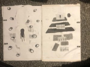
I scanned my partners work in a variety of sizes as well as multiple scans so I could cut up and collage etc. We were not supposed to draw or physically change the illustrations but change the layout etc.

This task was very freeing for me personally, As I was using someone else’s work I could change the story and narrative completely as well as cut and collage the illustrations and not feel worried as to what they are meant to look like.
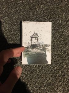
Then, with the new pieces, I created a new zine.


Here is my  artwork that was redirected into a zine by the student I swapped with.


2021 – AGP500 – Work Play Work – Part 2

The next task was to take our loose sketchbook, choose a text and create  images that relate.
I chose the ‘Natural Disaster’ text because it stood out to be as extremely descriptive.
We were told it was best not to look at any inspiration from Pinterest or Instagram so it was only what our own minds created.

The text narratives a house that is being swept in slowly and surely by the relentless ocean. The people who live in the house are getting sore and bleeding skin from the salt and some of them have died from pneumonia. They cannot go into the bottom floor of the house because of the damage, the clothes they dry on the line inside are always wet and rub their skin.


Oil pastel

Graves from the people who have passed.

1 min

Oil pastel

Water Damage in the walls

30 seconds
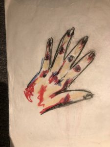
Oil Pastels

Raw and red skin

2 mins

Oil pastels and biro

Of the dark water in the tub

2 mins

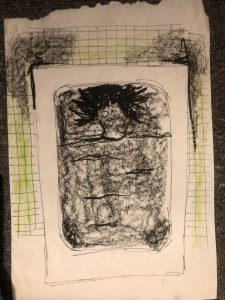
Oil pastel rub over texture and red felt tip pen of a skinny, pale human with red raw skin.

2 mins

Collage of sea from magazine with oil pastel house.

5mins

Oil pastel hands and face figure.

5 mins.

Person laying in bed, oil pastels with rubbing technique on cardboard texture.

2 mins.

Waves from black oil pastels.

2 mins

Skeleton in the kitchen with graves – biro and oil pastels.

3 mins

kitchen with sea in window – black oil pastels

1 min

Oil pastel people in bed on water

3 mins

Oil pastel house with waves

5 mins
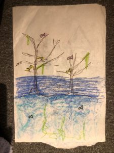
tree with fish on it, oil pastel and felt tip pen.

3 mins.
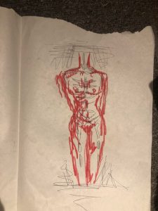
red human figure, black biro and red felt tip

2 mins

Black and blue felt tip, house with shells and sea coming in.

2 mins.

Birds eye view of mouldy bathroom, biro pen.

5 mins.


For these sketches, I took my inital designs and altered them with new designs which were more precise and took longer to create.
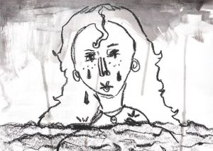
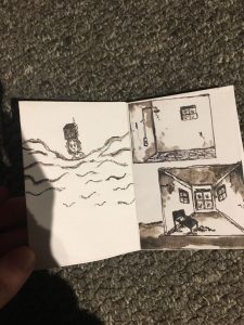
  black oil pastels and a black ink wash. Woman in the ocean crying.

15mins


   Black ink wash of woman in the ocean with the house on her head.

20 mins


Black Ink wash and oil pastels of bed floating in the water.

20 mins,

Oil pastels  clothes hanging.

5 mins


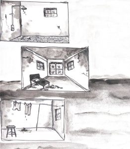
Black ink wash scenes of the mouldy water ridden house with an ocean background. Comic book style

30mins.


collage of words from the text with a hand coming from the water.

20 mins


Black ink wash, black paint and oil pastels of very large woman on the water with tiny house and rain.

15 mins.

Ink wash, waisting away house in water.

30 mins.


Bubble wrap with cut out of house created with oil pastel, scanned and colours inverted.

Scanned image of waves made from oil pastels, then digitally collaged and colours inverted.


2021 – AGP500 – Work Play Work – Part 1

For the first part of this project, we used large newsprint pieces and folded them to create A4 loose ‘sketchbooks’. The idea was to have pages that were not precious.
Our tutor then found random words from magazines and we had around 60 second to draw whatever came to our heads, without any worry that it would be ‘rubbish’ or inappropriate or make no sense.

The first words called out were ‘Sinful’ and ‘Heights’.
This is what I created without any inner critic.
Using red and black oil pastels.

‘Swanky’ ‘Garden’.
This was fairly difficult as I didn’t know what the word ‘ Swanky’ really meant. I assumed it meant posh so I created two characters our of flowers and trees dressed in fancy clothes.
Oil Pastels

‘Shuttle’ ‘Diploma’
This also was a struggle because I didn’t know what type of shuttle to draw so It’s a mixture of a rocket and a plane and a bus and that is because it’s where my mind took me.
I used red felt tip pens and a black biro.


The second half of the studio session, we were given texts (short stories) to create some sketches from, in the same way as the previous task. Anything that comes to mind from the words in the text, it didn’t have to fall into the narrative of the text. The text was merely a guide to ideas.

I used the FAT WORKIE text.

I used mixture of Collage and Oil Pastels and fine liner.