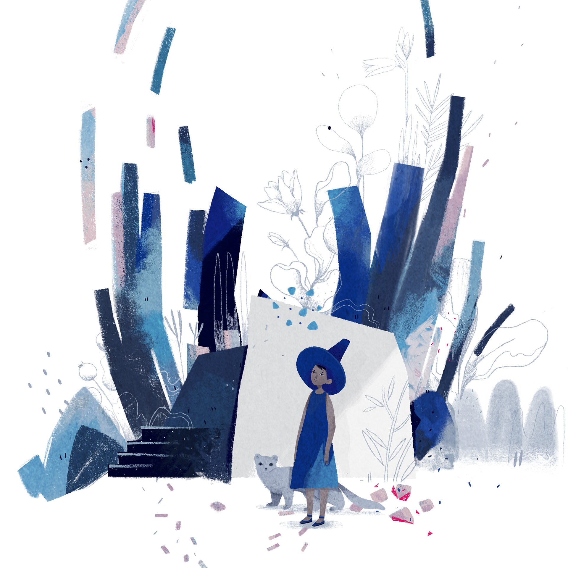
My personal project has gone through many changes but I kept the main idea of promoting my work. Initially I planned to participate in illustration competitions and to create a board game design. in words sounds quite good, in actions not so much. Of course I am all about challenge so I wanted to go and challenge myself. I got different points of view from tutors, some said not to deal with competitions and have fun with the project as later on rarely there will be such possibility as we enter the professional side of illustration. Other tutors encouraged me to pursue this idea, and of course I was quite confident I could manage it. Before life events interrupted my process, I started making illustrations for the first competition that was on the theme ” Our Planet”. After that I decided to switch to a different competition for Vogue on the theme “Reset and Renewal”. By the time the competition was about to end, I entered an Art Festival in my country Bulgaria with few of my illustrations, and again, I switched gears and then thought that I would just make my own thing out of all of this. I kept the theme of the competition which I found to be very relatable to my own personal experiences that I was going through – a time of emerging from the darkness, finding your way again, restarting, blooming. As a result I thought I would make a little poetry picture book illustrating a poem that I wrote on the topic, accompanied by few posters of self-empowerment on the subject matter of self-help, and If there’s an opportunity, I would make some stationaries to go along with the initial idea of promoting my work as mentioned in my statement for the Self-Directed Project.
Here are some references I looked at to navigate me towards my outcomes
I always start by looking at some visual material, then sketching elements that I like by thumbnailing. I do quite a lot of thumbnails of different versions until I get my final idea.
Here I have gathered some illustration examples of style, composition and colour palette. Of course my style is way more different than these but this is something I find inspirational. I quite like the concepts and the metaphors. Combining different aspects/elements of certain pieces of art makes me invent my own things. That could be also architecture, films, historical artefacts, the natural world, some fantasy, myths and legends.
I have always been absolutely obsessed with these pastel colours which apparently are quite trendy at the moment. I would like to find a balance between these whimsical colours and some natural and earthy ones as well.
I experimented after I did monoprints onto long cut outs of paper approximately around 20 x 80 cm. I had this idea of a accordion book, and in order to visualise things better I had to see them in 3D. I then made this dummy book by combining the monoprints that I usually use for digital backgrounds and collage. This time I thought I would use them to tell a story. After I scanned the prints I started playing with them digitally to make a more finished result. Working digitally is something very new to me and I must admit I learned so much this academic year. I now definitely feel like I am finding a balance between the digital and analogue techniques.
This is the finished result of Page 1 of the book. It is basically a digital collage. I do quite like using traditional textures. After all the pages are done I would finish the dummy book by sticking the printed page onto it. Then I hope I will properly print out the actual book.
The idea for this book was to illustrate a poem that I wrote in my native language but as I was doing the illustrations I felt that they were going in their own direction, simultaneously the story was changing.
Something to point out is the character on this page. It is not very strong. I do think I need to work a lot on character design. I did this one fully digitally without planning ahead. I have never actually trained myself to illustrate for a younger audience, but at this stage I got inspired by a Russian Children’s Book Illustrator – Anastasia Suvarova. It is mind-blowing how much diversity there is in her work.
 Here is an example of Anastasia’s style.
Here are some examples of what outcomes I imagine I would like to produce. I had this idea of make a short picture book/zine, so I looked into some book designs and layouts. I couldn’t find too many interesting ideas so I sticked to this idea of a foldable picture book. I would like to get it printed at some point soon. I also would like to make some promoting stationary designs like stickers, a calendar, book binders etc.


