
How can we use data to advocate for social change?
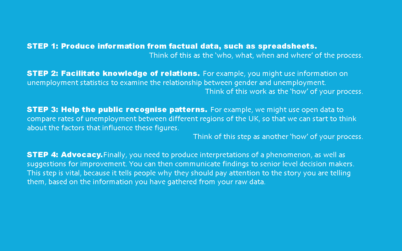
Data by themselves are not particularly useful. To change behaviour, we need to extract information from data, filter this information so that it serves a purpose, and then visualise this information in order to turn it into meaningful, impactful stories.
What are the best ways of representing data?
Anyone can tell a story using data. One of the most important benefits of visualisation is that it allows us visual access to huge amounts of data in easily digestible visuals. Well-designed data graphics are usually the simplest and, at the same time, the most powerful.
From data to advocacy
Types of data visualisation
- Bar charts and pie charts – to communicate strong messages quickly
- Histograms – much like a bar chart, but it groups numbers into ranges per bar
- Line charts – for displaying time series only
- Maps – though take care to choose the right type of map (see here)
- Infographics – a collection of eye-catching imagery, charts and minimal text to give a clear overview of a particular topic
- Creative media – artistic representations using a range of media
See Data Viz Project for more examples and explanations of which type of visualisation to use.
Read more: Organising your information
Think about what the best organising principle for the information might be, rather than what is the most convenient. You will need to:
- Balance aesthetics and design with getting the right narrative and foregrounding the most important information
- Use colour to make information ‘pop out’ and convey meaning (see the example below)
- Make things immediately clear and accessible without dumbing down the issue
- Remember that the success of advocacy and campaign communications can only be judged by how they affect an audience
- Give your audience one clear task or message: for example, a call to change one small piece of behaviour, a volunteer sign-up option, or a donation link
Read more: Examples of effective data visualisation
- Journalist Peter Aldhous made a map for a BuzzFeed article about aerial surveillance of U.S. cities. The U.S. government claimed that these planes were following up on specific leads related to drug smuggling, human trafficking, and other criminal activities, though Buzzfeed reported critics’ views that the data showed a tendency to target particular communities by ethnicity and other characteristics. This example shows how effective visualisation can help to add value and meaning to a campaign designed to effect policy and practice.
- Mastadon C, in collaboration with the Open Data Institute, analysed 37 million rows of statin prescription data in different regions across England. They identified that if generic medication could be prescribed over branded medication, the NHS could potentially save £200m in a year. The Prescribing Analytics website provides a visualisation of this finding using maps and clear labelling system of colour density.
Training your critical eye
Be aware that many data visualisations can be misleading – always take a critical view. Do the segments of a pie chart actually add up to 100%? Are the segments proportionate? Do the horizontal and vertical axes of a bar chart make sense? See viz.wtf for examples of bizarre, funny and downright wrong data visualisations.
Some data visualisations may be unintentionally misleading, but be alert to graphics which lead you to a conclusion that support specific agendas. For example, this graph was tweeted by Ann Coulter, a far-right US media pundit. It claims that the impact of COVID-19 has been overstated, but has been widely shown to have been misreprepresented.
For a start, the two visualisations show different age categories; they also compare two data sets without additional context – such as the fact that the US and South Korea have taken very different approaches to managing the coronavirus outbreak. Finally, the figures don’t support the assertion made in the tweet: the death rate for South Koreans under 60 for COVID-19 is in fact over 7 times higher than the deaths in the US from flu in the under-65 range. This illustrates how bad visualisations are not only easy to misread, but can be actively misrepresentative. The journalist who explored the original figures, Andy Kiersz, even wrote an article about Coulter’s misuse of them.
See also: