
Mobile apps are significantly more popular than mobile websites; consumers rely on apps opposed to internet browsers due to simplistic, efficient and online/offline capability(Spence, 2014). In 2014, Flurry, an American analytics company, highlighted 86% of time spent on mobile devices was on apps, whereas 14% was on browsers(Spence, 2014). Therefore,looking at apps from the customer’s perspective is fundamental to improving the customer experience and likelihood to regularly using the app.
To ensure that mobile apps meet acceptable standards and level of usability, rigorous testing is required. Therefore, conducting focused analysis of User Interface (UI) and User Experience (UX) is crucial (DCI, 2018). Conversely, a bad experience with UI or UX on an app can lead to lack of use, user frustration and increased uninstalls, which, in turn, negatively affects the organisation (Macias, 2019), thus leaving the app redundant and the investment costly and an ineffective exercise.
Thus, to reduce the negative effects of an app, and improve the user experience, here are three key steps to follow:
1. User vs. Designer: App Features and Attributes.
Fu et al. (2019) research found a difference between users’ preferred features and designers’ assumption of users’ preferredfeatures for apps. The research highlights how designers assume the holistic layout influenced users to stay on and use the app, whereas the small and specific features like multi-function icon buttons and richness of colour schemes are the influencing factors to users’ perception and their likelihood to use it. Figure 3 highlights the difference between the users’ and designers’ opinion on attributes, with the most notable differences being on 3.1, 2.3 and 1.2 (Fu et al., 2019).


This research shows key attributes which should be targeted during the designing and testing stages of producing an app to improve the users’ experience. Albeit the research was conducted in China, and change of geographical location and culture could alter the smaller and insignificant features such as specific colour choices, language and currency, the fundamental UI and UX features predominantly stay the same.
2. The Start-To-Finish Experience.
Valacich, Parboteeah and Wells(2007) designed the Online Consumer Hierarchy of Needs (OCHN) framework to apply to websites, identifying if generic minimum requirements are met, then further analysing if specific requirements, for the websites classification, are met (See Appendix A: OCHN Framework for a detailed explanation).
OCHN can be applied to mobile apps due to similarity between websites and mobile apps; the key difference being apps are downloadable to a device and launchable regardless of a network connection.
OCHN framework is a highly useful analytical tool to identify if users’ basic and specific needs have been met and the likelihood of them staying on and using the given platform. This rigorous analysis tool is invaluable due to its rich and specific scrutiny of fundamental basics before tailoring to specific website types.
3. A Scale of Usability.
John Brooke’s System Usability Scale (SUS) is an analytical tool which highlights the usability of mobile apps. It requires 10 questions to be answered, rated between 1-5, which subsequently, after finalising the data, result in a number between 0-100 which is applicable to the scale. (Brooke, n.d.) See Figure 5.

Applying SUS framework is invaluable due to the nature of criteria analysed; the ease of usability, which is directly applicable to the successfulness of an app. Furthermore, its concise manner gives dependable, easy to analyse results. (See Appendix B: Brooke SUS).
Mitigating Risk!
It is important to note that if a mobile app does not reach satisfactory standards in any of these steps, it should be scrutinised and mitigated accordingly. If the issue is not remedied, this could negatively impact and increase risk(s) to the organisation. There are numerous risks related to launching an app; the prominent risk is to the organisation’s reputation: reputation takes considerable time to build up, but can be ruined within a short time period (Sefferman, 2016).
Other risks such as bad eWOM and lost revenue, along with reputation damage, can be found in detail at: http://www.mobiadnews.com/documents/risks_bad_app_quality.pdf
Finally, confirmation bias can inhibit the results of analysis: if the person who requested the app to be built completes the analysis, subconsciously wanting to prove the positive effects of the app, as opposed to finding the faults (Calikli and Bener, 2015). Therefore, analysis completed by someone external to the app design and build will reduce bias and give more reliable and qualitative results.
The Key Points You Really Need To Know.
Following the three steps outlined above, and taking into account risk factors, will positively influence the success of executing a mobile app as a marketing initiative.
Key Summary:
- Fu et al’s (2019) Research: Maximises UI and highlights attributes users prefer on apps.
- Valacich, Parboteeah and Wells’(2007) OCHN Framework: Maximises UX and ensures user needs and specific requirements for the type of application are met.
- Brooke’s (1986) SUS framework: Maximises UI and UX by efficiently analysing the usability using a simple, yet academically proven framework providing an easy to understand and effective result.
Consequently, following these frameworks and research will enable constructive app usability analysis relating to UX and UI, reducing negative effects and supporting the initiative. It is essential to bear in mind, due to the popularity and fast evolving technological business environment, that new research, frameworks and best practices will be developed.
A little extra; Google’s user experience researcher highlighting principles of mobile app design.
References.
Brooke, J. (2013). SUS: a retrospective. Journal of Usability Studies, [online] 8(2), pp.29-40. Available at: https://dl.acm.org/citation.cfm?id=2817913 [Accessed 29 Mar. 2019].
Brooke, J. (n.d.). SUS – A quick and dirty usability scale. [online] Available at: https://hell.meiert.org/core/pdf/sus.pdf [Accessed 28 Mar. 2019].
Calikli, G. and Bener, A. (2015). Empirical analysis of factors affecting confirmation bias levels of software engineers. Software Quality Journal, [online] 23(4), pp.695-722. Available at: https://link.springer.com/article/10.1007/s11219-014-9250-6#citeas.
DCI. (2018). Importance Of UI/UX Design In The Development Of Mobile Apps. [online] Available at: https://www.dotcominfoway.com/blog/importance-of-ui-ux-design-in-mobile-app-development [Accessed 26 Mar. 2019].
Fu, Y., Jiang, H., Zhang, D. and Zhang, X. (2019). Comparison of Perceptual Differences Between Users and Designers in Mobile Shopping App Interface Design: Implications for Evaluation Practice. IEEE Access, 7, pp.23459-23470.
Macias, P. (2019). What’s the best platform to use to hire UI/UX designers?. [online] Quora. Available at: https://www.quora.com/Whats-the-best-platform-to-use-to-hire-UI-UX-designers/simple_answer/Pablo-Macias-9 [Accessed 25 Mar. 2019].
Sefferman, A. (2016). Mobile Ratings: The Good, the Bad, and the Ugly – Apptentive. [online] Apptentive. Available at: https://www.apptentive.com/blog/2016/06/23/mobile-ratings-good-bad-ugly/ [Accessed 25 Mar. 2019].
Spence, E. (2014). The Mobile Browser Is Dead, Long Live The App. [online] Forbes.com. Available at: https://www.forbes.com/sites/ewanspence/2014/04/02/the-mobile-browser-is-dead-long-live-the-app/#2cd3c4cb614d [Accessed 24 Mar. 2019].
Valacich, J., Parboteeah, V. and Wells, J. (2007). The Online Consumer Hierarchy of Needs. [ebook] pp.84 – 90. Available at: http://delivery.acm.org.ezproxy.brighton.ac.uk/10.1145/1290000/1284624/p84-valacich.pdf?ip=194.81.203.94&id=1284624&acc=ACTIVE%20SERVICE&key=BF07A2EE685417C5%2E7748C8603FAAB869%2E4D4702B0C3E38B35%2E4D4702B0C3E38B35&__acm__=1541150409_326c9d1742b6d2a7b384f32746451ef0 [Accessed 24 Mar. 2019].
Appendices:
Appendix A: OCHN Framework.
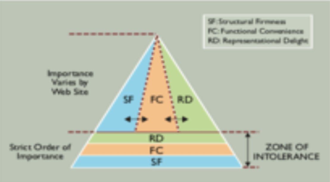
OCHN framework highlights consumers’ initial interaction with a website or mobile application, and highlights key criteria which need to be met in sequential order for the users to stay on the platform. The key criteria, at the bottom of the pyramid are known as the Zone of Intolerance: Structural Fairness (SF), Functional Convenience (FC) and Representational Delight (RD). See Figure 1 – OCHN Theory Framework (Valacich, Parboteeah and Wells, 2007).
The characteristics of each category:
SF: The characteristics that impact the performance of the website in terms of speed/loading time and security in terms of data and computer protection of the website.

This characteristic is deemed to be a crucial and prominent factor, therefore, it is analysed first, and without meeting the criteria, the consumer will be less likely to stay on the website. (Valacich, Parboteeah and Wells, 2007)
FC: The characteristics that impacts on the consumer usage when navigating around the website; how easy it is to understand and navigate to the required page with the given website structure (Valacich, Parboteeah and Wells, 2007).
RD: The characteristics that impact the senses, visual and auditory, of the consumer when using the website such as: animations, music and the overall design to the website (Valacich, Parboteeah and Wells, 2007).
Once the Zone of Intolerance criteria have been met, the analysis moves to the top half of the pyramid. Depending on the classification of the website, Utilitarian, Hybrid or Hedonic, it identifies the ratio of SF, FC and RD required. See Figure 2 – OCHN Utilitarian-Hedonic Continuum.
Figure 7 demonstrates how the ratio of the size of the three categories in the three vertical sections, in the upper half, varies depending on the website’s type and focus.

This is the second stage of the application of the framework where one decides which website in the continuum best reflects the website and then considers the balance of the three categories. The three website types represented here are Utilitarian, Hybrid and Hedonic. A Utilitarian website is for completing practical day-to-day tasks such as paying phone bills and banking. A Hybrid website is generally related to gathering of information related to, and for, purchasing products or services. A Hedonic website relates to sensory aspects such as a gaming, film and music website.(Valacich, Parboteeah and Wells, 2007)
Figure 8 demonstrates how the ratios differ to make the website more suitable and efficient for its specific purpose.

Furthermore, the characteristics interrelate with each other: one feature, such as animation, can positively influence RD characteristic, but it will negatively influence FC. For example, features such as videos and animation can make a website more interactive and interesting, but can significantly decrease the loading speed of the website. (Valacich, Parboteeah and Wells, 2007)
Appendix B: John Brooke’sSUS Questionnaire.
John Brooke designed the Scale of Usability Score (SUS) to be widely applicable to services, products, applications and websites. There are 10 questions which need to be answered:
- I think that I would like to use this system frequently.
- I found the system unnecessarily complex.
- I thought the system was easy to use.
- I think that I would need the support of a technical person to be able to use this system.
- I found the various functions in this system were well integrated.
- I thought there was too much inconsistency in this system.
- I would imagine that most people would learn to use this system very quickly.
- I found the system very cumbersome to use.
- I felt very confident using the system.
- I needed to learn a lot of things before I could get going with this system.
(Brooke, n.d.)
The questions are rated between 1 and 5; 1 being highly disagree and 5 being high agree.
Question Example:

The equation to calculate the score:
- Every question which is an odd number i.e 1,3,5… you subtract 1 from the score.
- Every question which is an even number i.e 2,4,6… you subtract the score from 5.
- Total the new scores and multiply them by 2.5. This gives the result out of 100 which can be applied to the SUS scale.
It is stated that:
- 51 or below highlights an extreme issue with usability and is graded an F.
- Circa 68 gives you an industry average score, the usability is good but could be developed and is graded C.
- 3 or higher is extremely easy to use and is graded A.
(Brooke, n.d.)
Holistically, SUS is a fantastic analysis tool due to its widely applicable nature and being relatively easy to use. Albeit the equation could be slightly confusing, it is a simple mathematical sum. The framework is useful due to its quick nature to gain results which is beneficial for quantitative data. Conversely, in 2013 Brooke stated the drawback to SUS is that the answers can be subjective to the opinion of the person answering relating to the usability, rather than factually analysis (Brooke, 2013). Furthermore, it was noted that the SUS scale should not be used as the only analysis method, it is best to accompany other analysis methods and can be used as a quick comparative tool. (Brooke, 2013)
Example of a SUS Questionnaire.


very interesting blog I like the focus on Ux and UI
Thanks! It’s an interesting subject area.