Infographic
Wednesday 15th March
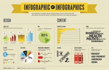
As part of last week’s task, I was to create an infographic detailing an aspect of English language learning. Infographics (information graphics) present information or data as visual representations using images, graphics, and visual data (Smiciklas, 2012). By visually presenting trends and information, recall of knowledge is vastly improved (Heer, Bostock, & Ogievetskey, 2010). In believing that 65% of individuals are visual learners, infographics can have a serious impact upon consumers (Balliett, 2015). Peachey (2016b) advocates for the use of infographics in ELT, claiming they afford many benefits to learners being information and vocabulary rich whilst simultaneously containing little written language. In both his book and blog he outlines ways in which infographics can be exercised in the classroom, both in the use and creation of such (Peachey, 2013, 2016a, 2016b). Suggested tasks included information and fact checking – developing skills of criticality -, summarising, comprehension and question forming, and infographic creating from informative texts (ibid).
In the creation of my infographic, I decided to focus on an informative visual as opposed to a lesson material. This was on the grammar point of ‘Adverbs of frequency’. Whilst it was in early development during last week’s session, I decided to continue and finish such during the week. I took a rather amateur approach to this and used adobe flash rather than taking advantage of the available software that allows the creation of professional infographics. I have previously created infographics of sorts, for instance, my current curriculum vitae takes the form of an infographic in its most basic sense.

Balliett (2015) provides a useful tutorial of sorts outlining infographics and tips on how to get the most from them. Importantly, she lists 5 key tips for successful creation of infographics: it should be visual driven and not rely on text to provide the context; goals should be prioritised so as to keep a narrow vision; it needs to have a hook as consumers typically have a very short attention span; whilst being visual driven, it must contain decent content; and visuals should be consistent throughout (ibid). Evaluating my infographic shows a number of flaws according to Balliett’s criteria.
Having created such however I can easily see the potential benefits of creating and using infographics for certain areas of English. Since the creation of this, I have begun to brainstorm ideas of how to create more professional looking infographics and potential areas of English to create such around. I feel there is real potential to develop such as useful and meaningful tools in the classroom, both for students and teachers, especially those in early practice as is such often the case with the teachers I work with.
Balliett, A. (2015). Learning Infographic Design. Retrieved 08th March, 2017, from https://www.lynda.com/Infographics-tutorials/Welcome/376982/445449-4.html?org=brighton.ac.uk
Heer, J., Bostock, M., & Ogievetskey, V. (2010). A tour through the visualization zoo. Communications of the ACM, 53(6), 59-67.
Peachey, N. (2013). Exploiting Infographics for ELT. Retrieved from http://quickshout.blogspot.co.uk/2013/04/exploiting-infographics-for-elt.html
Peachey, N. (2016a). 9 Generic Activities for Exploiting Infographics. Retrieved from https://nikpeachey.blogspot.co.uk/2016/01/9-generic-activities-for-exploiting.html
Peachey, N. (2016b). Exploiting Infographics. Peachey Publications [Online]: http://peacheypublications.com/books/exploiting-infographics.
Smiciklas, M. (2012). The Power of Infographics: Using Pictures to Communicate and Connect with Your Audience. Harlow: Pearson Education.