In EAP, it can be easy to brush images aside in favour of content and making sure that materials achieve their aims. As I mentioned in my post on materials evaluation, aesthetics (beyond being clearly laid out) came quite far down my list of priorities when evaluating or creating materials.

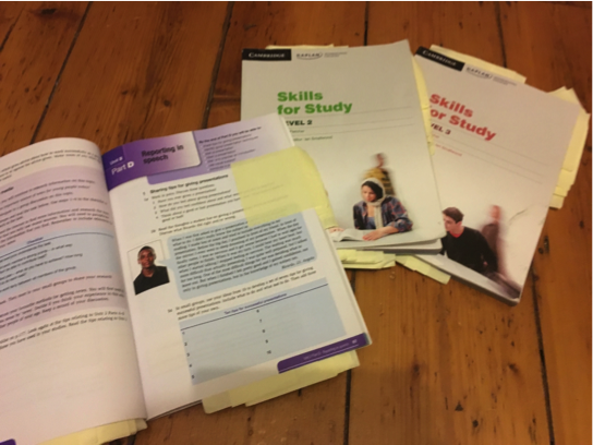
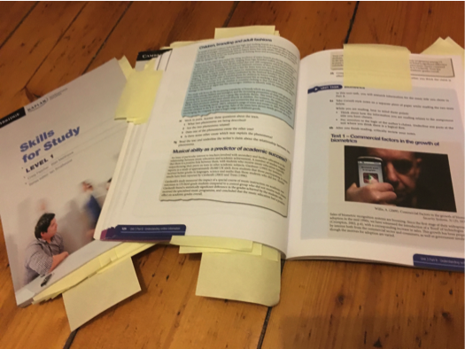
Out of interest, I looked at the Skills for Study series that we use in our college and analysed the functions of the images included.
Functions:
- Affective – enhancing interest and motivation
- Attentive – attracting and directing attention (Duchastel, 1978)
- Didactic/explicative – facilitating learning by showing something difficult to convey in words (Duchastel, 1978)
- Supportive – for less-able learners
- Retentional – facilitating memory (Sless 1981)
The first thing to note is that while your typical EFL text book is full of images and colour, in the Skills for Study series the use of image is sparse, particularly in the first 2 levels. I wonder whether this is for similar reasons as to why aesthetic came so far down my list of priorities when evaluating materials – there are simply too many other considerations that would come first.
Decorative image?

Didactic image

Didactic images used to show mistakes when creating graphics.

Didactic images showing essay structures
Affective image or just decorative?
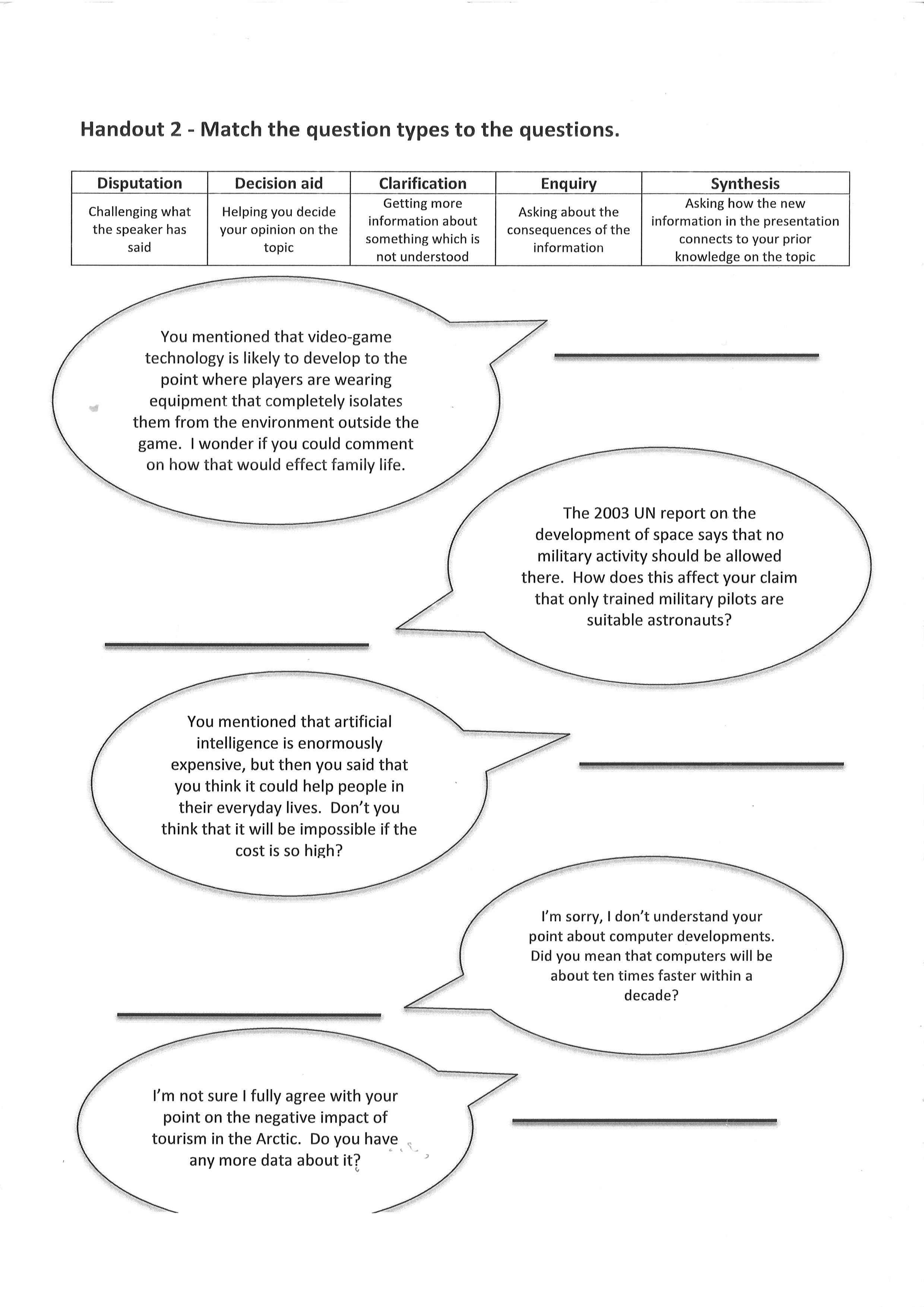
The use of images is overwhelmingly in the form of tables and charts rather than pictures. These could infrequently be termed as affective (students may see the interpretation of these as relevant to their future studies).
Any pictures are in the majority decorative rather than supportive or didactic, although there is the odd mind map or illustrative image.
There are very few attentive or retentional images.

An average page
I think a lot more images could be added to help students to engage with the materials differently. Although the general layout seems to have been set out with functionality in mind, have a look at what I did with an exercise from the third book in the series (also in my post about adapting materials). I think it makes it more approachable and less uniform in terms of format. Which do you prefer?
Exercise 3b reworked