Quora Summer Project

Project One

At the start of the summer we were asked to source questions on the website Quora. For my starting point I came across the following question,

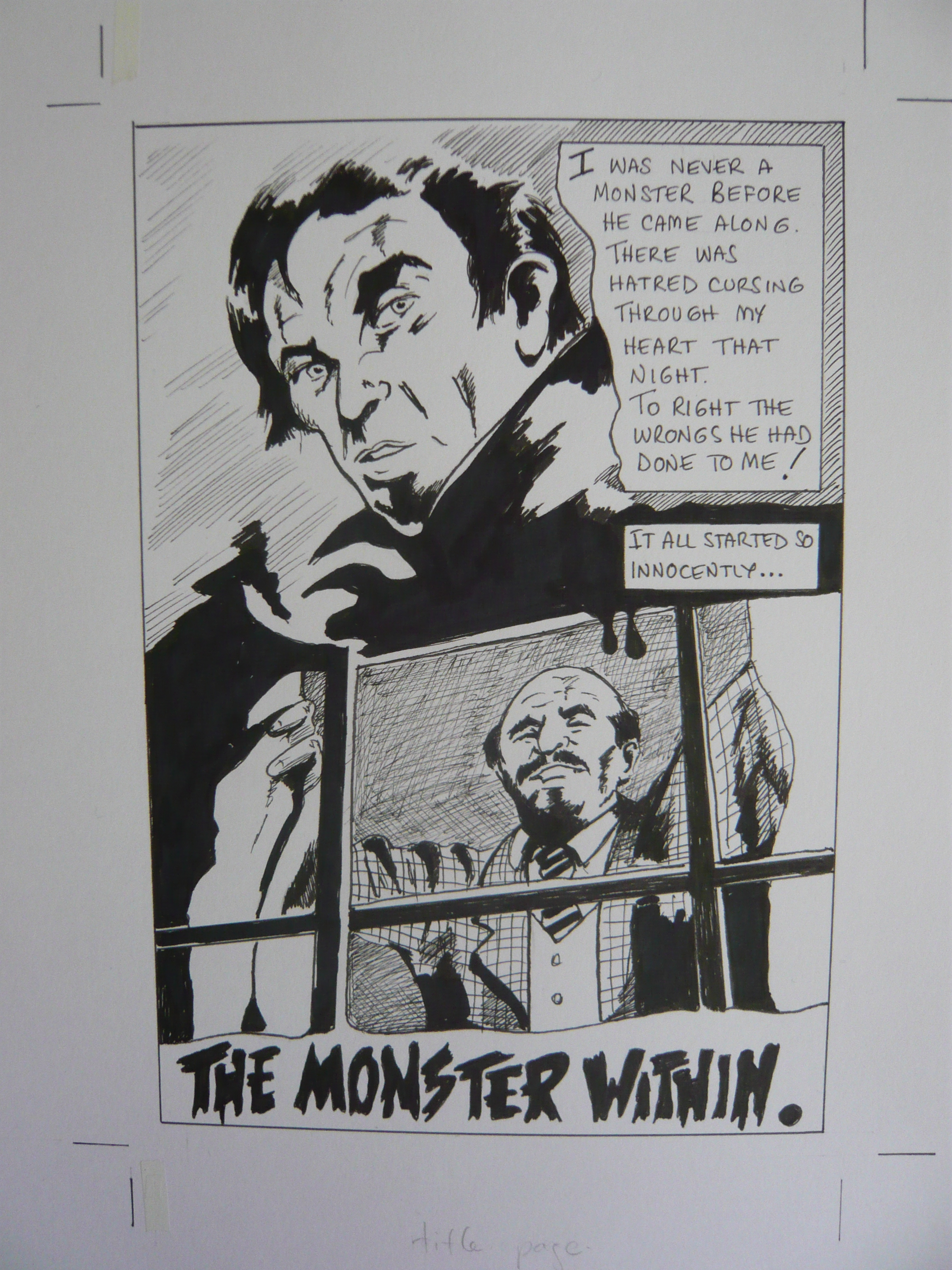
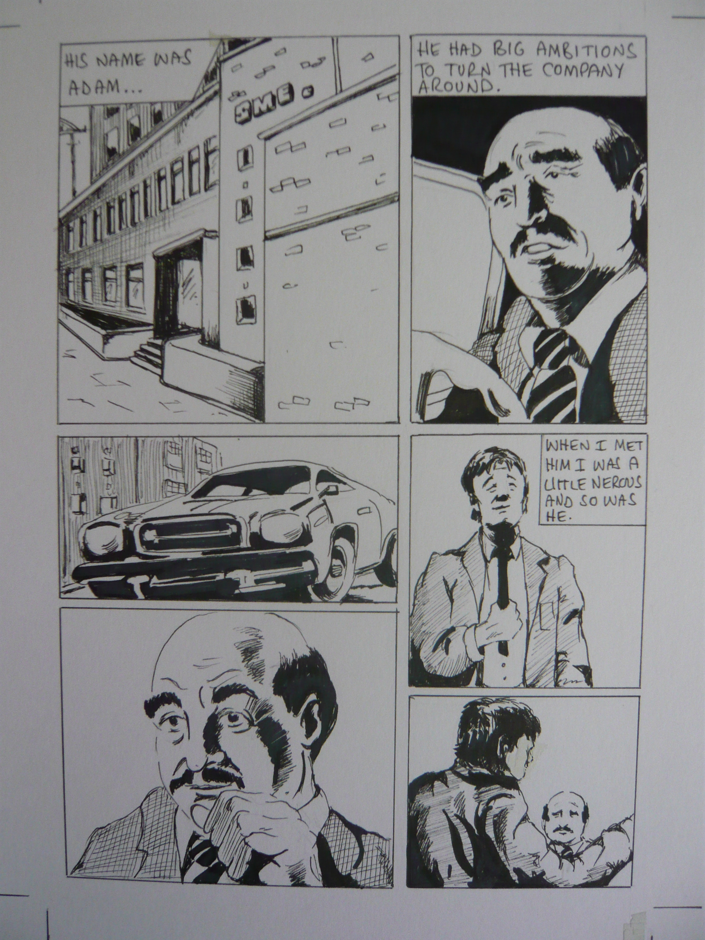
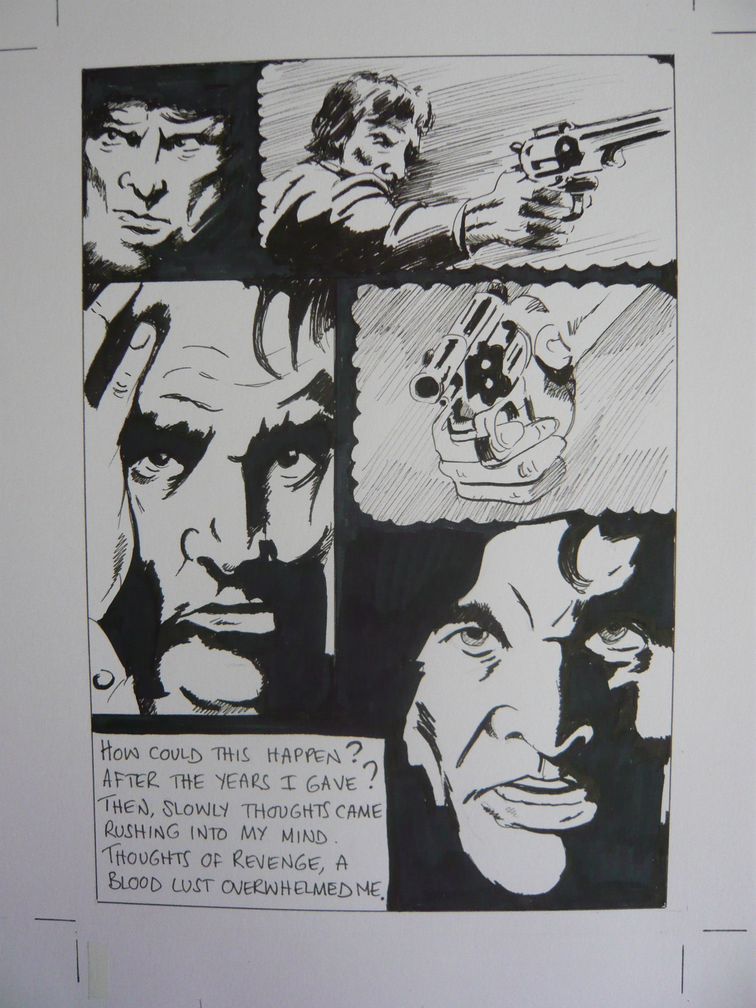
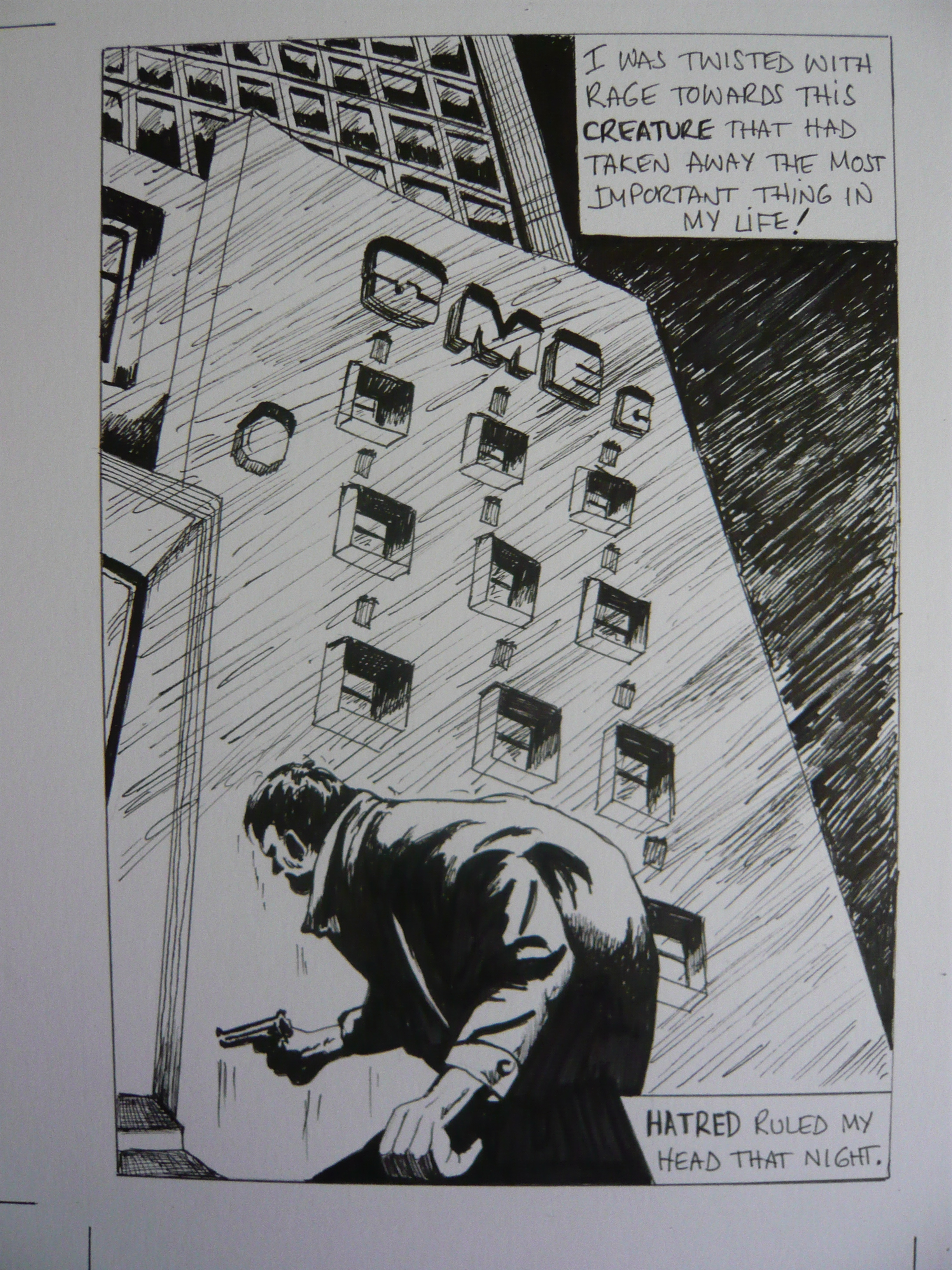
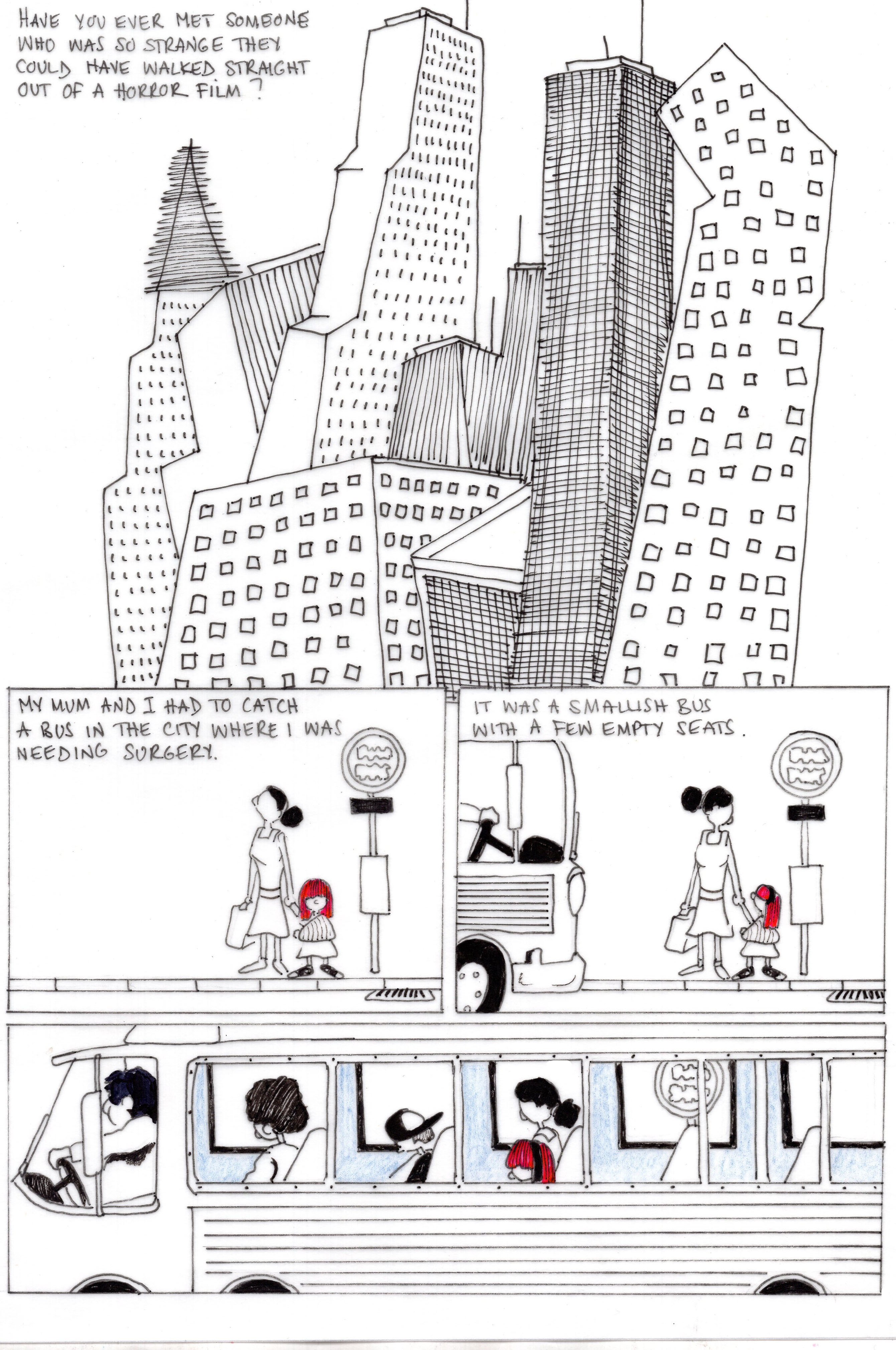
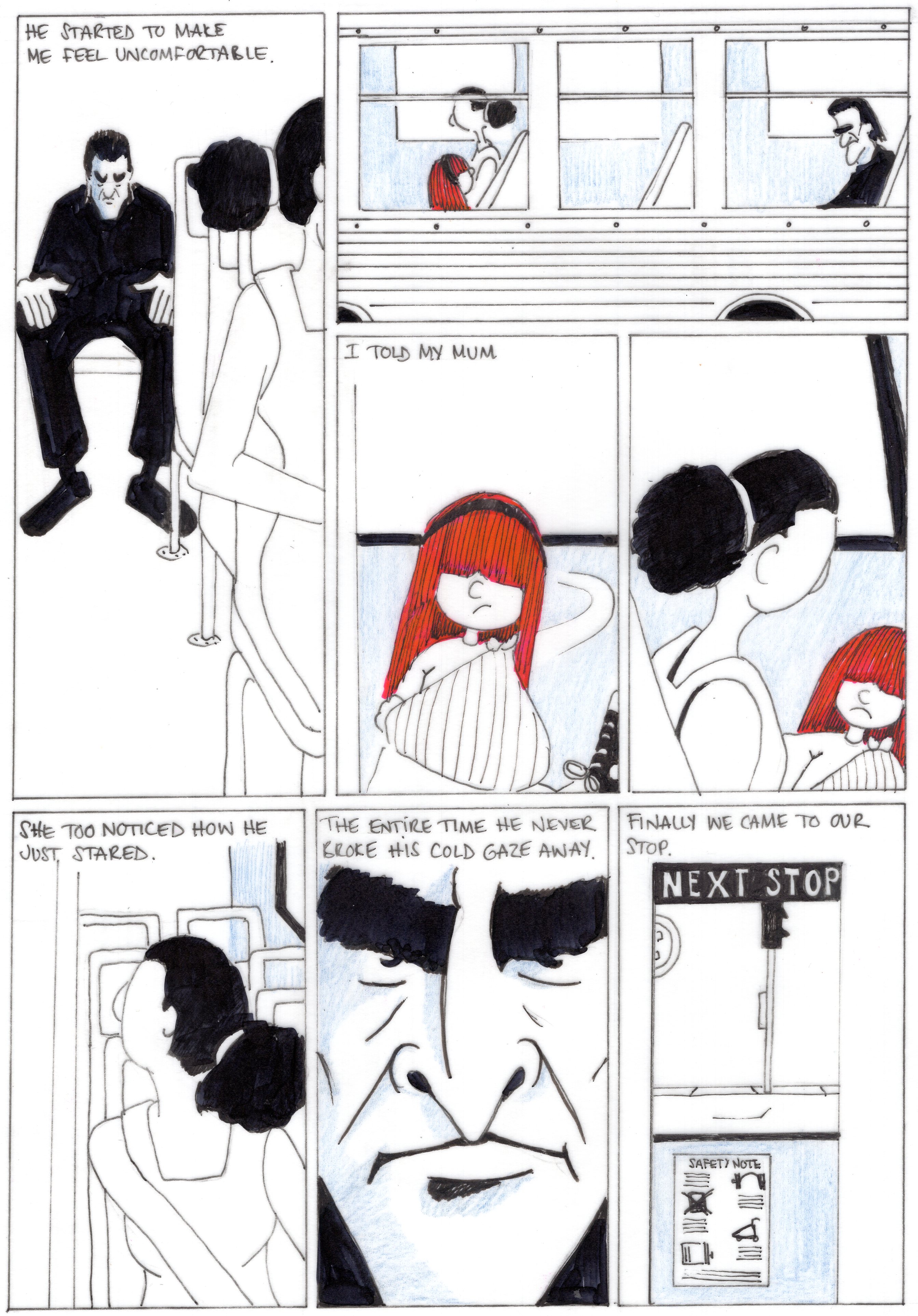
Have you ever met someone who was so strange they could have walked straight out of a horror movie?

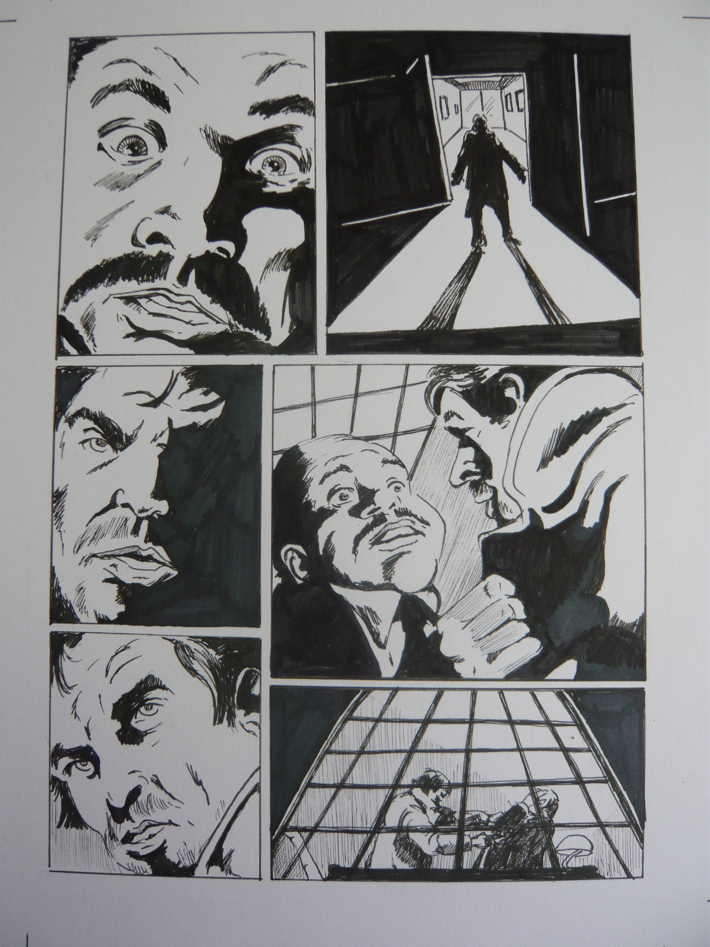
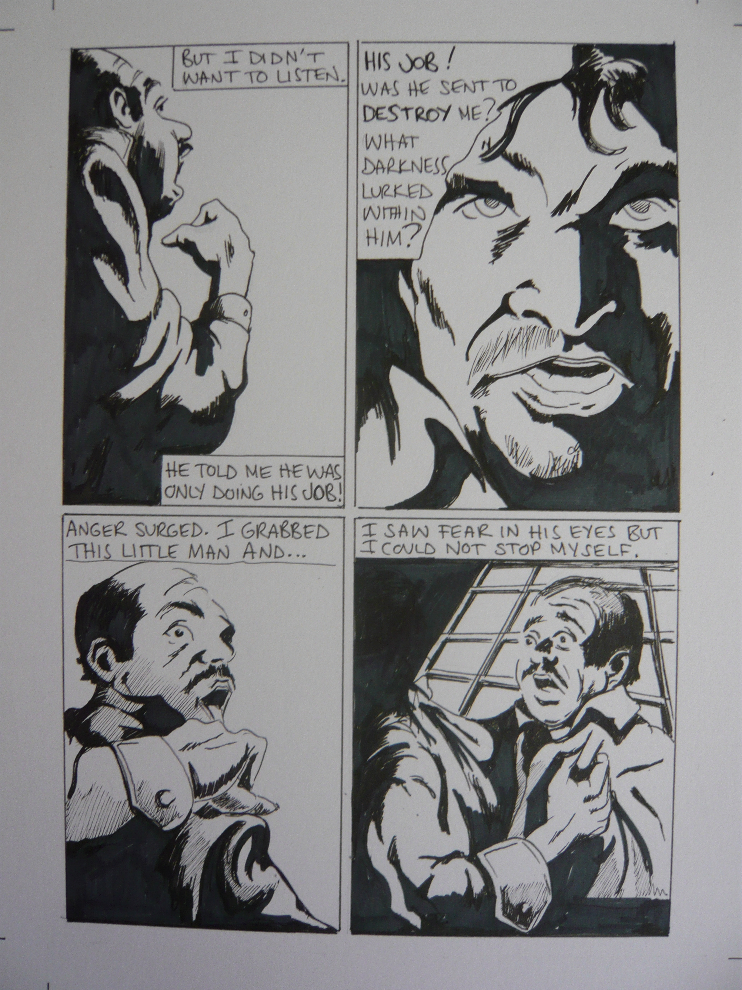
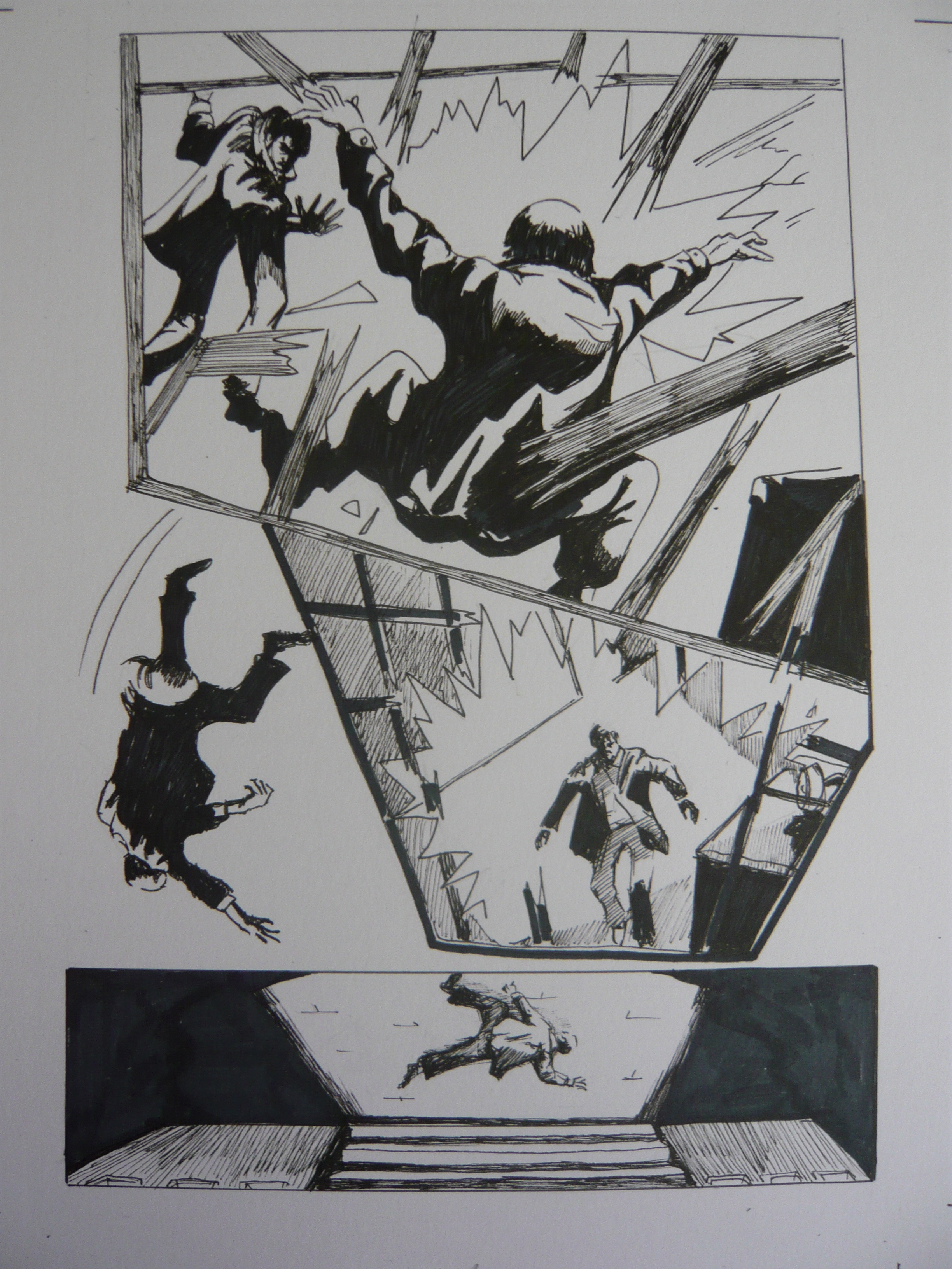
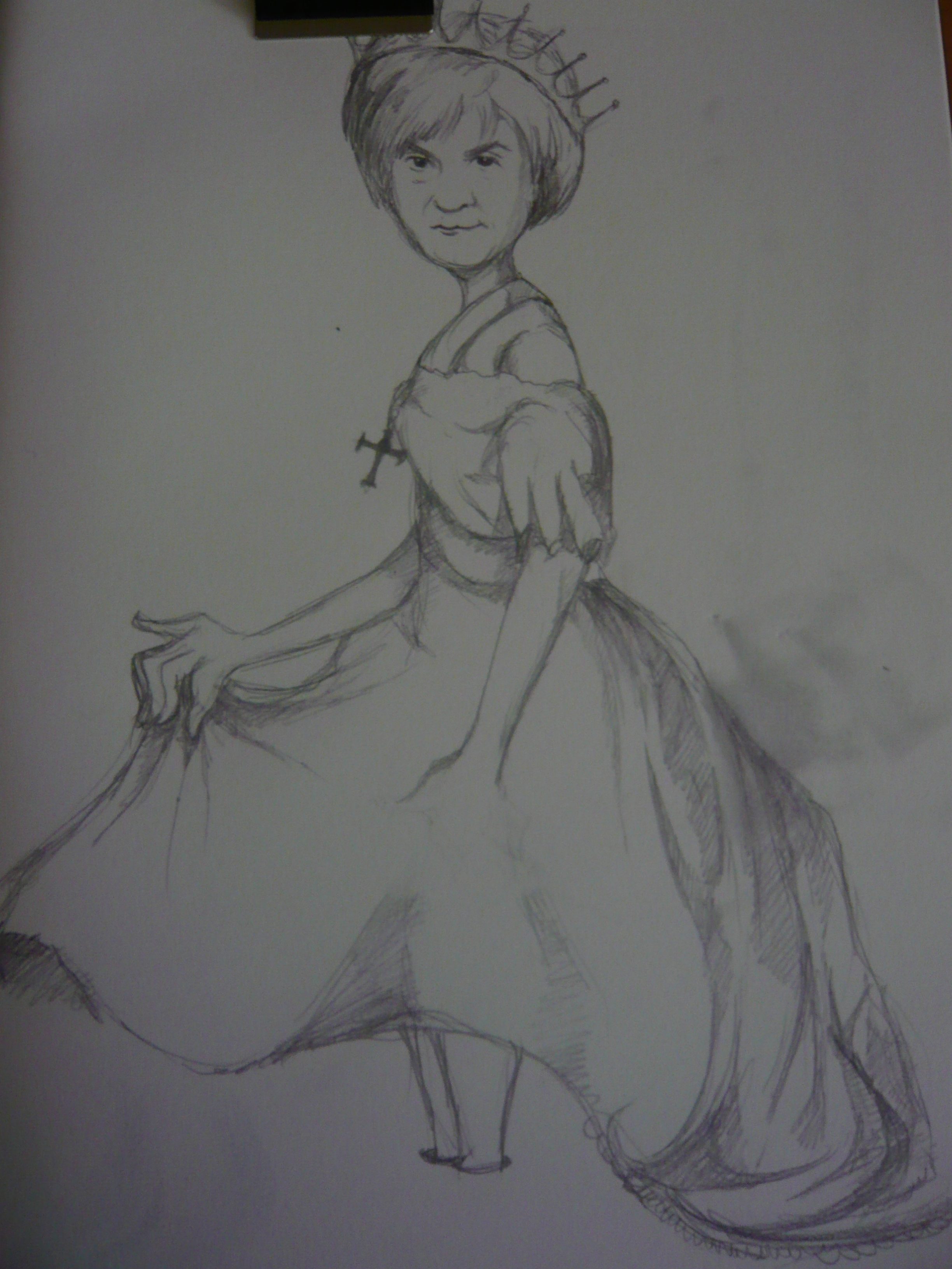
One of the answers was a short story about a girl who, whilst visiting the city, encounters a strange man on a bus that would not stop staring at her. As he continues to stare the young girl starts to feel more and more uncomfortable. She tells her mum who then confronts the man when they get off of the bus.

It turns out that this gentlemen had previously been a bank robber and had been in jail almost all his life. This was the first time he had ever been in the outside world and it was the first time he had ever seen a girl with red hair, which he thought was quite beautiful. As a result he could not stop staring at the little girl.
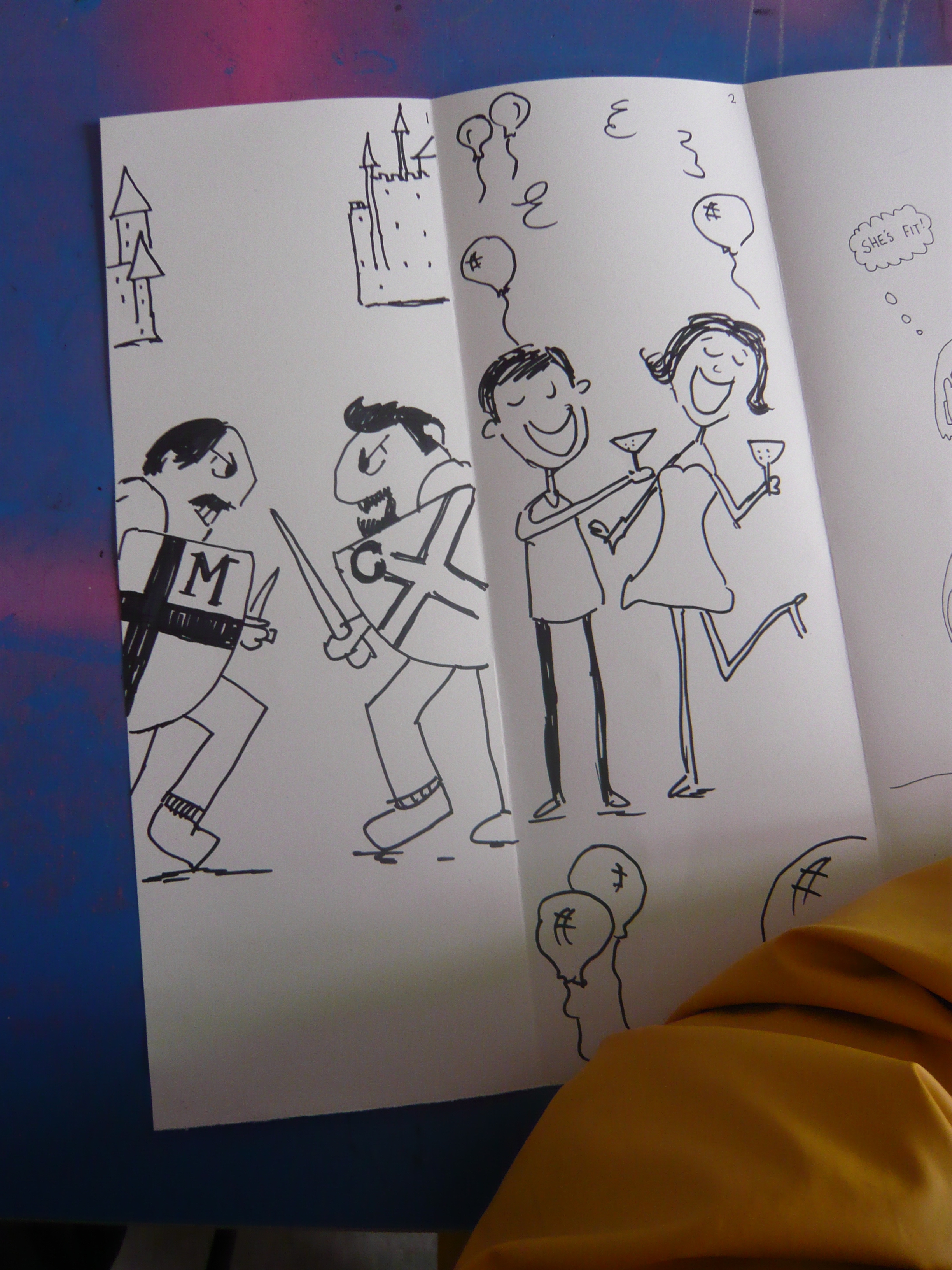
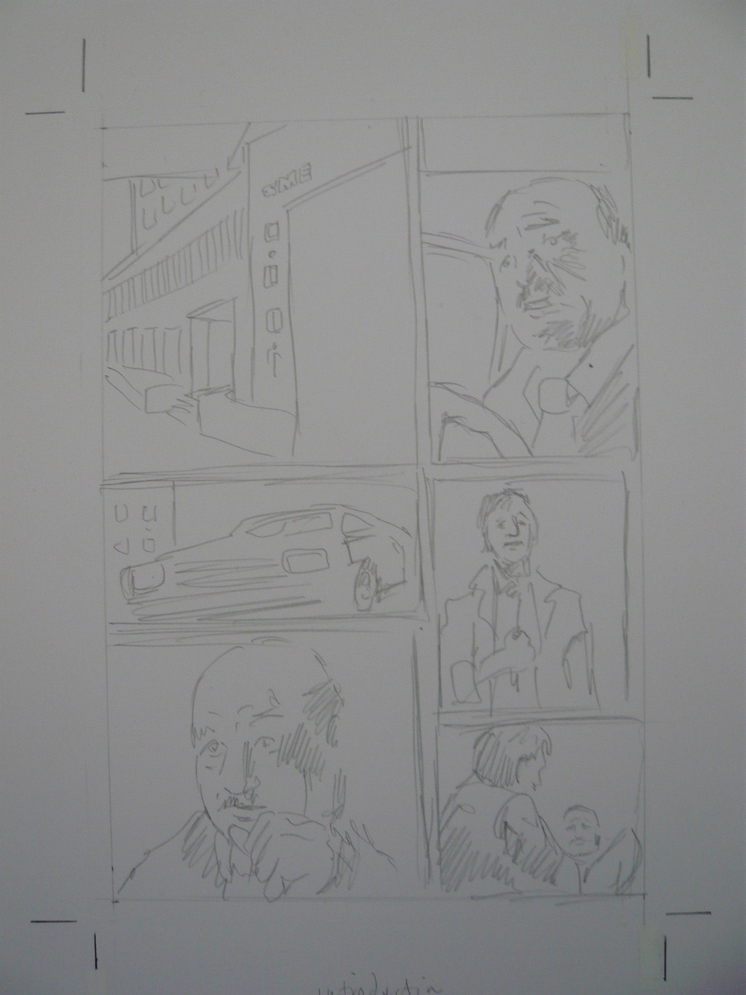
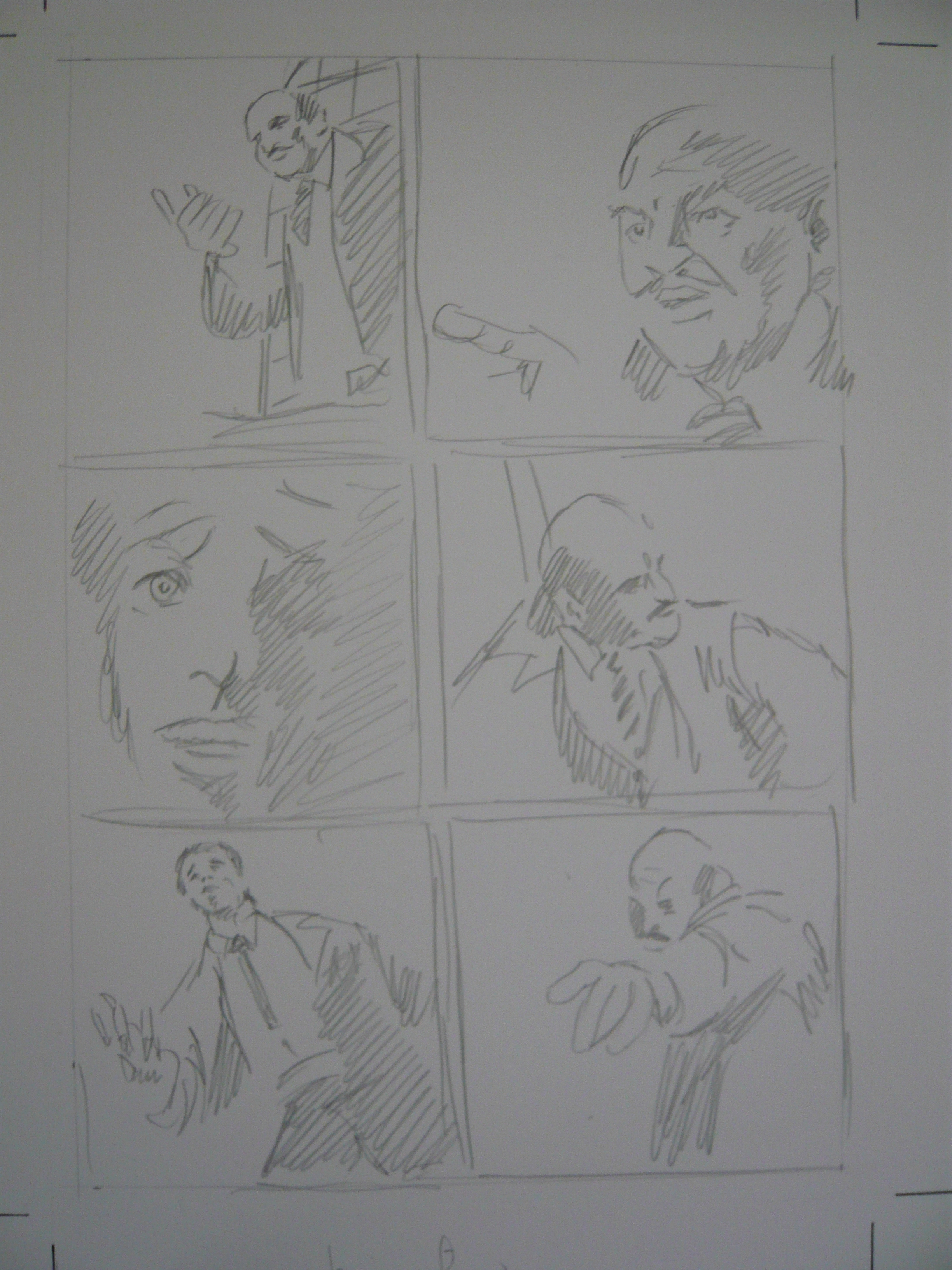
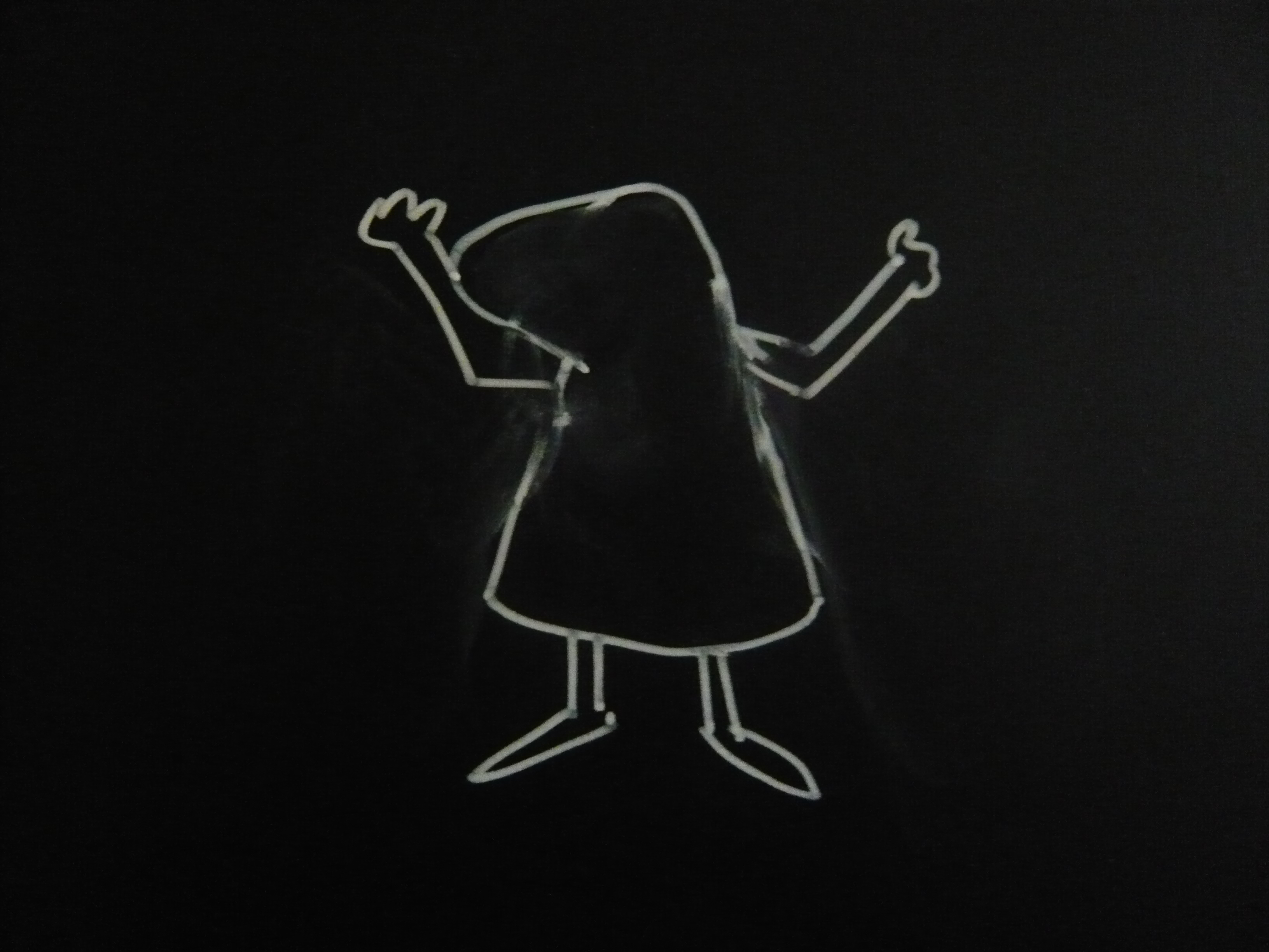
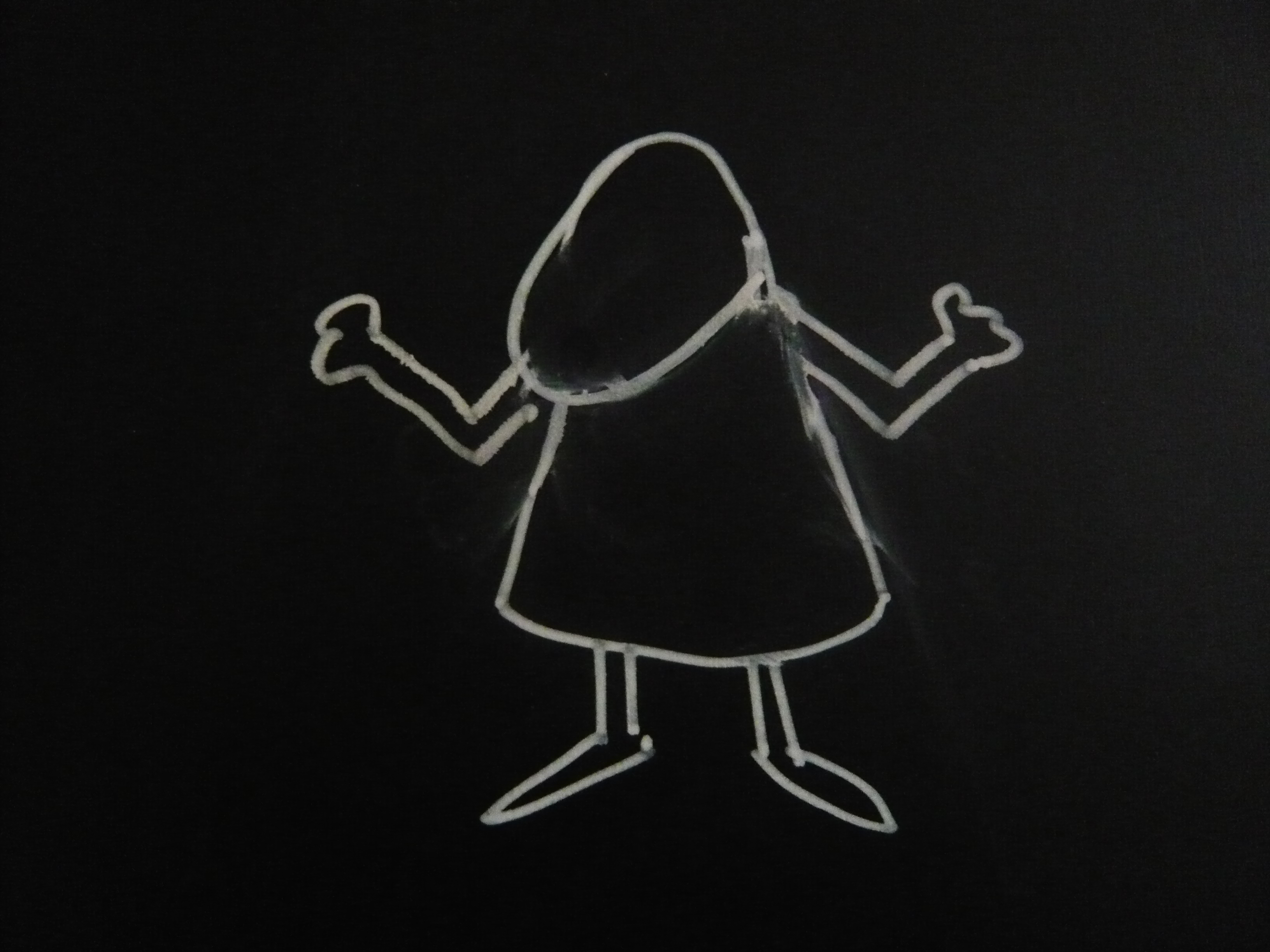
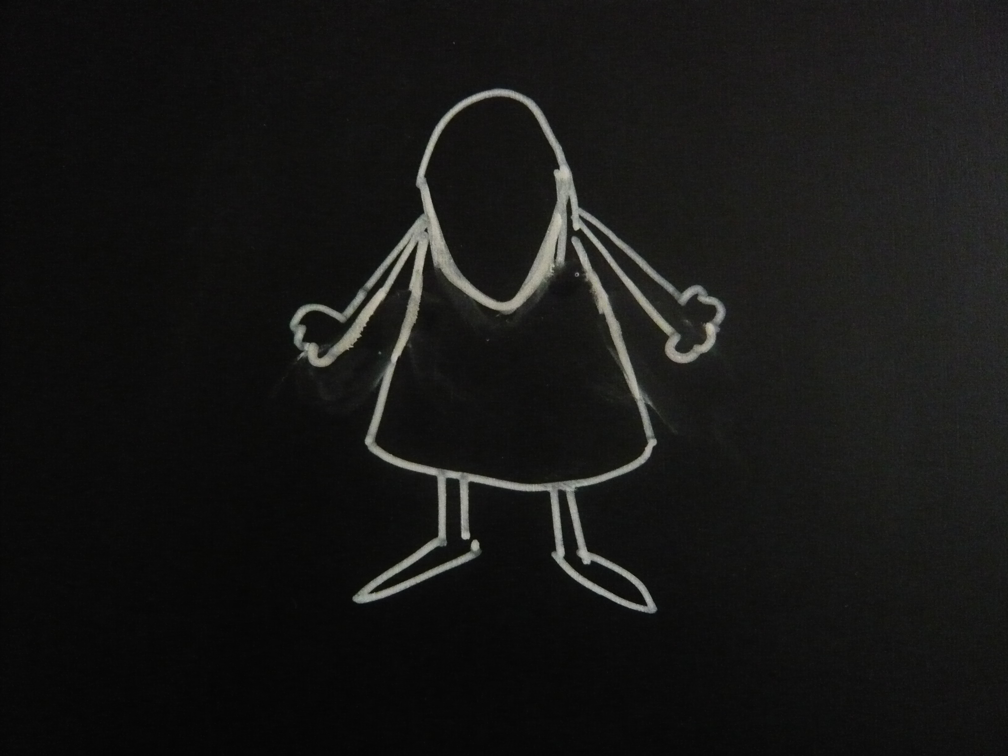
First Roughs:


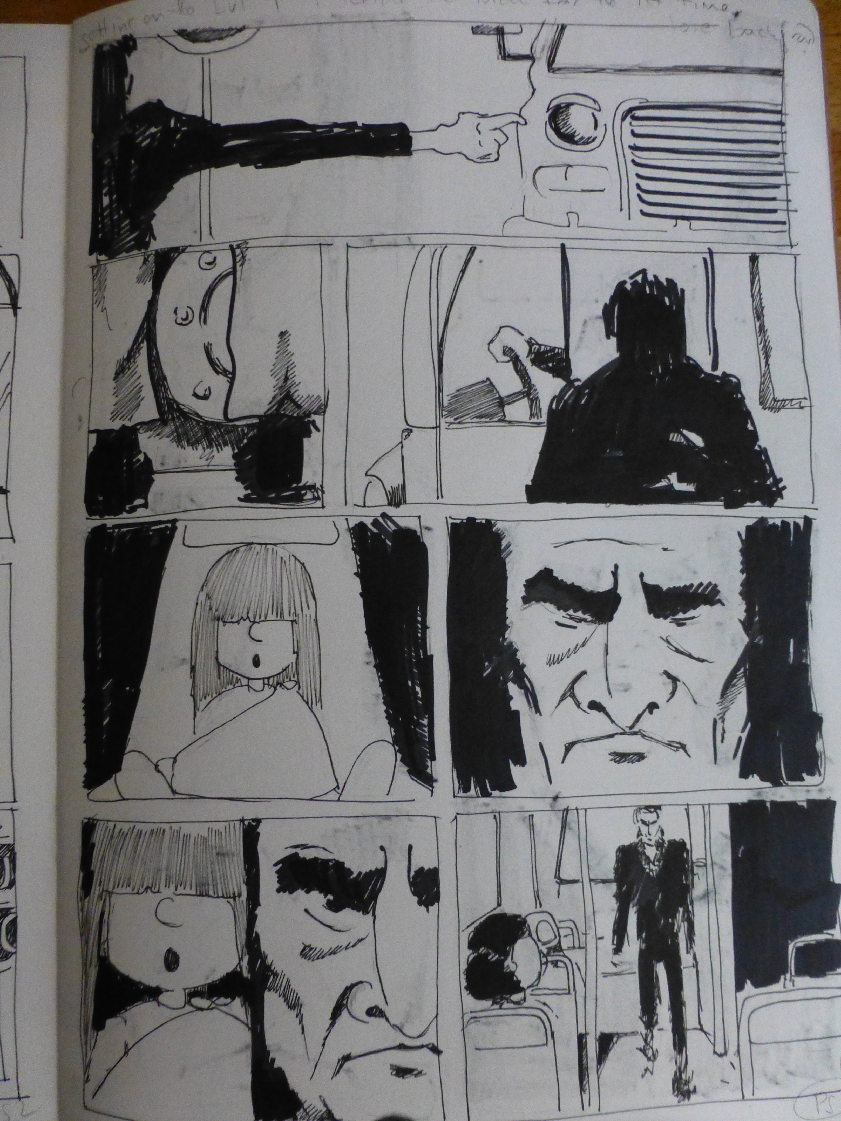
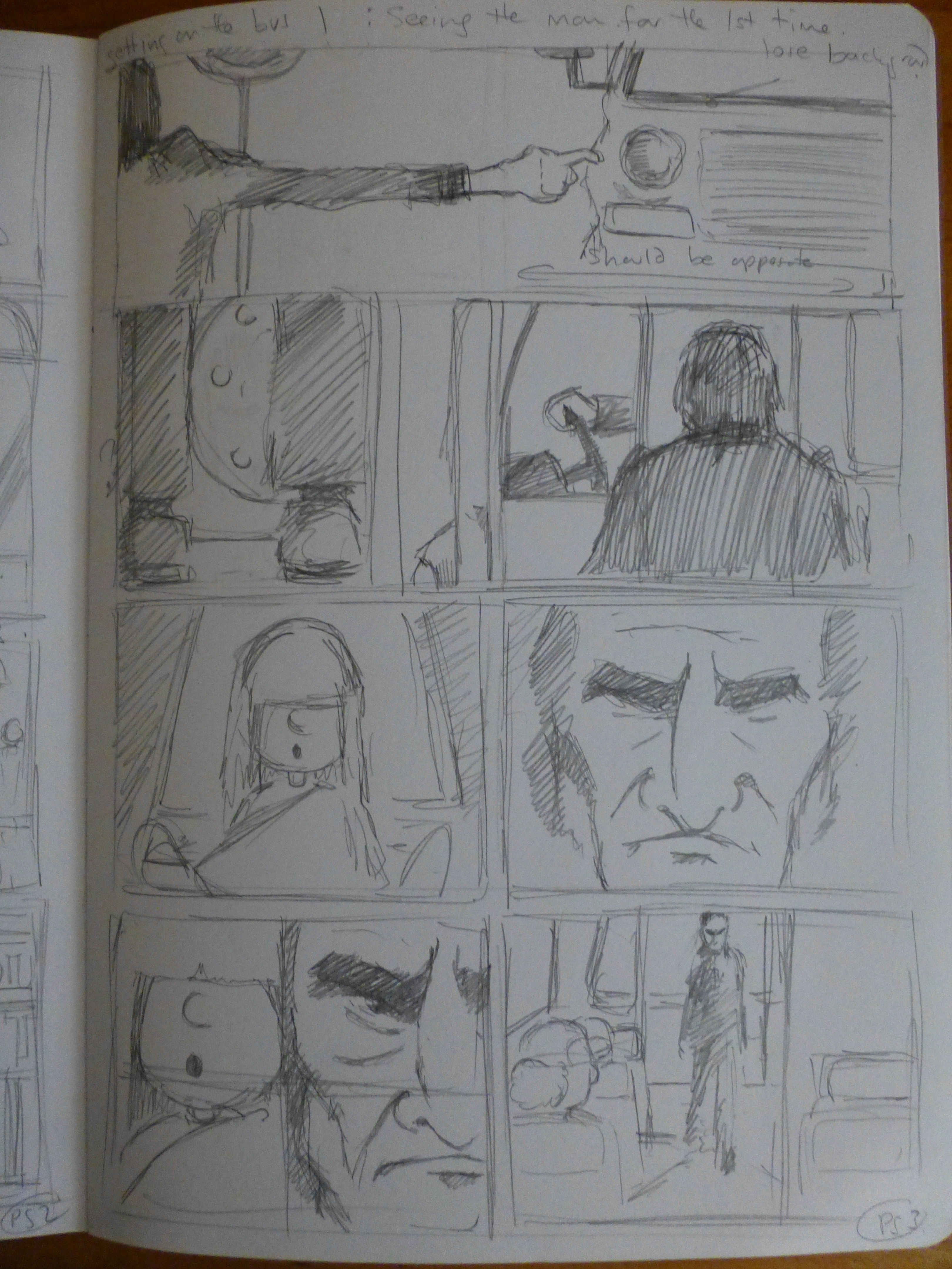
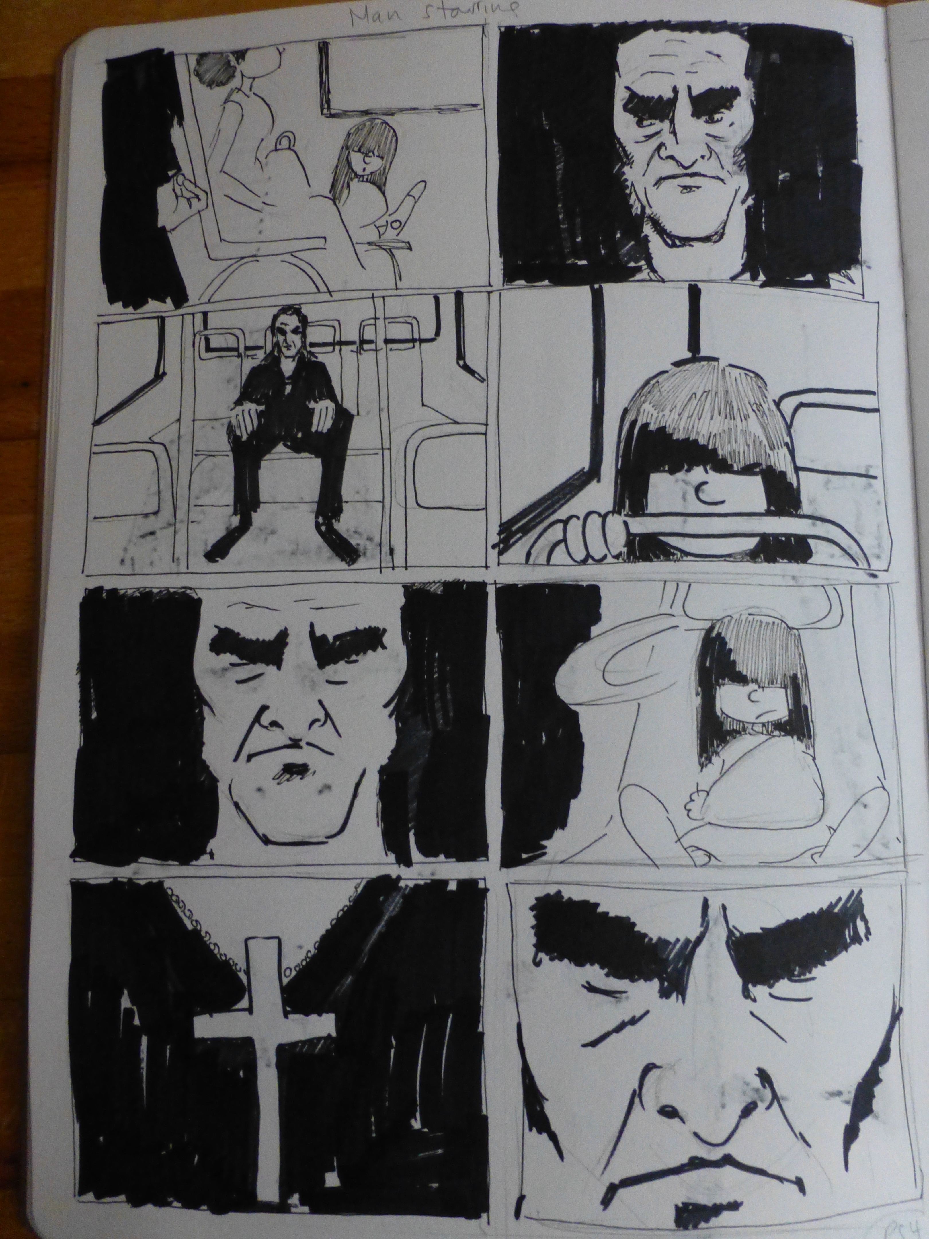
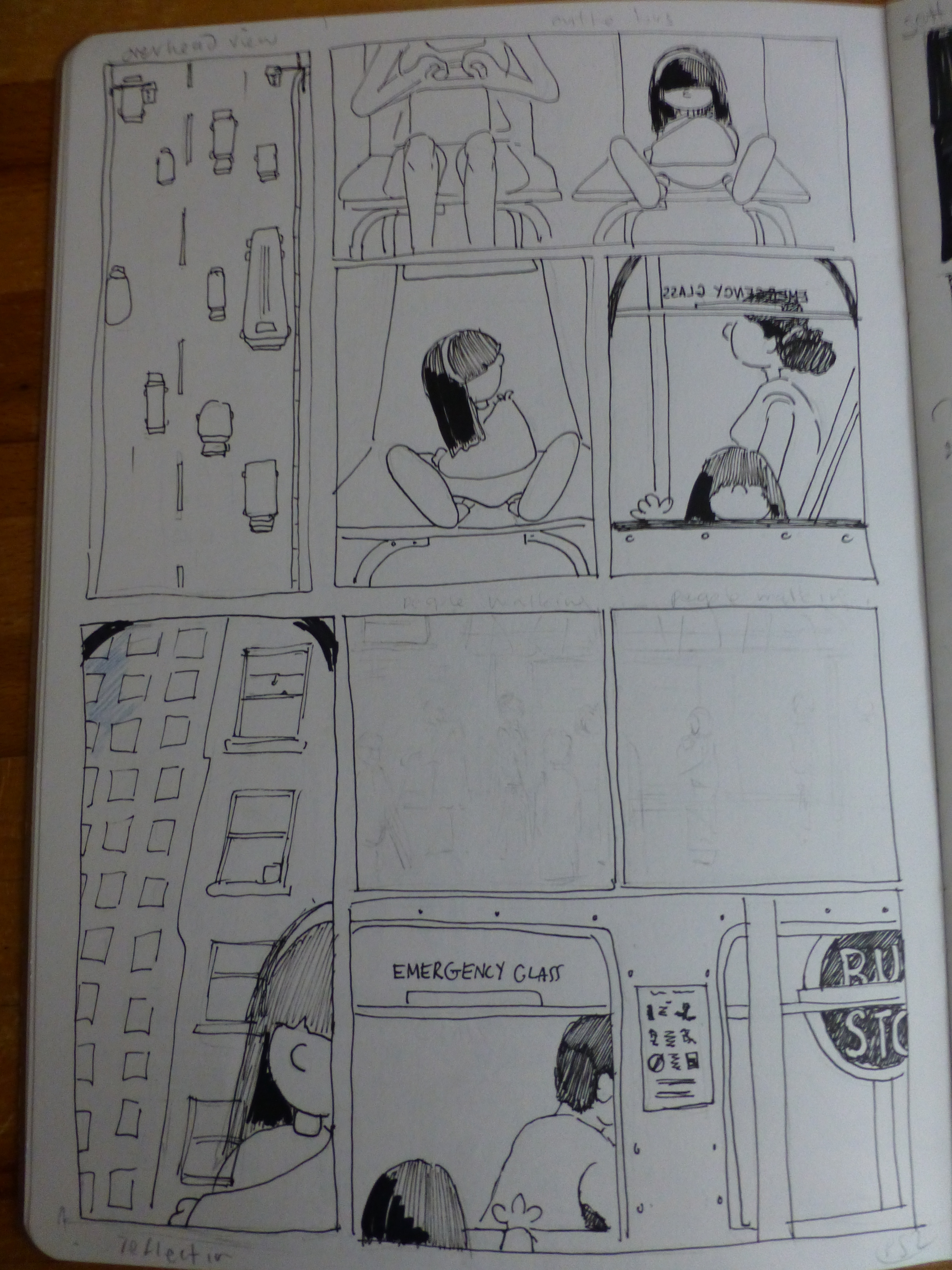
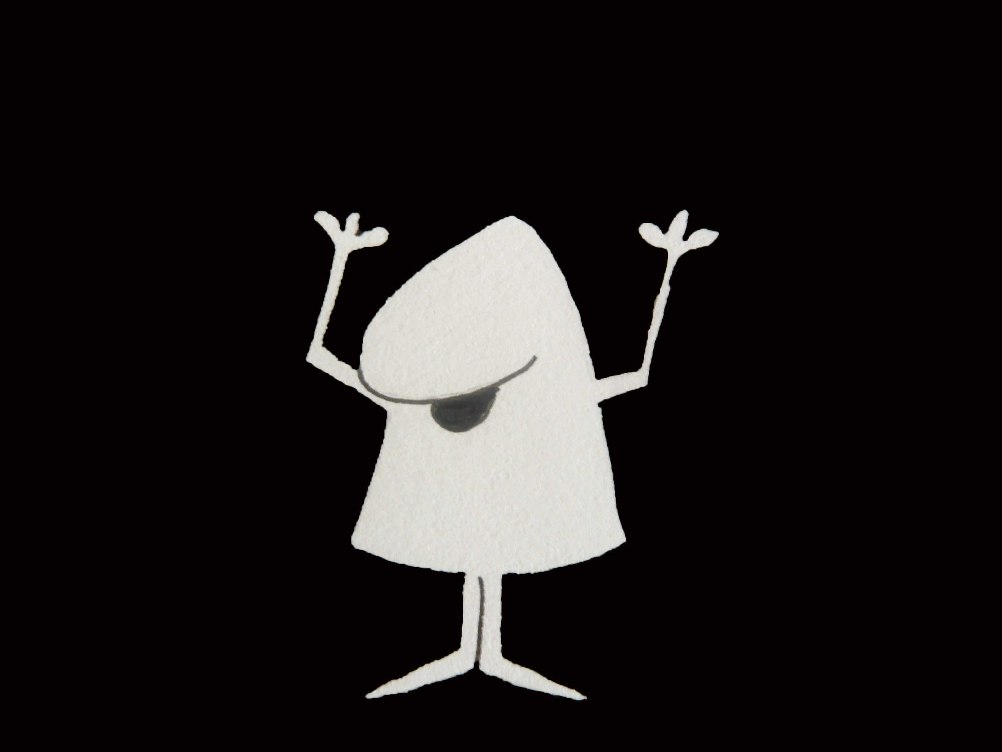
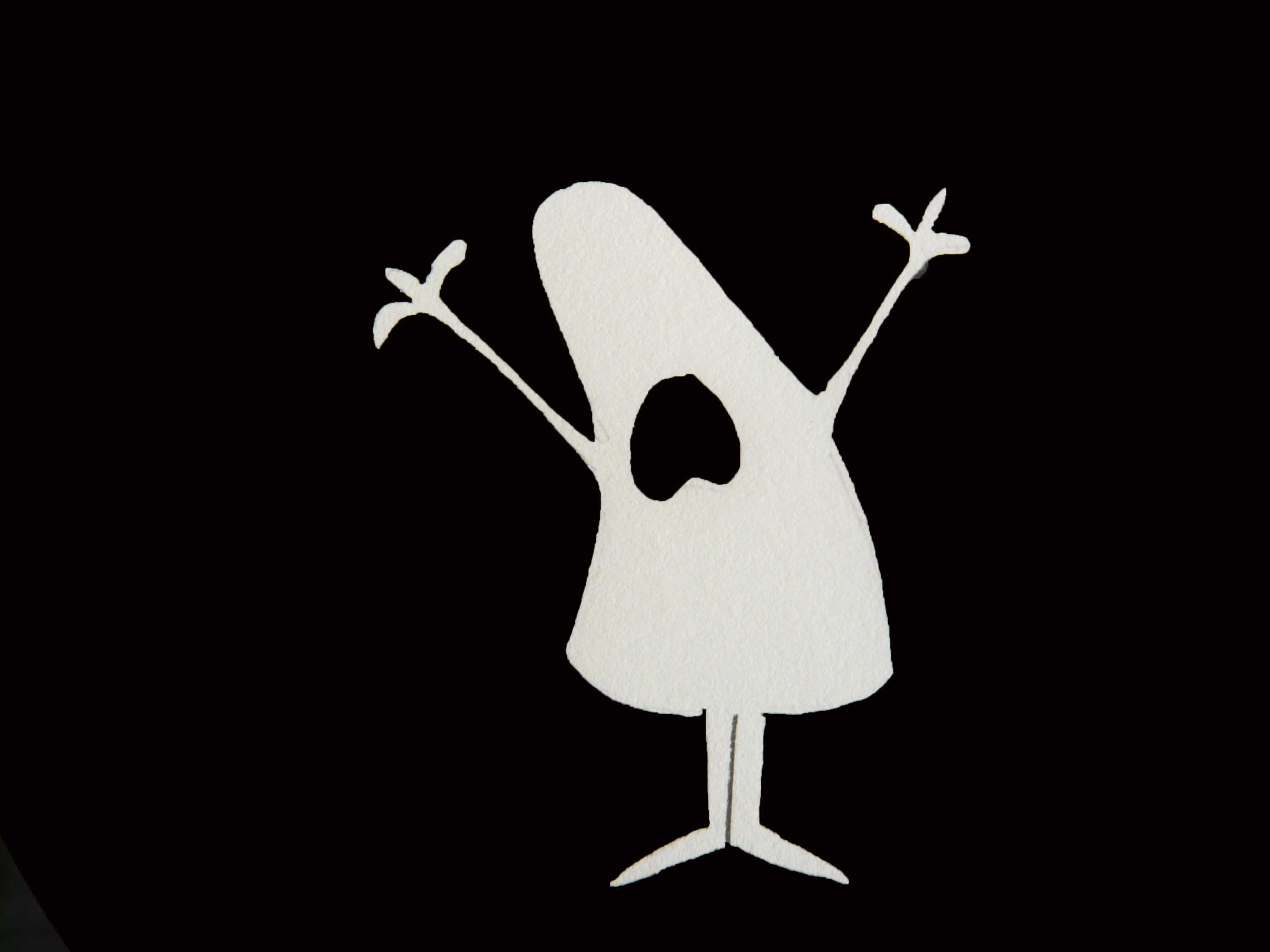
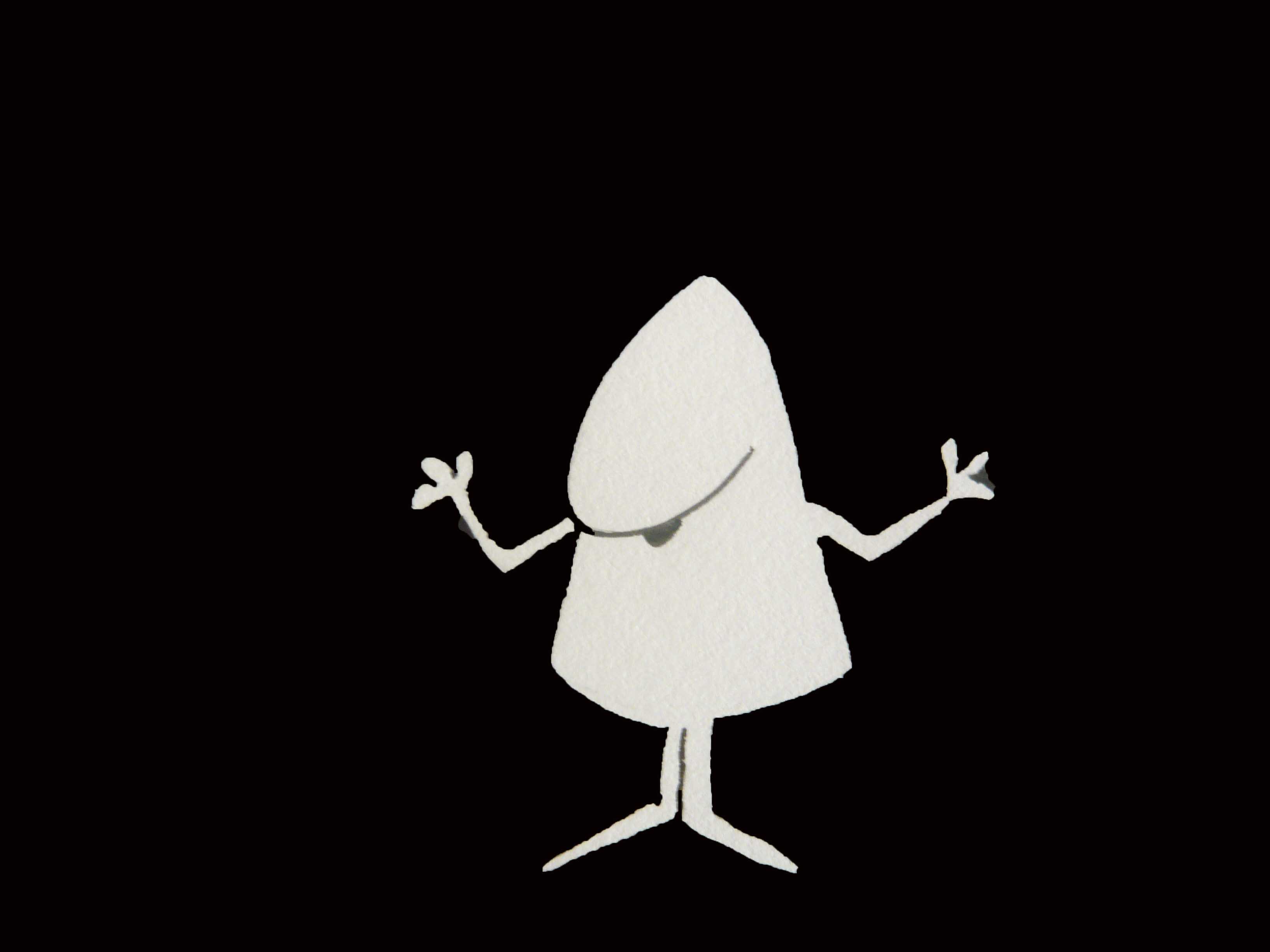
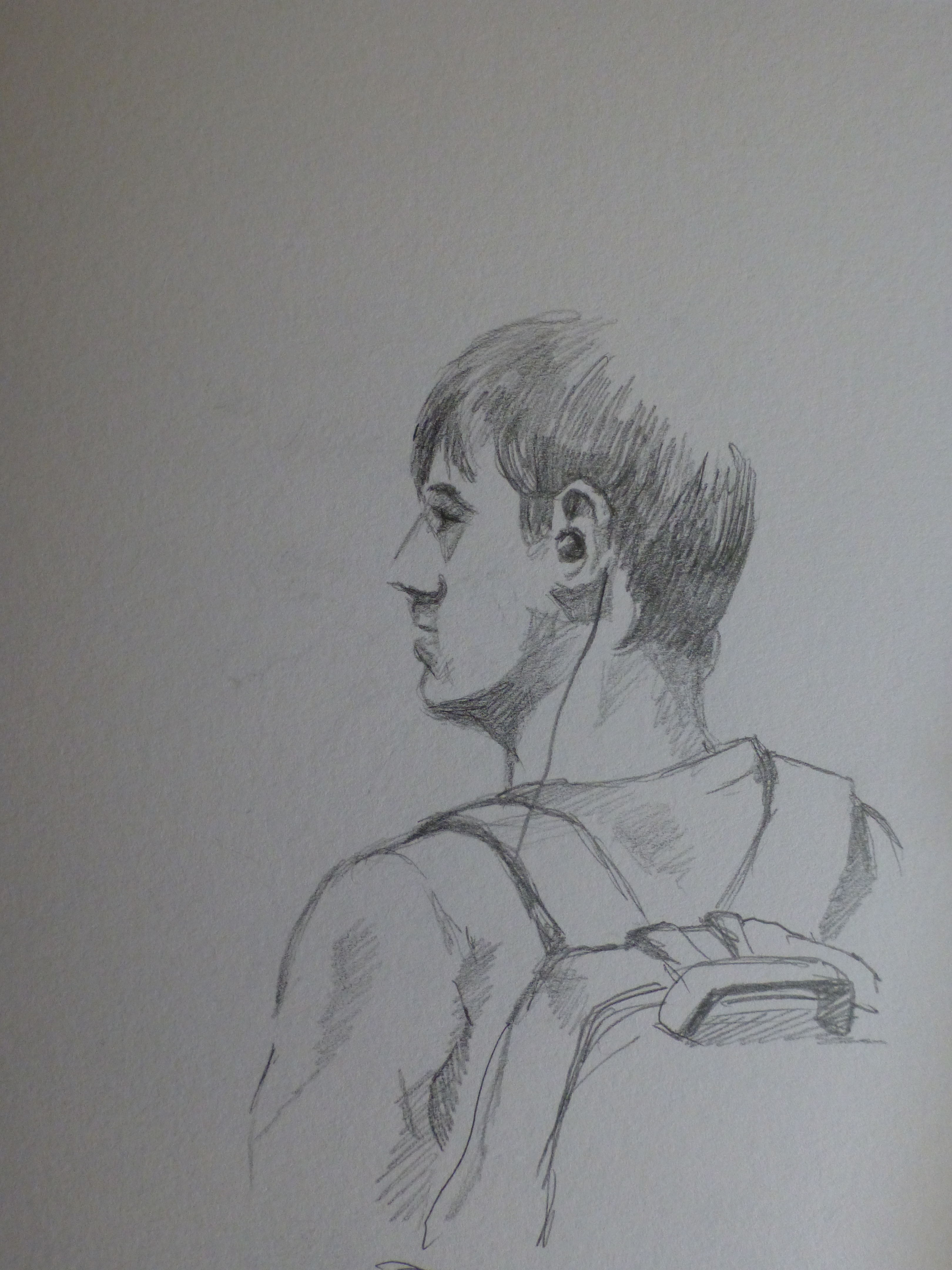
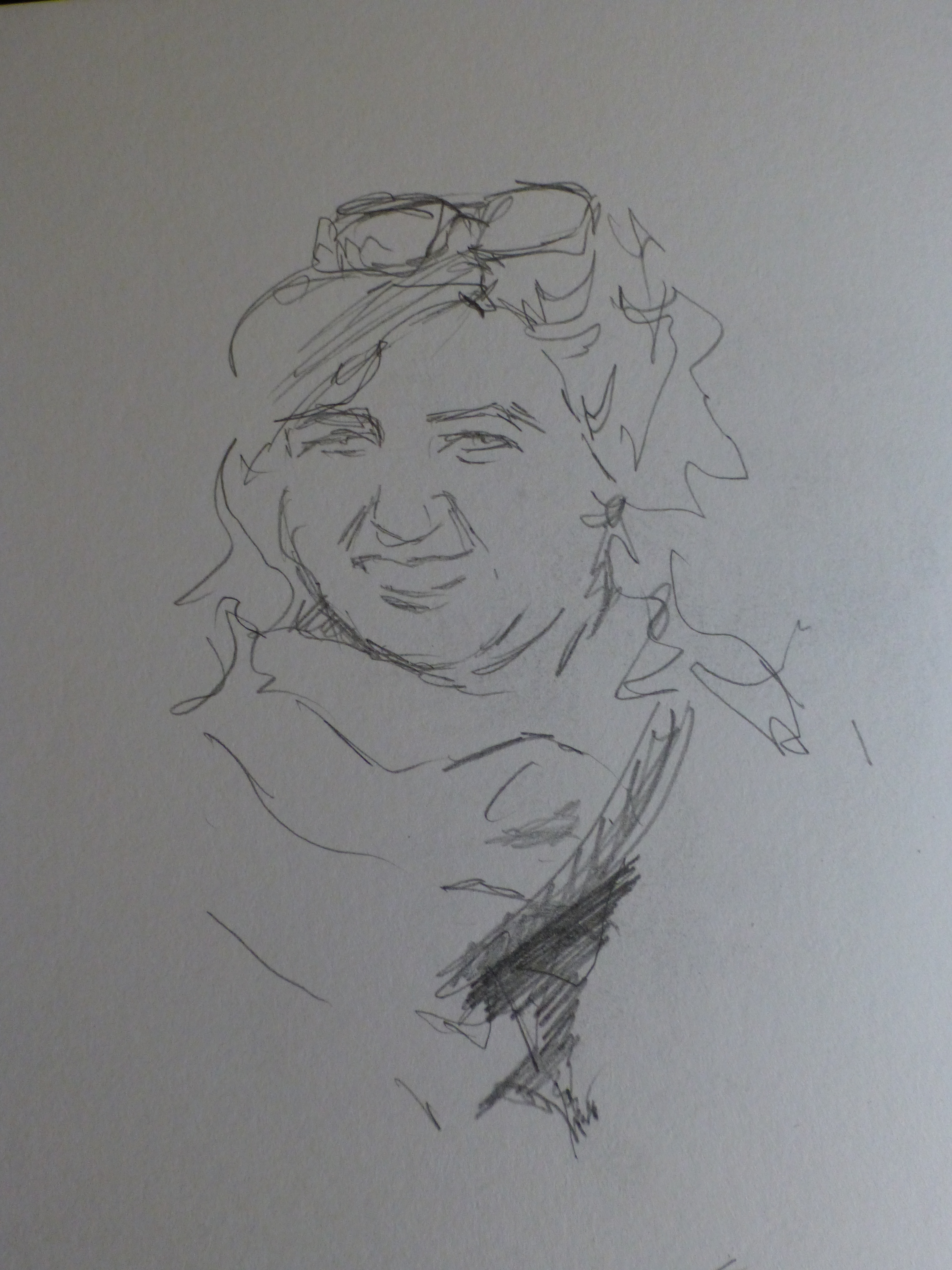
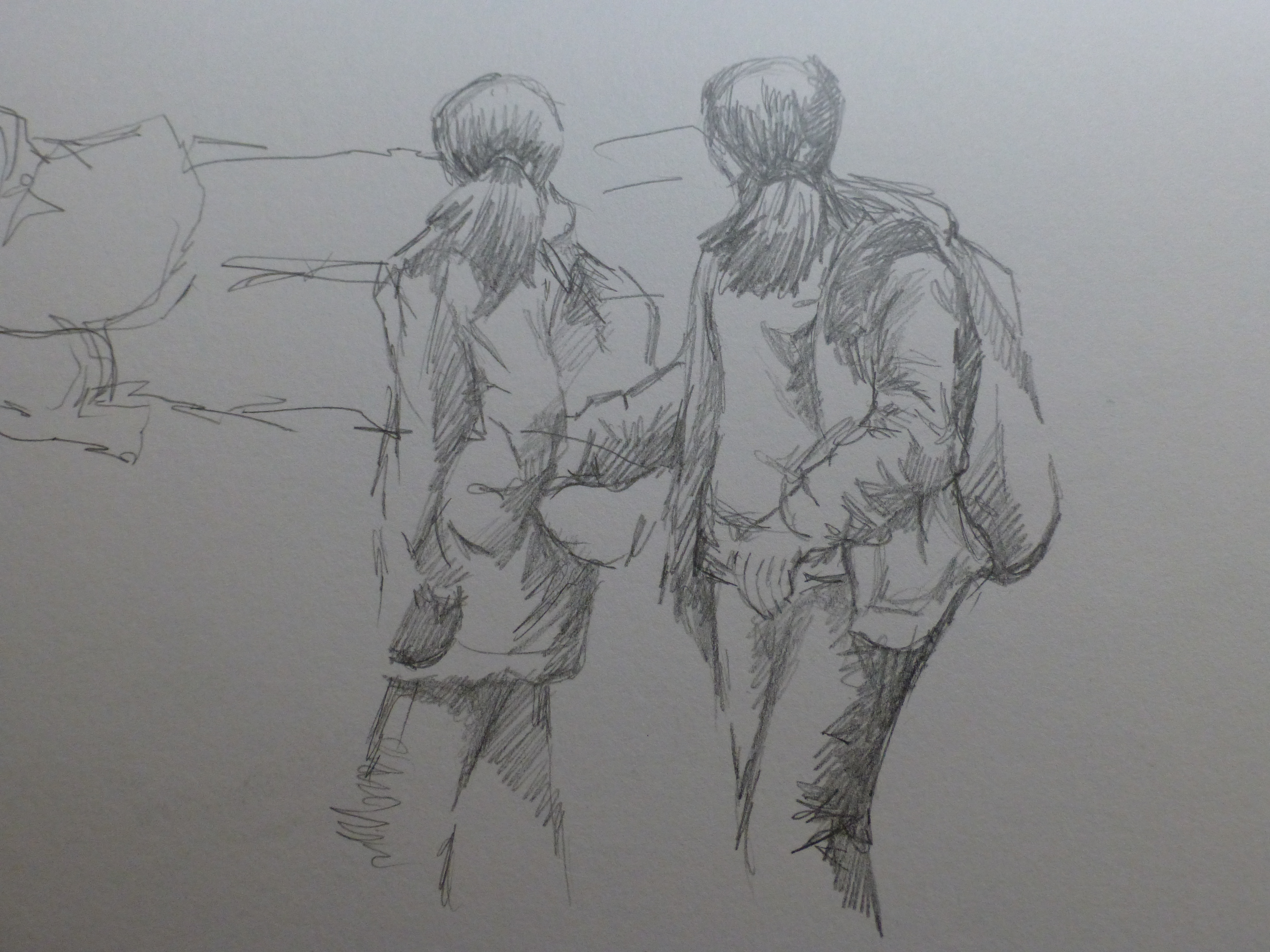
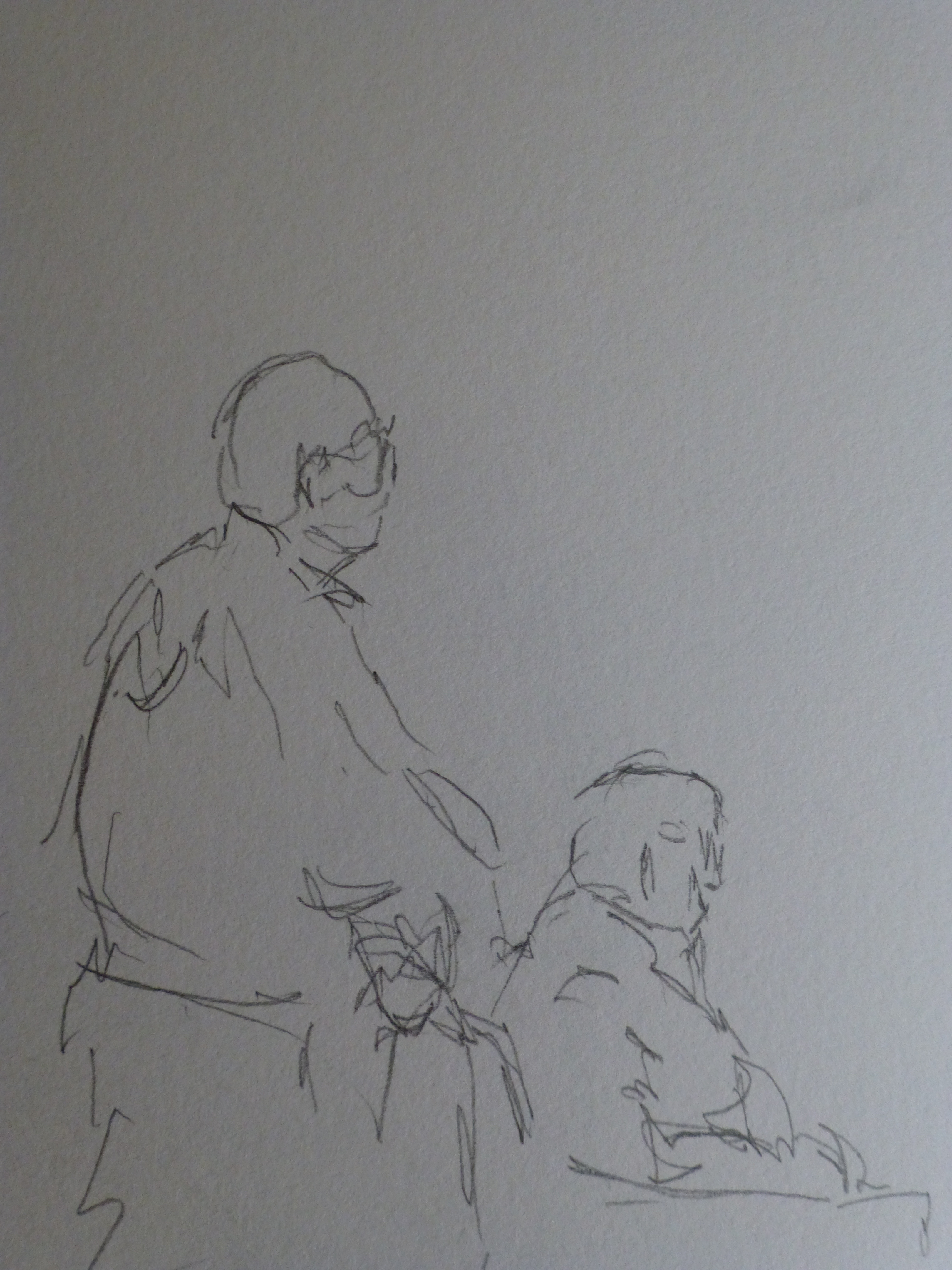
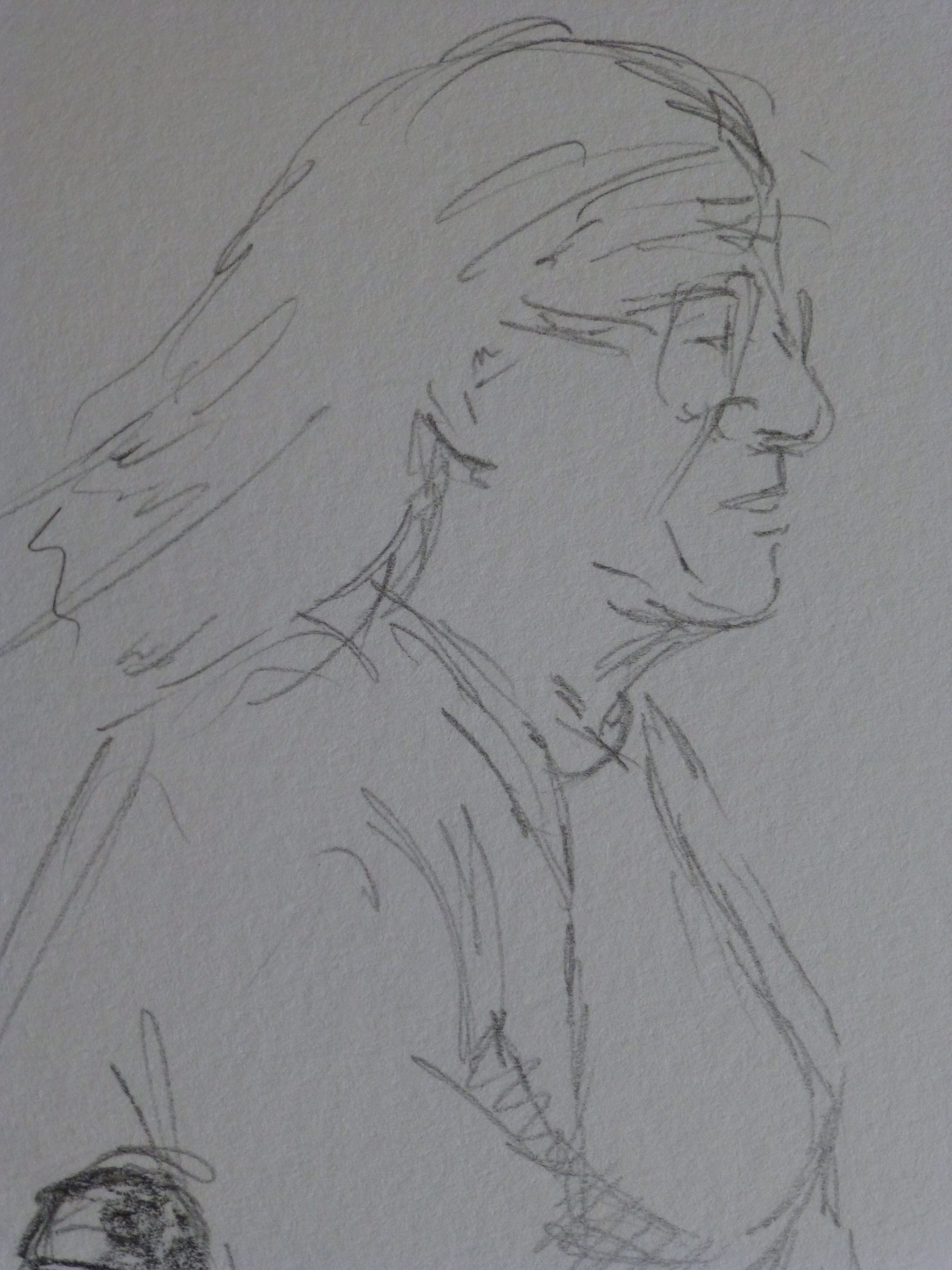
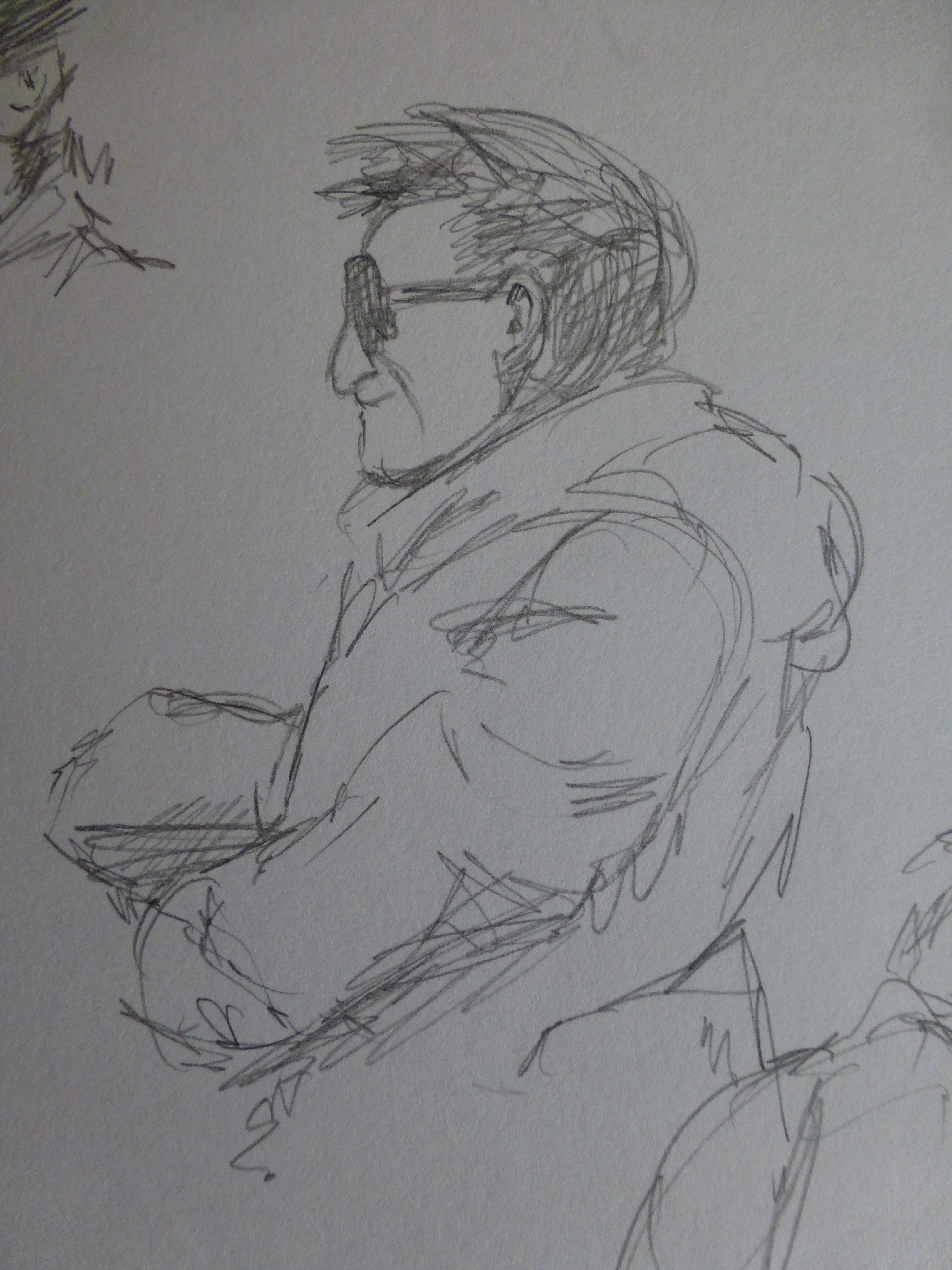
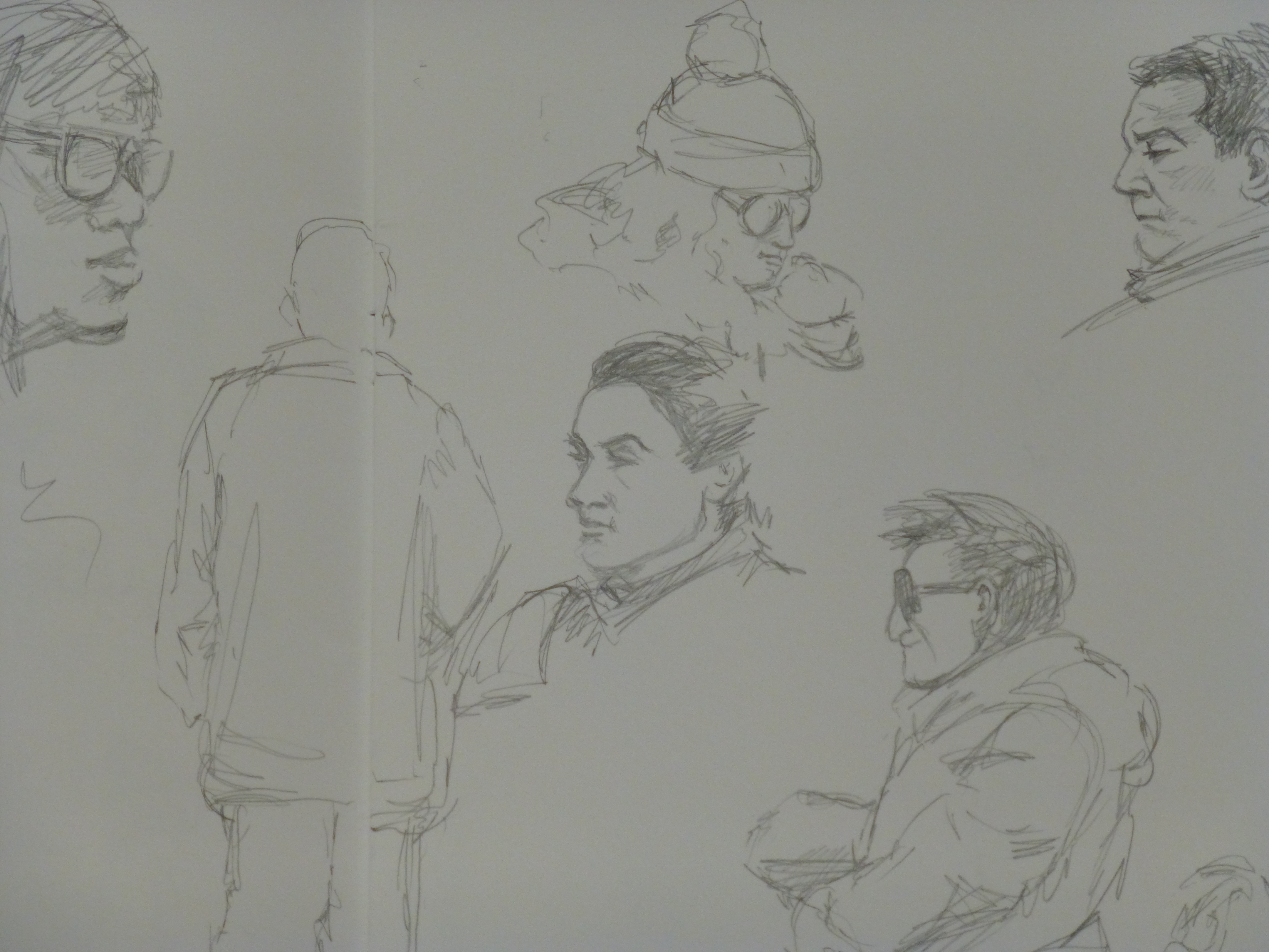
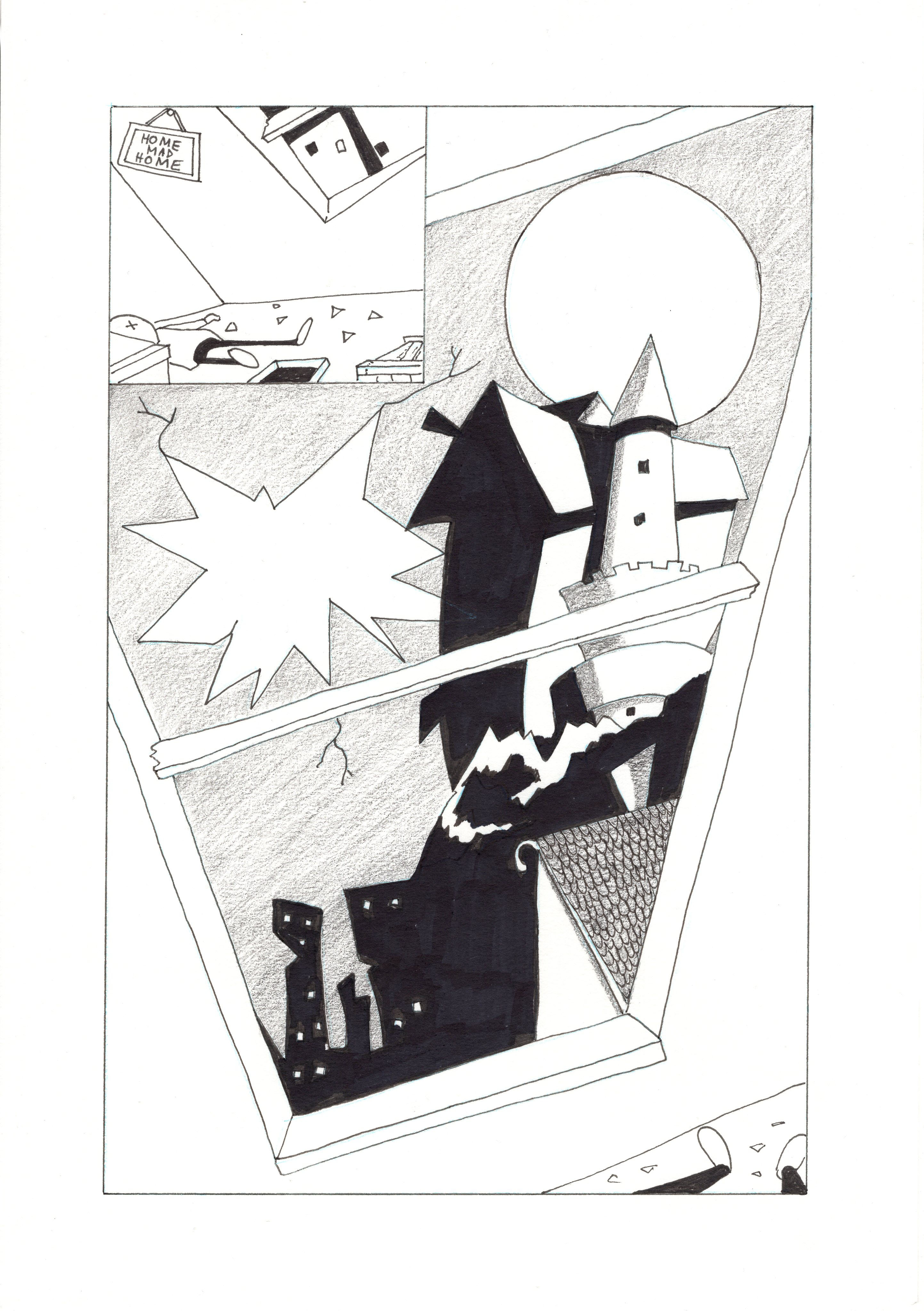
I thought this was a great little story and started to rough some ideas and characterisations. The challenge was to present this narrative in a brief and clean style. Not over complicated by detail but a  simple series of renderings.
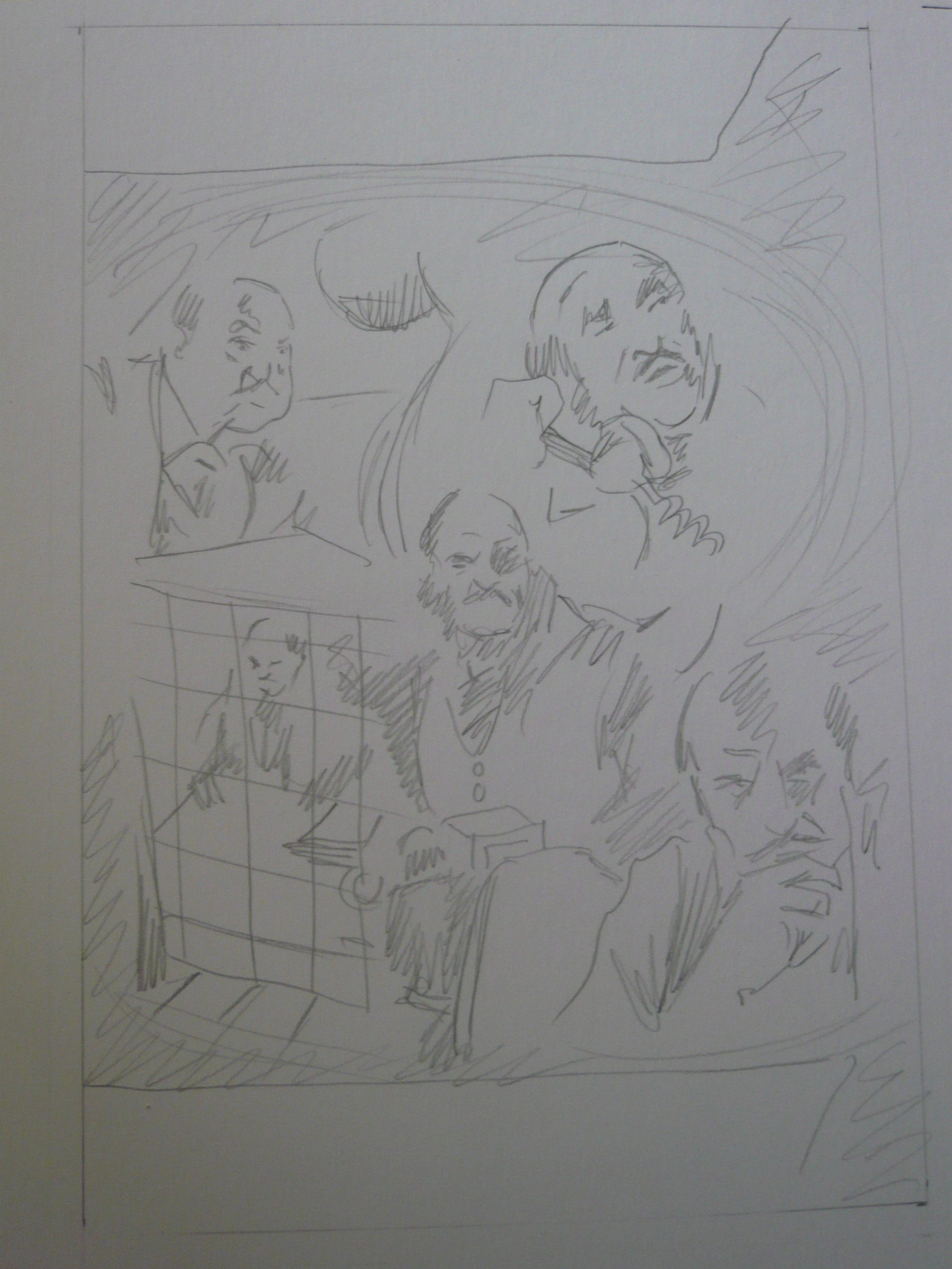
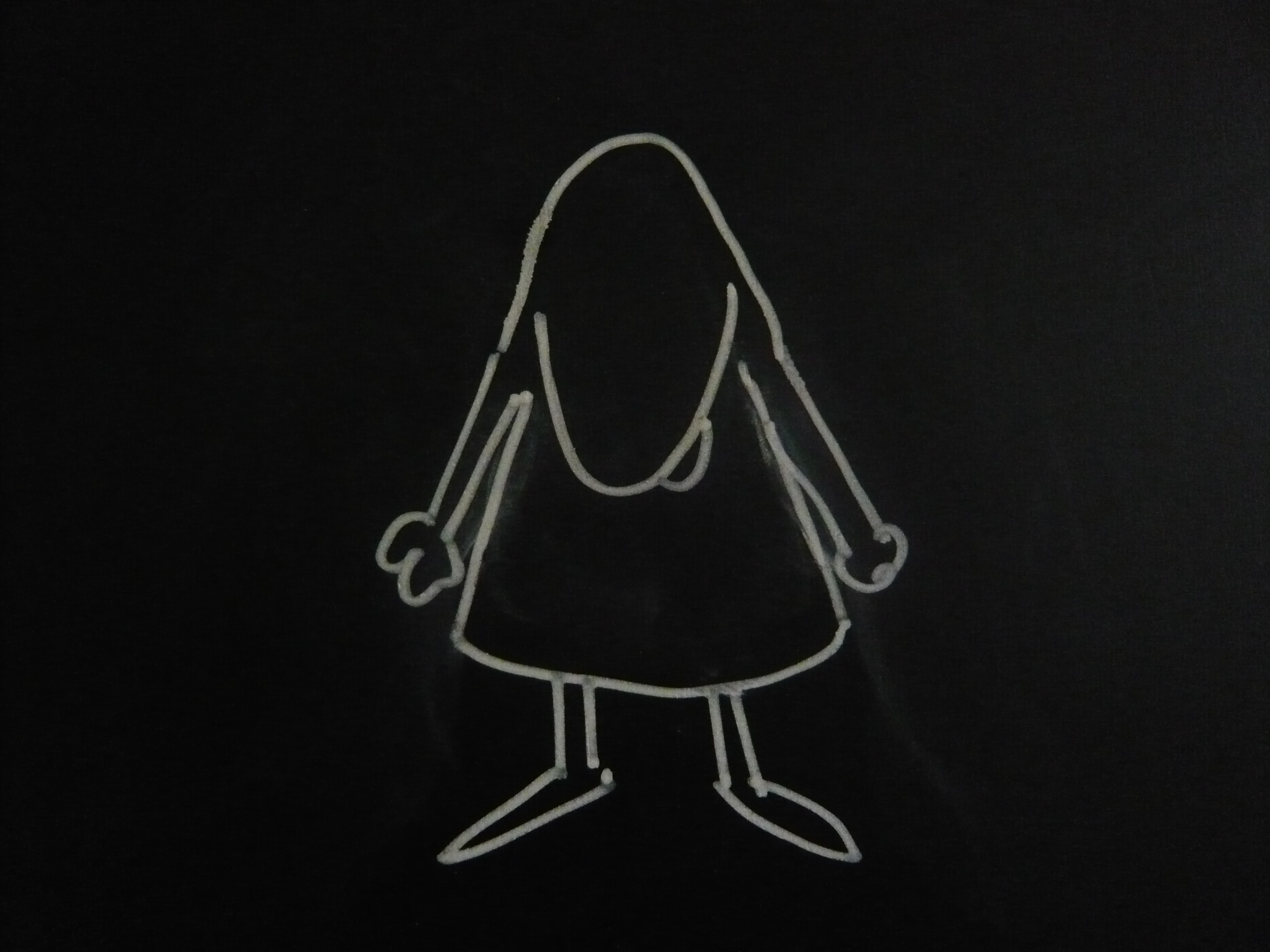
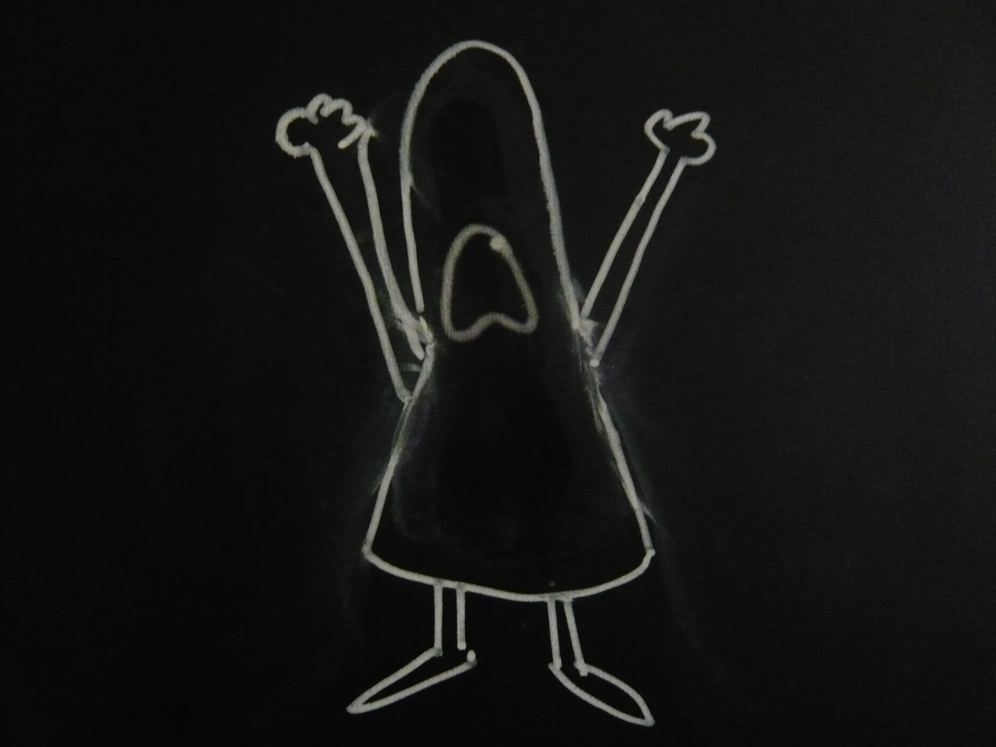
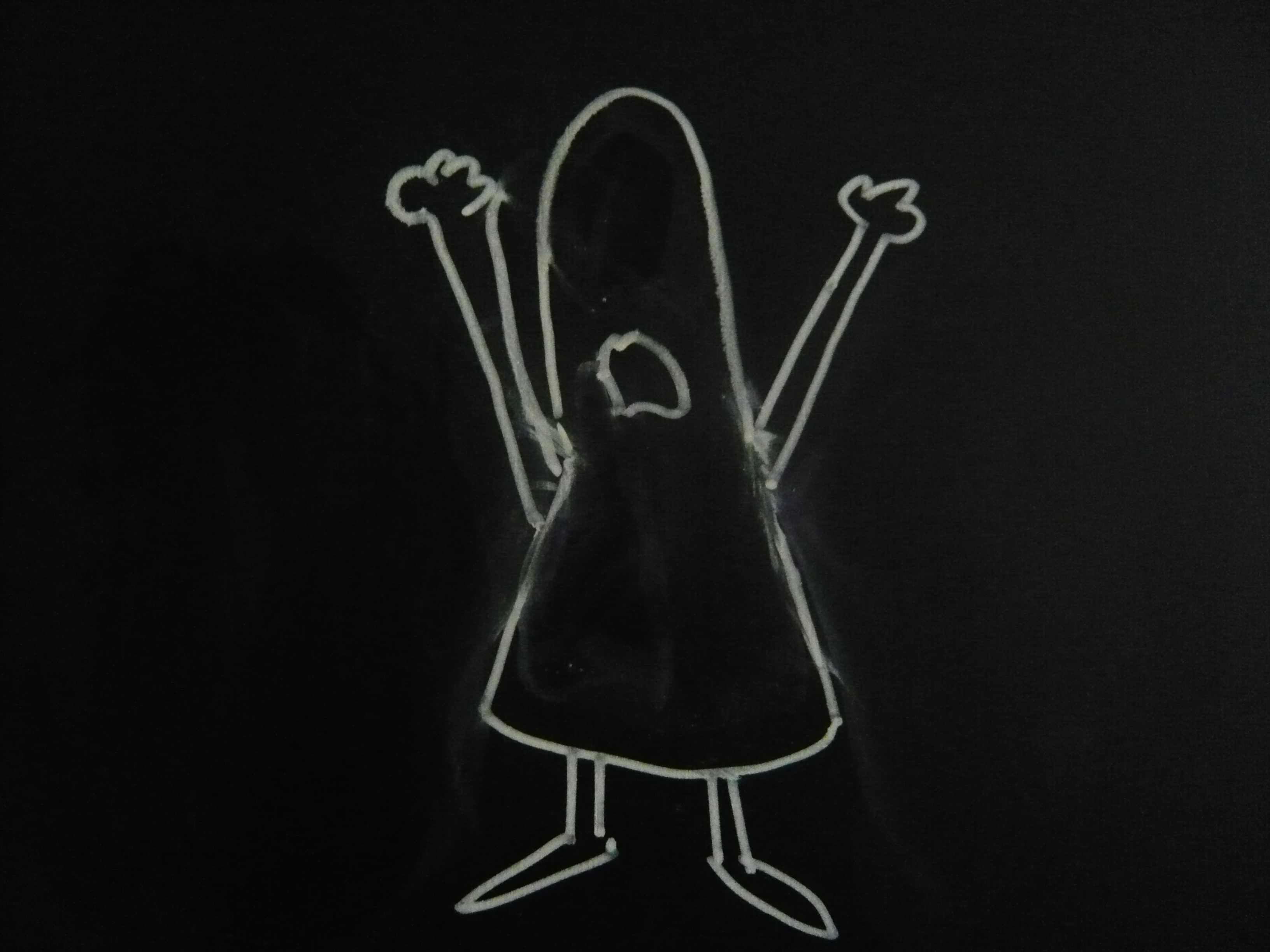
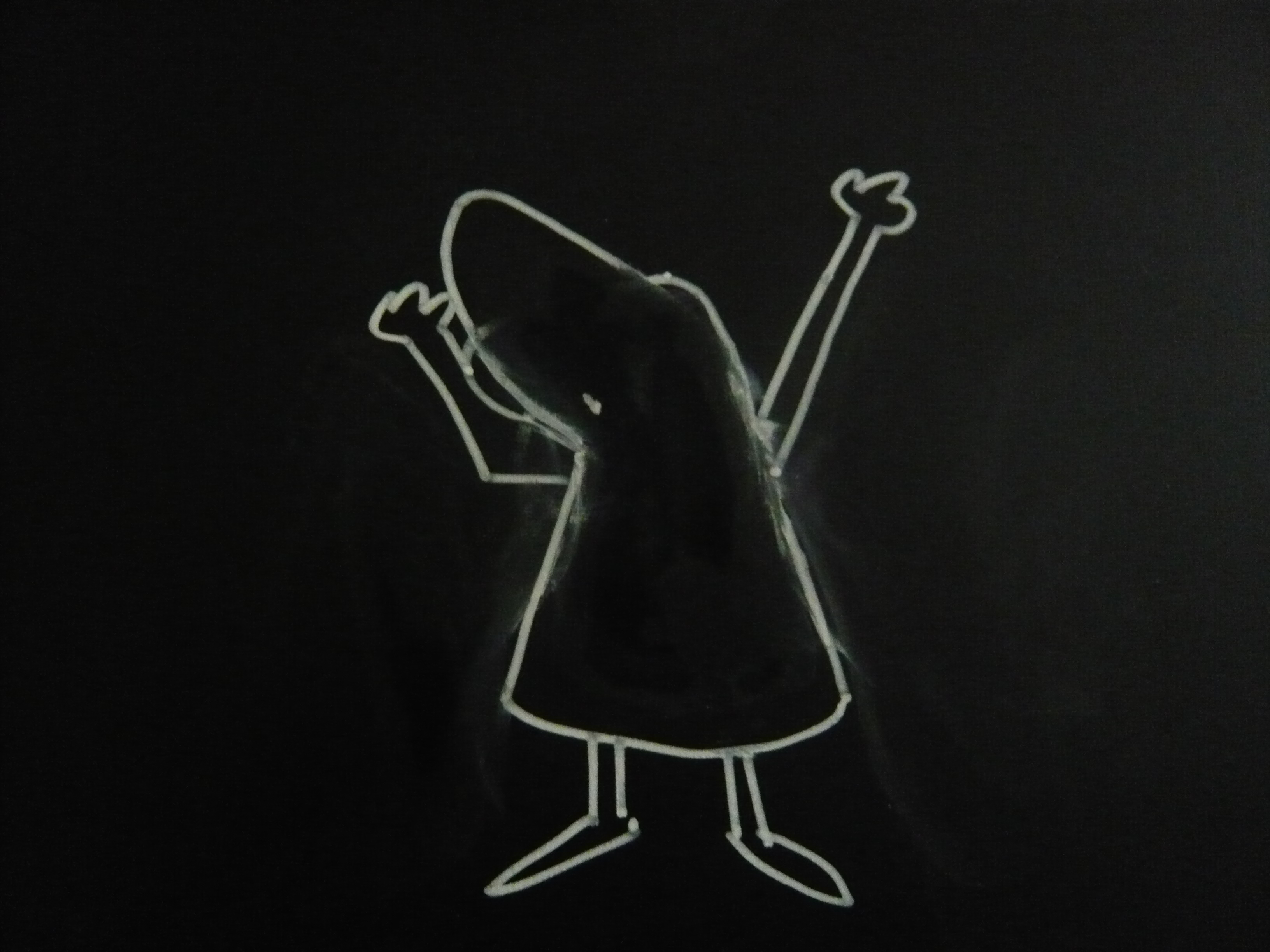
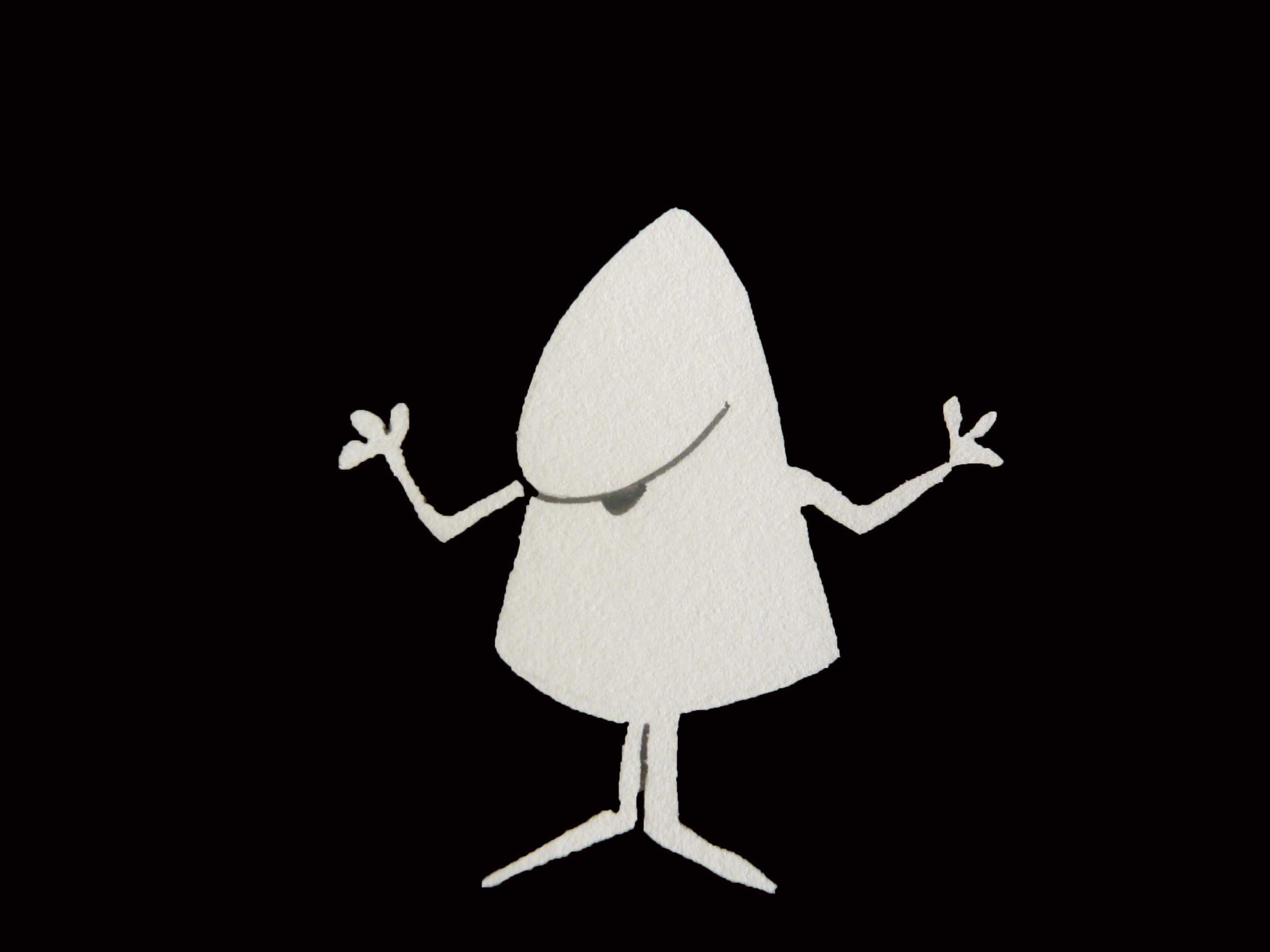
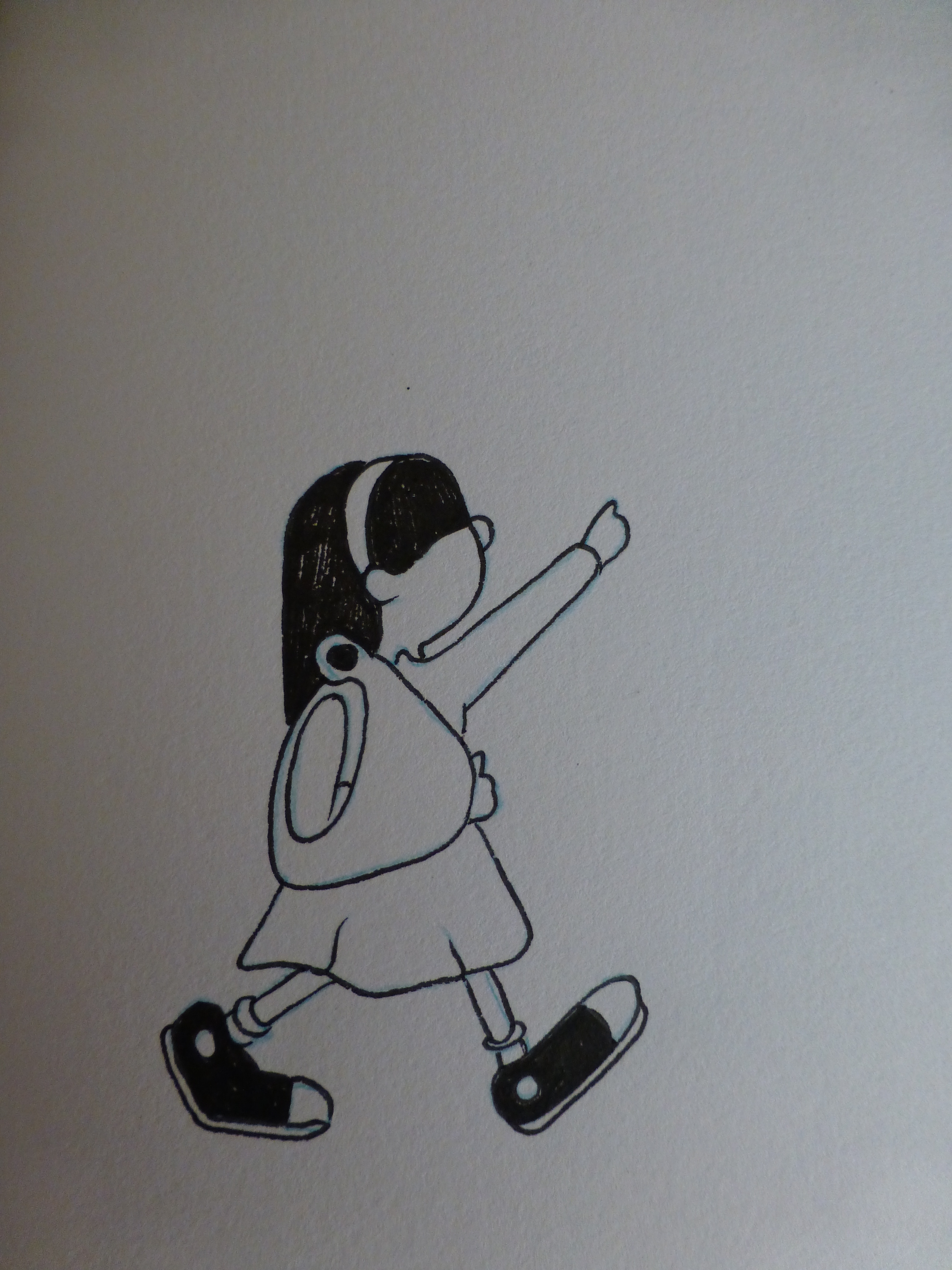
Final Draft


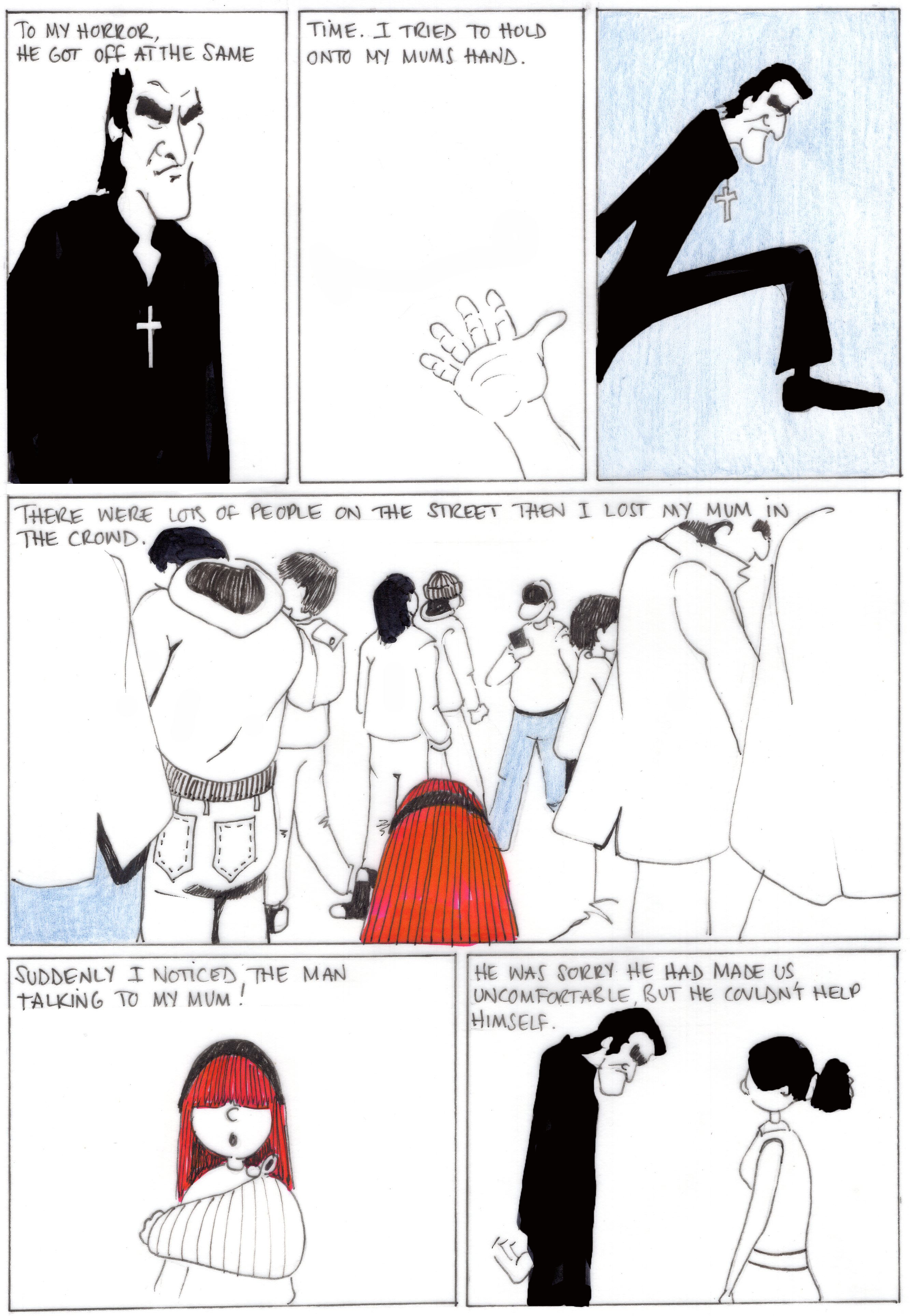
All the original drawings were composed onto tracing paper then inked. On reflection this was a poor choice of material as the final scans appeared fuzzy when printed.

 Project Two

Intrigued by a question regarding the ‘worst ranged weapon in history?’ I found, through researching, the Apache Revolver.


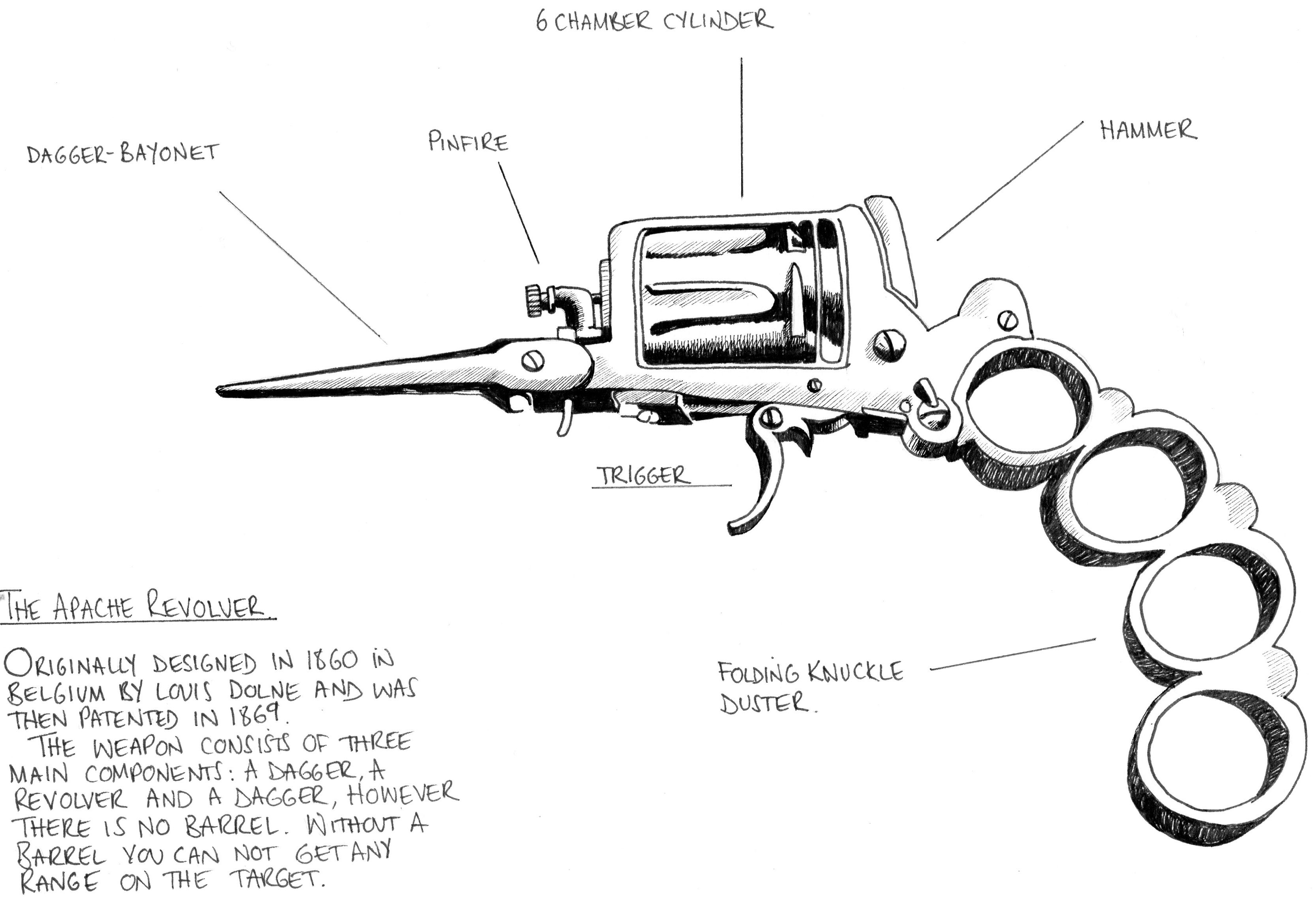
You’ve got a revolver, a knife, and a brass knuckle. All bundled up into a small yet lethal package. You can put some lead into a person with the revolver part before they can get near you, then if they do somehow survive that you can easily finish them off by either shanking them or giving them a tasty knuckle sandwich with the knife and brass knuckles respectively. But it doesn’t live up to the hype that you may had for it. You see, the problem with the revolver is that there is something critical missing: THE BARREL. The thing is that with revolvers and guns in general is that there must be a way to make sure that the bullet goes to where you want it to go. The barrel does exactly that. Whereas, the Apache revolver doesn’t even have anything close to a barrel. Making it unreliable even in a short range. .

The Apache Revolver is the worst ranged weapon due to the lack of a barrel, the part of the gun that is the shooting tube. Interestingly this weapon was used as a status symbol by Parisian Gangs in the early 20th century.

Project Three

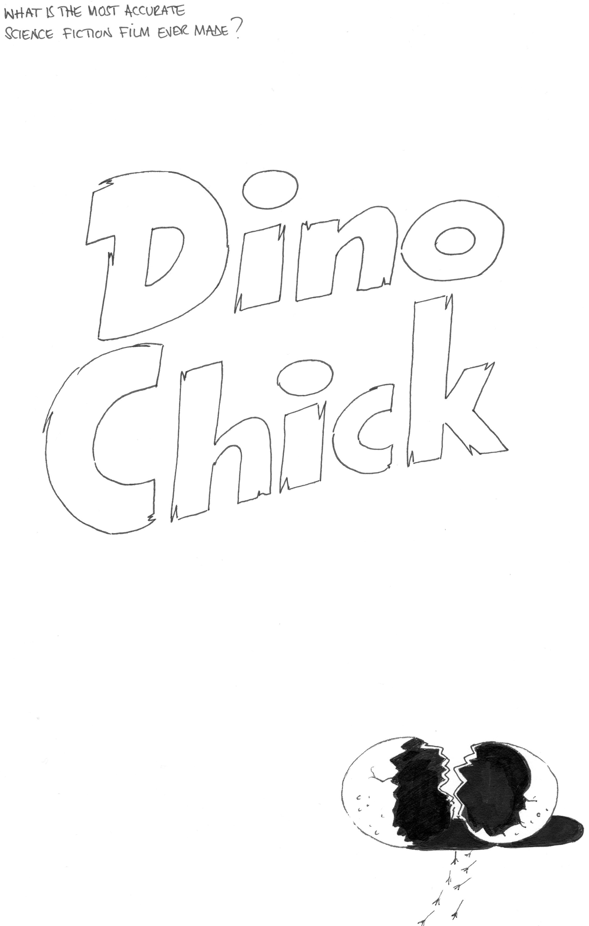
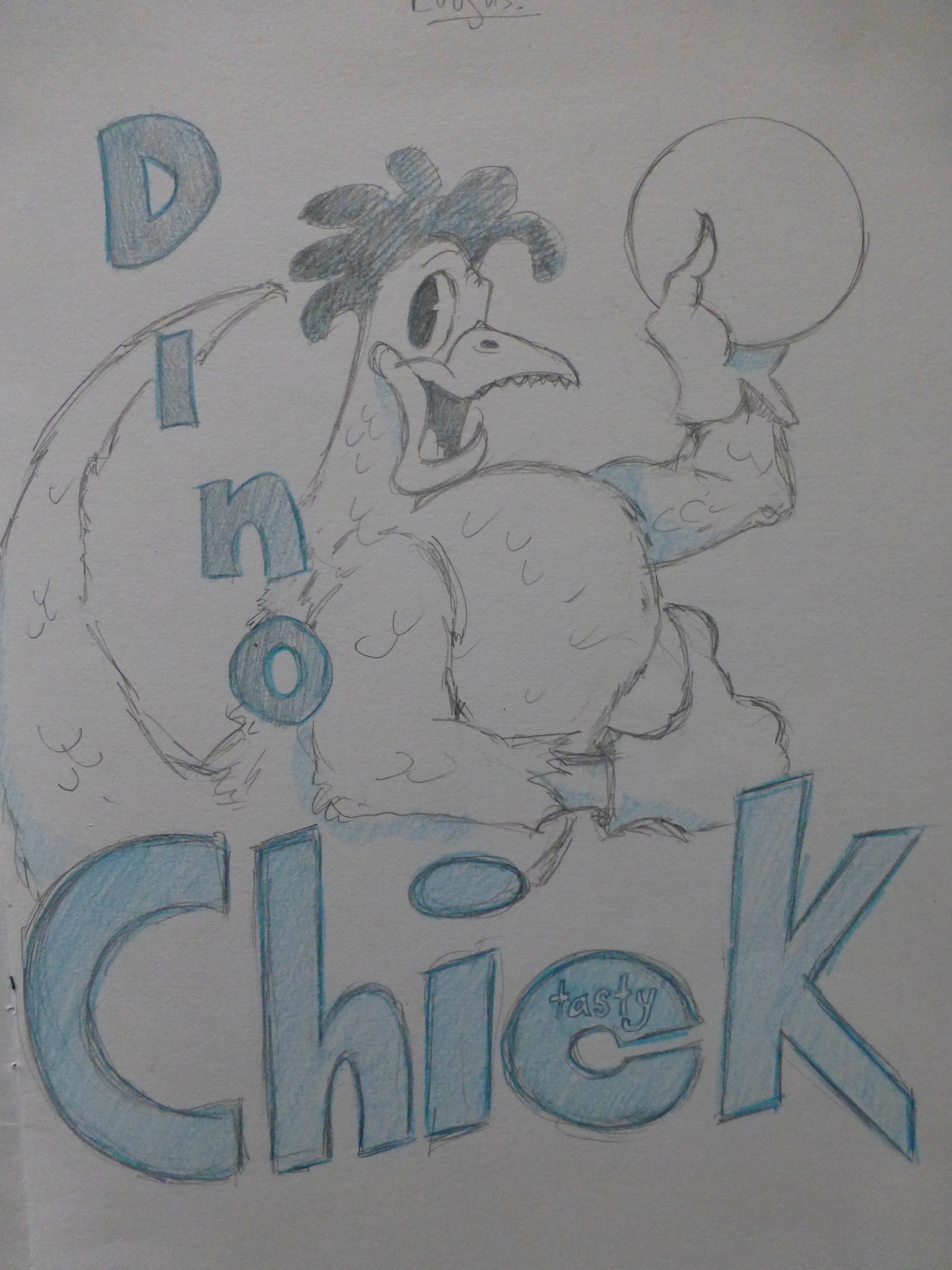
This body of work came from the question, ‘what is the most accurate science fiction film?’ The answer given was Jurassic Park. Primarily on the scientific accuracy of the genetic engineering part of the story. Through research it appears that there are current programs adopting  similar techniques in the genetic field. Most questionably, the re-engineering of chicken DNA into a dinosaur. Known commonly as “Chickenosaurus”.

This project is the mastermind of Palaeontologist Jack Horner.

Horner has long supported the idea of modifying a chicken to look like a dinosaur, and unlike the researchers on the latest study, he actually wants to raise a live one. And why stop there? By understanding how and when to modify certain molecular mechanisms, countless changes could be within reach. As Horner pointed out, a glow-in-the-dark unicorn is not out of the question.

There are four major modifications needed to make a so-called chickenosaurus, Horner said. To turn a chicken into a dinosaurlike beast, scientists would have to give it teeth and a long tail, and revert its wings back into arms and hands.

The creature would also need a modified mouth — a feat accomplished by the researchers who did this latest study, he said.

“This dino-chicken project — we can liken it to the moon project,” Horner told Live Science. “We know we can do it; it’s just there are … some huge hurdles.”

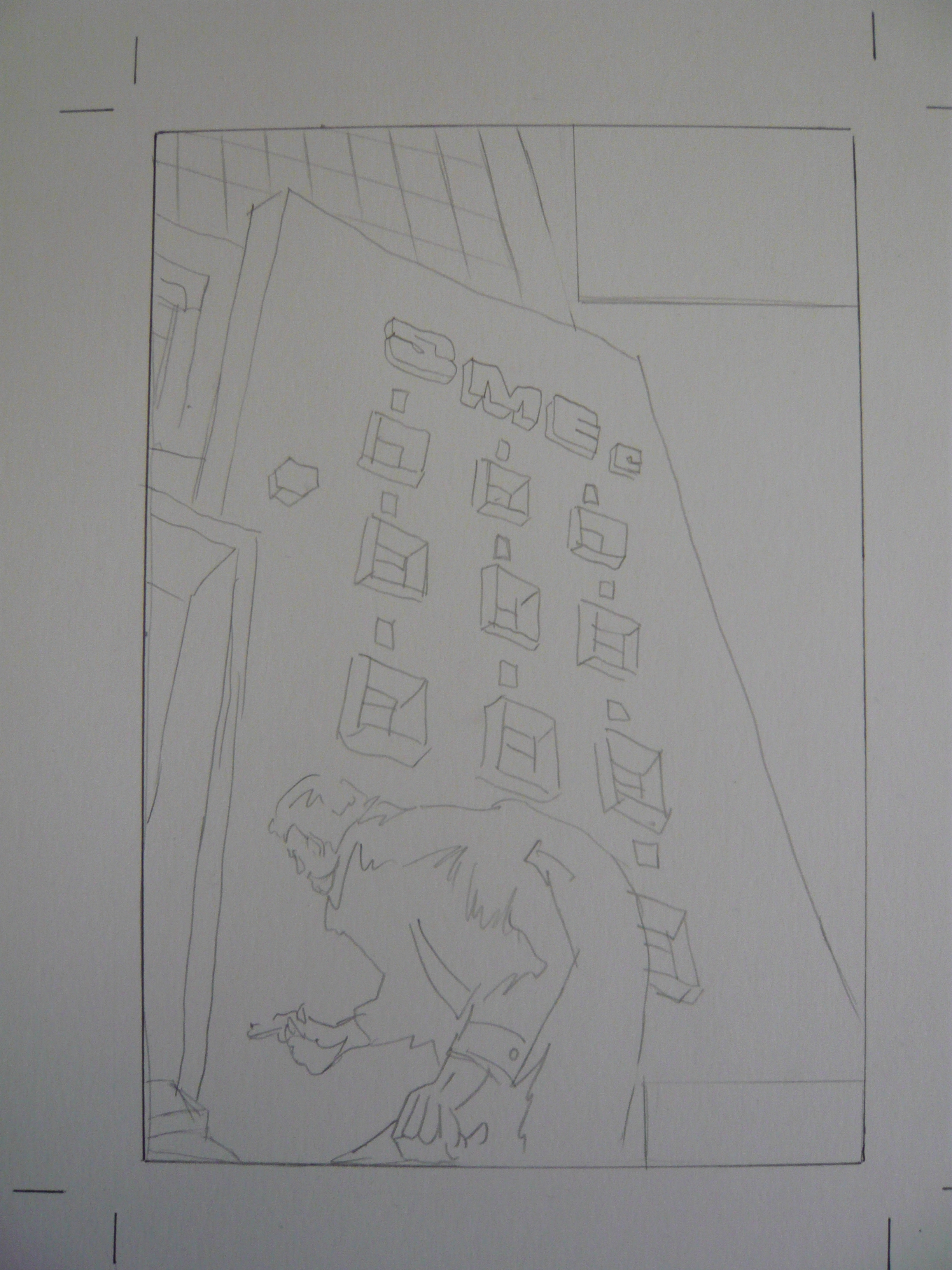
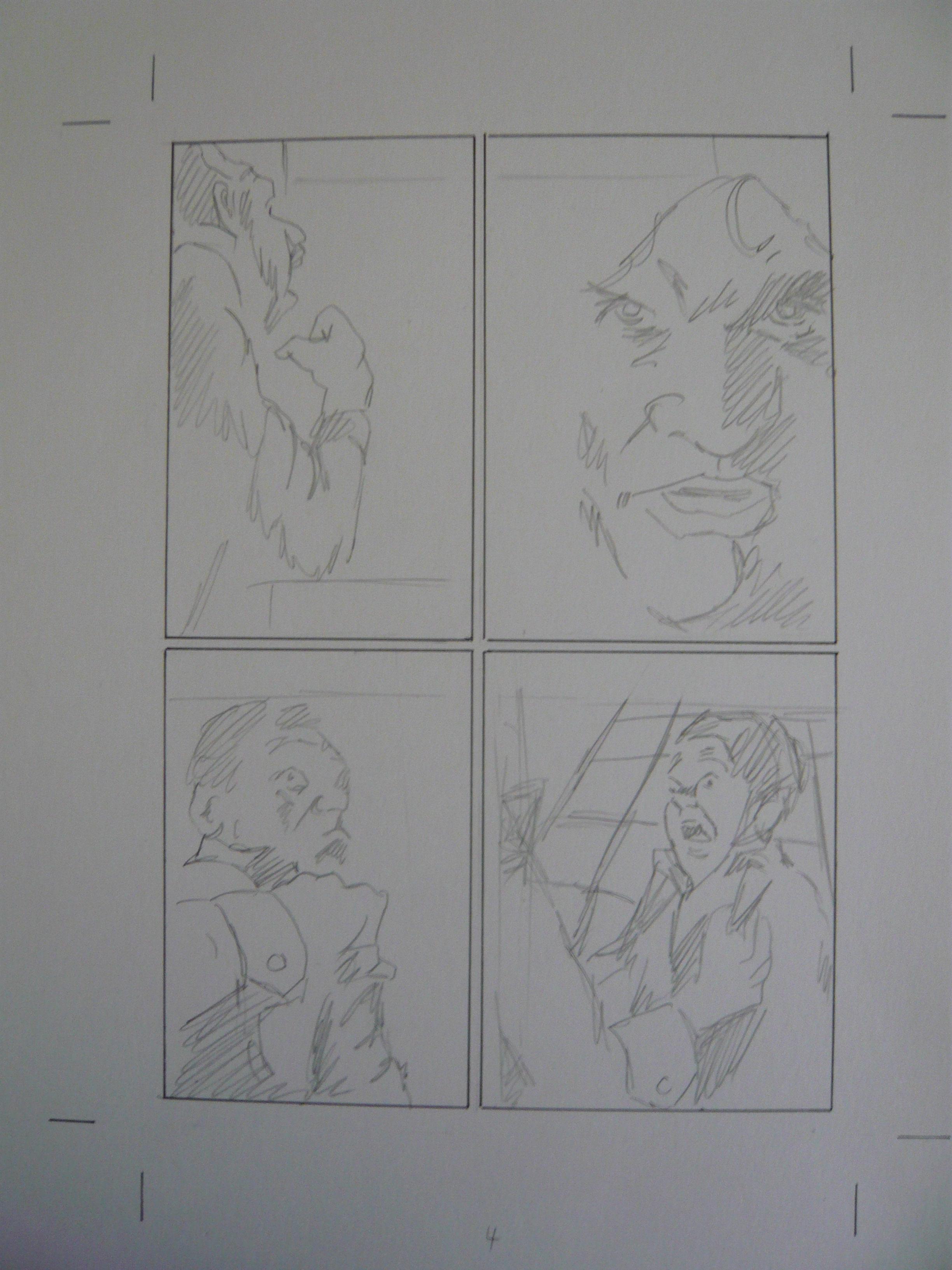
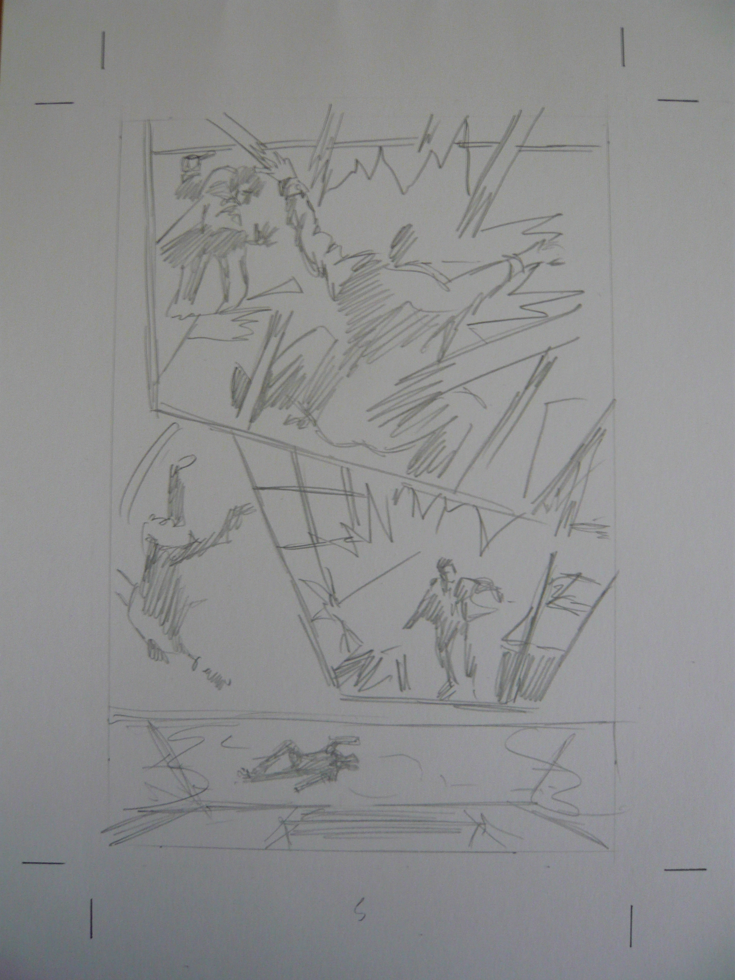
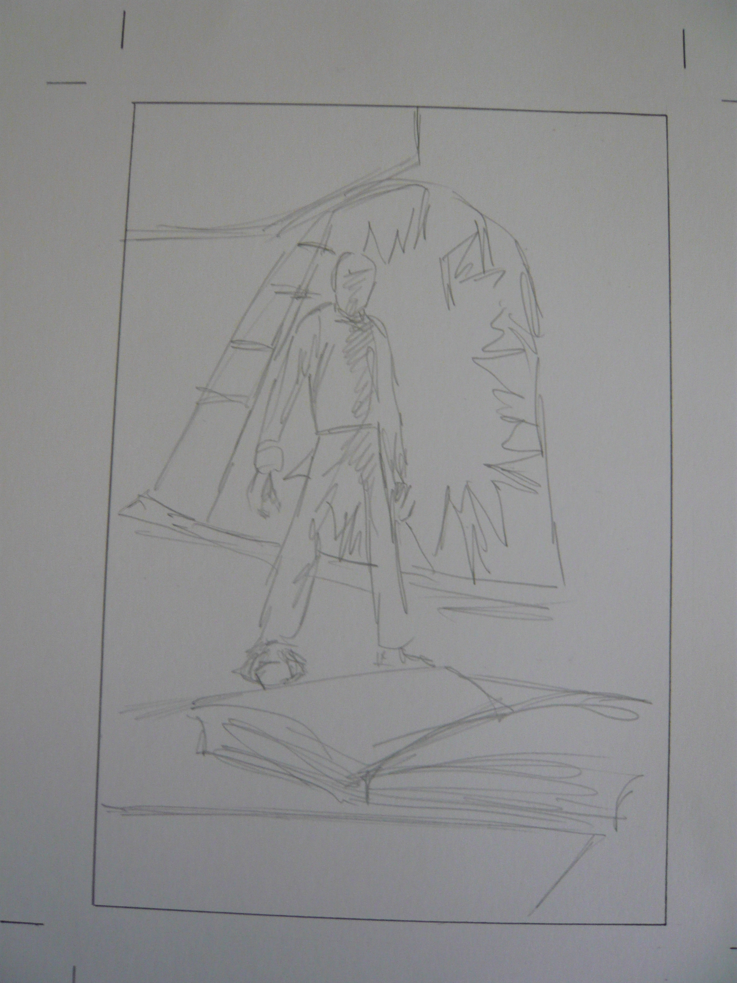
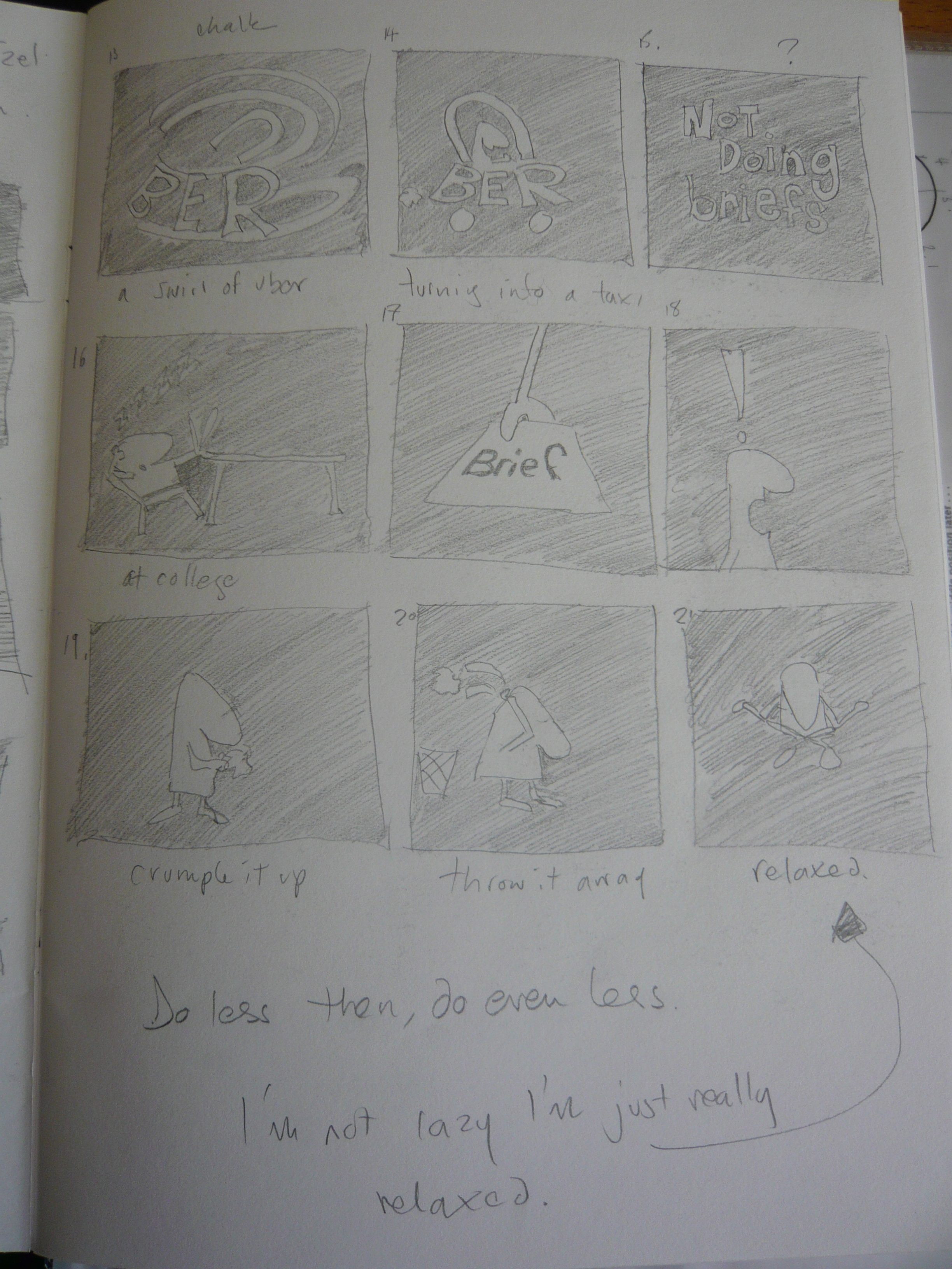
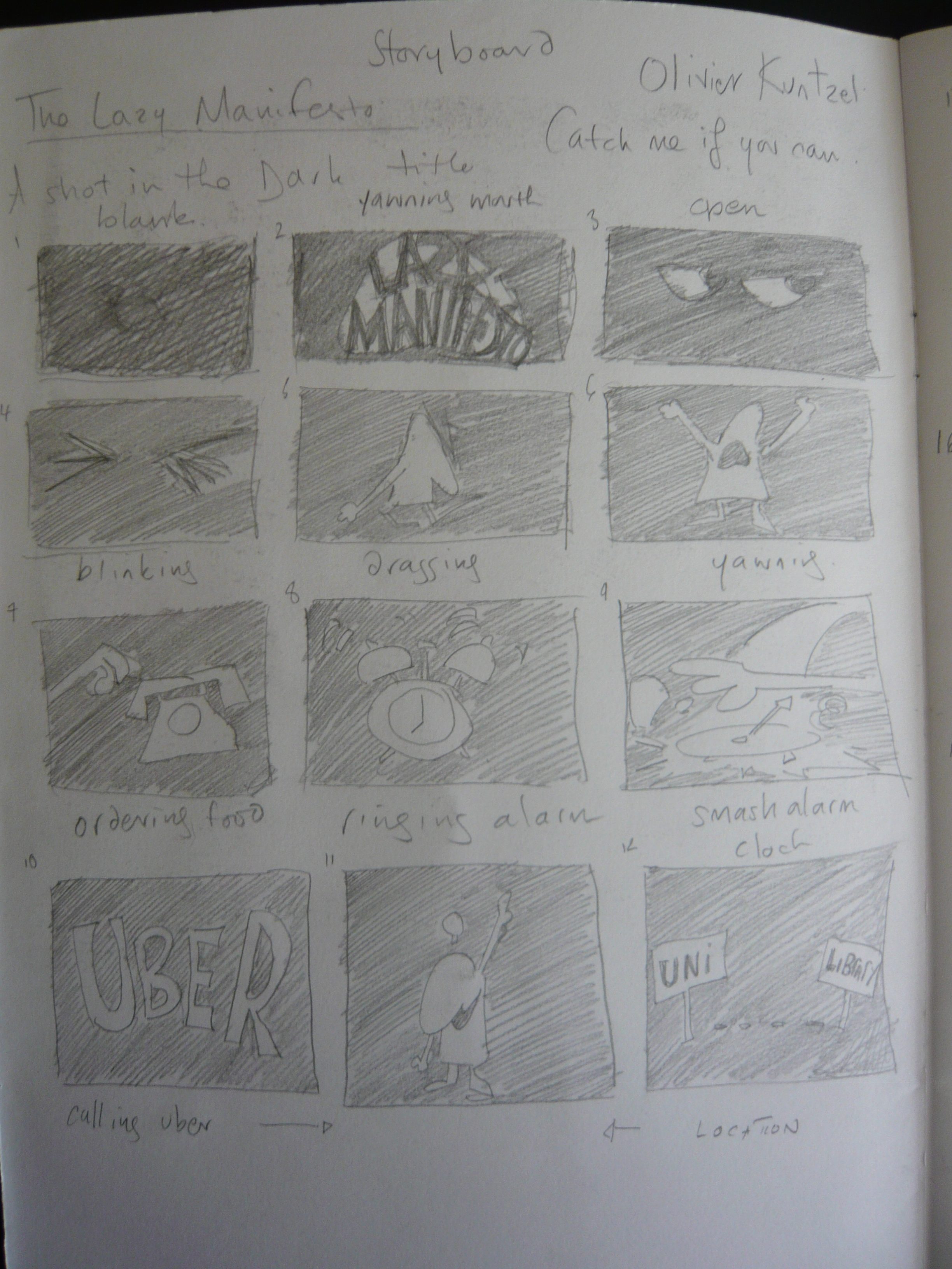
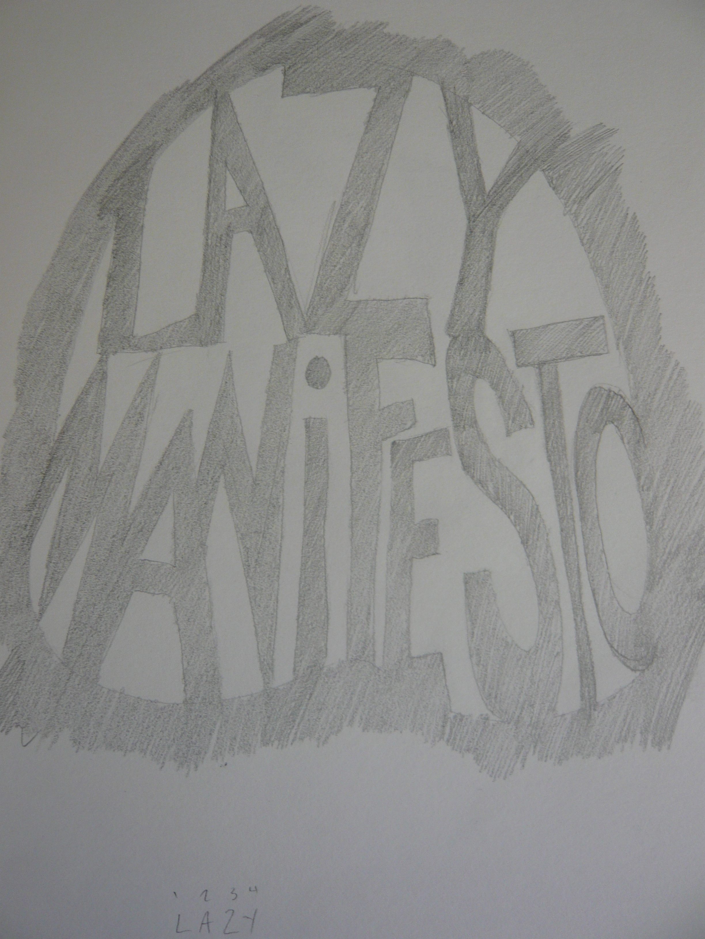
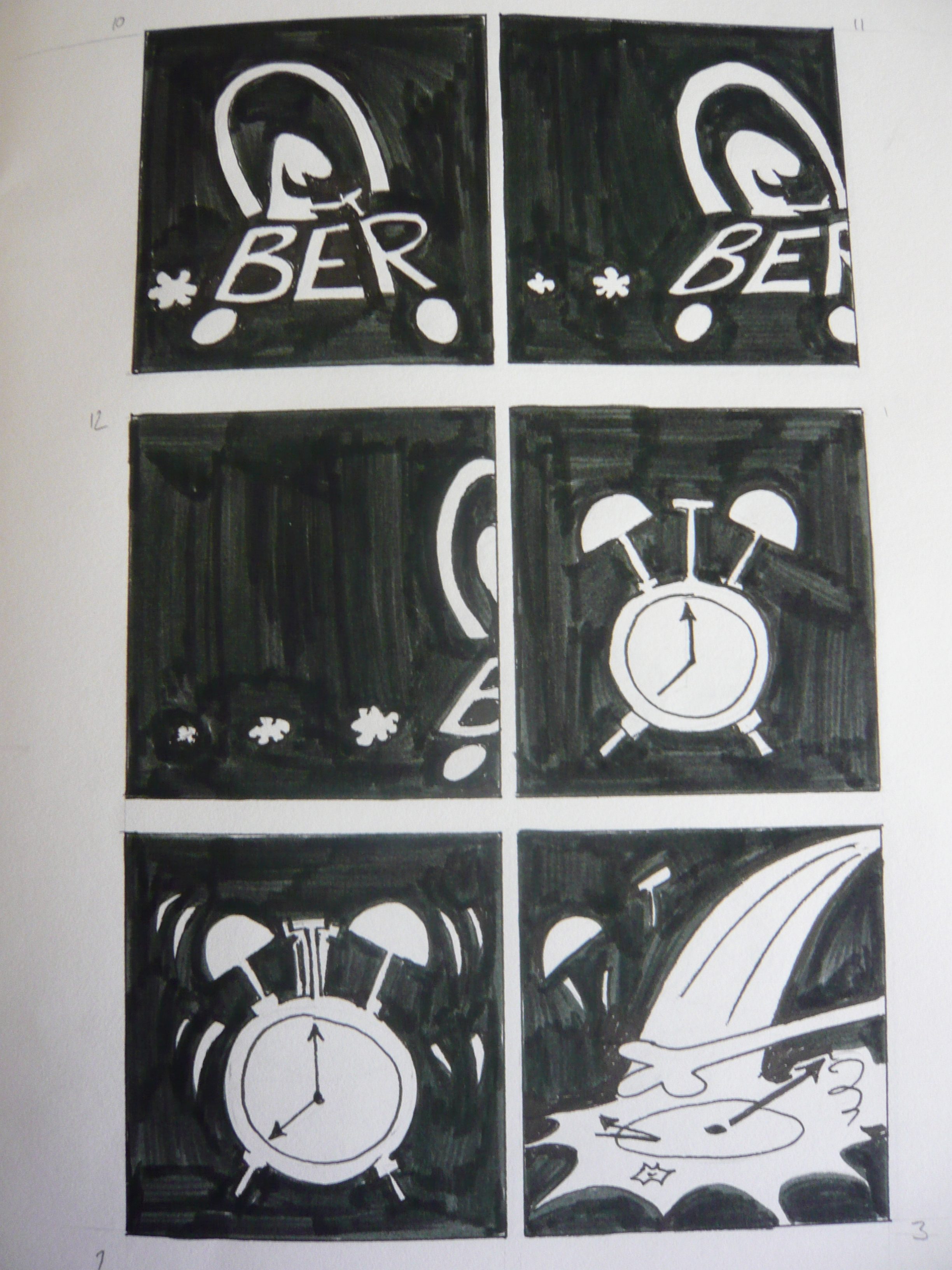
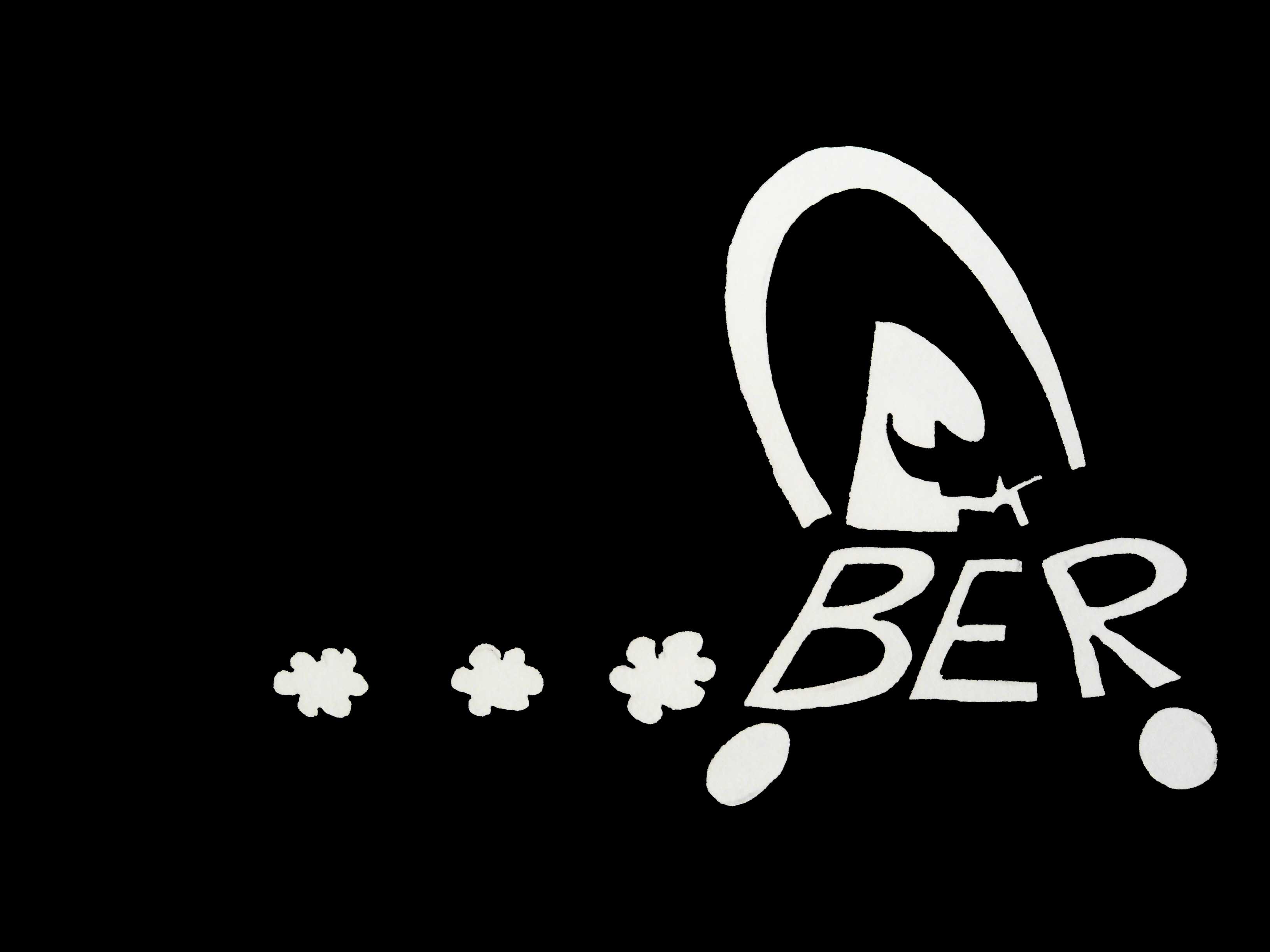
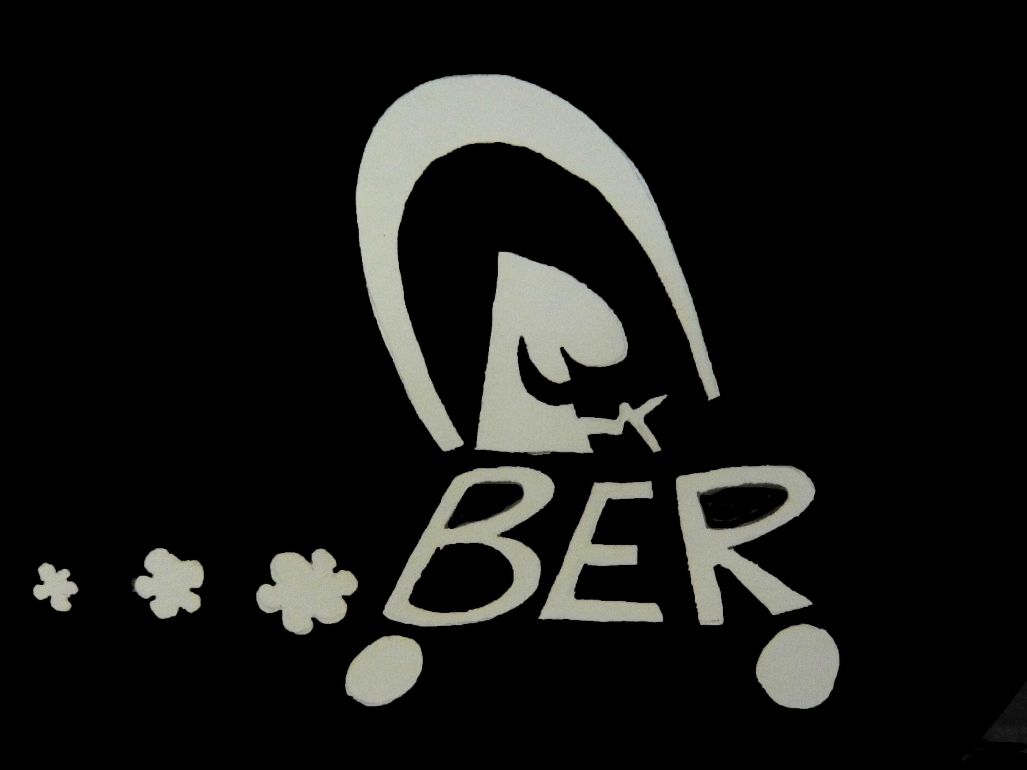
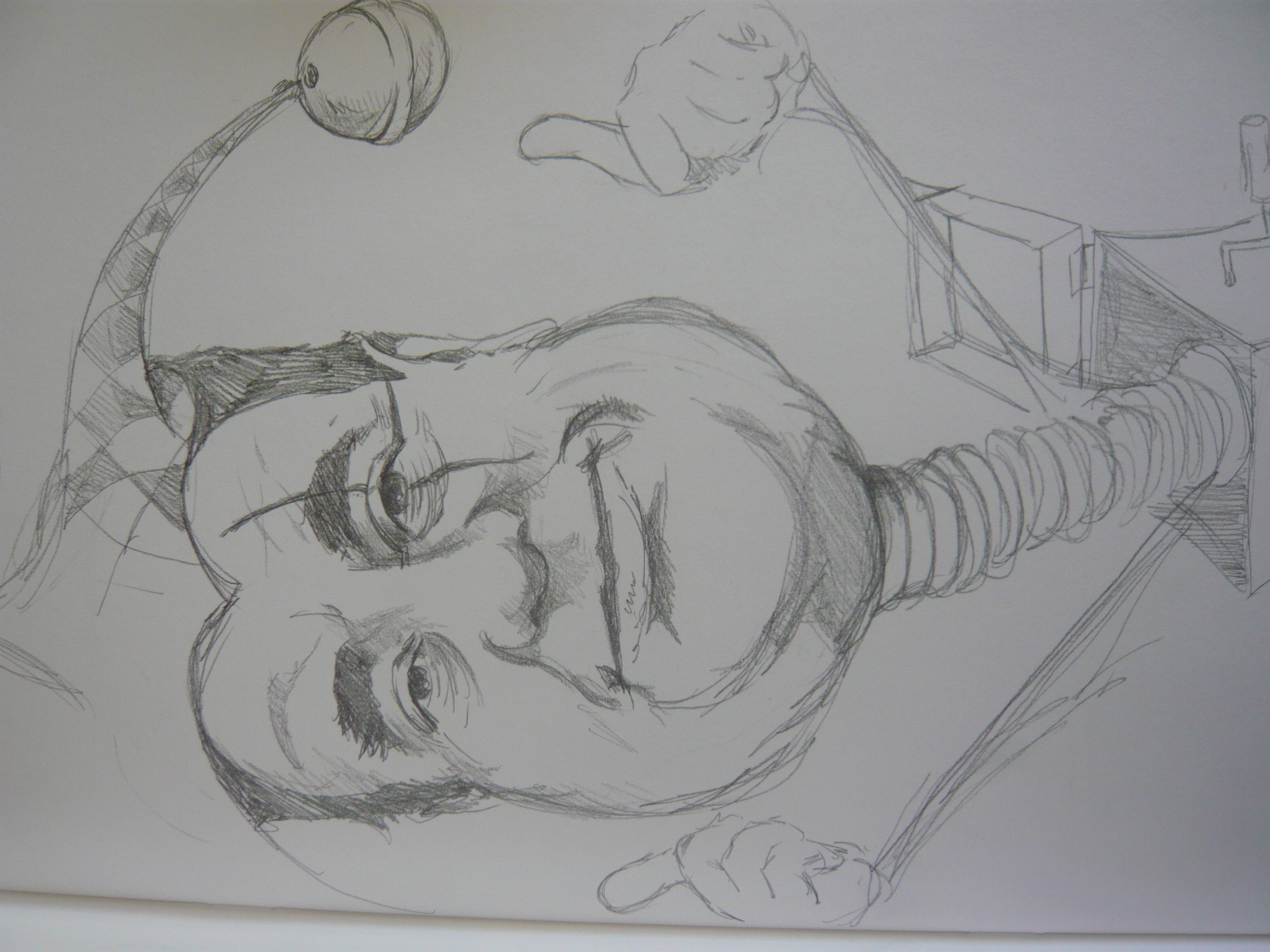
From this basis I wanted to create a short silent comic about a crazy scientist.
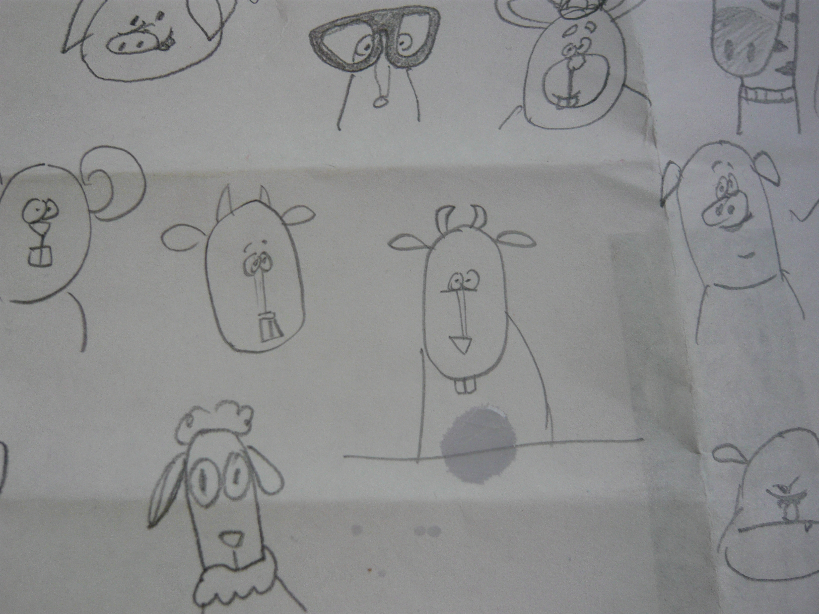
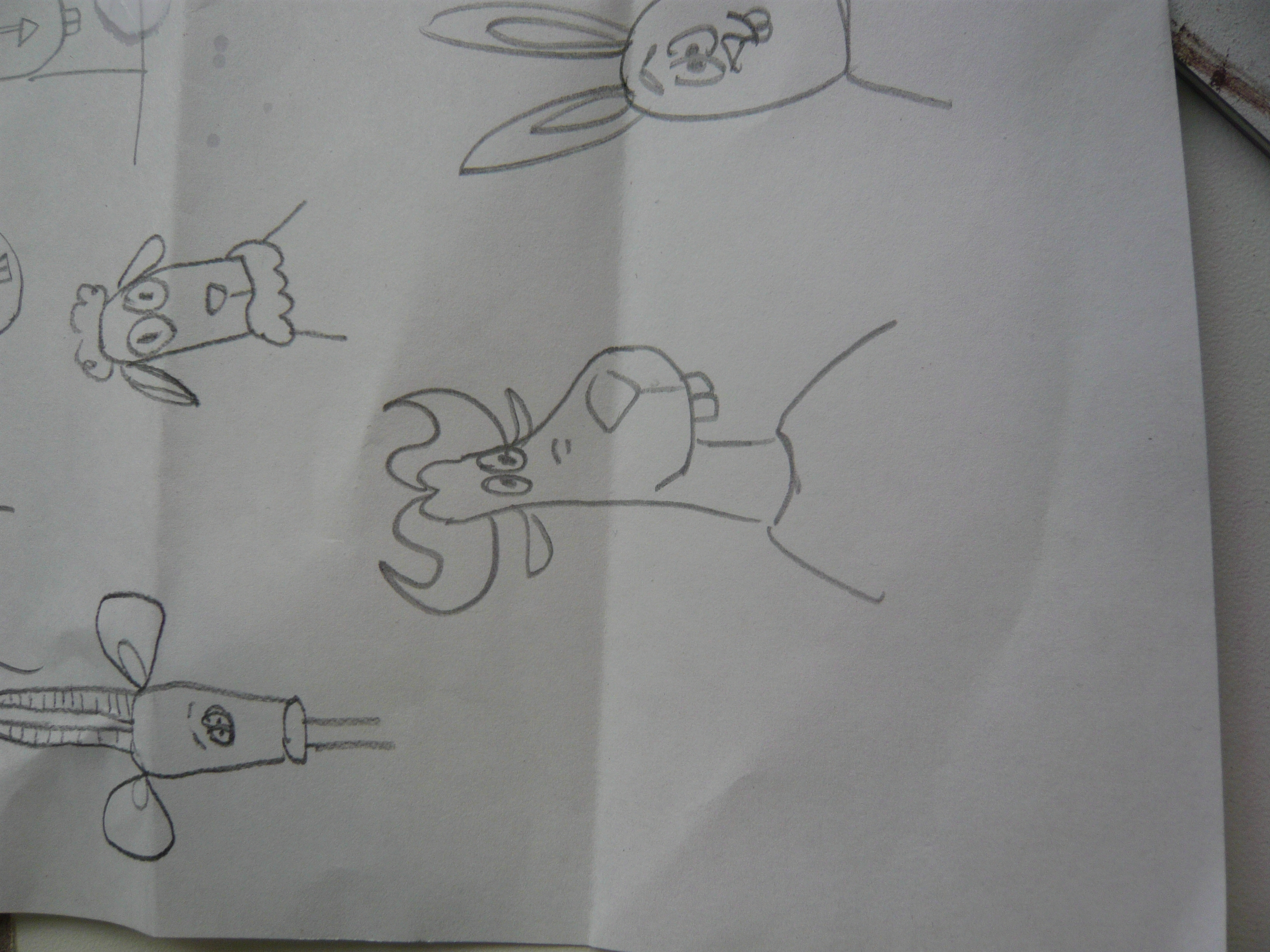
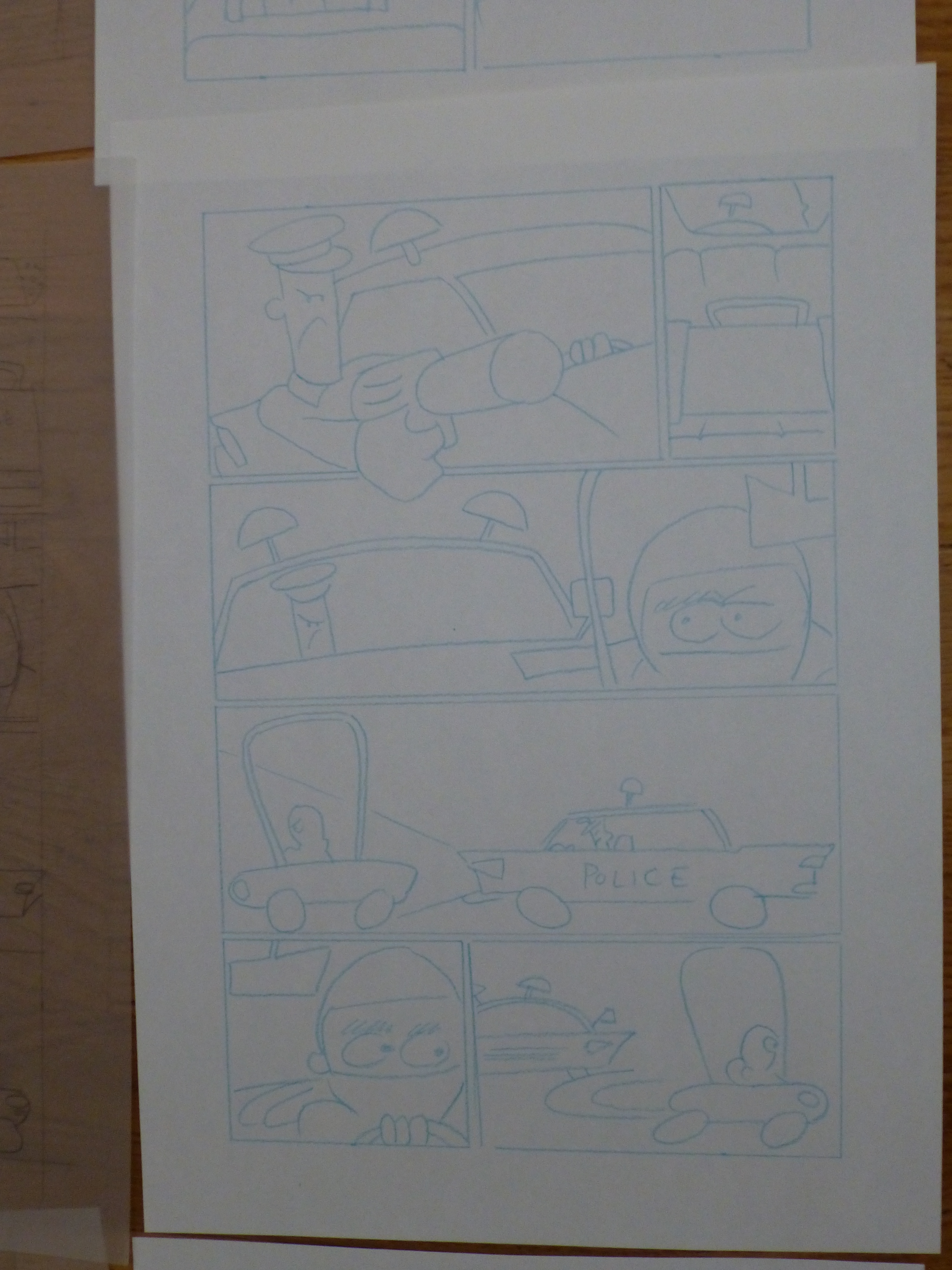
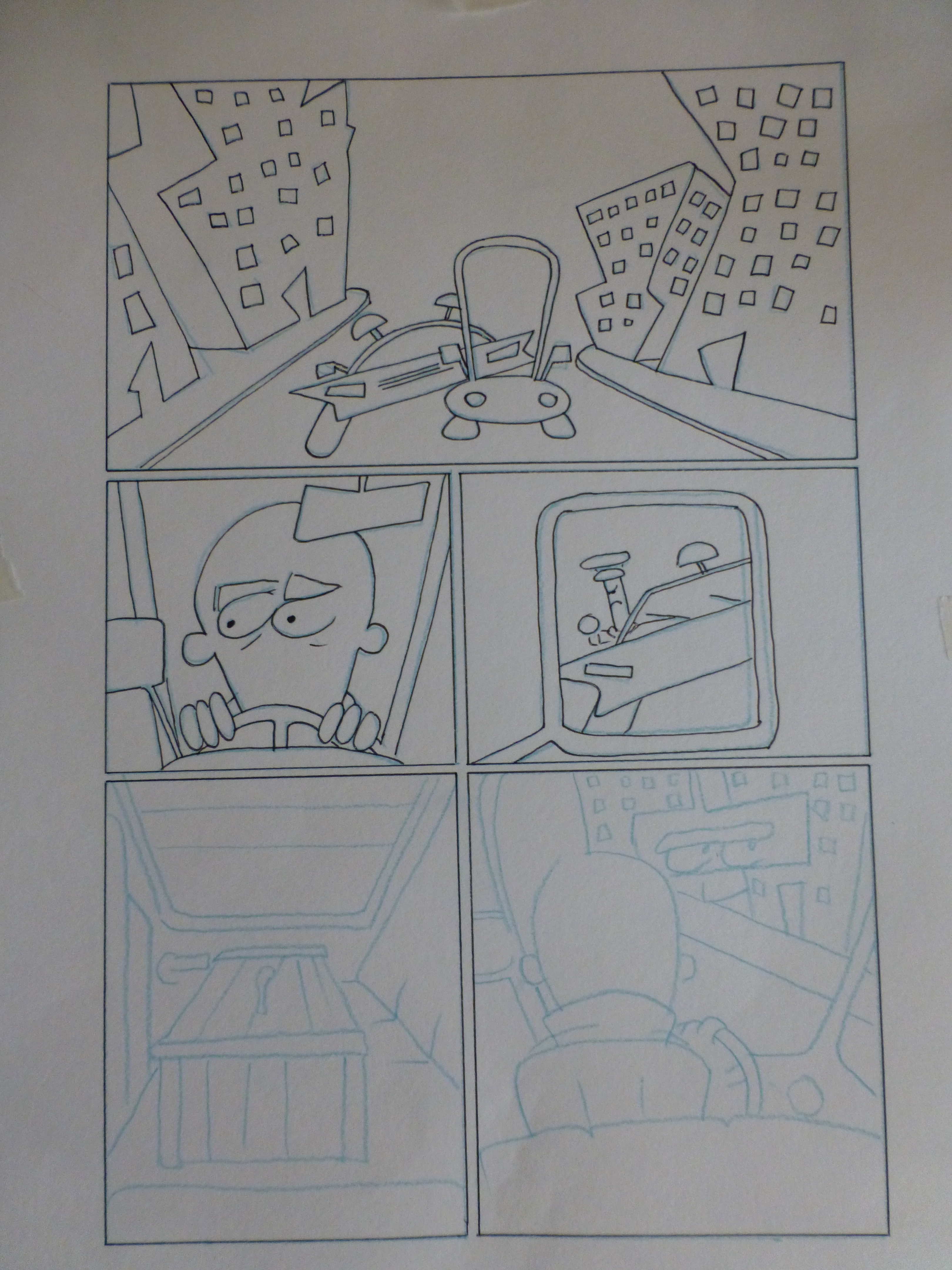
First Drafts

Final Draft


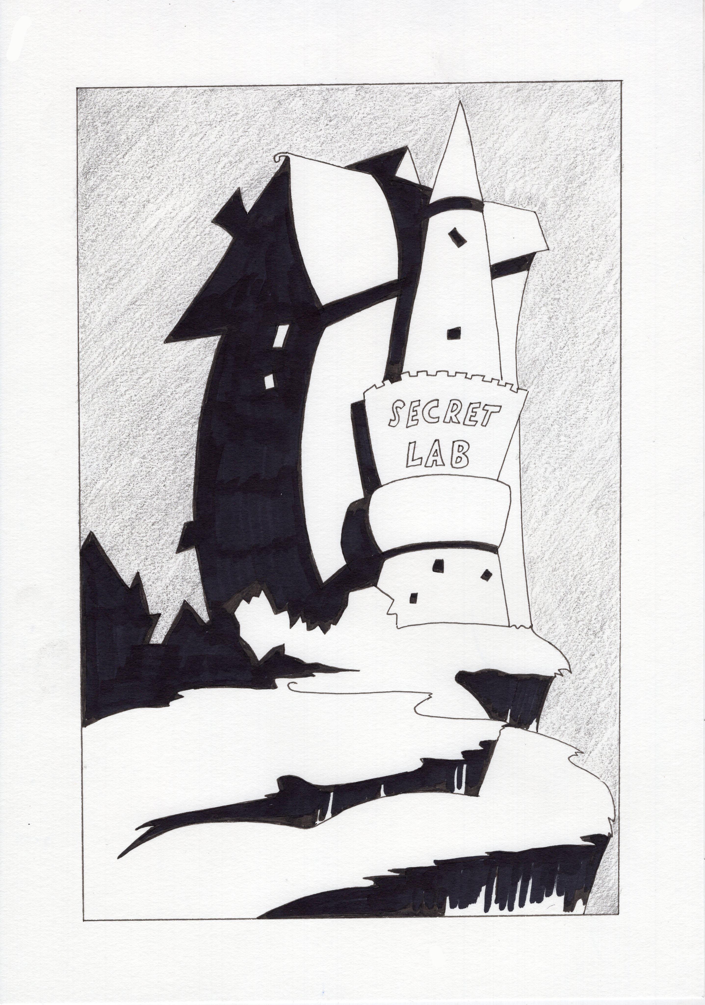
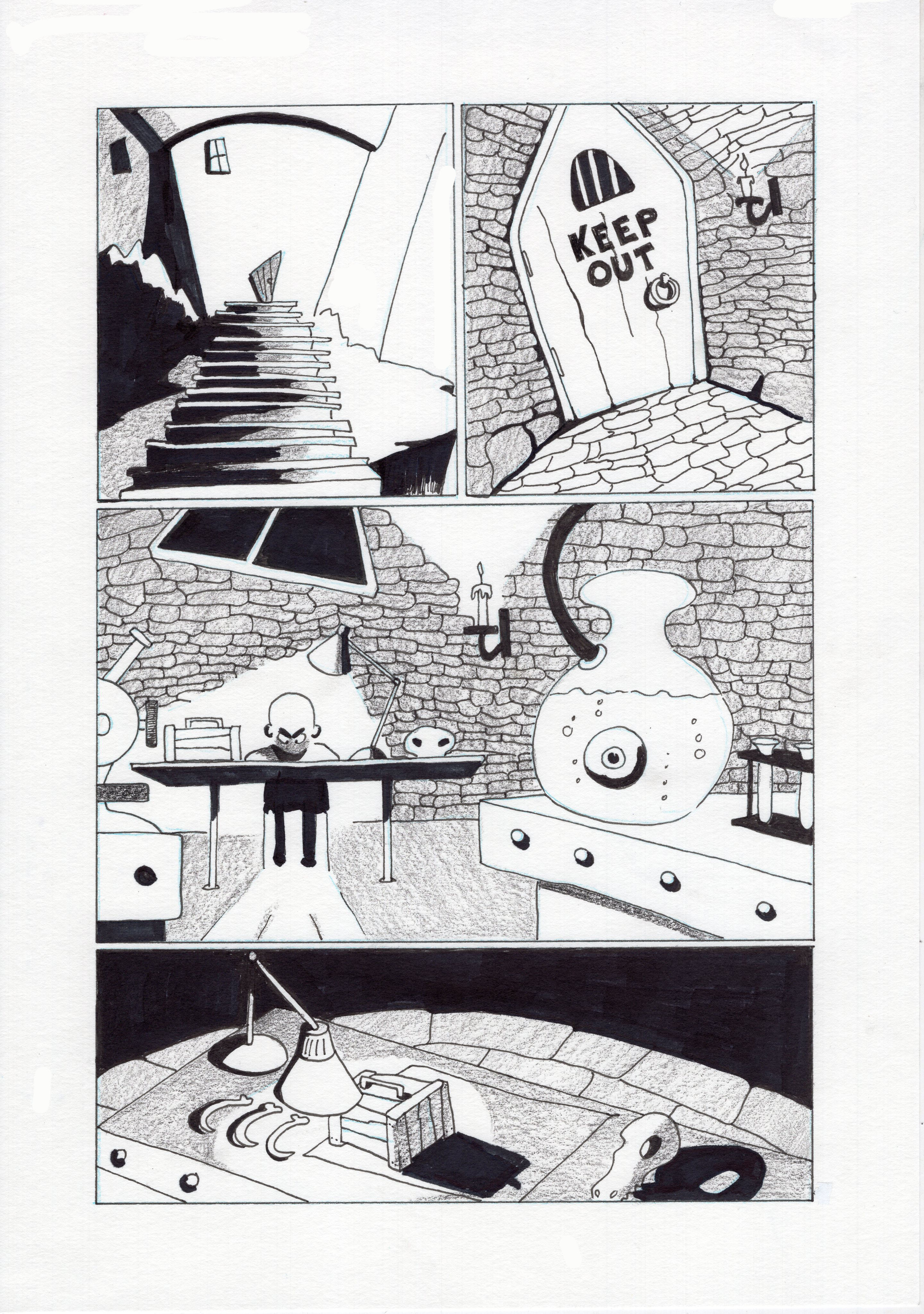
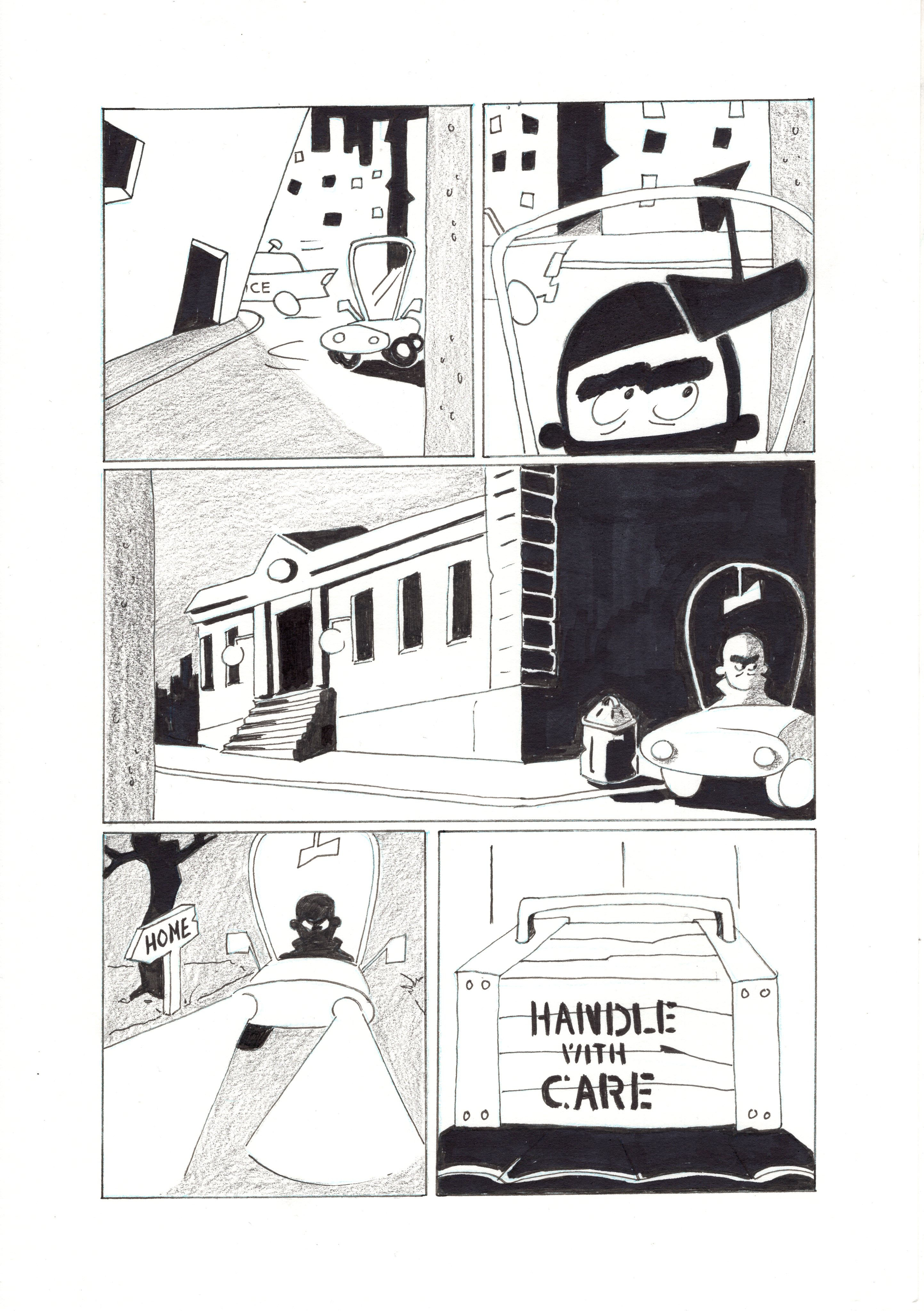
Keeping the overall composition to a minimum was a challenge. Again I did not want to over complicate the drawings with too much detail and instead tried to create a more gothic look from my first project.

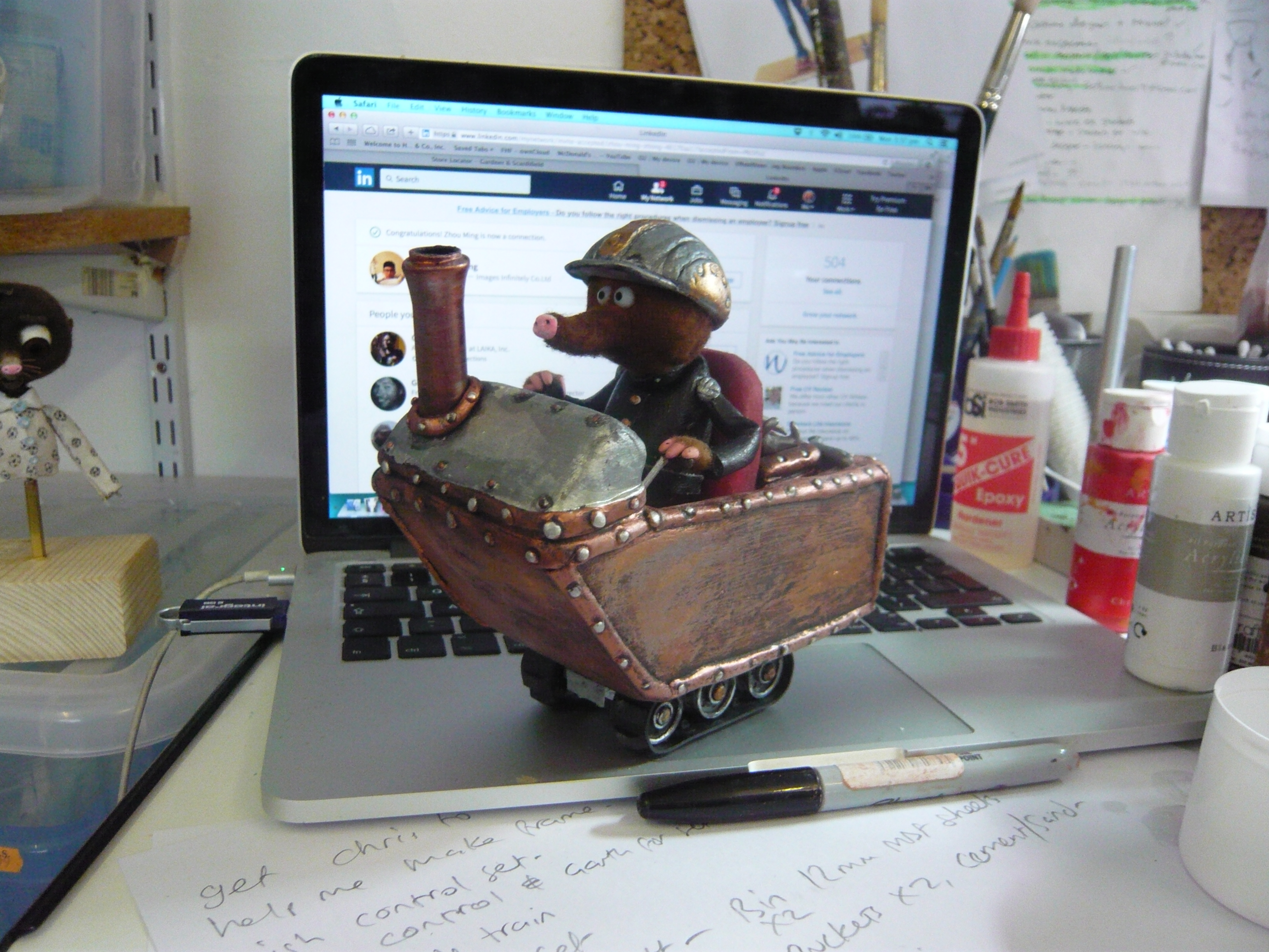
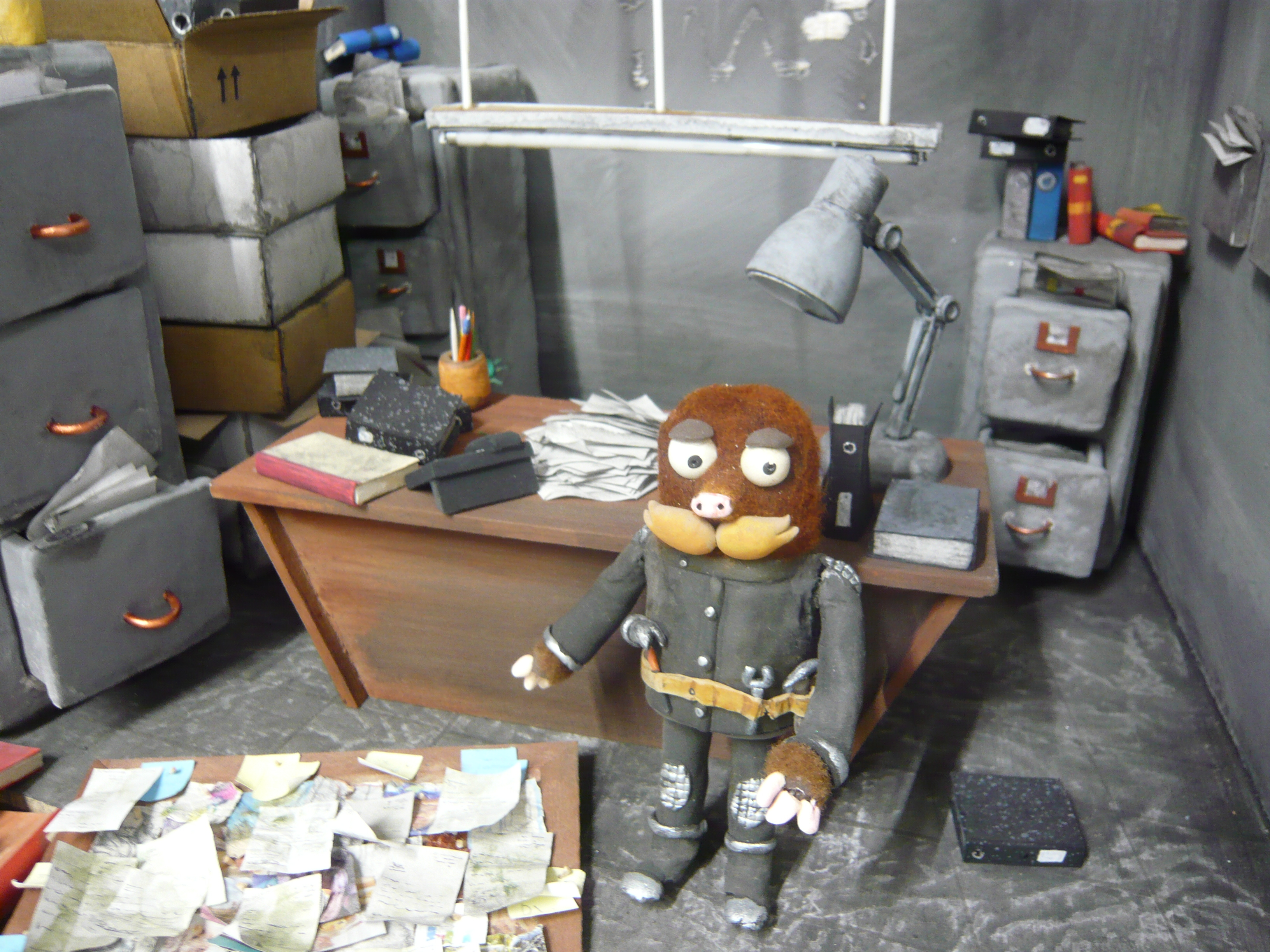
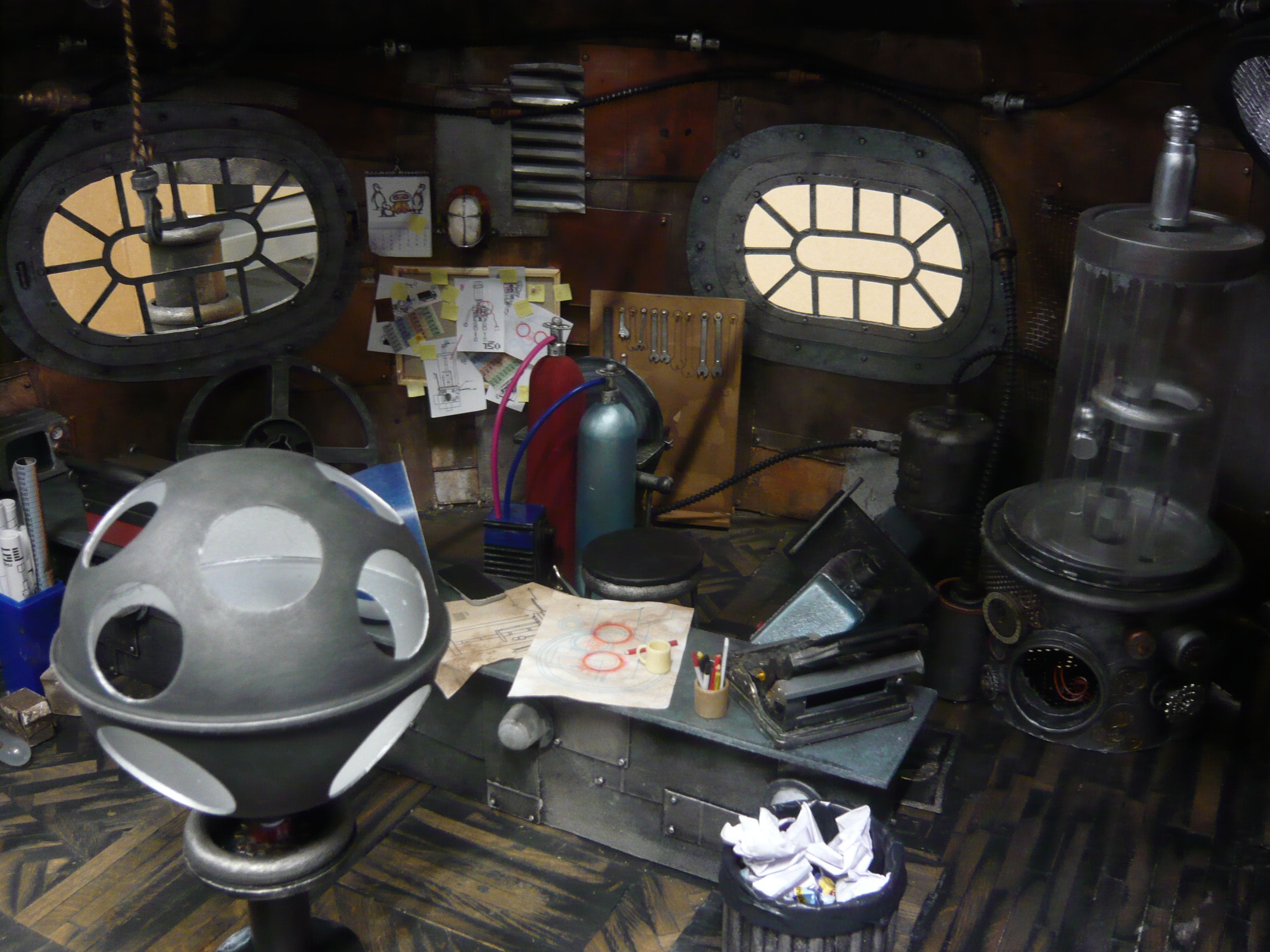
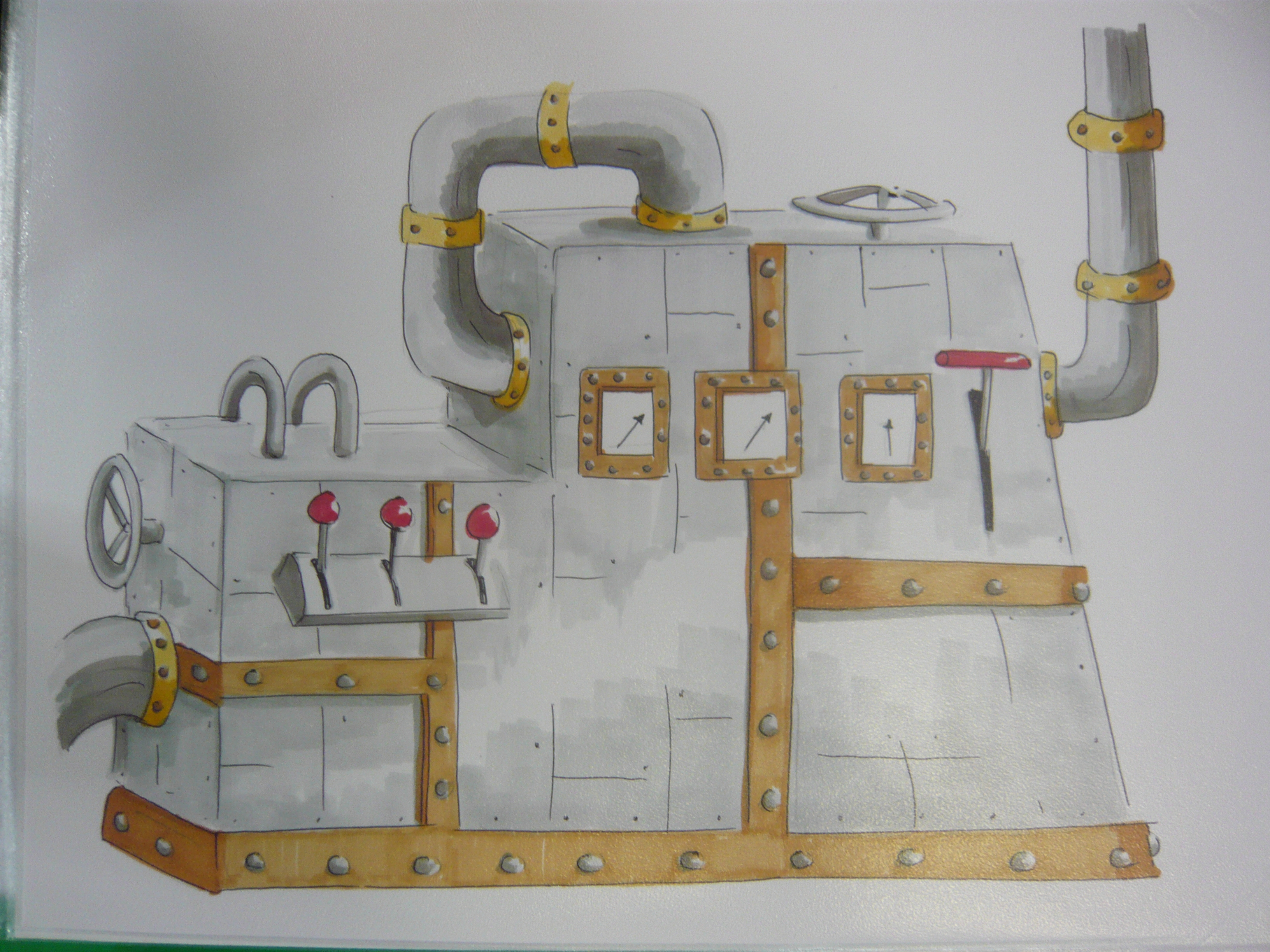
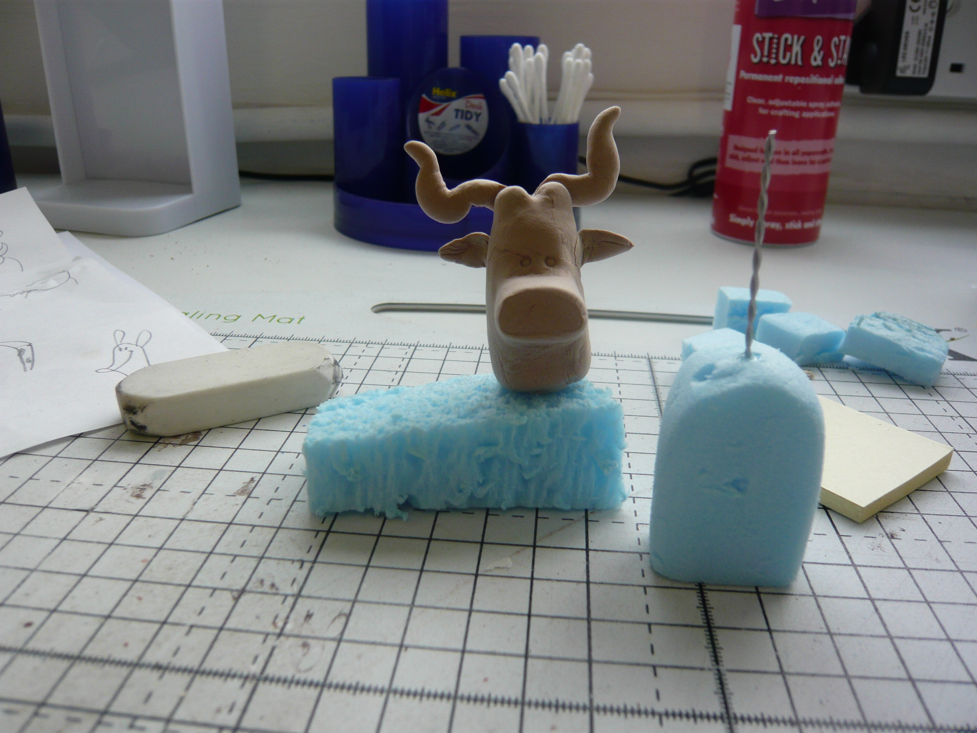
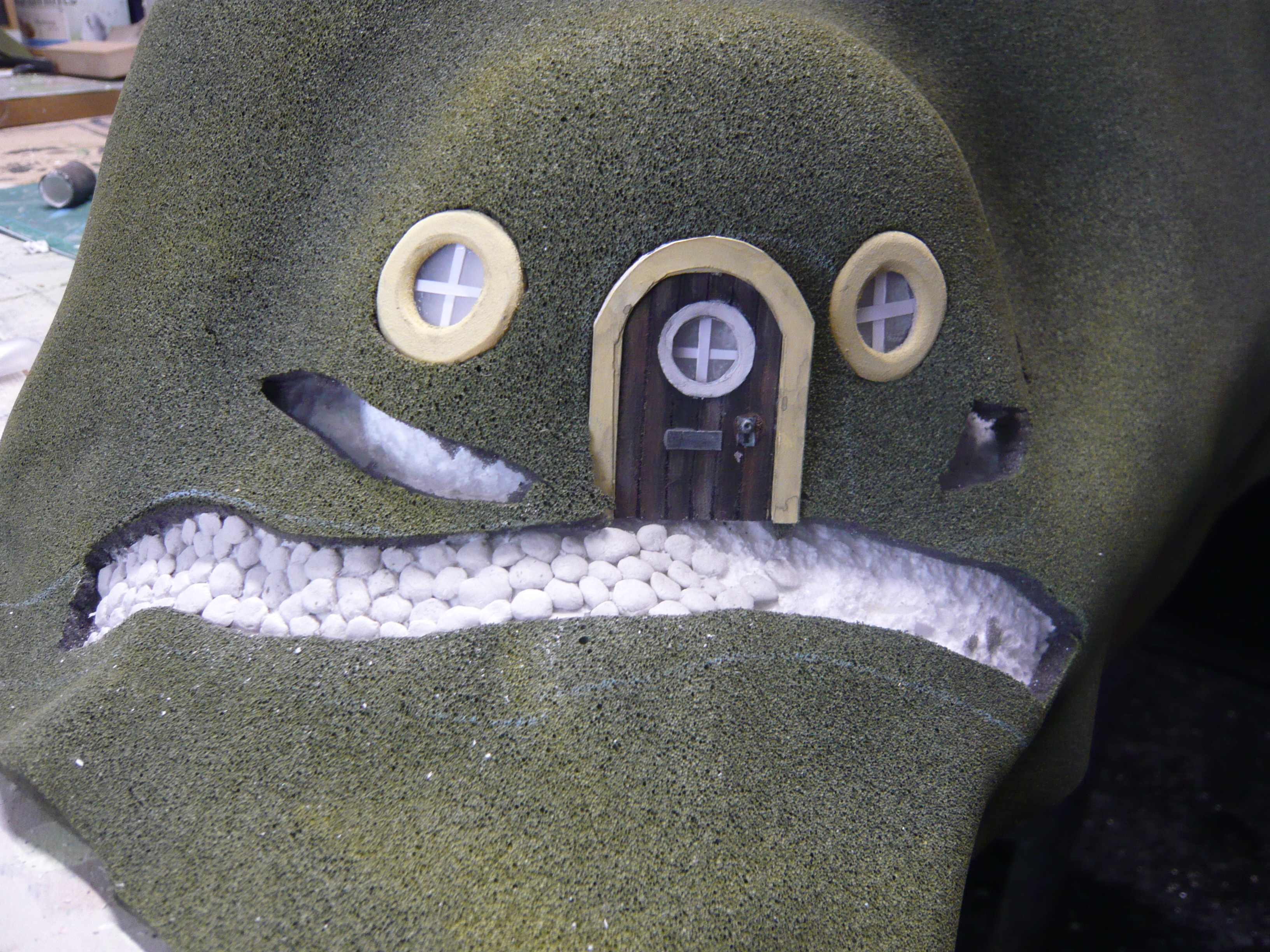
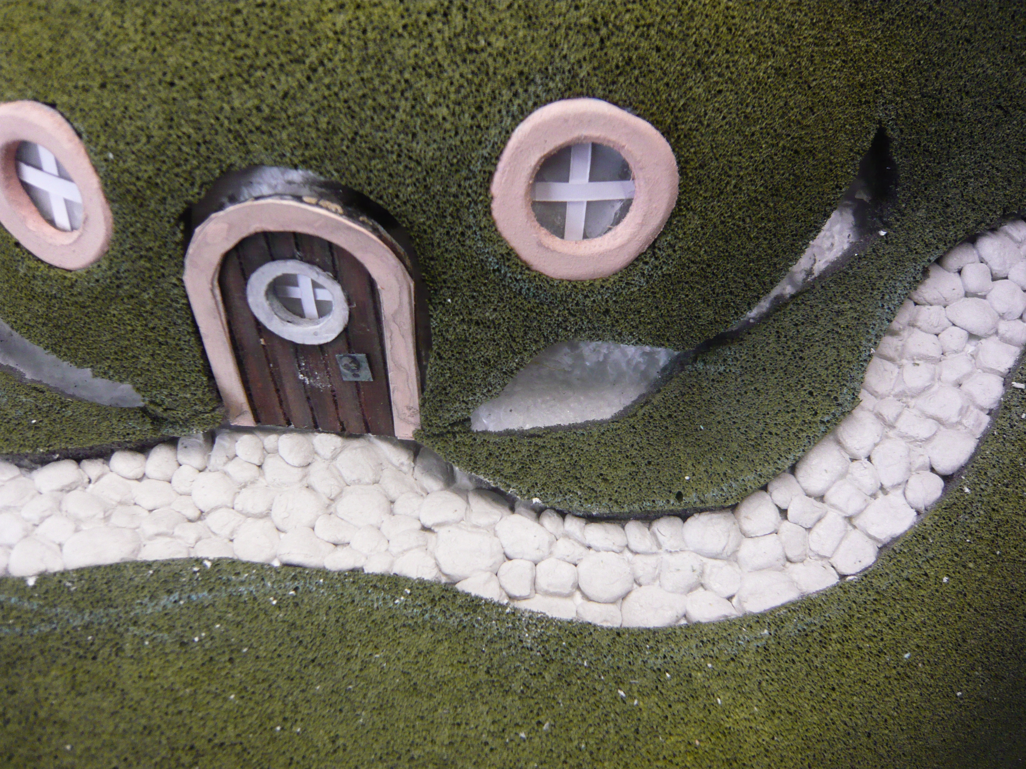
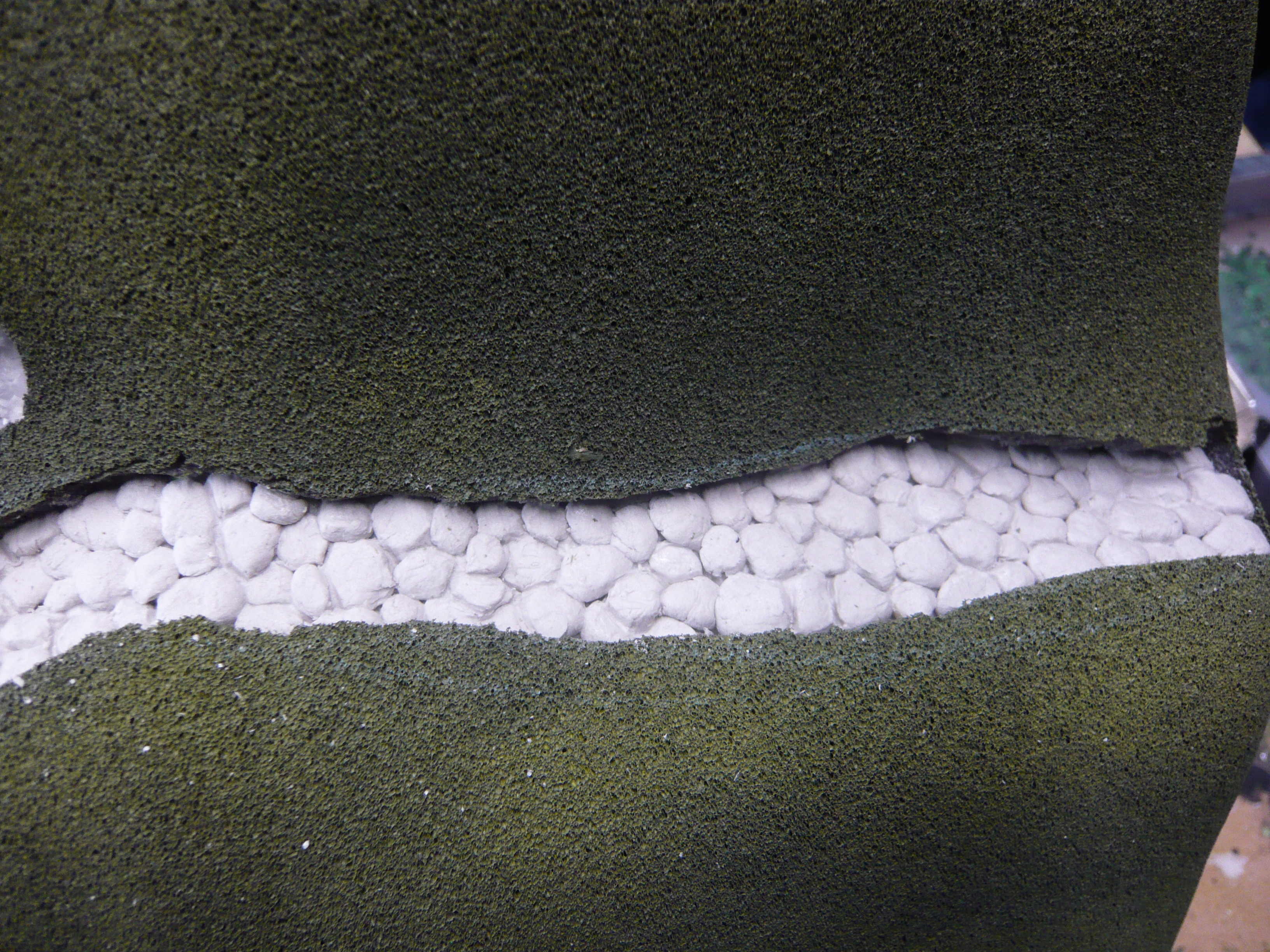
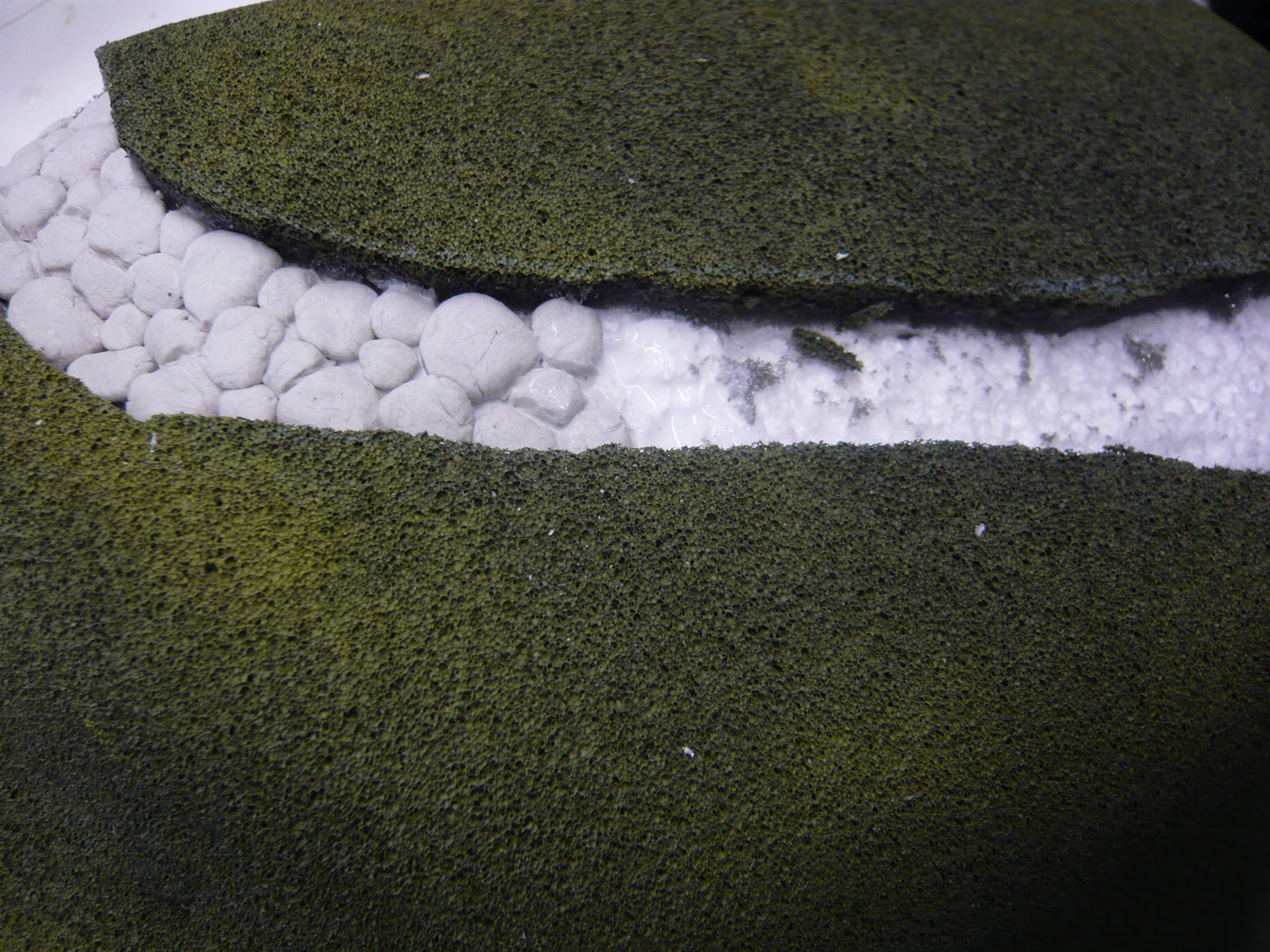
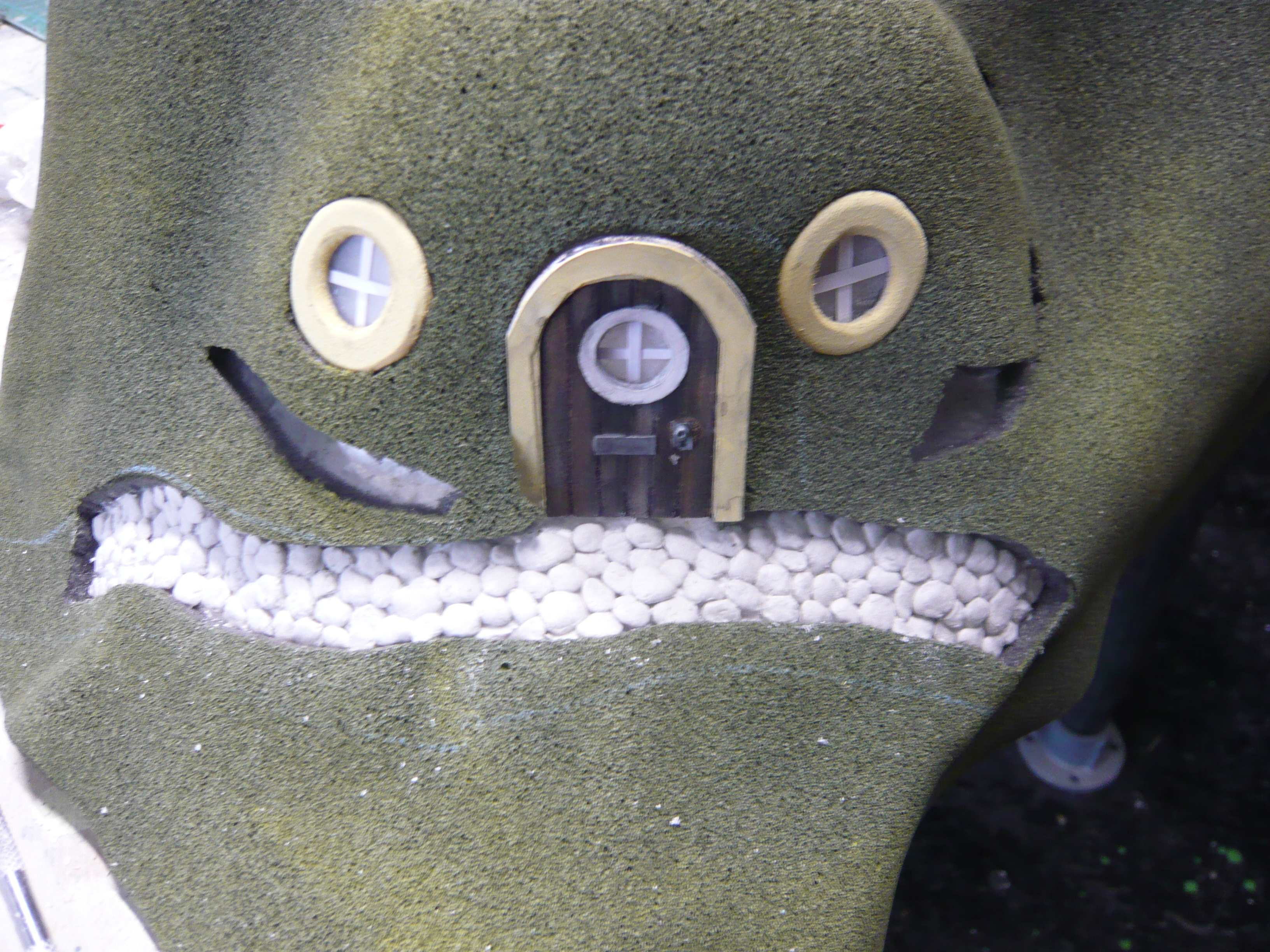
I decided I would like to develop this idea further trying to re visualise the creature as a more user friendly beast.

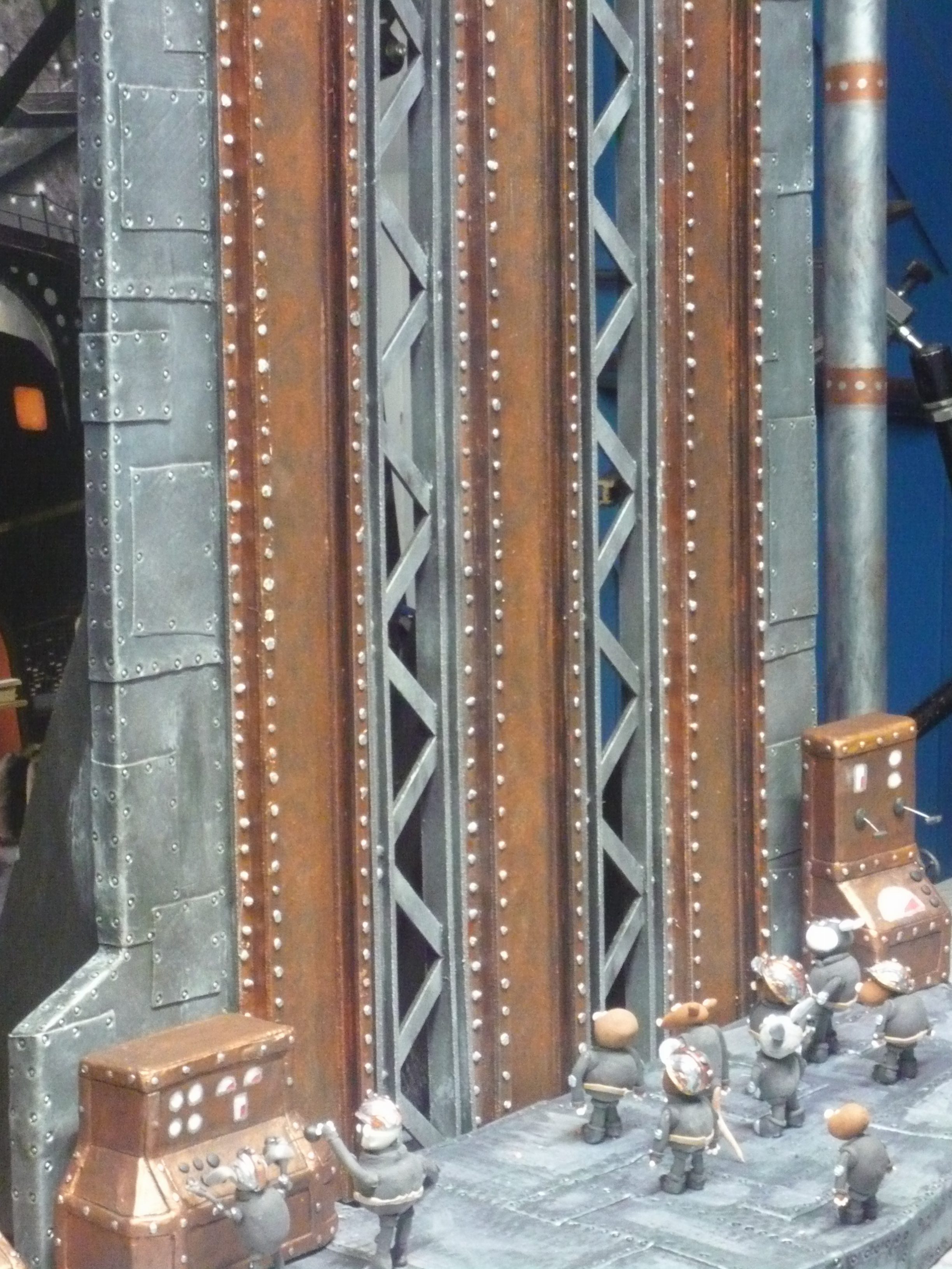
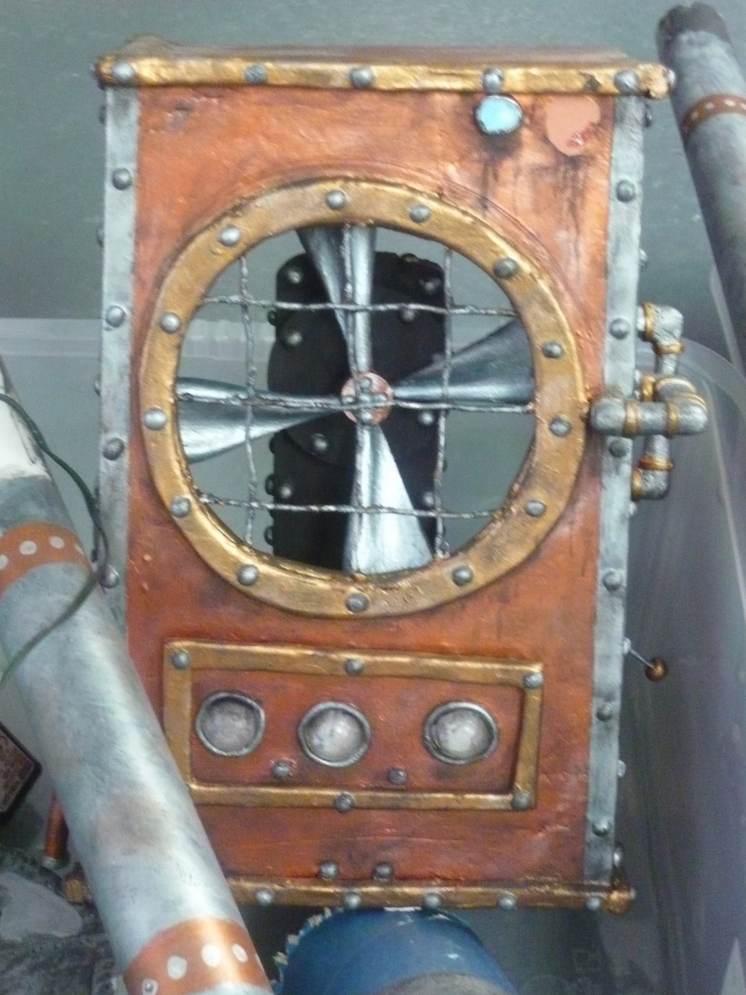
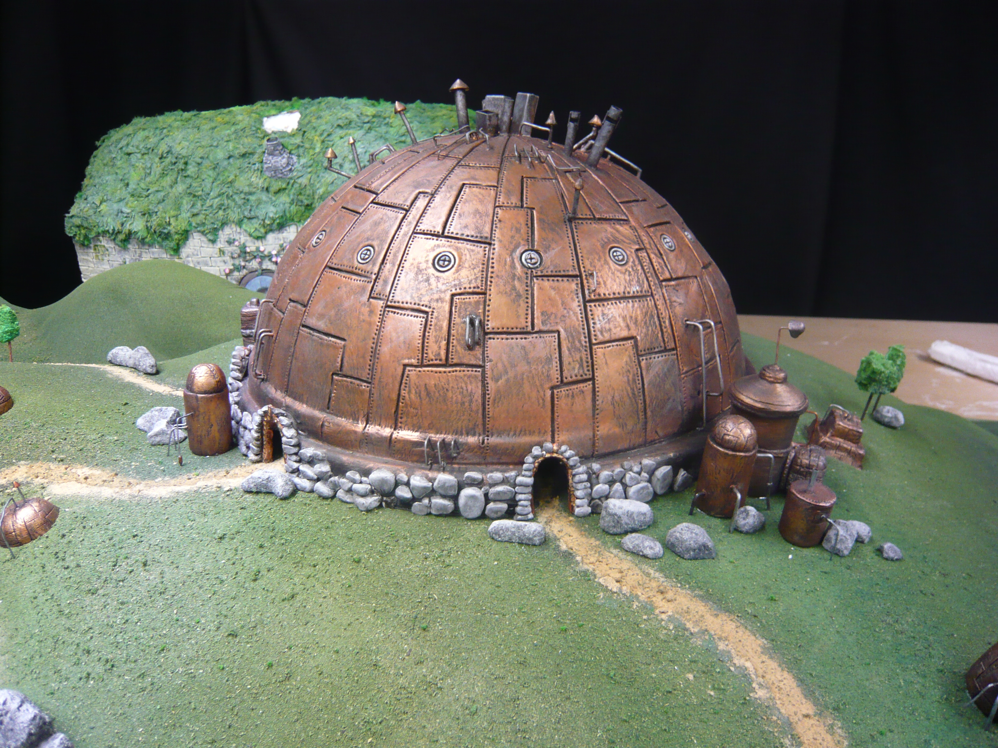
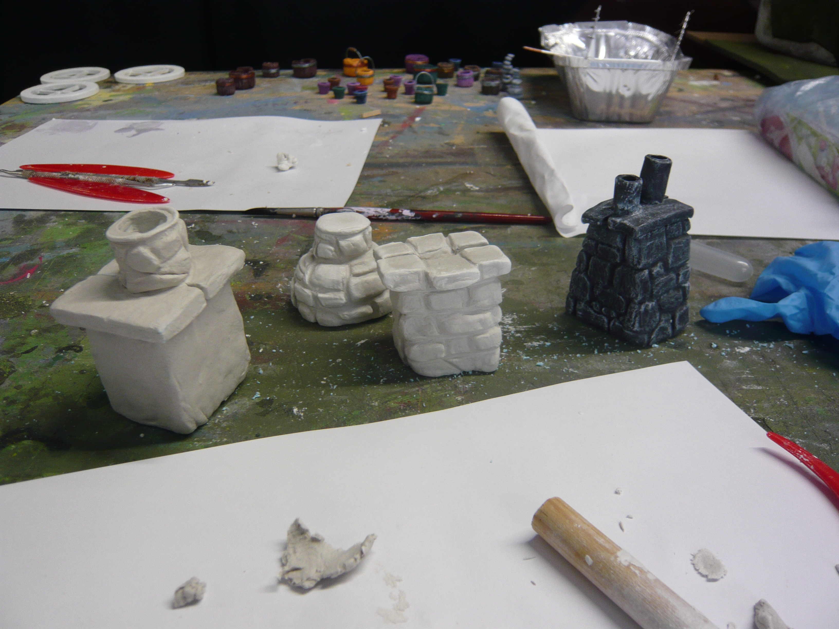
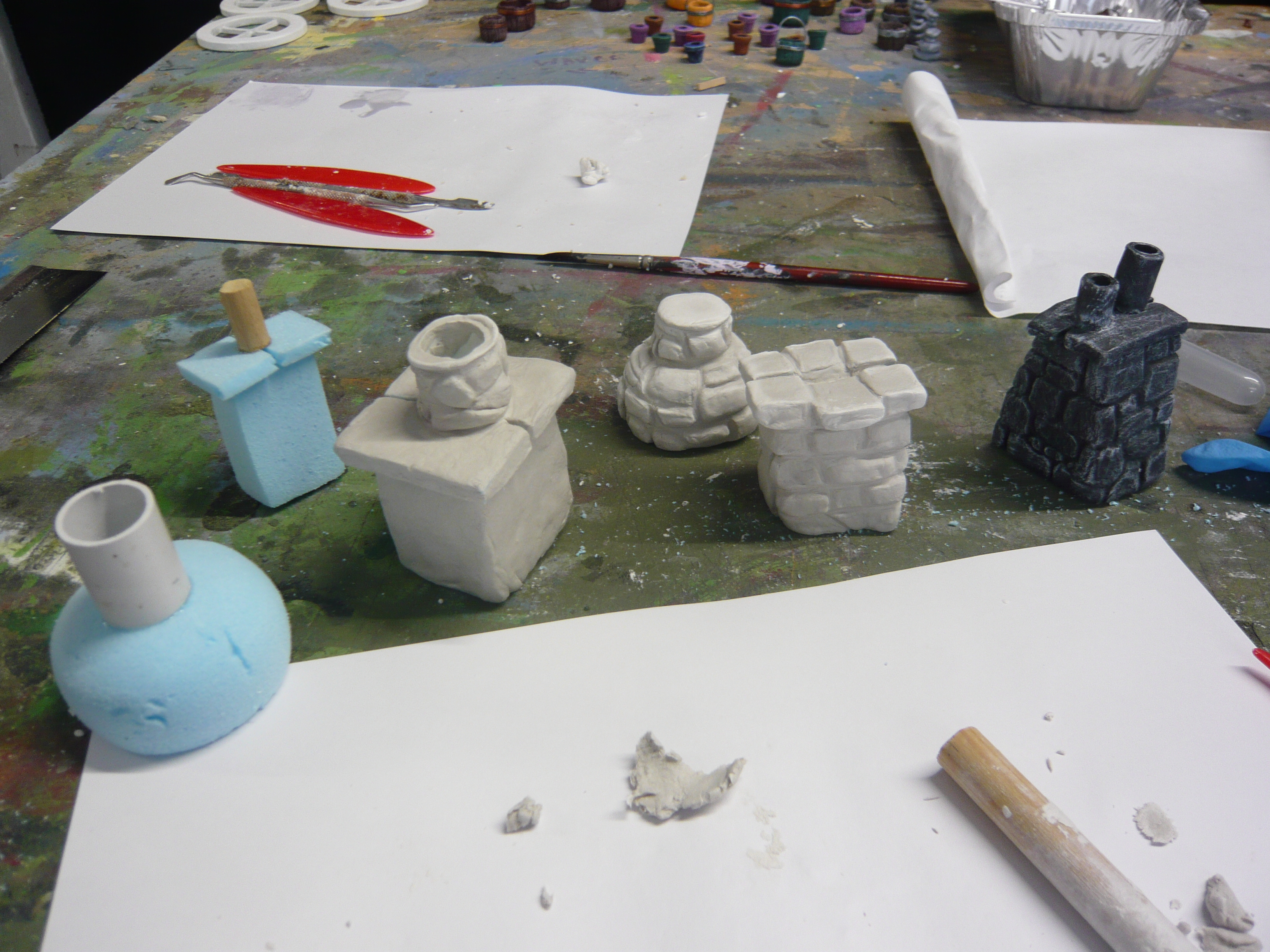
And as a consequence tried to create a three dimensional sculpture.


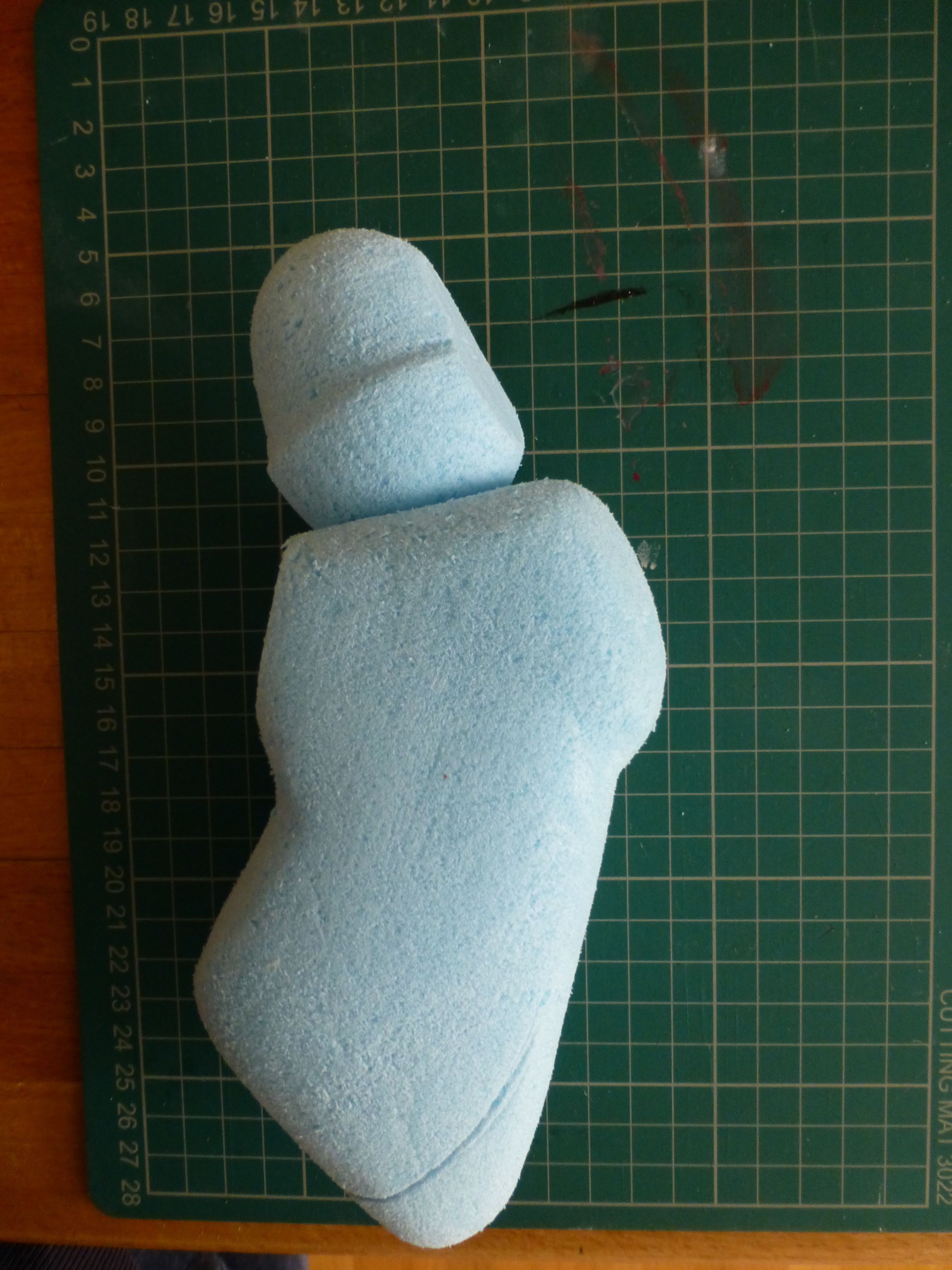
This is still in process. Using epoxy clay, which takes 24hours to harden, I have to gradually build up from the shaped styrofoam the dinochick structure then drill the details.Hopefully this will be completed soon.

Text and Context: Frankenstein

Frankenstein: Workshop

Research

From tutorials I discussed the idea of translating Frankenstein into a modern enviroment such as an once.
Here the story follows a new member of sta that rises to become the boss only to then re the member of sta that showed them the ropes. Seeking revenge the former employee returns to work and kills the boss, becoming a monster.


Gene Colan 1926-2011 was comic book artist that worked with a series of my personal favourite comics called ‘The Tomb of Dracula’ from the 1970’s by Mar- vel. His work is extrodinary with the archetype style of Marvel but an intense lev- el of detail. I decided to create a short comic of 12 pages in a similar style. Using heavy black shading in an attempt of recreating a Gothic horror narrative.


Location

Situated in Steyning is one of my favourite buildings. SME is an engineering company. The building has a simple aesthetic appeal that I wanted to utilise in my comic book. Dated from the 1960’s I wanted it to create a certain feel to the overall composition.


Roughs 

Starting with rough pencil layouts from a sketch book I developed various key scenes. Each frame was then blocked in ink before the nal detail was added. e characters were then placed in a sequence that illustrated the stories main plot points.

is was very difficult to achieve as each rendering and layout was done by hand therefore there was little margin for error. Working through my Marvel catalogue I noticed that the strong dramatic sequences were traditionally illustrated through a splash page. This was then reworked as title page within the inner cover. Both are examples of my attempt of this recreation.Trying to define the continuity of the story and merging the narratives was challenging.


Below are the final spreads that were then scanned into Indesign to create the comic. The sequence of pages were not exact to how they would be printed. is was an error on my part. e rst spread was the last spread completed. All the other run consecutively.

Final Drawings

Critical Analysis

Within the exercises I have attempted to draw upon the previous workbook utilising storyboards as a means pf exploration and structuralism with the subject matter. As an introduction to this brief we were encouraged to work on a particular theme from the original text. I attempted a brief outline. Identifying this contemporary setting I incorporated my research into the final composition. Overall the final outcome was rewarding. The project pushed my limits of illus- tration with a medium that isn’t forgiving. The blocking and shading required an attention to detail to the overall composition. This was then dependent as to whether a particular scene would work, or not .


Steam Punk Animation Project

Gigglefish Project: Steam Punk : 

Background: Research Steampunk.

Based around the world of steampunk which is influenced by the style of the 19th-century work of Jules Verne, H.G. Wells, and Mary Shelley. Steampunk’s  most recognisable features are the anachronistic technologies or retro-futuristic inventions that  people in the 19th century might have envisioned. It is a style rooted in the era’s perspective on fashion, culture, architectural style.

At the start of the year I contacted a fiim studio that was embarking on a full length stop animation feature film based around this world of a steampunk mine. The company ‘Giggle fish’ are based in Lancing and were looking for any volunteers to help make models and props.

I initially approached them with a few examples of my illustrative work. Explaining that I have zero experience of model or prop making they were happy for any help they could get.

On my first day I was asked to come up with some concept drawings of the uniforms worn by the miners. The director explained that he wanted a series of Thunderbird type uniforms with a sash and tool belt. I drew the main character wearing various outfits. Remembering the leather outfits that motorcyclists wear I then drew the main character wearing a similar uniform.

I drew him initially in white, then with direction from the director re-drew him in black with pads. Black costumes are cheaper to produce white.
The drawings were then used as costume blueprints for all the main characters. Concept drawings main character costume development:


Machinery Concept Drawings and finalised props.

The work load has been intense. In addition to model making I was asked to draw more concept designs for machinery that were then created by myself under guidance of the props team.


Model Making Development:

Every week I have been spending time at the studio. I have been shown how to shape styrofoam and then mould models of characters required for the lm. Working with materials such as clay silk and creating working armatures has been an incredible experience.

Continuation: These models are part of a backdrop scene. The characters are based on preliminary sketches that then need to be shaped and moulded with clay silk. Then using scraps of cloth I then had to create clothing and working arms that can be animated.


Styrofoam moulding is an extremely difficult medium. Using silicone the mixture is created and then poured into the moulds. To get the consistency correct takes practice and the results need to be consistent. The heads, once hardened, are then shaped with sand paper and passed onto the puppet making team.

Sets: The story is set in a steam punk mine where the characters live and work.


Each set is intricate to make and the level of detail required is a time consuming process. Using PVA and DAS clay the styrofoam is gradually built up to create a cooper type effect that is finished with metallic paint.

Shaping and prop making The following are models of chimneys for the houses. They are shaped in styrofoam and then textured with clay before finally being painted.


Each week the sets are built up to include pathways made of cobbles. This process requires individual cobble stones being moulded out of DAS then stuck into a path that has been carved out of the styrofoam.


Book arts

Bookarts

Throughout the second semester my Moday module was Bookarts. Each session introduced us to a series of stitching techniques and book design based around the tradition of book binding.The sessions were all day and required a level of craft and skill.

This was not my strong point. Thanks to a very patient Helen the aspect of paper folding was made less of a challenge. Each book was crafted within the session and then various stiches were practiced.

The beauty of binding was opening up to the realisation that so much work goes into the crafting of books. e individual consideration to how each project should be developed was extremely interesting. This then required additional thought to how each style could be applied to our projects. Most noted was my project of Grand Parade which was originally an exercise that was carried out at the start of level 5 from a sketch book.

Manifesto

Manifesto Research:

This collaborative project developed around the idea of ‘Doing less. Then do even less’. The principle concept was divided and then articulated into a manifesto based around various ideas of what laziness is and how that can be achievable in an everyday context. Some members of our group explored posters and leaflets. I attempted to create a short animation, something I have never done.

Researching protest art I was struck by La Chienlit C’est Lui work depicting Charles de Gaulle, and the shadow imagery of the caricature used.


The Lazy Manifesto

Basic Principles:

Initial concepts were discussed around such topics as how to be lazy and lazy alternatives to consuming drinks for example. These then developed into:

1. Odering takeaways rather than cook. 2. Taking an Uber everywhere.
3. Using wet wipes rather than shower. 4. Laying in on weekdays. 5. Not doing uni work.

A Shot in the Dark (United Artists, 1964)
Director Blake Edwards Opening Credits (DePatie-Freleng Enterprises/George Dunning and Associates) Director: George Dunning

Catch Me If You Can was my second source of research. The opening sequence portrays a mysterious style title, which both gives the viewer a small insight to the basic plot of the film, but also keeps them in suspense and maybe keeps them guessing before it has even started. Inspired by the work of Saul Bass. This is an effective title sequence that sets up the film and gives a small idea of what the film is about. It is a quirky and an interesting piece to watch.

Storyboards Concepts:

I created a series of drawings that were negatives to the protest art that I re- searched. Each drawing was sequenced by hand doing various actions highlighted in our Lazy Manifesto.
The challenge was how time consuming each rendering took and understanding the basic movements in animation that when edited together illustrated an agenda.
Every process was labour intensive and creating visual narratives that illustrated yawning, walking and an Uber sequence that turned into a car was very difficult to execute. Using the above examples I storyboarded the initial sequences.


Sequences:

My original sequence was drawn on a chalk board and photographed. Each movement was then rubbed out and replaced with the next series of animation.

Rendered in Photoshop:

Having decided that the chalk board exercise was too incomplete I returned to my sketchbooks and reworked various themes. Then scanning each image into photoshop and re-rendered and animated each action.


Rendered in Photoshop


Title’s:      


Final Sequence:

Critical Analysis

Regarding the storyboards: The introduction to utilising our environment and therefore structuring a narrative was really enjoyable. Within the storyboard i created a brief outline of a broader story based around the structure of the Manifesto. Using  key elements of the agenda was built as a semantic exercise  relying only on these components to propel the narrative. Visually I think my animation is scrappy and underdeveloped however it does convey the general idea. Developing technically the ideas needed to be more coherent and required sound to the final sequence. The overall composition was still not completed by the time of assessment and throughout the second semester I have revisited this project. This was a very steep learning curve and was an extremely challenging project.


Memories: Vertical Project

Memories: The Don Ameche’s Band

In the late 1980’s and early 90’s I created a fantasy band named after the actor Don Ameche from the film Trading Places. We were a three piece band with Wendy on drums, Terri on bass and me on guitar. At the time I was just learning to play the guitar so the idea of an imaginary band made perfect sense. I had even written songs for this ficticious trio.  These people never existed, but over the years the memory of this false creation has permeated so much that my friends actually think that I was in a band. I have to remind them that I made the whole thing up.

Don Ameche: Trading Places

Research: Raymond Pettibon, Sonic Youth

Influenced by grunge music of the early 1990’s I listened to a lot of Sonic Youth, Pixies, Smashing Pumpkins and Black Flag. The characters I created all had troubled backgrounds and the music that I tried to create echoed the early punk sound of the 1990’s. For the brief I went through my CD collection and wanted to recreate the artwork of my imaginary band including tour flyer and cd artwork. One artist who was prolific at the time was Raymond Pettibon. He did the cover artwork for Black Flag and Sonic Youth. His use of heavy black lines and hand lettering created an instantly recognisable style. The aggressive and confrontational artwork that I remember from that time seemed to capture the music scene. Using these research points I started to work with this style in re-creating my own band artwork.

Trying to remember other memories I also drew upon a chocolate bar that I recalled my Grandad used to treat us with called Fry’s Five Boys Chocolate. The wrapper was very distinctive, depicting the five stages of being rewarded with a chocolate bar. Looking at the artwork today it seems a little disturbing. Each child was titled with the various stages: Desperation, Pacification, Expectation, Acclamation and Realistaion ‘it’s Fry’s’.

Using this memory I contextualised a couple of the titles and reworked them into the cd cover artwork.

 Tour Flyer Outcome

Using a  rendering of Don Ameche I stencilled the image with various colours in an attempt to block out any detail. Then working away from the sketch book scanned the image into photoshop to create the flyer. Originally I was going to incorporate the Fry’s boy image but instead I decided to use the titles.


Adding the Admission Free tabs at the bottom of the flyer and the title tracks of the songs help create the overall effect of an authentic tour flyer of my fictitious band.


Outcome: CD Cover

Building from the theme of the ‘Fry’s Five Boys’ I twisted the wording to ‘Five Boys Fry’ with an image that characterises the resistance of acclamation and is replaced with the title ‘Desperation, Expectation and Fuck this shit!’. The idea behind this concept was to illustrate the exact opposite of what a good boy receives. Rather than the reward of a chocolate bar this particular boy commits a crime and will end up in the electric chair.


Conceptualising the artwork into other  mediums pushed the initial design.


Critical Analysis

The challenge presented a visualisation of artwork. Within the exercises I attempted to explore and create different realisations of the initial concept. The rendering of the subject and the placement of the composition within the tour flyer is effective when contextualised in the poster montage. Reworking these themes and utilising bold lines and block colours of the pose is an attempt at being  reminiscent of the tour posters of the early 1990’s. Overall the project required a representation of an imaginary imagery. Visualising the memory was a challenge to convey.


Vinegar Valentine

Vinegar Valentine

Research Brief:

“Vinegar valentines are greeting cards, or rather insult cards. They are decorated with a caricature, and below an insulting poem. Ostensibly given on Valentine’s Day, the caricature and poem is about the “type” that the recipient belongs to—spinster, floozy, dude, scholar, etc.”

Below are various examples of  vinegar valentines. Largely they evolve around one illustration depicting  satirical look at the chosen figure.

Gustave Dore:

As a starting point I looked at the work of Gustave Dore. Although satire in the 21st century is by and large a television-based affair; Doré’s considerable career as a satirist for Parisian publications, including Le Journal amusant, Journal pour rire, and Le Monde illustré. Doré’s fame and productivity translated into humour in magazines at the age of 15 and by 16 was the highest-paid illustrator in France. However, they were also dependent on the emerging industry of immediate news. Satire is often based on swift response; a cartoon in the same week’s paper would have a far more pointed impact than a delayed one. The news cycle allowed Doré to extend his lampooning pen internationally, pricking national self-conceptions as he went. Below are some examples.

Subject: SNP, Nicola Sturgeon.

Rise of Nicola Sturgeon: Shallow empress of north Britain

SNP leader Nicola Sturgeon. She has been continuously in politics since the age of 16, and for the last 8 years has been at the top of the Scottish government. Sturgeon is relaxed about Scotland being a province of the EU with far less power than it now has in devolved Britain. Her primary drive is divide the UK with divisive referendums. Hell bent on politics based around self entitlement that has little if any true political clout on an international stage. The SNP is convinced that, regardless of the subsidies from the British government, they will better off out. I say ‘fuck off’ then!


Concept Drawings:

Initially I played with the idea of depicting Alex Salmond as a Jack in the Box caricature. The idea being of a joke that never goes away. But the development of this concept was difficult to execute.


Ode:

Nicola Sturgeon the Shallow Empress

Pushing your agenda down our necks

Your resolute to break my heart by making sure that we will part

Trying to divide and trying to spilt

the UK up…

you fucking bitch.


Critical Analysis

The overall composition of the final piece contained all the elements as intended. However, the material used was difficult to use and the colours and inking become transparent and illegible. As a satirical exercise the illustration contained elements that are recognisable as the subject.  There is room for further development and perhaps a greater exploration of this subject. The rendering of Sturgeon lacked the visual vitriol that I had intended to convey which is why the final composition is a little lacklustre in execution.


HTML Visual Methods

HTML

Throughout the Semester we have had an introduction to HTML and CSS script. Using Brackets as a platform, each week we have coded the templates of workable sites for future use. Using my self initiated project The Little Book of Leviathans I have created a website with the intention of outlining the inspiration and development of these sequence of illustrations. As a sample I have used Lorem Ipsum as selected text. Due to issues uploading the sample website I have had to include screen shots of selected pages.

The coding is as follows:

<!DOCTYPE html>
<html lang="en">
<head>
<meta charset="utf-8">
<meta http-equiv="X-UA-Compatible" content="IE=edge">
<meta name="viewport" content="width=device-width, initial-scale=1">
<title>Elavate</title>
<!--
Elevate
http://www.templatemo.com/tm-481-elevate -->
<!-- load stylesheets -->
<link rel="stylesheet" href="http://fonts.googleapis.com/css?
family=Open+Sans:300,400">  <!-- Google web font "Open Sans" -->
<link rel="stylesheet" href="css/bootstrap.min.css"><!-- Bootstrap style -->
<link rel="stylesheet" href="css/magnific-popup.css"><!-- Magnific pop up style -->
<link rel="stylesheet" href="css/templatemo-style.css"><!-- Templatemo style -->
<!-- HTML5 shim and Respond.js for IE8 support of HTML5 elements and 
media queries -->
<!-- WARNING: Respond.js doesn't work if you view the page via file:// -->
<!--[if lt IE 9]>
<script src="https://oss.maxcdn.com/html5shiv/3.7.2/html5shiv.min.js"></script>
<script src="https://oss.maxcdn.com/respond/1.4.2/respond.min.js"></script>
<![endif]-->
</head>
<body>
<div class="container">
<div class="tm-sidebar">
<img src="img/menu-top.jpg" alt="Menu top image" class="img-fluid 
tm-sidebar-image">
<nav class="tm-main-nav">
<ul>
<li class="tm-nav-item"><a href="#home" class="tm-nav-item-link">Home</a></li>
<li class="tm-nav-item"><a href="#about" class="tm-nav-item-link">About</a></li>
<li class="tm-nav-item"><a href="#ideas" class="tm-nav-item-link">Ideas</a></li>
<li class="tm-nav-item"><a href="#contact" class="tm-nav-item-link">Contact</a></li>
</ul>
</nav>
</div>
<div class="tm-main-content">
<section id="home" class="tm-content-box tm-banner margin-b-10">
<div class="tm-banner-inner">
<h1 class="tm-banner-title">Suzette Moon</h1>
<p class="tm-banner-text">Illustration <br>Brighton University</p>  
</div>                  
</section>
<section>
<div class="tm-content-box flex-2-col">
<div class="pad flex-item tm-team-description-container">
<h2 class="tm-section-title">From The Deep</h2>
<p class="tm-section-description">Lorem ipsum dolor sit amet, 
consectetur adipiscing elit. Quisque vel nisi pharetra nibh varius 
pharetra ac sagittis nisi. Etiam pharetra vestibulum hendrerit.</p>
<p class="tm-section-description">Donec ex libero, fringilla vitae 
purus sit amet, rhoncus pharetra lorem. Pellentesque id sem id lacus 
ultricies vehicula. Aliquam rutrum mi non.</p>  
</div>
<div class="flex-item">
<img src="img/squid%2001.jpg" alt="">  
</div>                      
</div>
<div id="about" class="tm-content-box">
<ul class="boxes gallery-container">
<li class="box box-bg">
<h2 class="tm-section-title tm-section-title-box tm-box-bg-title">The</h2>
<img src="img/white-bg.jpg" alt="Image" class="img-fluid">
</li>
<li class="box">
<a href="img/fish%20head%20large%2002jpg"><img src="img/fish%20head%2002.jpg" 
alt="Image" class="img-fluid"></a>
</li>
<li class="box box-bg">
<h2 class="tm-section-title tm-section-title-box tm-box-bg-title">Little</h2>
<img src="img/white-bg.jpg" alt="Image" class="img-fluid">
</li>
<li class="box">
<a href="img/from%20the%20deep%2001%20large.jpg"><img src="img/from%20the%
20deep%2001.JPG" alt="Image" class="img-fluid"></a>
</li>
<li class="box box-bg">
<h2 class="tm-section-title tm-section-title-box tm-box-bg-title">Book</h2>
<img src="img/white-bg.jpg" alt="Image" class="img-fluid">
</li>
<li class="box">
<a href="img/Scary%20fish%20large.jpg"><img src="img/scary%20fish.jpg" 
alt="Image" class="img-fluid"></a>
</li>
<li class="box box-bg">
<h2 class="tm-section-title tm-section-title-box tm-box-bg-title">of</h2>
<img src="img/white-bg.jpg" alt="Image" class="img-fluid">
</li>
<li class="box">
<a href="img/Octopus%20Large%2001.jpg"><img src="img/Octopus%2002.jpg" 
alt="Image" class="img-fluid"></a>
</li>
<li class="box box-bg">
<h2 class="tm-section-title tm-section-title-box tm-box-bg-title"
>Leviathans</h2>
<img src="img/white-bg.jpg" alt="Image" class="img-fluid">
</li>
</ul>
</div>
</section>
<!-- slider -->
<section id="ideas">
<div id="tmCarousel" class="carousel slide tm-content-box" 
data-ride="carousel">
<ol class="carousel-indicators">
<li data-target="#tmCarousel" data-slide-to="0" class="active"></li>
<li data-target="#tmCarousel" data-slide-to="1" class=""></li>
<li data-target="#tmCarousel" data-slide-to="2" class=""></li>
</ol>
<div class="carousel-inner" role="listbox">
<div class="carousel-item active">
<div class="carousel-content">
<div class="flex-item">
<h2 class="tm-section-title">The Ideas</h2>
<p class="tm-section-description carousel-description"
>Suspendisse fermentum auctor turpis quis volutpat. Ut 
sed nibh non purus porta lacinia. Donec et euismod elit. 
Aenean vitae quam leo. Pellentesque interdum metus sed 
massa rutrum.</p>
</div>
</div>                              
</div>
<div class="carousel-item">
<div class="carousel-content">
<div class="flex-item">
<h2 class="tm-section-title">Inspiration</h2>
<p class="tm-section-description carousel-description"
>Lorem ipsum dolor sit amet, consectetur adipiscing elit. 
Quisque vel nisi pharetra nibh varius pharetra ac sagittis 
nisi. Etiam pharetra vestibulum hendrerit. Pellentesque 
interdum metus sed massa rutrum.</p>
</div>
</div>                              
</div>
<div class="carousel-item">
<div class="carousel-content">
<div class="flex-item">
<h2 class="tm-section-title">The Project</h2>
<p class="tm-section-description carousel-description"
>Donec ex libero, fringilla vitae purus sit amet, rhoncus 
pharetra lorem. Pellentesque id sem id lacus ultricies 
vehicula. Aliquam rutrum mi non. Pellentesque interdum 
metus sed massa rutrum.</p
</div>
</div>                             
</div>
</div>
</div>                  
</section>
<section class="tm-content-box">
<img src="img/Head%2001.jpg" alt="Contact image" class="img-fluid">
<div id="contact" class="pad">
<h2 class="tm-section-title">Contact Us</h2>
<form action="#contact" method="get" class="contact-form">
<div class="form-group col-xs-12 col-sm-12 col-md-6 col-lg-6 
form-group-2-col-left">
<input type="text" id="contact_name" name="contact_name" 
class="form-control" placeholder="Name" required/>
</div>
<div class="form-group col-xs-12 col-sm-12 col-md-6 col-lg-6 
form-group-2-col-right">
<input type="email" id="contact_email" name="contact_email" 
class="form-control" placeholder="Email" required/>
</div>
<div class="form-group">
<input type="text" id="contact_subject" name="contact_subject" 
class="form-control" placeholder="Subject" required/>
</div>
<div class="form-group">
<textarea id="contact_message" name="contact_message" class=
"form-control" rows="9" placeholder="Message" required></textarea>
</div>
<button type="submit" class="btn btn-primary submit-btn">Submit</button>
</form>    
</div>
</section>
<footer class="tm-footer">
<p class="text-xs-center">Copyright &copy; 2016 Company Name - 
Design: <a rel="nofollow" href="http://www.templatemo.com/tm-481-
elevate" target="_parent">Elevate</a></p>
</footer>
</div>
</div>
<!-- load JS files -->
<script src="js/jquery-1.11.3.min.js"></script>             
<!-- jQuery (https://jquery.com/download/) -->
<script src="js/bootstrap.min.js"></script>                 
<!-- Bootstrap (http://v4-alpha.getbootstrap.com/getting-started/download/) -->
<script src="js/jquery.magnific-popup.min.js"></script>     
<!-- Magnific pop-up (http://dimsemenov.com/plugins/magnific-popup/) -->
<script src="js/jquery.singlePageNav.min.js"></script>     
<!-- Single Page Nav (https://github.com/ChrisWojcik/single-page-nav) -->
<script src="js/jquery.touchSwipe.min.js"></script>         
<!-- https://github.com/mattbryson/TouchSwipe-Jquery-Plugin -->
<!-- Templatemo scripts -->
<script>                    
$(document).ready(function(){// Single page nav if($(window).width() 
<= 1139) {$('.tm-main-nav').singlePageNav({'currentClass' : "active",
offset : 100});} else {$('.tm-main-nav').singlePageNav({'currentClass' 
: "active",offset : 80});}
// Handle nav offset upon window resize
$(window).resize(function(){if($(window).width() <= 1139) 
{$('.tm-main-nav').singlePageNav({'currentClass' : "active",offset : 
100});} else {$('.tm-main-nav').singlePageNav({'currentClass' : 
"active",offset : 80});}});// Magnific pop up $('.gallery-container').
magnificPopup({delegate: 'a', // child items selector, by clicking on 
it popup will opentype: 'image',gallery: {enabled:true}// other options}
);$('.carousel').carousel({interval: 3000})
// Enable carousel swiping (http://lazcreative.com/blog/adding-swipe-
support-to-bootstrap-carousel-3-0/) $(".carousel-inner").swipe( {//Generic 
swipe handler for all directionsswipeLeft:function(event, direction, 
distance, duration, fingerCount) {$(this).parent().carousel('next');},
swipeRight: function() {$(this).parent().carousel('prev');
}
});
});
</script>

The extensive exercise resulted in the screenshots of the website below.

screen-shot-2016-11-25-at-14-29-59

screen-shot-2016-11-25-at-14-30-16

screen-shot-2016-11-25-at-14-30-38

screen-shot-2016-11-25-at-14-31-16 screen-shot-2016-11-25-at-14-31-06screen-shot-2016-11-25-at-14-30-53

screen-shot-2016-11-25-at-14-31-41