HTML
Throughout the Semester we have had an introduction to HTML and CSS script. Using Brackets as a platform, each week we have coded the templates of workable sites for future use. Using my self initiated project The Little Book of Leviathans I have created a website with the intention of outlining the inspiration and development of these sequence of illustrations. As a sample I have used Lorem Ipsum as selected text. Due to issues uploading the sample website I have had to include screen shots of selected pages.
The coding is as follows:
<!DOCTYPE html>
<html lang="en">
<head>
<meta charset="utf-8">
<meta http-equiv="X-UA-Compatible" content="IE=edge">
<meta name="viewport" content="width=device-width, initial-scale=1">
<title>Elavate</title>
<!--
Elevate
http://www.templatemo.com/tm-481-elevate -->
<!-- load stylesheets -->
<link rel="stylesheet" href="http://fonts.googleapis.com/css?
family=Open+Sans:300,400"> <!-- Google web font "Open Sans" -->
<link rel="stylesheet" href="css/bootstrap.min.css"><!-- Bootstrap style -->
<link rel="stylesheet" href="css/magnific-popup.css"><!-- Magnific pop up style -->
<link rel="stylesheet" href="css/templatemo-style.css"><!-- Templatemo style -->
<!-- HTML5 shim and Respond.js for IE8 support of HTML5 elements and
media queries -->
<!-- WARNING: Respond.js doesn't work if you view the page via file:// -->
<!--[if lt IE 9]>
<script src="https://oss.maxcdn.com/html5shiv/3.7.2/html5shiv.min.js"></script>
<script src="https://oss.maxcdn.com/respond/1.4.2/respond.min.js"></script>
<![endif]-->
</head>
<body>
<div class="container">
<div class="tm-sidebar">
<img src="img/menu-top.jpg" alt="Menu top image" class="img-fluid
tm-sidebar-image">
<nav class="tm-main-nav">
<ul>
<li class="tm-nav-item"><a href="#home" class="tm-nav-item-link">Home</a></li>
<li class="tm-nav-item"><a href="#about" class="tm-nav-item-link">About</a></li>
<li class="tm-nav-item"><a href="#ideas" class="tm-nav-item-link">Ideas</a></li>
<li class="tm-nav-item"><a href="#contact" class="tm-nav-item-link">Contact</a></li>
</ul>
</nav>
</div>
<div class="tm-main-content">
<section id="home" class="tm-content-box tm-banner margin-b-10">
<div class="tm-banner-inner">
<h1 class="tm-banner-title">Suzette Moon</h1>
<p class="tm-banner-text">Illustration <br>Brighton University</p>
</div>
</section>
<section>
<div class="tm-content-box flex-2-col">
<div class="pad flex-item tm-team-description-container">
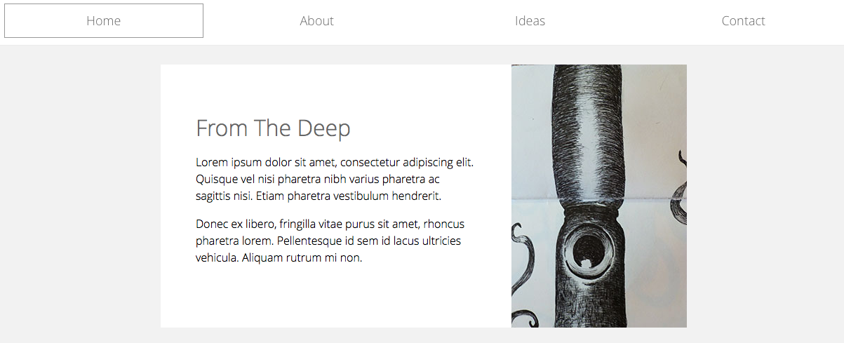
<h2 class="tm-section-title">From The Deep</h2>
<p class="tm-section-description">Lorem ipsum dolor sit amet,
consectetur adipiscing elit. Quisque vel nisi pharetra nibh varius
pharetra ac sagittis nisi. Etiam pharetra vestibulum hendrerit.</p>
<p class="tm-section-description">Donec ex libero, fringilla vitae
purus sit amet, rhoncus pharetra lorem. Pellentesque id sem id lacus
ultricies vehicula. Aliquam rutrum mi non.</p>
</div>
<div class="flex-item">
<img src="img/squid%2001.jpg" alt="">
</div>
</div>
<div id="about" class="tm-content-box">
<ul class="boxes gallery-container">
<li class="box box-bg">
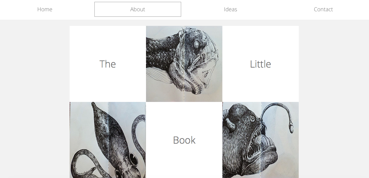
<h2 class="tm-section-title tm-section-title-box tm-box-bg-title">The</h2>
<img src="img/white-bg.jpg" alt="Image" class="img-fluid">
</li>
<li class="box">
<a href="img/fish%20head%20large%2002jpg"><img src="img/fish%20head%2002.jpg"
alt="Image" class="img-fluid"></a>
</li>
<li class="box box-bg">
<h2 class="tm-section-title tm-section-title-box tm-box-bg-title">Little</h2>
<img src="img/white-bg.jpg" alt="Image" class="img-fluid">
</li>
<li class="box">
<a href="img/from%20the%20deep%2001%20large.jpg"><img src="img/from%20the%
20deep%2001.JPG" alt="Image" class="img-fluid"></a>
</li>
<li class="box box-bg">
<h2 class="tm-section-title tm-section-title-box tm-box-bg-title">Book</h2>
<img src="img/white-bg.jpg" alt="Image" class="img-fluid">
</li>
<li class="box">
<a href="img/Scary%20fish%20large.jpg"><img src="img/scary%20fish.jpg"
alt="Image" class="img-fluid"></a>
</li>
<li class="box box-bg">
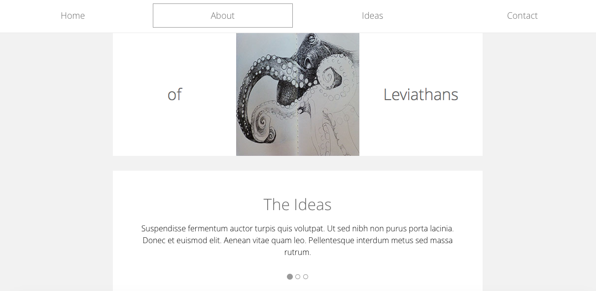
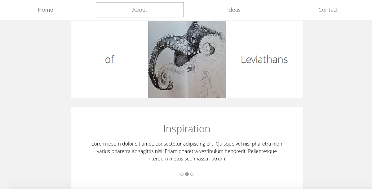
<h2 class="tm-section-title tm-section-title-box tm-box-bg-title">of</h2>
<img src="img/white-bg.jpg" alt="Image" class="img-fluid">
</li>
<li class="box">
<a href="img/Octopus%20Large%2001.jpg"><img src="img/Octopus%2002.jpg"
alt="Image" class="img-fluid"></a>
</li>
<li class="box box-bg">
<h2 class="tm-section-title tm-section-title-box tm-box-bg-title"
>Leviathans</h2>
<img src="img/white-bg.jpg" alt="Image" class="img-fluid">
</li>
</ul>
</div>
</section>
<!-- slider -->
<section id="ideas">
<div id="tmCarousel" class="carousel slide tm-content-box"
data-ride="carousel">
<ol class="carousel-indicators">
<li data-target="#tmCarousel" data-slide-to="0" class="active"></li>
<li data-target="#tmCarousel" data-slide-to="1" class=""></li>
<li data-target="#tmCarousel" data-slide-to="2" class=""></li>
</ol>
<div class="carousel-inner" role="listbox">
<div class="carousel-item active">
<div class="carousel-content">
<div class="flex-item">
<h2 class="tm-section-title">The Ideas</h2>
<p class="tm-section-description carousel-description"
>Suspendisse fermentum auctor turpis quis volutpat. Ut
sed nibh non purus porta lacinia. Donec et euismod elit.
Aenean vitae quam leo. Pellentesque interdum metus sed
massa rutrum.</p>
</div>
</div>
</div>
<div class="carousel-item">
<div class="carousel-content">
<div class="flex-item">
<h2 class="tm-section-title">Inspiration</h2>
<p class="tm-section-description carousel-description"
>Lorem ipsum dolor sit amet, consectetur adipiscing elit.
Quisque vel nisi pharetra nibh varius pharetra ac sagittis
nisi. Etiam pharetra vestibulum hendrerit. Pellentesque
interdum metus sed massa rutrum.</p>
</div>
</div>
</div>
<div class="carousel-item">
<div class="carousel-content">
<div class="flex-item">
<h2 class="tm-section-title">The Project</h2>
<p class="tm-section-description carousel-description"
>Donec ex libero, fringilla vitae purus sit amet, rhoncus
pharetra lorem. Pellentesque id sem id lacus ultricies
vehicula. Aliquam rutrum mi non. Pellentesque interdum
metus sed massa rutrum.</p
</div>
</div>
</div>
</div>
</div>
</section>
<section class="tm-content-box">
<img src="img/Head%2001.jpg" alt="Contact image" class="img-fluid">
<div id="contact" class="pad">
<h2 class="tm-section-title">Contact Us</h2>
<form action="#contact" method="get" class="contact-form">
<div class="form-group col-xs-12 col-sm-12 col-md-6 col-lg-6
form-group-2-col-left">
<input type="text" id="contact_name" name="contact_name"
class="form-control" placeholder="Name" required/>
</div>
<div class="form-group col-xs-12 col-sm-12 col-md-6 col-lg-6
form-group-2-col-right">
<input type="email" id="contact_email" name="contact_email"
class="form-control" placeholder="Email" required/>
</div>
<div class="form-group">
<input type="text" id="contact_subject" name="contact_subject"
class="form-control" placeholder="Subject" required/>
</div>
<div class="form-group">
<textarea id="contact_message" name="contact_message" class=
"form-control" rows="9" placeholder="Message" required></textarea>
</div>
<button type="submit" class="btn btn-primary submit-btn">Submit</button>
</form>
</div>
</section>
<footer class="tm-footer">
<p class="text-xs-center">Copyright © 2016 Company Name -
Design: <a rel="nofollow" href="http://www.templatemo.com/tm-481-
elevate" target="_parent">Elevate</a></p>
</footer>
</div>
</div>
<!-- load JS files -->
<script src="js/jquery-1.11.3.min.js"></script>
<!-- jQuery (https://jquery.com/download/) -->
<script src="js/bootstrap.min.js"></script>
<!-- Bootstrap (http://v4-alpha.getbootstrap.com/getting-started/download/) -->
<script src="js/jquery.magnific-popup.min.js"></script>
<!-- Magnific pop-up (http://dimsemenov.com/plugins/magnific-popup/) -->
<script src="js/jquery.singlePageNav.min.js"></script>
<!-- Single Page Nav (https://github.com/ChrisWojcik/single-page-nav) -->
<script src="js/jquery.touchSwipe.min.js"></script>
<!-- https://github.com/mattbryson/TouchSwipe-Jquery-Plugin -->
<!-- Templatemo scripts -->
<script>
$(document).ready(function(){// Single page nav if($(window).width()
<= 1139) {$('.tm-main-nav').singlePageNav({'currentClass' : "active",
offset : 100});} else {$('.tm-main-nav').singlePageNav({'currentClass'
: "active",offset : 80});}
// Handle nav offset upon window resize
$(window).resize(function(){if($(window).width() <= 1139)
{$('.tm-main-nav').singlePageNav({'currentClass' : "active",offset :
100});} else {$('.tm-main-nav').singlePageNav({'currentClass' :
"active",offset : 80});}});// Magnific pop up $('.gallery-container').
magnificPopup({delegate: 'a', // child items selector, by clicking on
it popup will opentype: 'image',gallery: {enabled:true}// other options}
);$('.carousel').carousel({interval: 3000})
// Enable carousel swiping (http://lazcreative.com/blog/adding-swipe-
support-to-bootstrap-carousel-3-0/) $(".carousel-inner").swipe( {//Generic
swipe handler for all directionsswipeLeft:function(event, direction,
distance, duration, fingerCount) {$(this).parent().carousel('next');},
swipeRight: function() {$(this).parent().carousel('prev');
}
});
});
</script>
The extensive exercise resulted in the screenshots of the website below.