Final Reflections before hand-in

I am astounded when I look back over this project. I have never had a project develop as dramatically as this and I am so proud of what it has become. The concepts around gender roles and the female gaze that I bought forward from my AD394 research did have the essence and potential for what this project evolved into, I just had no idea at that point. 

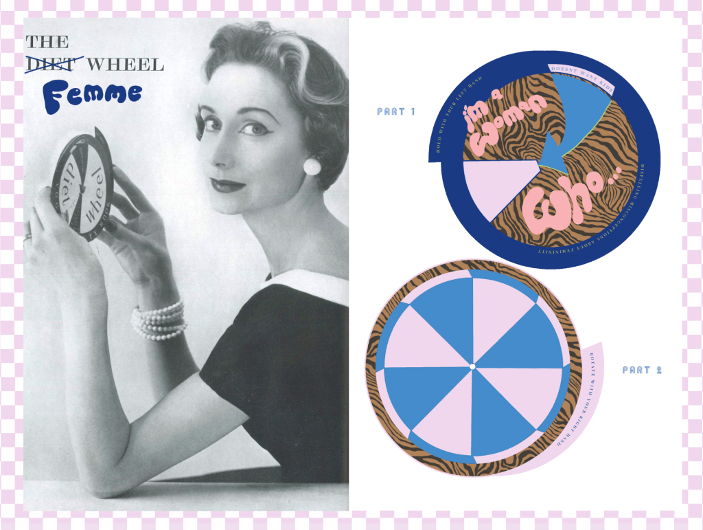
I am so pleased that despite my outcome being ultimately different to the experiential box I had planned, I have stayed true to my design values and prioritised creating work that is interactive and experiential. I think this is shown throughout the ways in which the campaign is interacting with its audience and collaborators but more literally through the design of the ‘Fortune Teller’ and ‘Real Wheel’. I am so excited to continue creating designs that can be brought into the physical world and be interacted with, for the ‘I’m a Woman Who…’ platform. 

Due to its accessibility and potential to reach much wider audience, the campaign became something more culturally valuable than I could’ve achieved with my original box idea. I believe as an artefact it documents a  more poignant moment of time within the evolution of feminism. 

Strangely, although at the end of this module, this campaign feels as though it is only in its infancy and I am excited to take it further. I currently have content collaborators producing more work for the campaign and I am going to continue reaching out to more people, as well as posting the imagery I already have. These plans are outlined in my sketchbook. I am particularly grateful to have found and learnt how to use these resources and organisation methods because it will make proceeding with ‘I am a Woman Who…’ campaign a professional and targeted process that will ultimately show through within the content. This level of integrity will be what shows this platform means business. 

Website and Manifesto development

The process of building my website has been a real journey. The majority of my reflection on the process is in my sketchbook but I will summarise it here. Strangely I began the web building process with a black background which was a decision I now realise I had taken because I was inspired by other websites that had used a similar colour scheme but I had forgotten to revisit my media pack and remind myself of ‘I’m a woman who…’s core values which scream for positivity and empowerment and therefore bright and dynamic colours. I went back to my colourful gradient background and started to get playful with coloured text and text boxes throughout the site.

I was initially proud of my scrolling images behind the logo but again, on reflection, realised that the homepage needed an injection of fun, playfulness and positivity. I am relieved I went back to the drawing board and came up with my sticker collage. The stickers I had designed previously in the project were originally only to be sent out to collaborators with the t-shirts but this context suits them even better. I now smile when I look at the homepage which is exactly the effect I hope this homepage and the wider campaign achieves for its’ audience. This web design has proved that more serious subject matters like some of the negative experiences of women can be discussed and promoted within an empowered, positive, and progressive visual setting. The web design now visually presents as the literal and metaphorical, light at the end of realising you can be yourself without society’s approval no matter what trying experiences you’ve been through.

A lot of work also needed to go into revising the Manifesto as I realised it was too wordy and the more I worked with it the more I saw it could be summarised in much fewer words that would make reading it much more manageable and appealing to visitors of the website.  Another huge part missing from the manifesto was the ‘WHAT’ which meant the manifesto was just a series of statements that left people (even myself at points) thinking but how is this going to be achieved? through what means?

It took me a while but I also managed to part ways with the wordy section titles, ‘limiting and toxic views’. After a lot of consideration, despite this section demonstrating what motivates this campaign, I did come to terms with the fact this section gave an overly negative tone to the page. Due to its length it distracted from other sections looked like the most important piece of text. I feel good about this decision now because I understand that as the campaign grows and women tell their stories this section would’ve been usurped. And what better way to explain why this campaign exists than with the words of the women it exists for.

Social media planning

Planning content and posting regularly has been overwhelming me whilst juggling the other priorities of this project. Previous experience I’ve had working with social media for brands has allowed me to concentrate solely on this platform of communication but thinking about how I’m going to build the website and considering what order things will be posted in and when has got me frazzled.

To address this I have been working with a downloaded resource, an editorial calendar. I explored using a traditional content calendar but it was not applicable to me at this stage as I am concentrating on the platform of Instagram first before branching out to other social media forms. The editorial calendar allows me to collate all of the shoots and collaborators I am working with and then plan when they will be posted. This way I can plan to post consistently and prioritise what edits and posts need to be drafted first.

I was really excited to hear about the ‘Later’ application as I had previously considered setting alarms to remind me to post on the Instagram. Later allows you to schedule and plan your posts ahead of time, taking a lot of stress away However I had a complete disaster as, trying to set it up meant complicated page setting on facebook which even after following the instructions repeatedly, didn’t ever appear to link up to later and I was therefore prevented from proceeding with the process any further. This has left me feeling frustrated but I am on the lookout for any other applications that do the same thing and are hopefully more user friendly.

For the time being, I am going to prioritise building the website and hopefully, once it is set up I will have more capacity to dedicate more time to posting consistently and regularly on social media again.


Shooting campaign t-shirt myself

As well as sending out the t-shirts to collaborators I know it is important for me to be producing a large portion of the content ‘in-house’ and this stage as I can’t rely on others to prioritise this campaign and I need to assure I will have enough content to post on social media in order to keep posting consistently. In planning the shoot, I reflected on the visual identity I have so far which is predominantly bold and colourful digital design, and used this to influence a mood board for ‘in-house’ content that would work well in balancing out the feed and add to the visual identity of the campaign overall. I settled on a low-fi, digital point-and-shoot camera method of photography as I felt this would mellow out the bright colours of the digital design. I like this style of photography as it feels relatable and personal, reminiscent of home films and snaps that your grandma takes. The mood captured in each shoot will be different. I think it’s appropriate for the campaign manifesto that the subject’s personality is communicated through the imagery. However ultimately, I think it will be strongest for the campaign that on the whole, the imagery portrays confidence and energy, reflecting positivity and empowerment.

Through planning this specific shoot I picked up on these considerations, making sure to include shots from lower angles to achieve the powerful and confident portrayal of the subject. Through the styling, I tried to let the campaign T-shirts sing loudest but introduced colours reminiscent of the digital designs through the bottom-half clothing, such as hot pink silk trousers. The poses of the model taking up more space are most effective in communicating the power and confidence of the subject which is important as it epitomises the manifesto’s sentiments of encouraging confidence and self-assurance.


Upon reflection, I am really chuffed that I achieve what I set out to with this shoot and furthermore the photography style works as I hoped it to, mellowing out the more intense vibrant digital design, as the Instagram feed shows:


Screen printing and reaching out to content collaborators

In haste to communicate the important personal aspect of the project on social media, I want to introduce images that show women, our community, and physical content. I feel that the digital content has been effective in communicating what we’re about at the get-g0 but it is essential that the human element is made clear. Thinking about this I’ve decided to go ahead and design hand-printed recycled t-shirts to bring this campaign into the physical world with the aim of sending them out to some exciting content collaborators and amazing women who can become the ambassadors for the campaign and community that it is my aim to build.

I sourced my t-shirts from charity shops and made stencils for the screen printing with a slightly edited version of the revised logo. Using textile acrylics I began screen printing the t-shirts with the screens at uni. My favorite element of the outcome is the low-fi feel that hand printing has given the t-shirts that is really appropriate for the campaign as every t-shirt is so different and unique which feels personal.

For social media, it helps to engage followers with the entire process and therefore I have been carefully documenting my production from t-shirt printing to package and posting.


The women I have reached out to take content in these t-shirts represent the audience of the campaign as well as the message behind it. They are all individual, ambitious and inspiring women who are confidently aware of dispelling societal stereotypes. I reached out to them using Instagram messages and asked if I could send them a t-shirt. I am concerned about the turnaround time of the collaborator-produced content as it is under time pressure due to hand-in but I am happy in the knowledge that so long as they do take the content as discussed I will have posts for Instagram as the campaign grows beyond the project.

Launching social media

Having been very apprehensive to start the Instagram page and make this project public, I realised it was a really important step in order to start building the community. This campaign feeds off of the people that it is created for so with this community beginning to build on social media, I can interact and gauge responses to the work being created.

On the first day, I posted three digital designs, the logo, a condensed manifesto, and a version of the wheel digitalized. The idea was to create a professional start to the grid however my feeling upon reflection is that it has struck a slightly impersonal/corporate appearance. Therefore, my next steps are to warm it up with some photos of physical objects/people as this is so integral to the identity of the campaign. Not only will these images help to make the Instagram page more causal and relatable but also gives the opportunity to bring the campaign into the physical world.

Media Pack Progress

Alongside the writing of my manifesto, I have been trying to understand my campaign from 360 view and have felt that the best way to do this is through creating a media pack. Identifying the target audience, summarising the visual identity and considering the platforms I am going to use have all helped me come to a better understanding of my direction and next steps. As I still find the breadth of my concept for this campaign very daunting I attempted to make sense of it by dividing up the categories I would like to investigate with the campaign into a monthly rotation. I have written a six month plan that outlines some examples of the topics that are central to the campaign. It also details the way in which they will be approached through social media content and physical merchandise or events.

Writing a manifesto

After a tricky week or so, coming to terms with the breadth and complexity of my new project, I’ve had a very helpful tutorial that helped me identify some immediate next steps. I was particularly overwhelmed by the scope of my concept and the endless opportunities for creating relevant content for this idea which ultimately has slowed me down. I was advised to distill my concept and understand the specific ethos and values of the campaign by writing a manifesto that I feel will really help me to focus and understand what is most important going forward to create concepts. I feel very aware that this campaign could look wishy-washy and uncoordinated if I do not fully understand the direction and aims of this campaign. This is why I have also decided to create a media-pack along with the manifesto in order to get to grips with the audience, the platforms I will be using, visual identity and projected plan and timeline.

It was also suggested that the campaign focuses on particularly topics at certain times in order to give further direction, structure and allow the campaign to dig deeper and form a greater sense of purpose. An example of a topics that I plan to consider initially is female sexuality as it is an area I have researched in particular depth and wrote my dissertation about. A heavy focus of the campaign will be laid into how every woman is different and cannot and should not be labeled, judged, or categorised. In this vain I want to prioritise celebrating diversity, supporting trans women and encouraging self love and acceptance. So I plan for these to be other topics that the campaign will champion and explore.

The penny drops

Whilst discussing the concept behind my ‘I am a woman who …’ paper wheel in my tutorial, the penny dropped that this concept had much further to go than just on this wheel. My tutor helped me realise that this slogan addressed all the aspects of challenging taboos and stereotypes amongst women, that is central to my work, in a coherent  concept. We conceived that this slogan had milage as the name for a 360 campaign and turned my working outcome idea on its head. I am really excited to start thinking about how I could this umbrella slogan could support everything I am trying to say in my project about women being pigeonholed, commodified, and limited by society. Over my placement year, I really enjoyed creating 360 content for the brand I was working for and I feel confident that I have an understanding of what content gains more traction and engagement on social media. Whilst this is a huge development in the concept of my project I feel the visual identity I have been forming will lend itself well to this campaign. Although my ultimate final outcome for the project will no longer be strictly the experiential box I had originally thought there is a lot that I have learned through developing the box idea that will work well as content for the campaign. These include the paper objects that will work well as an option to be downloaded and printed as part of the campaign and also to photograph in order to make multi dimensional content for the social media. I am keen that not all imagery will be digital graphic design and that I can produce some shoots of products and content for the Instagram and potentially TikTok.

Going forward I am excited to start designing content for the campaign. I plan to start with some poster designs in order to distill the essence of my project into a few images in order to refine the idea and understand the direction in my own head.

Above, is my digi-poster design. I wanted to encourperate analog campaign methods (poster) with the online world we are in now (the moving gif element). I think the outcome is effective and makes some headway in communicating what I want this campaign to be about.

Developing my message

The challenge I am currently facing is developing a strong and clear message that communicates my findings and interpretation of the research I have undertaken so far.

At this stage in the project, I would have hoped to have had a more distilled understanding of the meaning behind my final outcome that could be communicated in a short and comprehensible mission statement.

Having experimented with my dolls, dollhouses, and papercrafts it is time to concentrate on a more obvious outcome that makes the agenda of this project loud and clear. It has always been part of my plan to have content in my box that includes writing in order to ground the visuals in their context and add an element of educative information.

In a vintage Vogue magazine from the 50s I was lucky enough to be given, there is a beautiful pull-out page that contains a paper wheel that the reader would assemble and operate themselves. However, the issue is that this wheel is the ‘diet’ wheel, an outdated and damaging concept that encourages low self-esteem and people to pursue unhealthy eating regimes. I thought to take inspiration from the design of this paper object but switch up the content to something that communicates my message and updates the object to appeal to the modern woman.

The idea I had was that each turn of the wheel would reveal a different fact dispelling misconceptions about what it is to be a woman, in order to show women are multi-dimensional, contrary to how they have been presented and understood in our society. My aim is that the wheel will communicate that having characteristics that go against stale gender norms does not make anyone who identifies as a woman any less of one. My motive was to broaden the definition of femininity and what we associate with it.